
KPL is a Saudi professional law firm based in Riyadh, providing specialized legal services to the corporate sector, including advisory, company formation, dispute resolution, and client rights protection. Its expertise extends across commercial law, corporate governance, arbitration, and regulatory compliance. The identity was developed to position KPL as a comprehensive legal partner for businesses in the Saudi market, through a visual language that brings together legal clarity and business flexibility.
The challenge was to build an identity that reflects legal precision and reliability without falling into the traditional image of law firms, often defined by direct legal symbols and rigid formal expression.
KPL needed a more modern presence that maintains the trust required in the legal sector while offering the flexibility to suit the nature of its work with businesses and corporations.
Turning the Legal Framework into a Visual Language
We found the opportunity in the nature of commercial law itself; it is built on a clear framework, yet allows room for movement and adaptation to different situations.
From there, the relationship between structure and flexibility became the starting point for building the identity and translating it into a visual system that reflects the way KPL works.
We began by understanding KPL as a Saudi law firm specializing in the corporate sector, offering services that include advisory, company formation, dispute resolution, arbitration, and regulatory compliance. The goal was to build an identity that reflects legal expertise without feeling rigid or traditional.
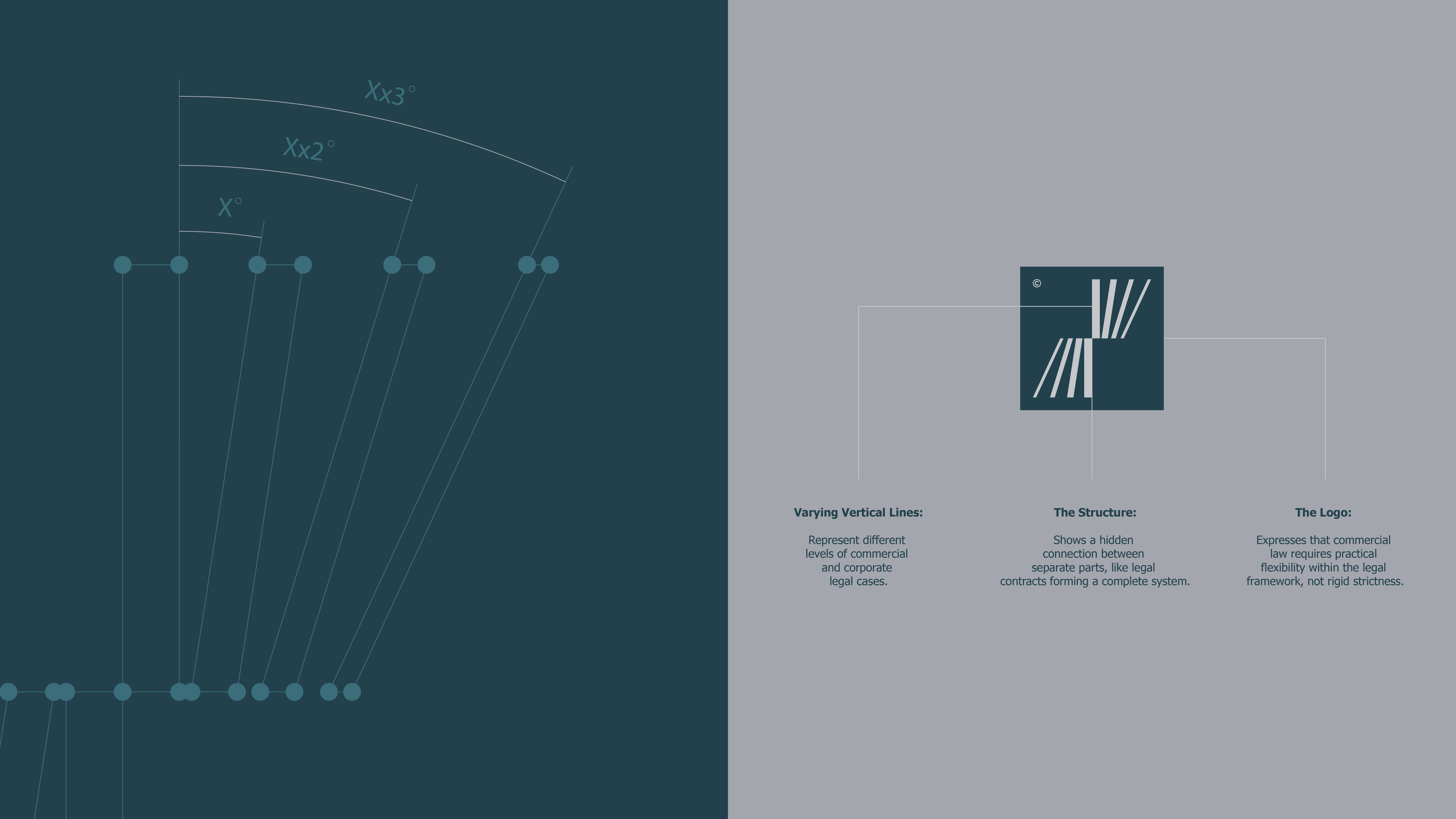
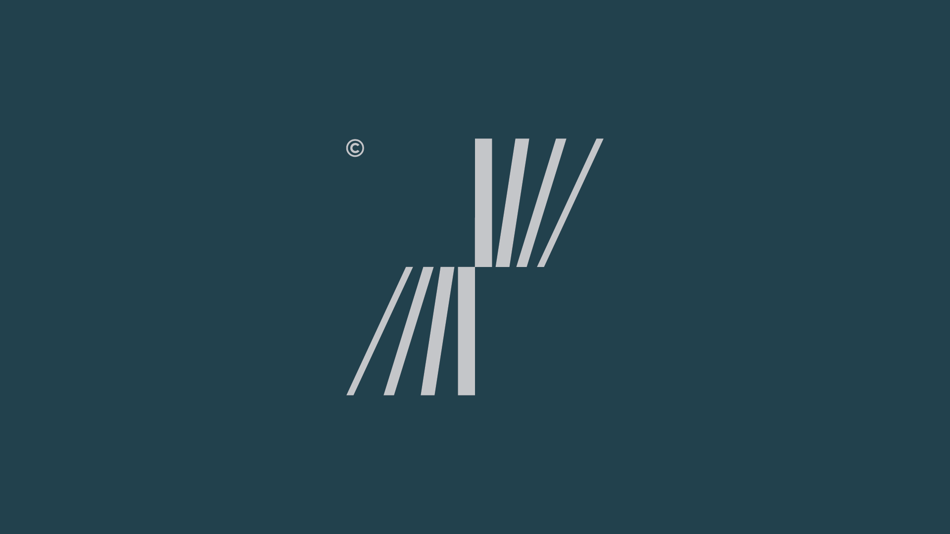
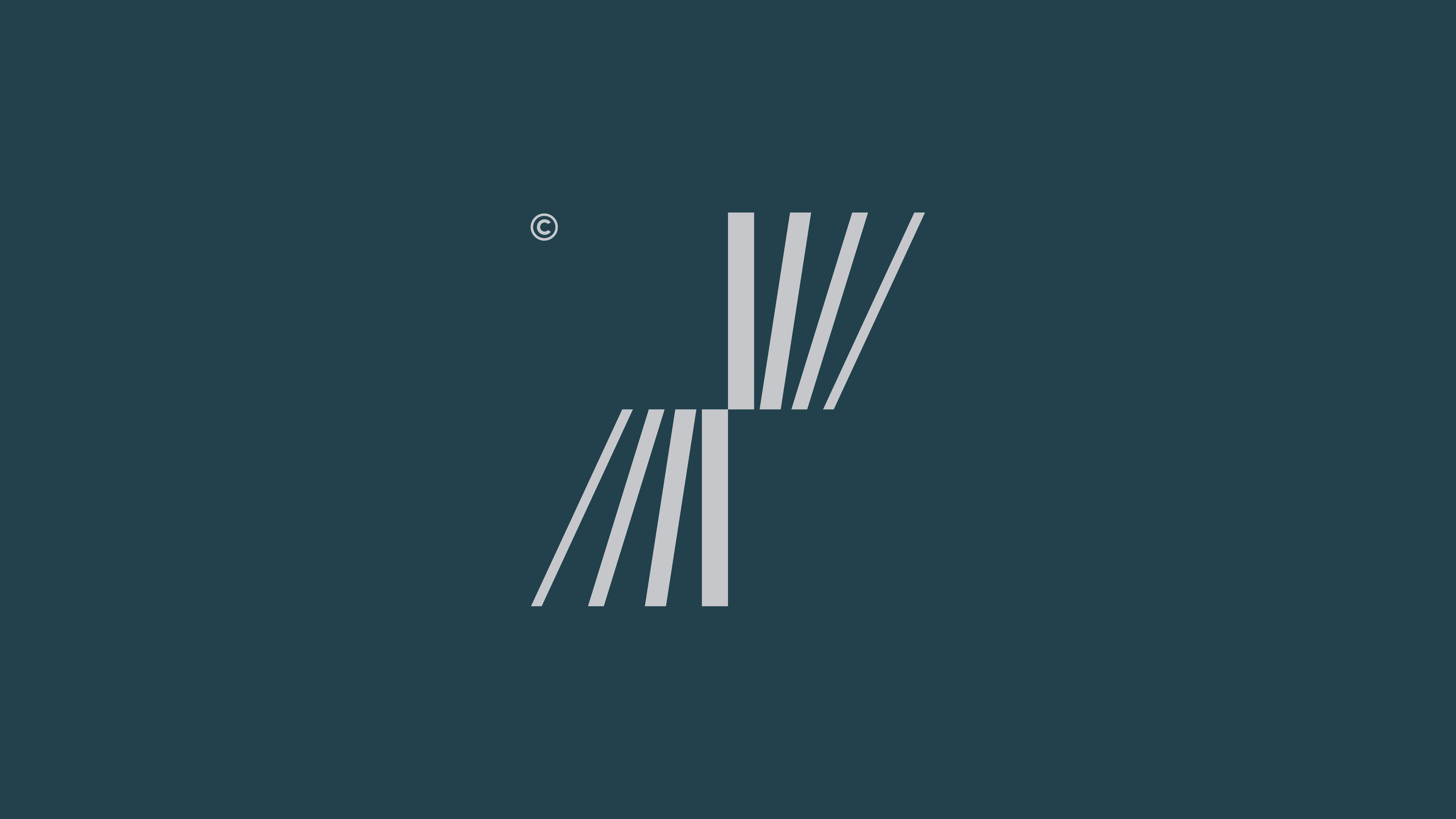
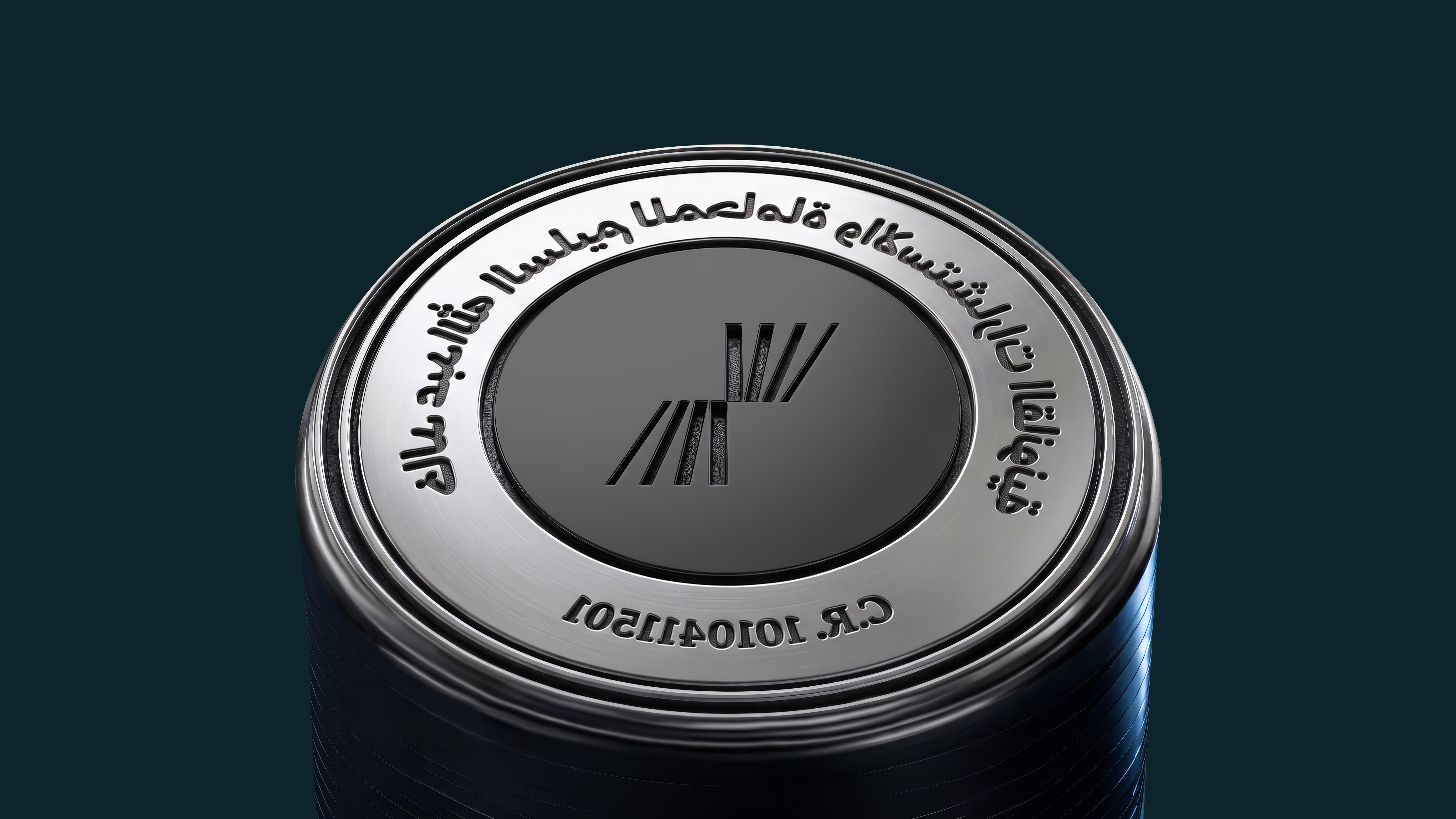
We developed the symbol from a series of varying vertical lines, representing different levels of corporate and commercial matters. We then connected them within a unified structure that reflects the relationships and connections linking the different aspects of legal work.
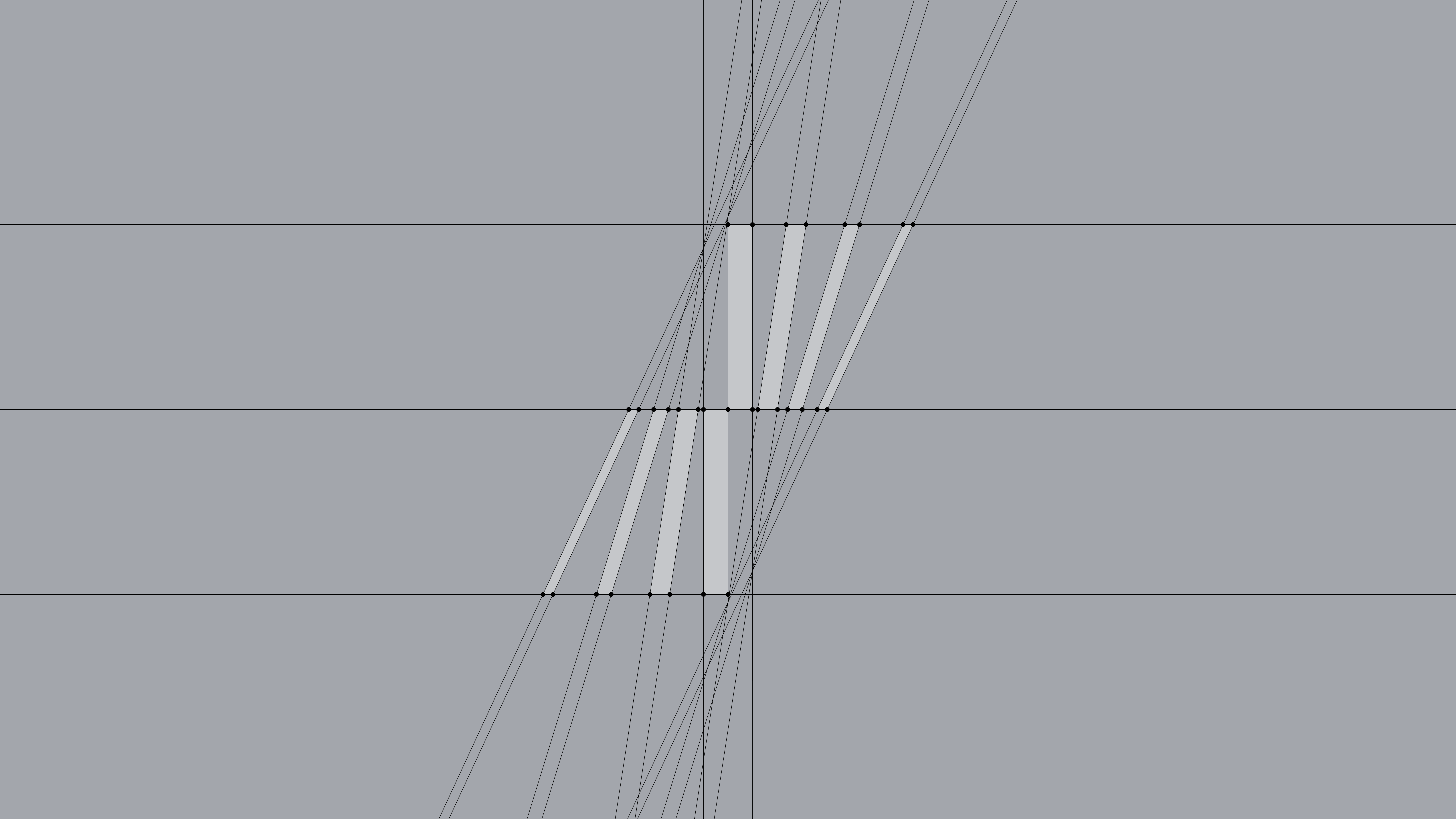
We developed the concept into a simple visual symbol built around vertical lines and their varying heights, with a geometric composition that expresses connection and integration. The symbol became a key foundation for shaping KPL’s personality and giving it a modern, confident legal presence.
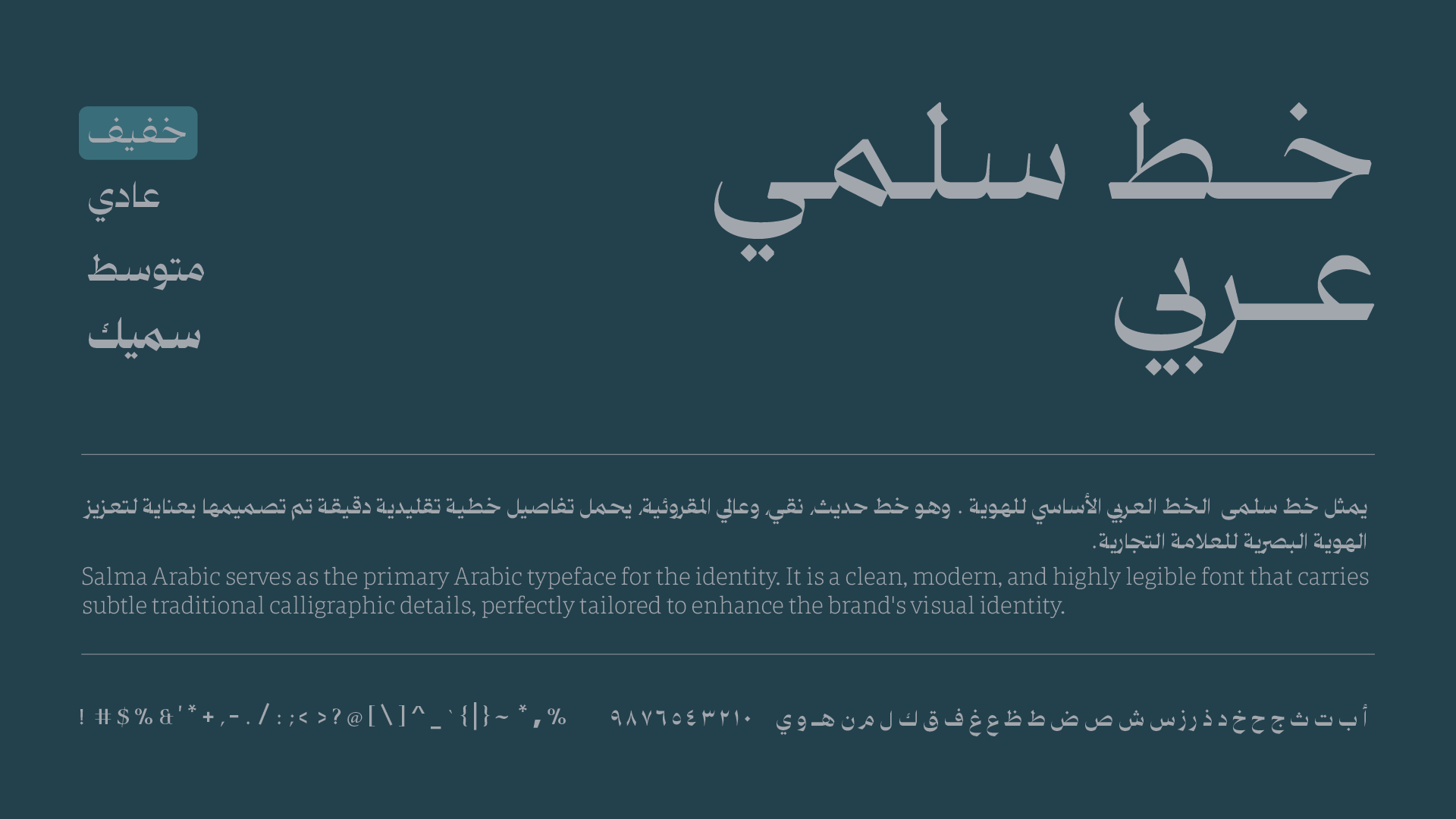
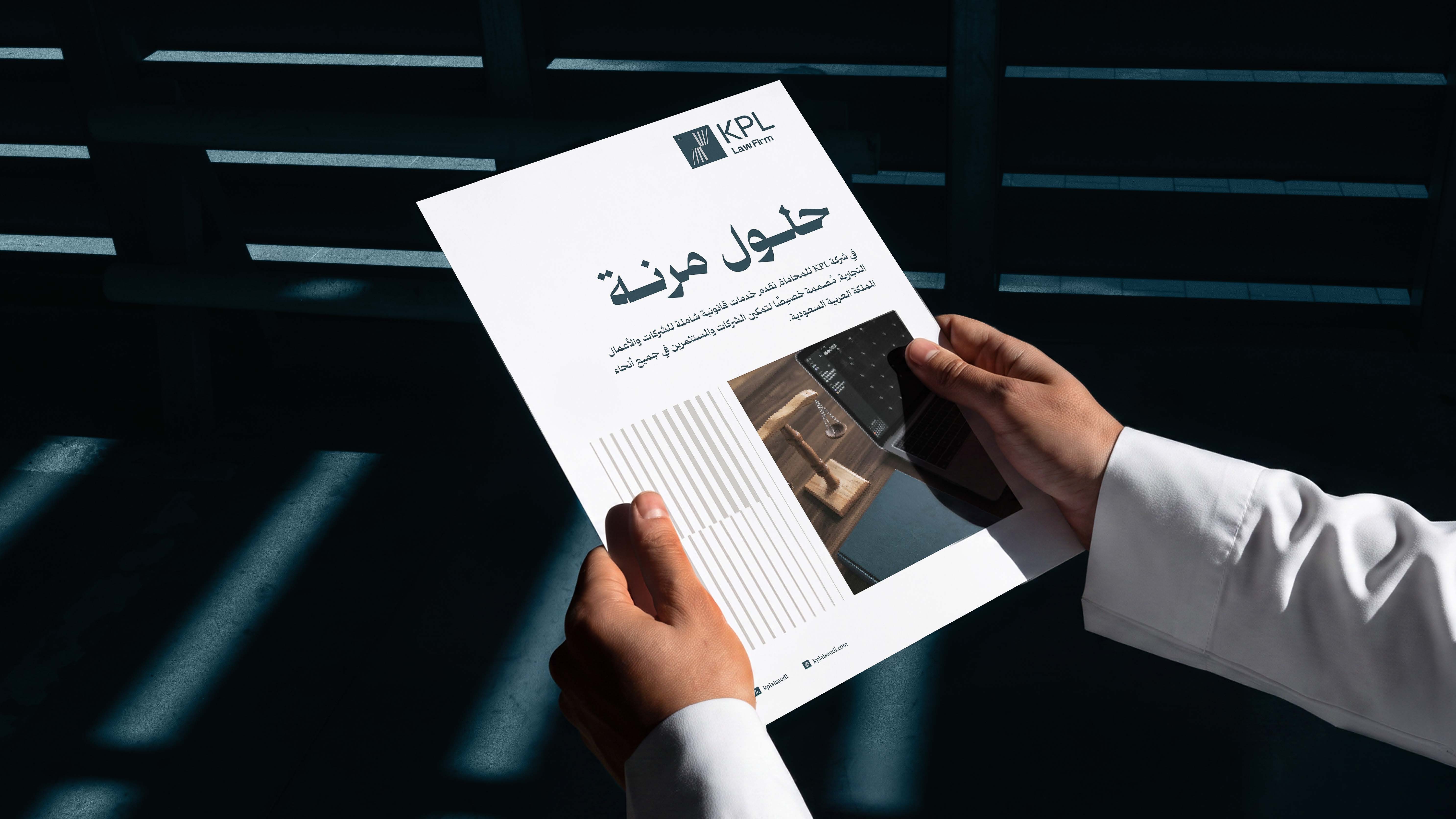
Once the symbol was established, we built the visual system around it through colors, typography, and supporting elements. We adopted Salma Arabic as the primary Arabic typeface for its balance of clarity and modernity, combined with traditional calligraphic details.
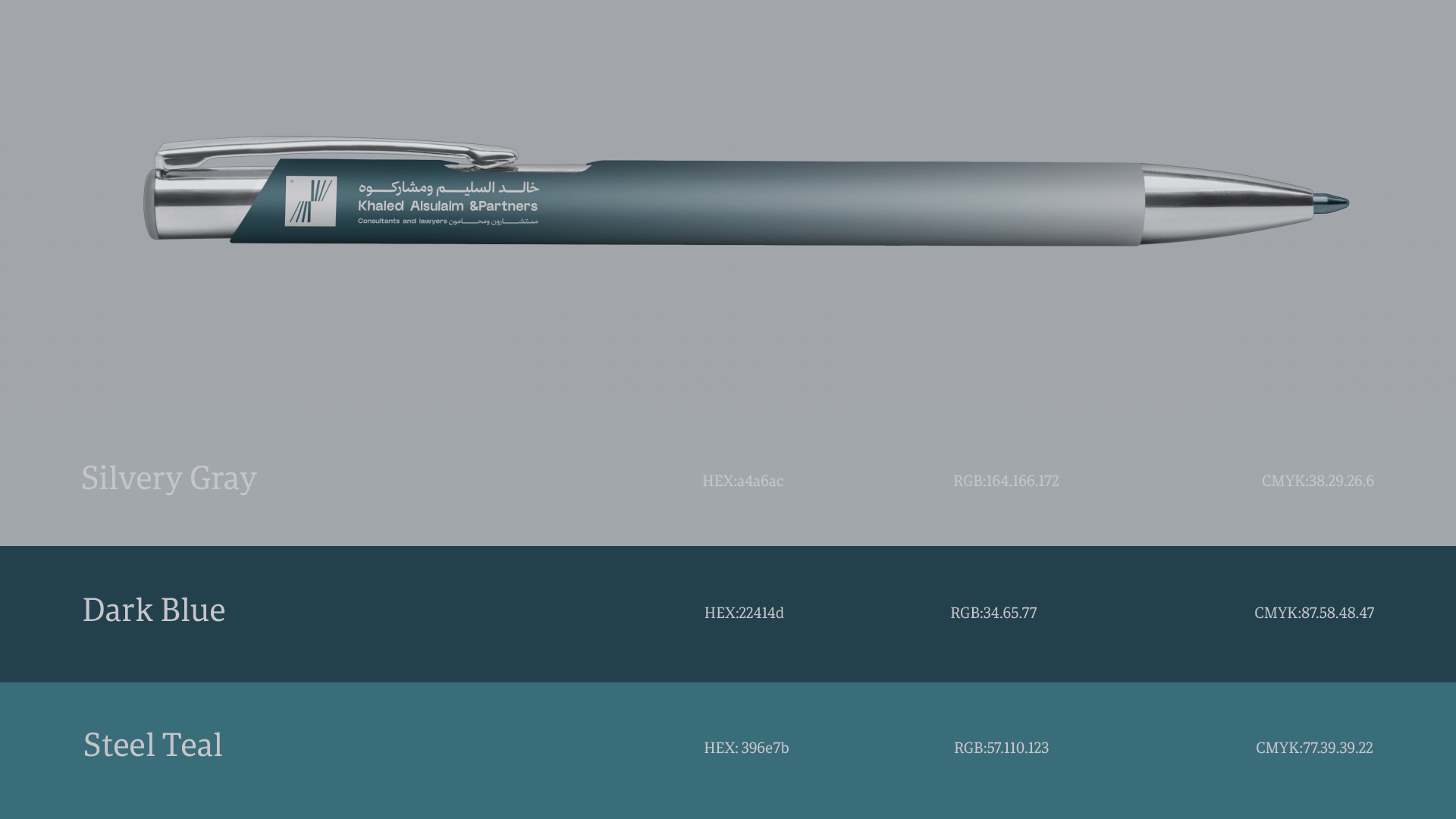
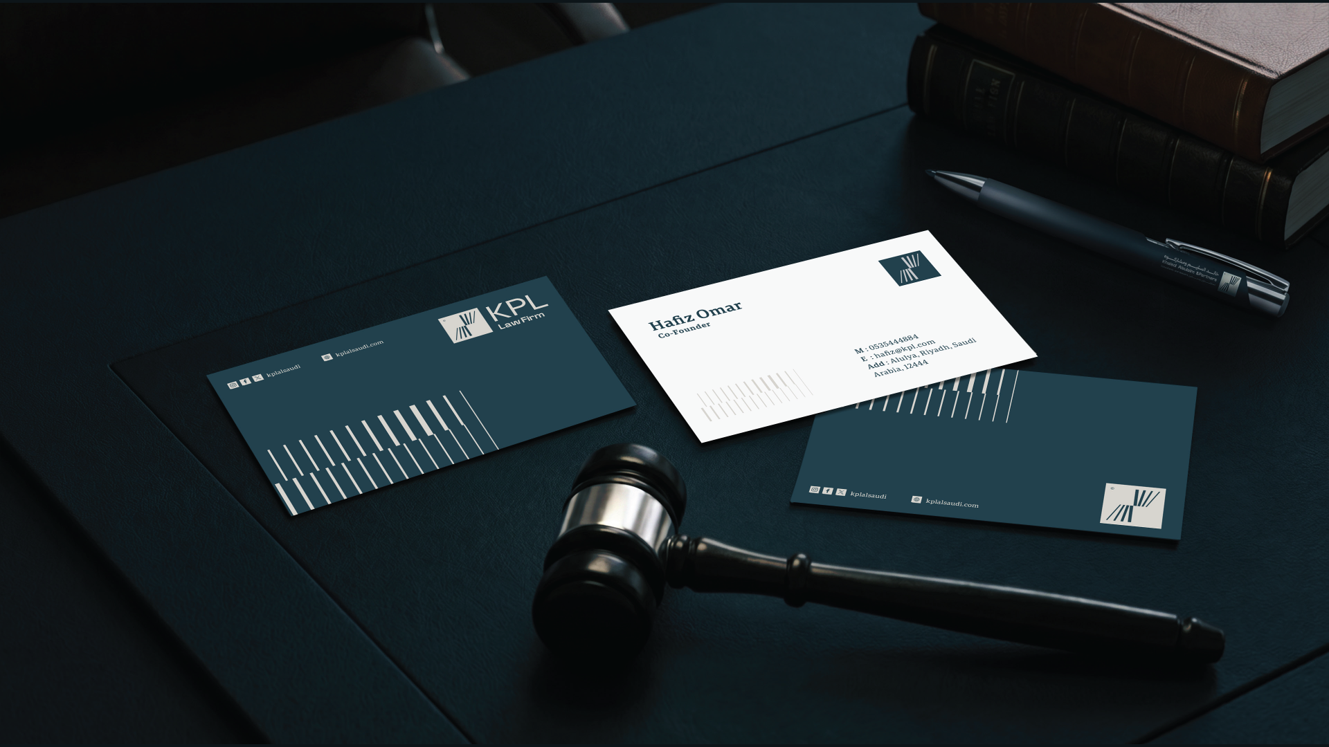
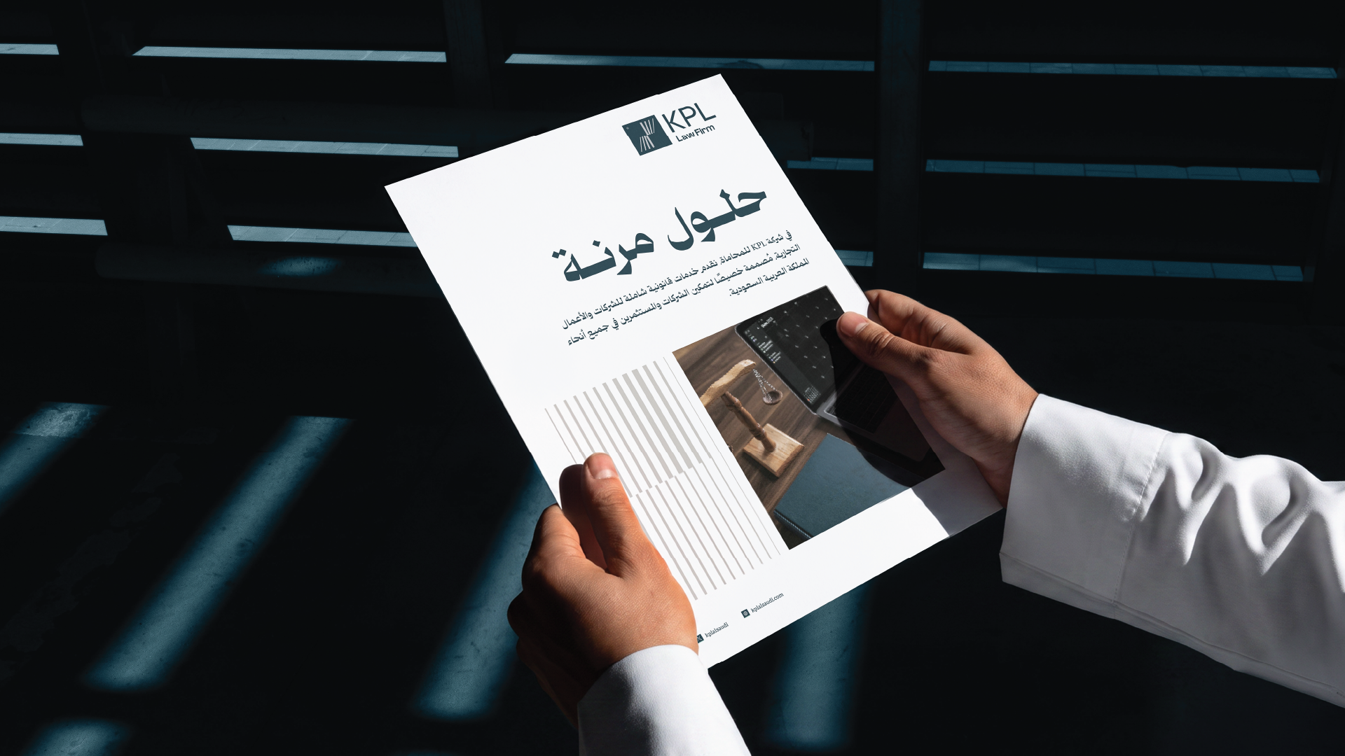
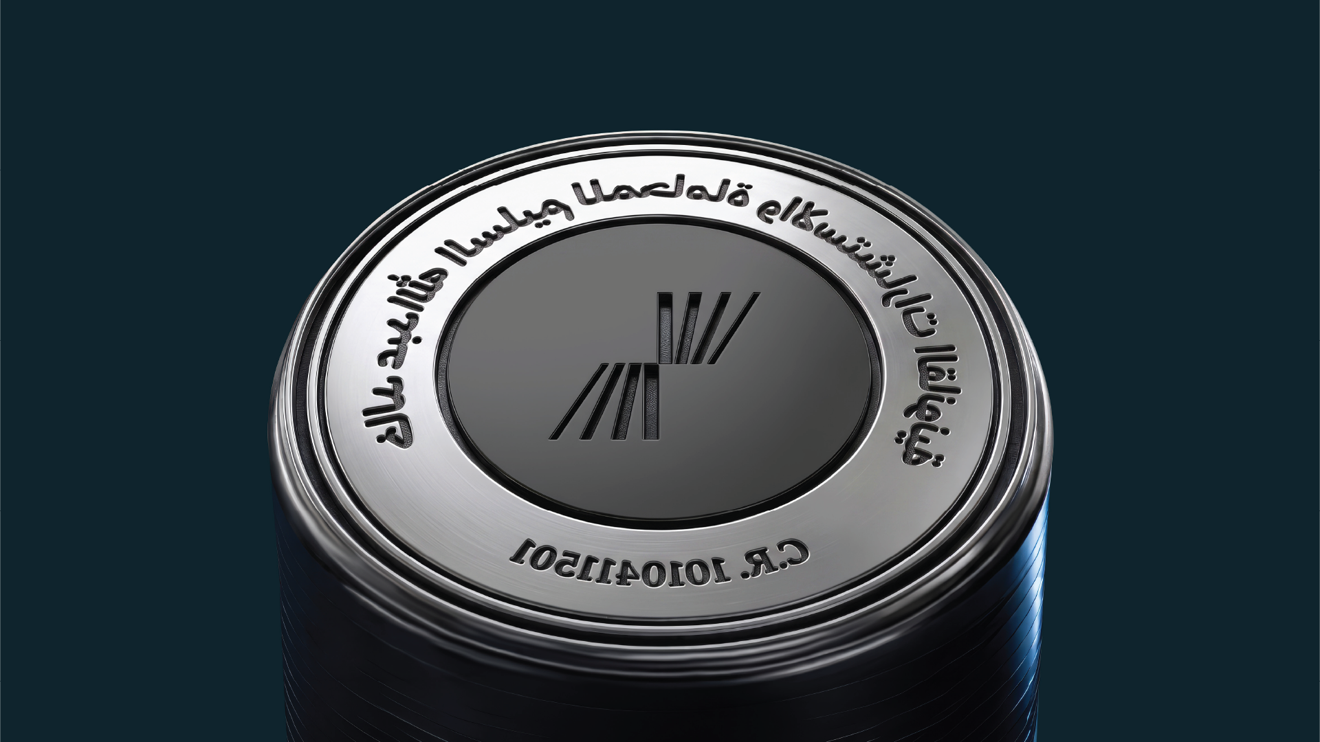
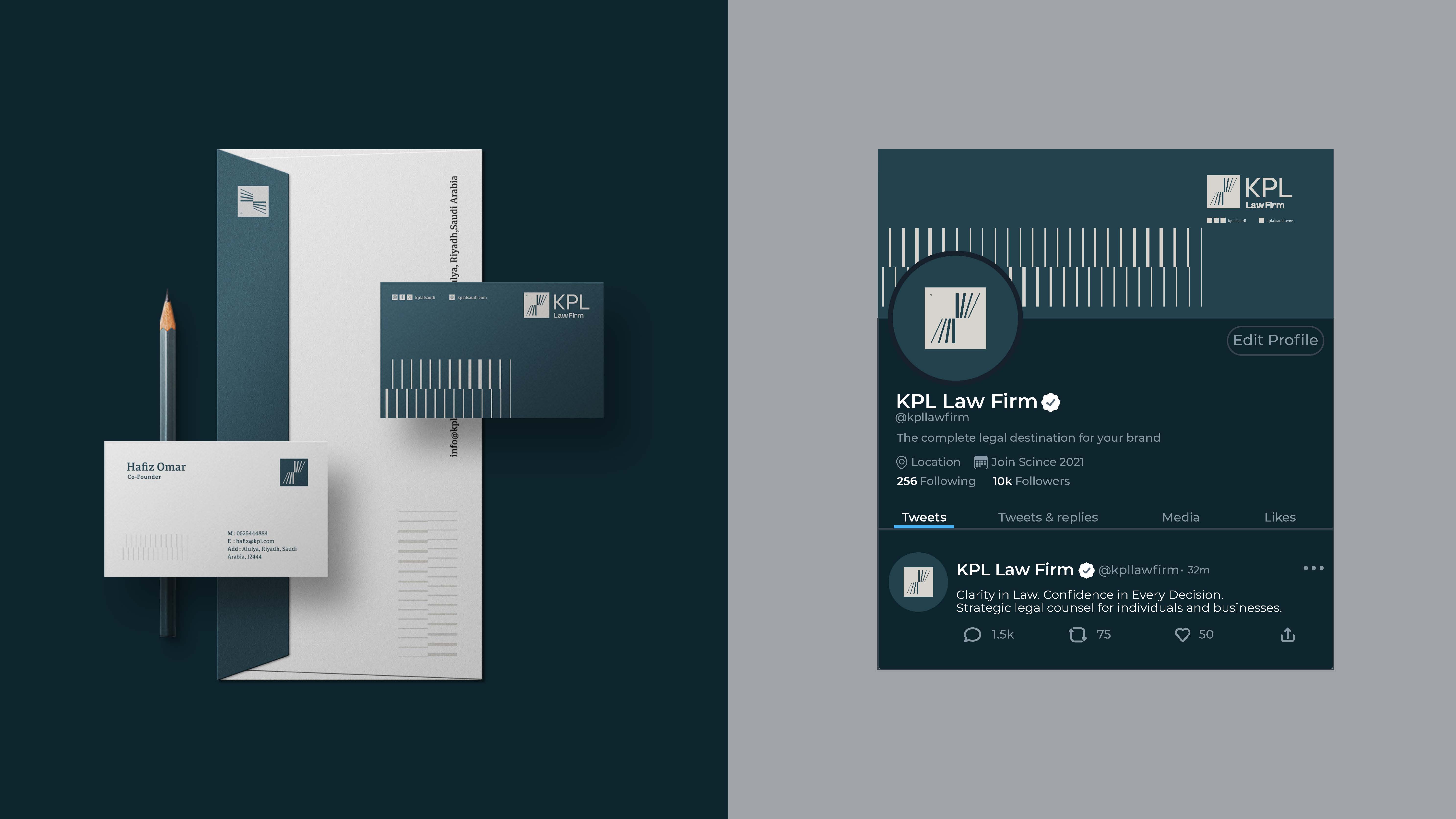
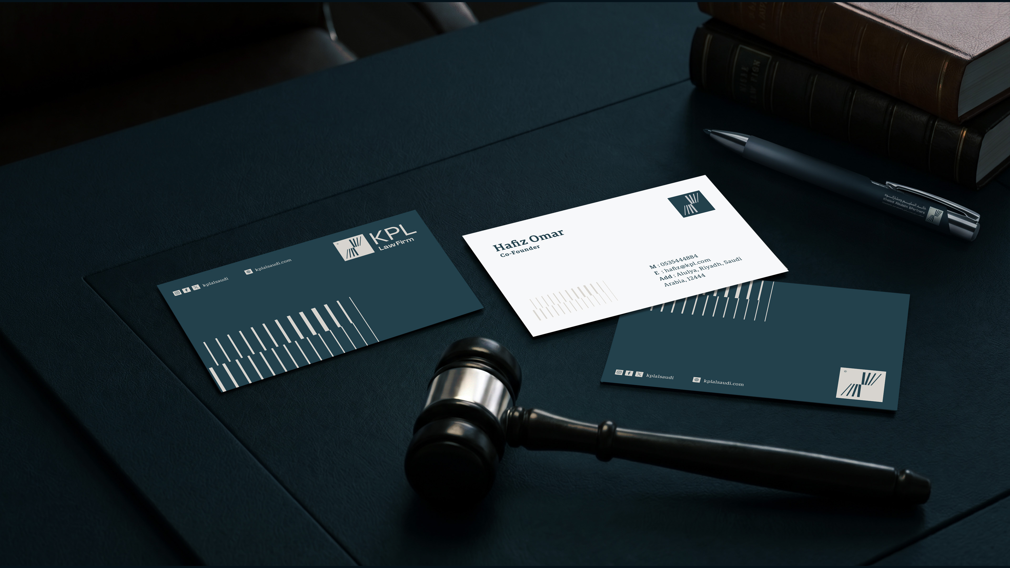
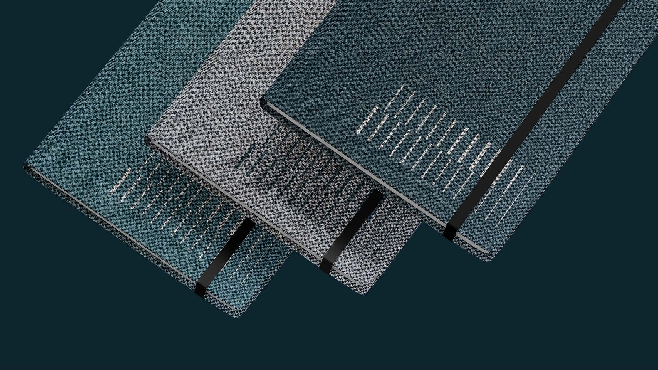
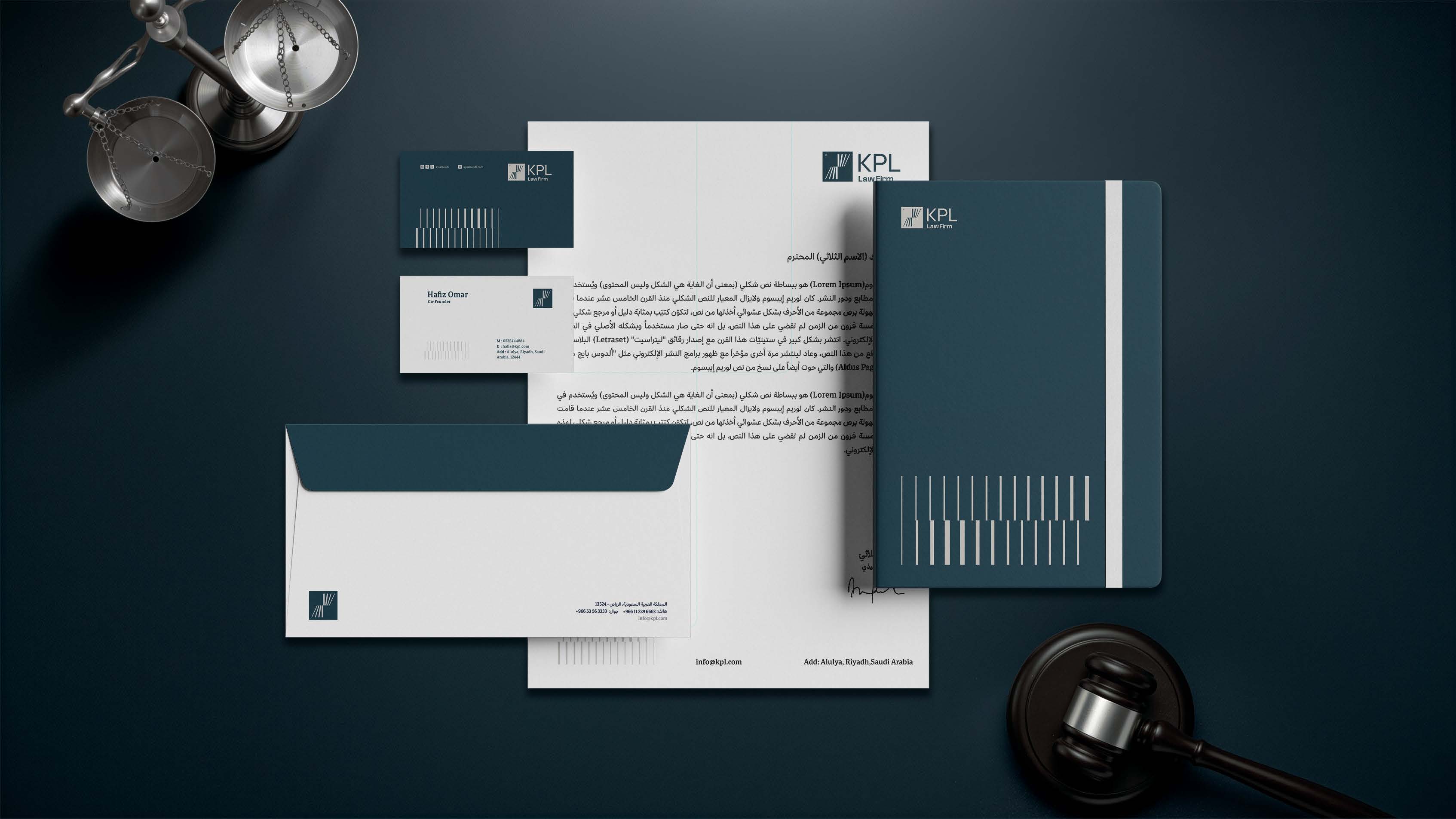
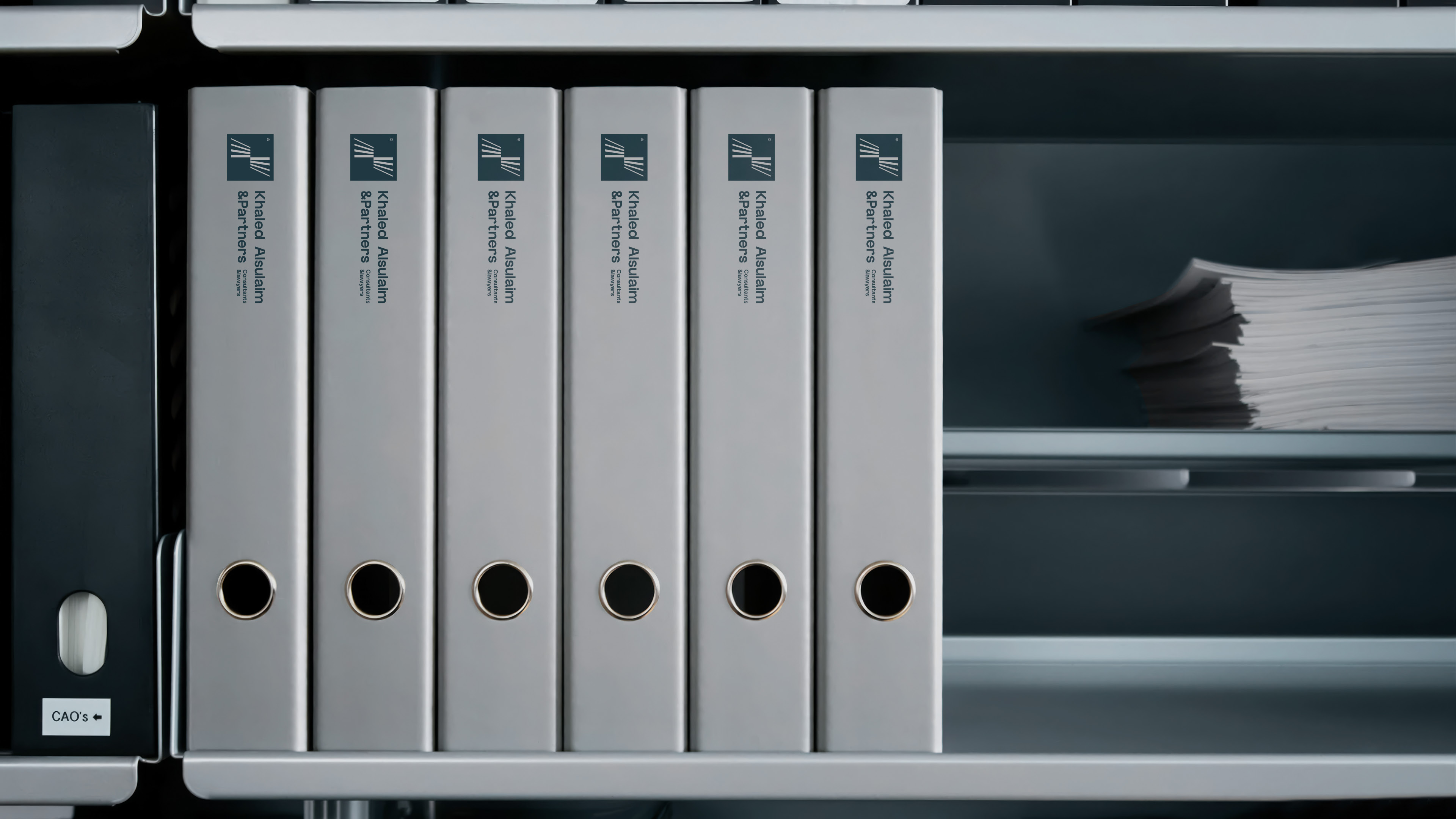
We tested the visual system across different touchpoints, from stationery and corporate documents to digital tools and social media presence. The result is a cohesive identity that maintains its professional and legal character, with a clearer and more flexible visual language.

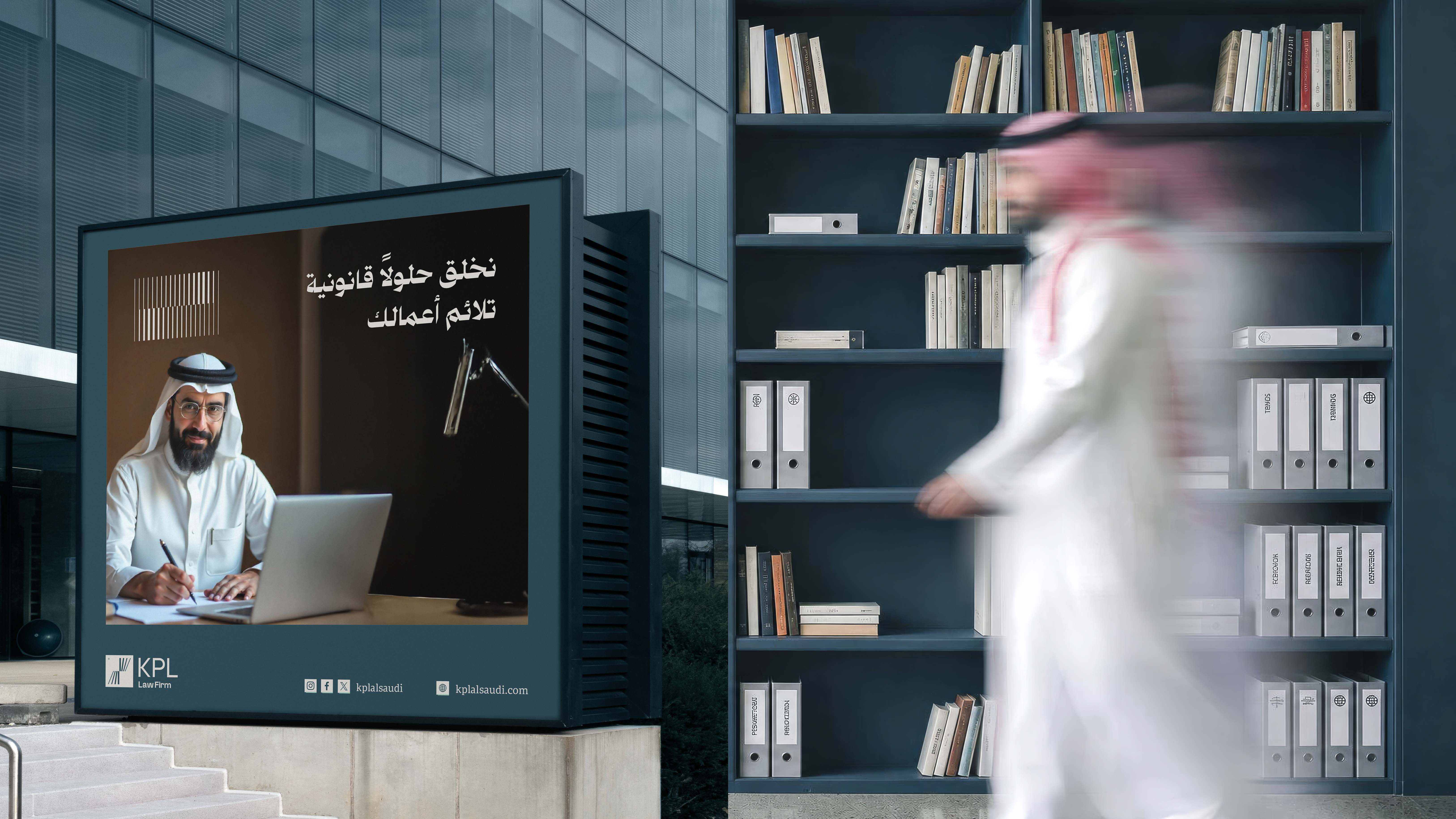
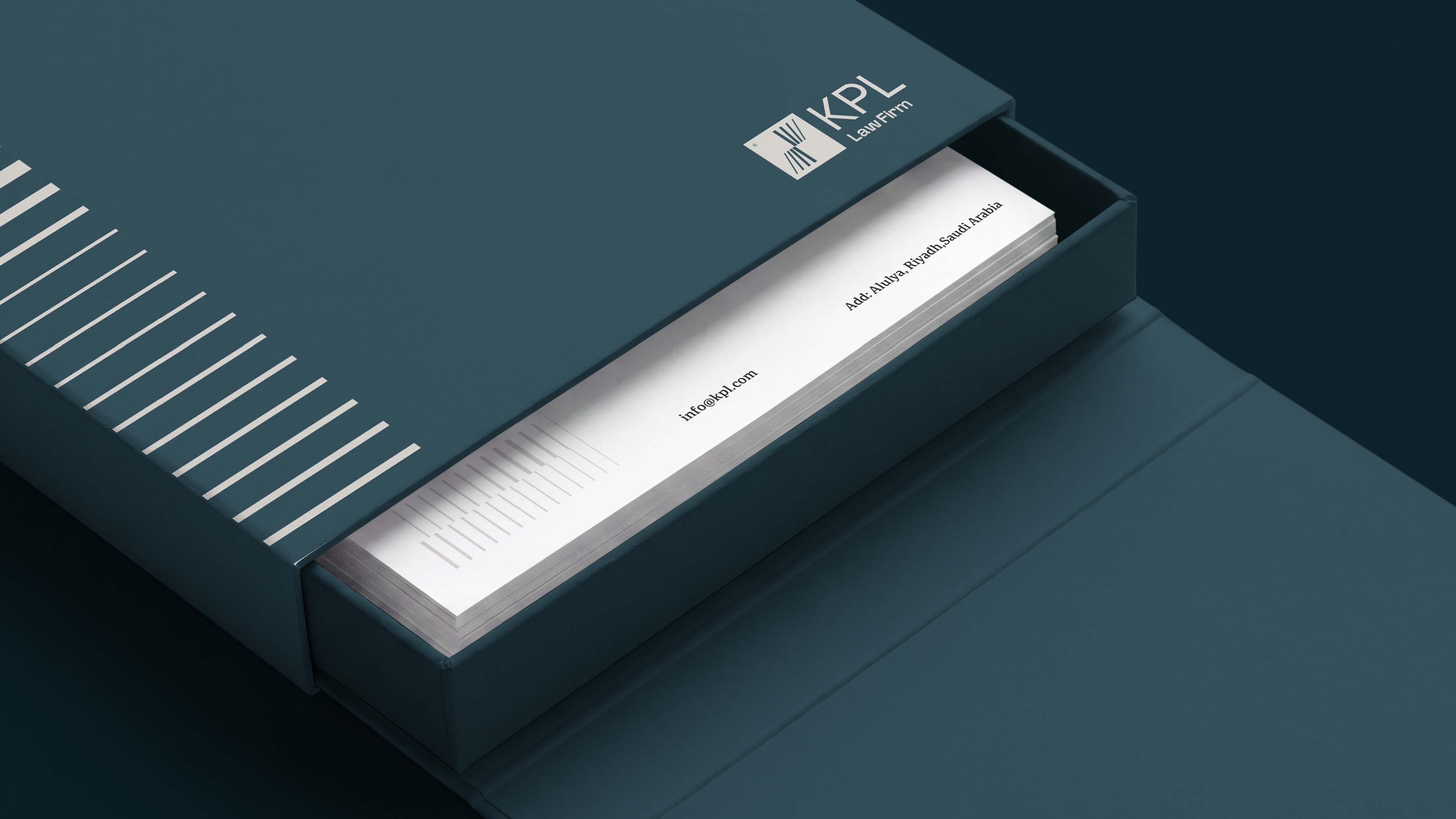

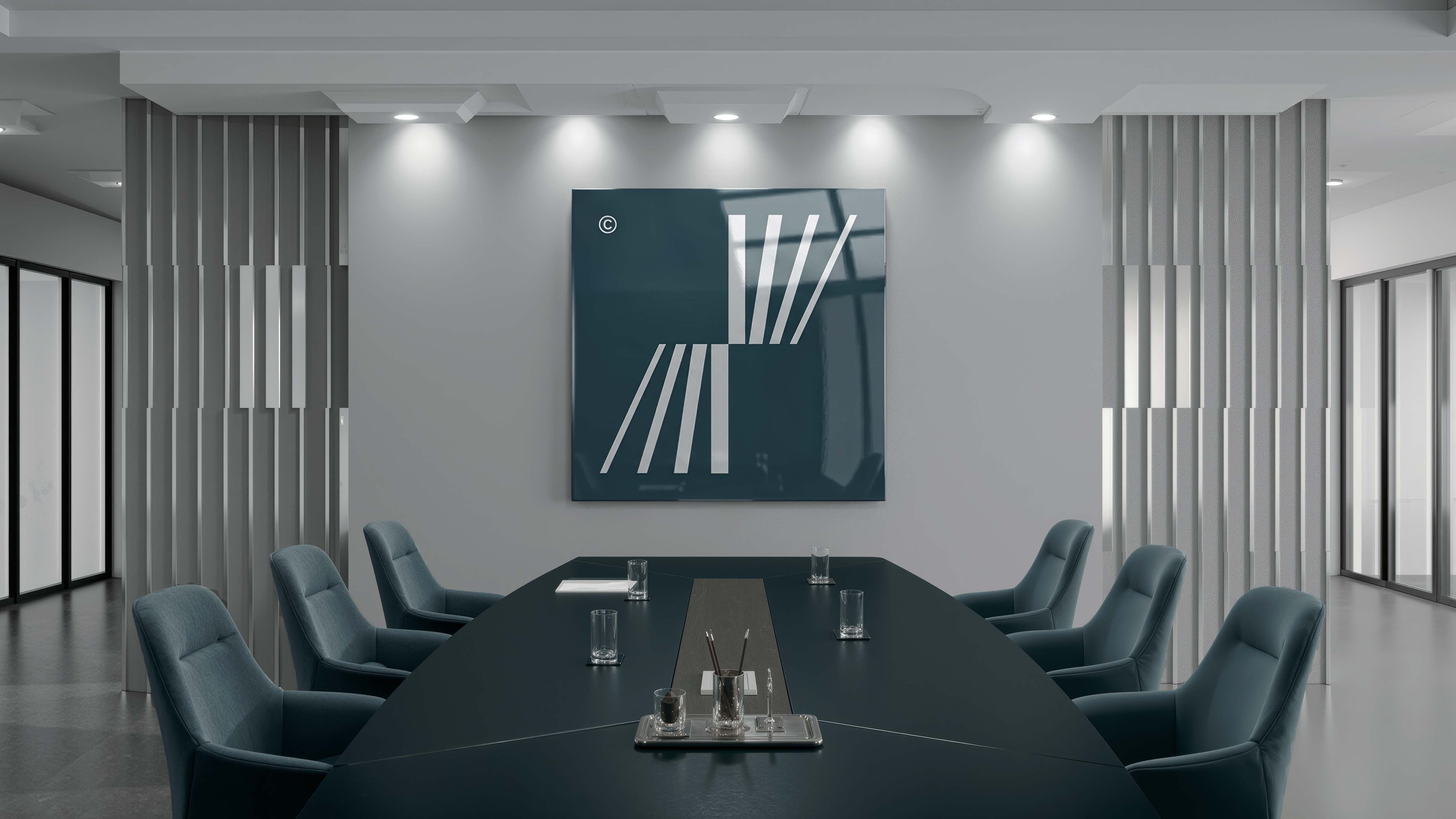
We transformed the nature of law from a rigid concept into a more flexible and clear visual language—an identity that builds trust through clarity and gives law a more adaptable expression without compromising its strength.