
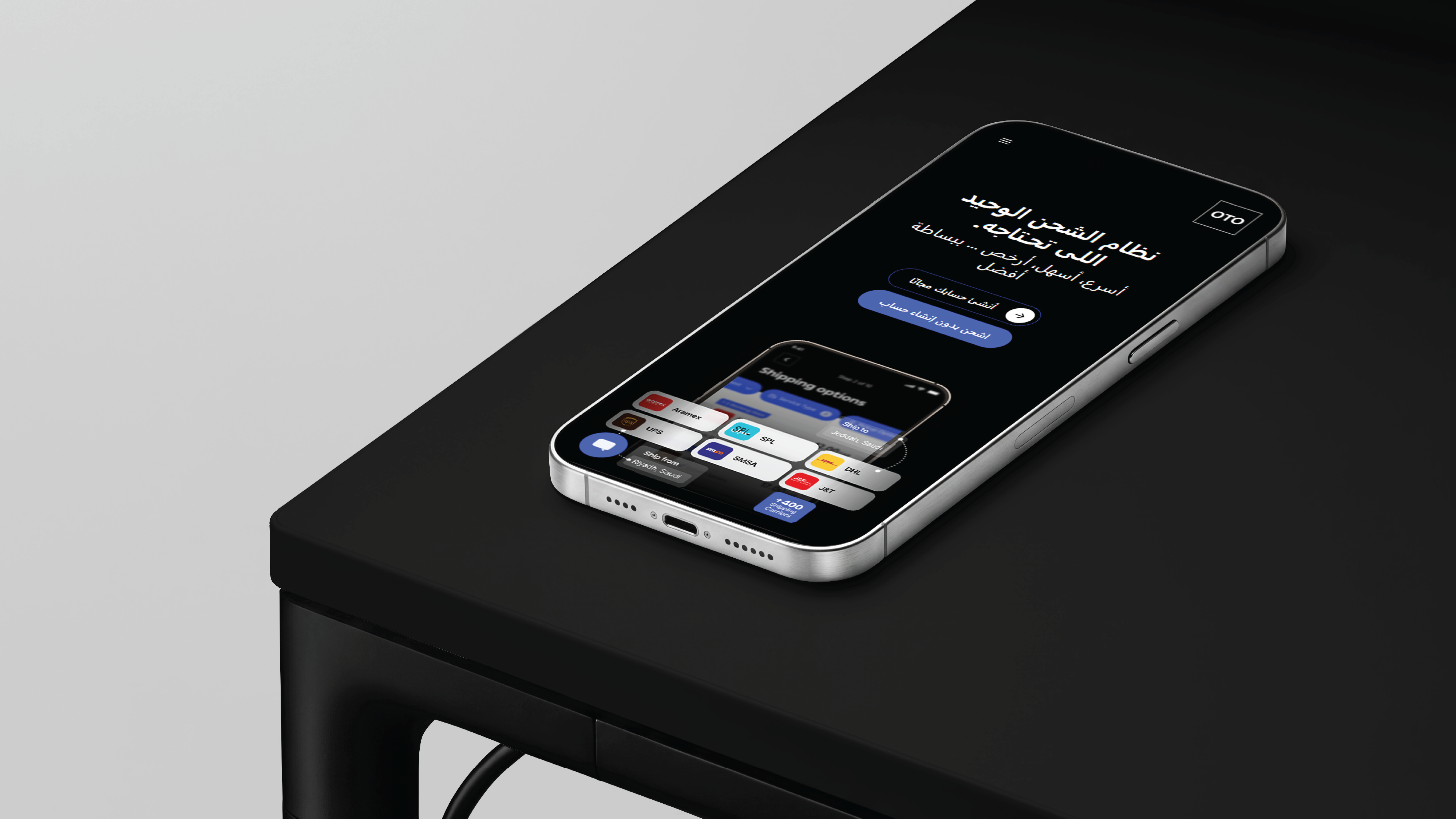
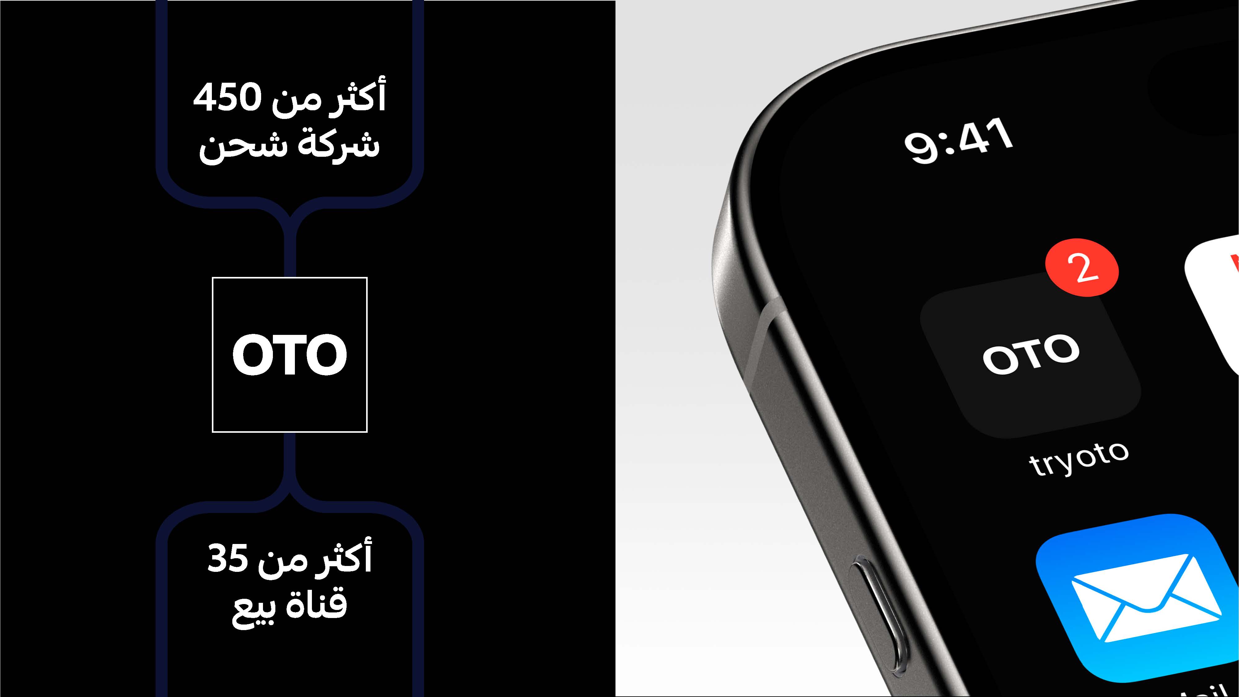
OTO operates in the logistics and shipping sector. The project began as the company prepared to expand its presence across the shipping and commerce ecosystem. Unit worked with OTO to build a visual identity and visual system that is clearer, simpler, and more flexible. OTO brings shipping companies and sales channels together within a unified ecosystem, with a presence spanning more than 450 shipping companies and 35 sales channels.
Translating OTO’s technical and logistics-driven nature into a simple, clear identity that communicates speed and ease of use without losing its strong presence.
Building a visual language that makes the OTO experience clearer and more approachable, transforming the idea of shipping and operations management into an easily recognizable brand capable of extending across digital and physical channels.
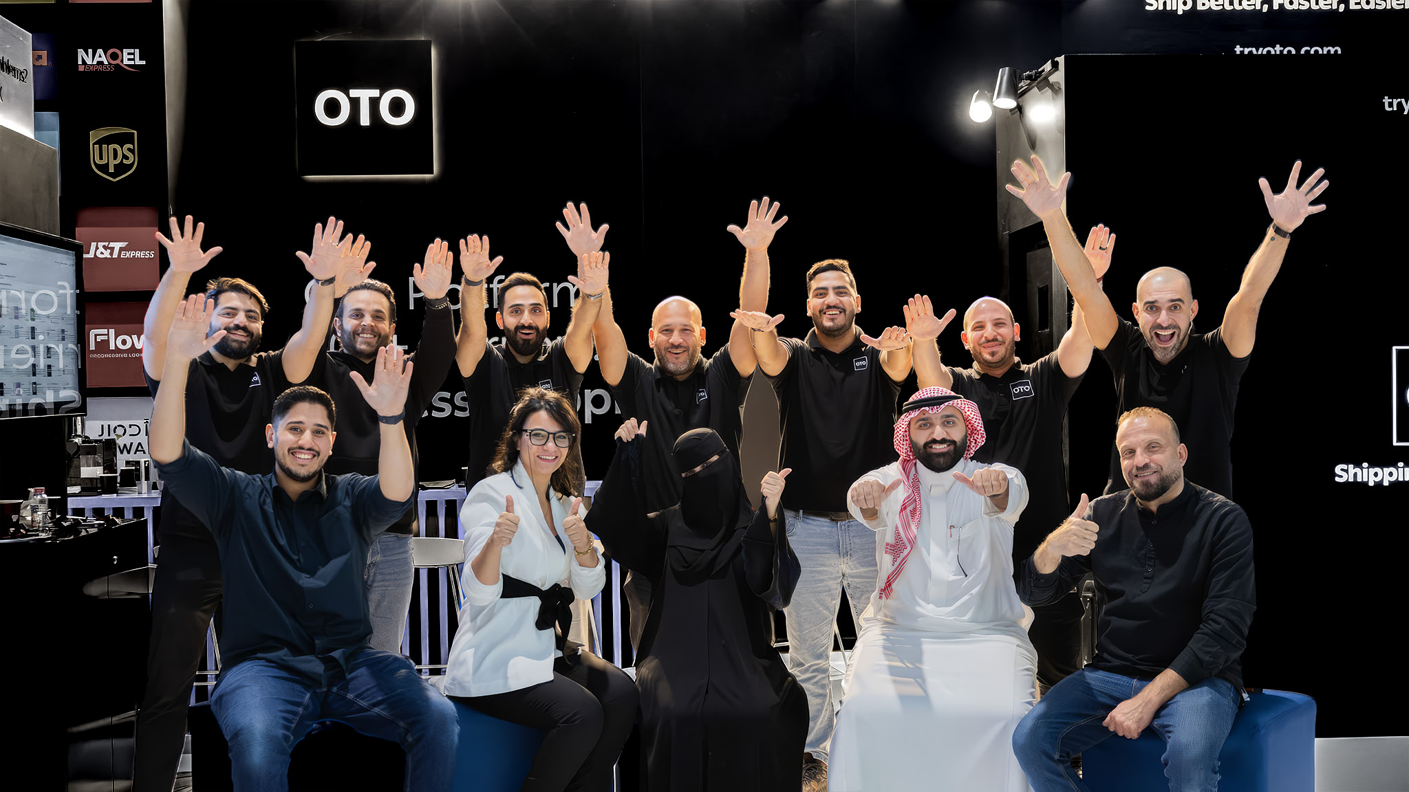
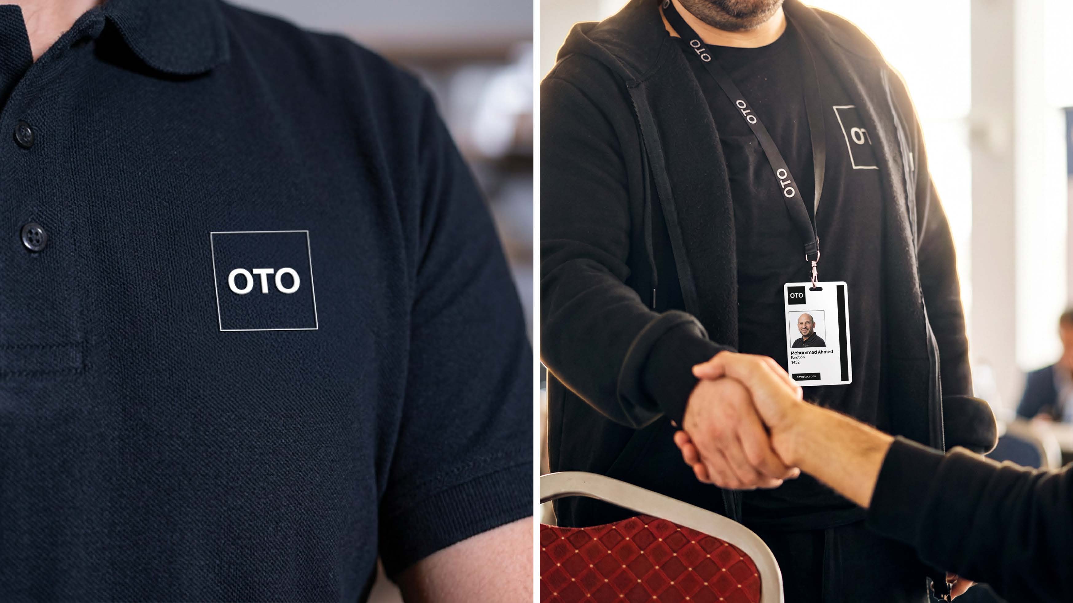
We began by understanding OTO as a solution that connects shipping companies and sales channels, reflected in the brand’s presence alongside more than 450 shipping companies and 35 sales channels. The direction was to create an identity that is clear, direct, and capable of expressing OTO’s technical and logistics-driven nature.
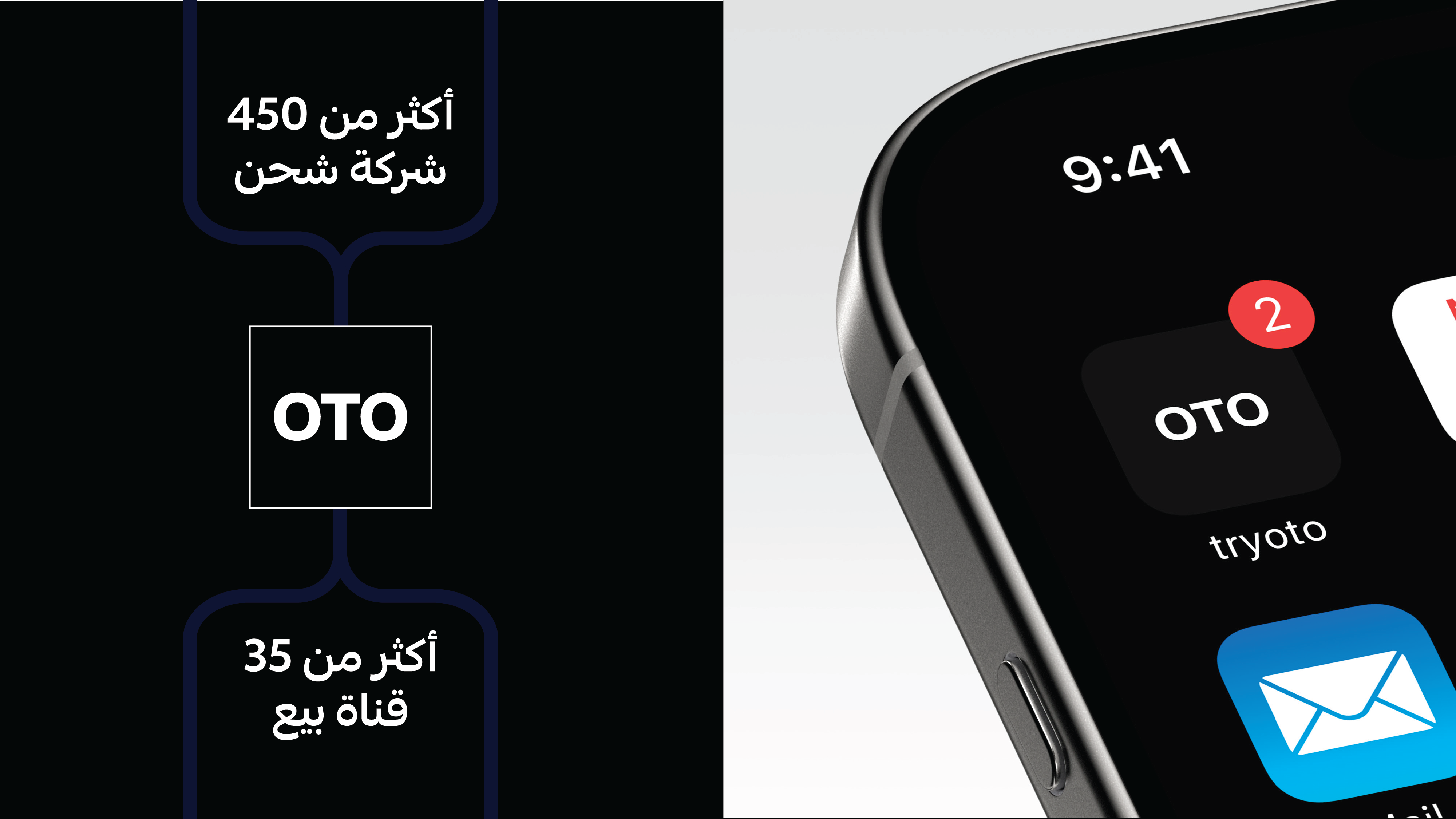
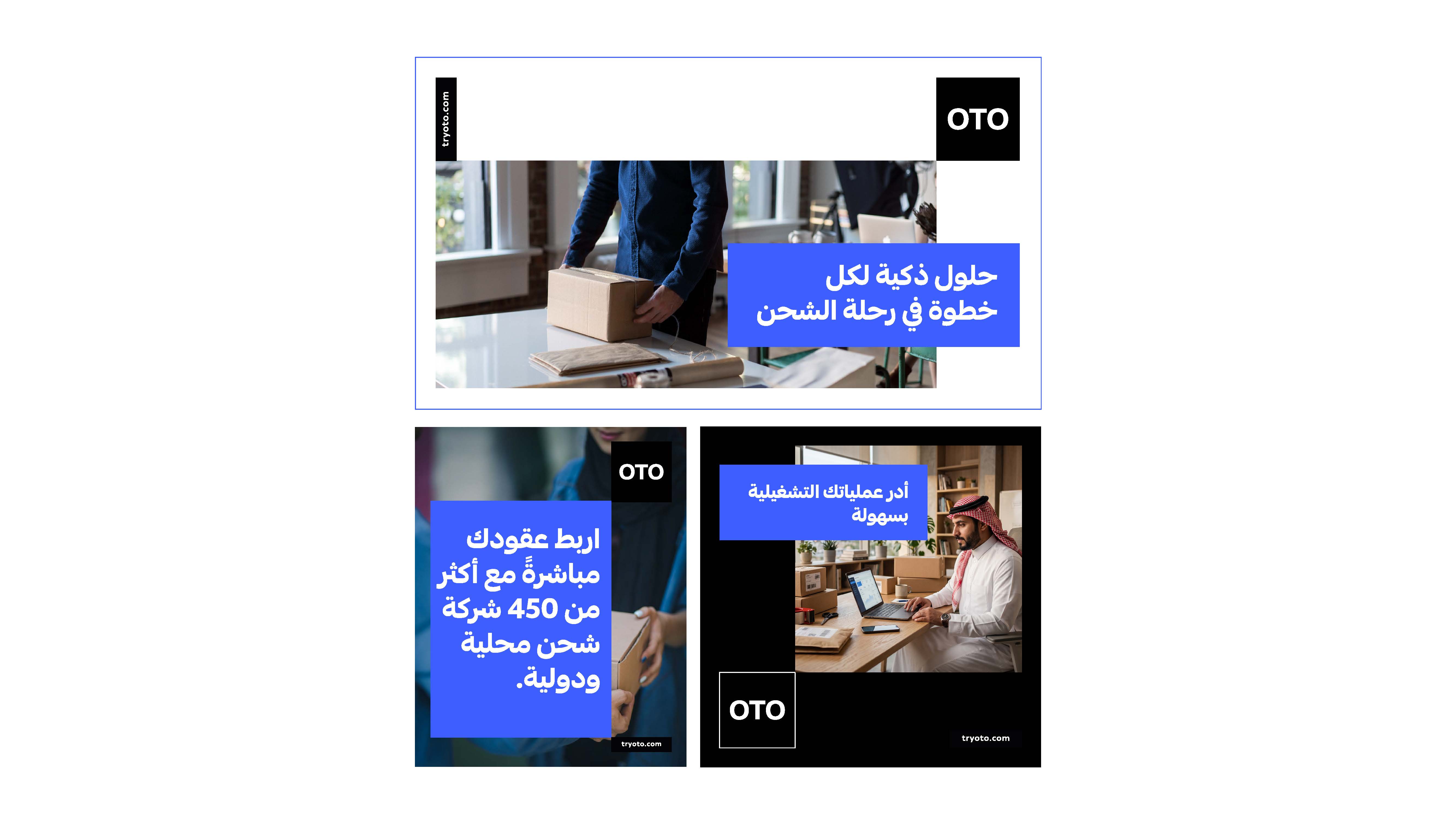
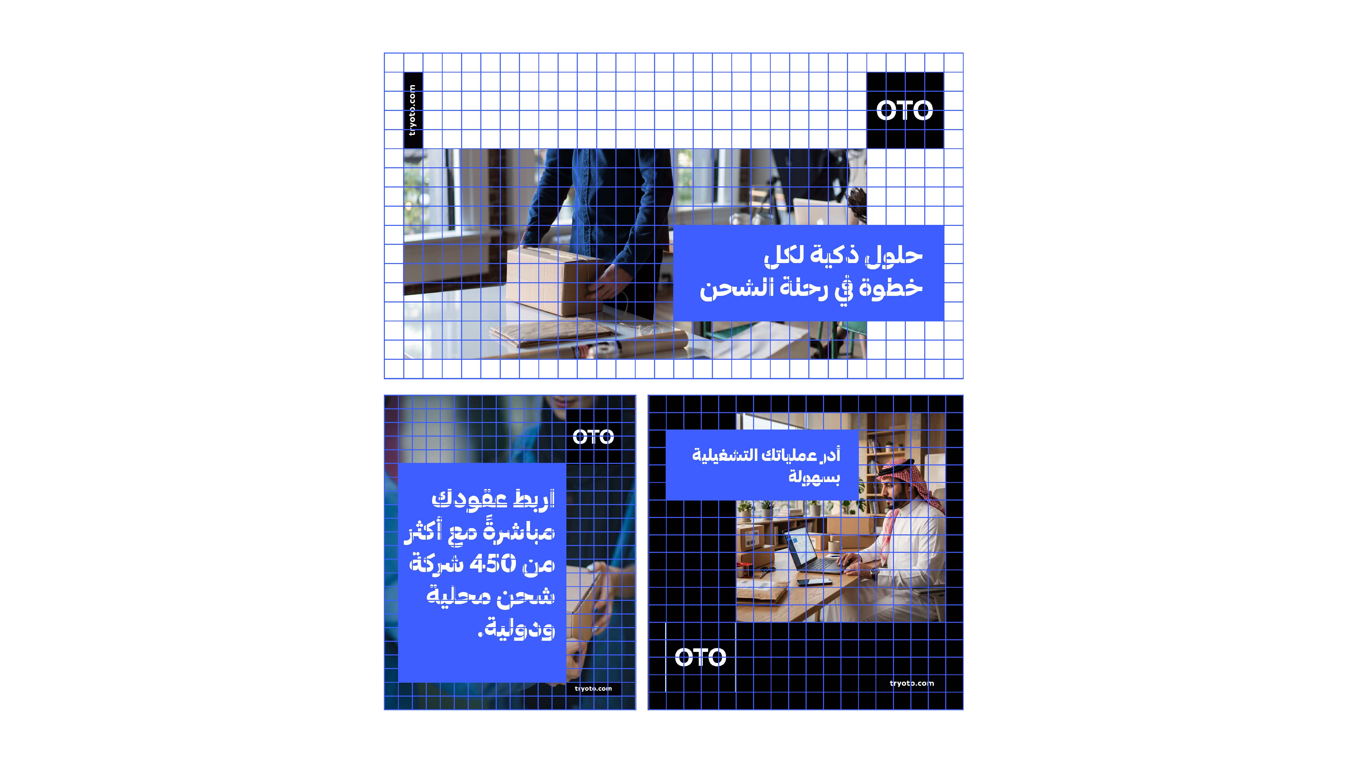
We translated OTO’s nature into a simple and direct visual direction, with a strong presence built around the logo, clear space, and bold colors. The idea was to make the brand easily recognizable and adaptable across both digital and physical environments.
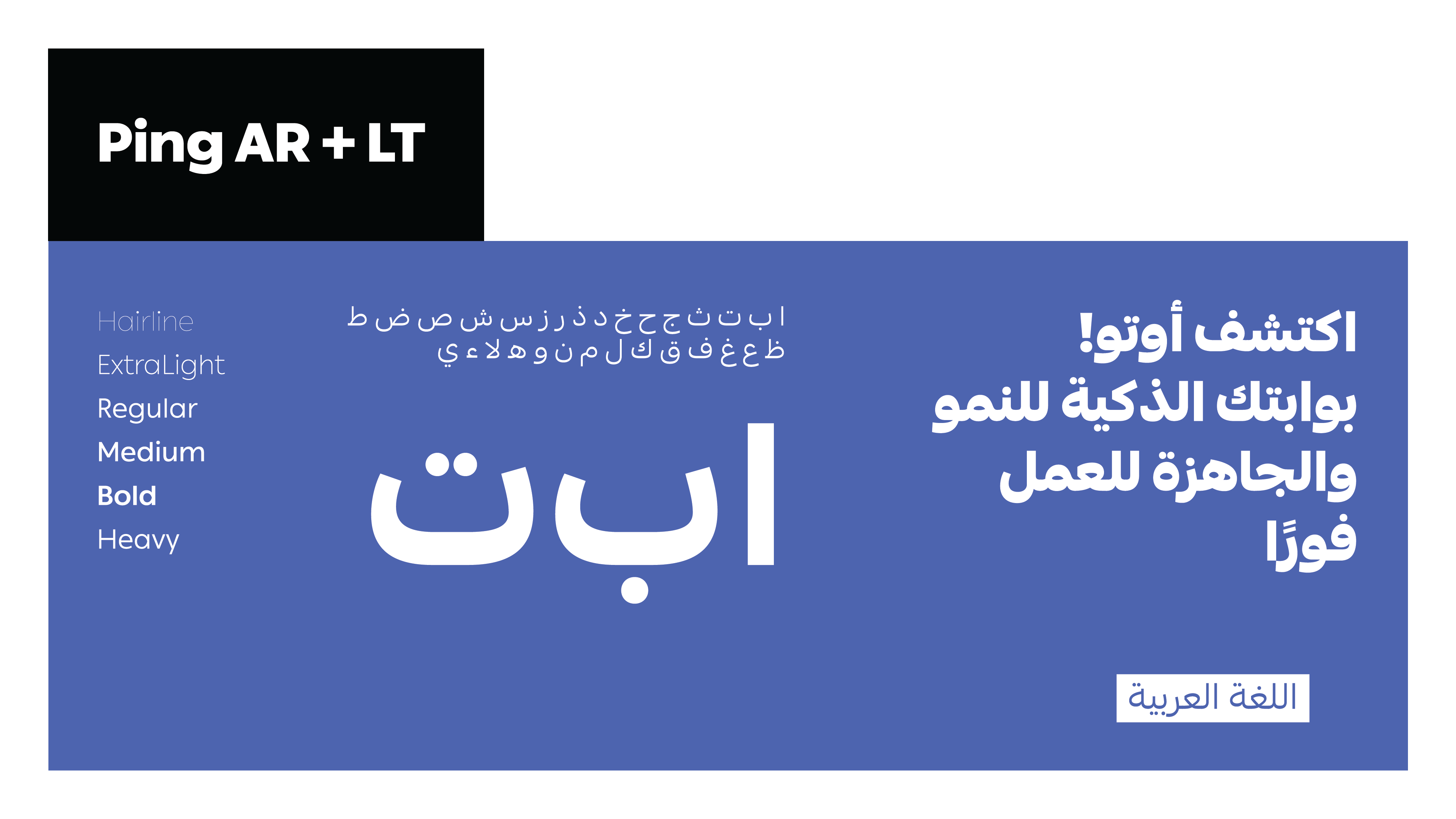
We developed the identity around a visual system built on the contrast between black, white, and blue, complemented by additional colors that provide greater flexibility across applications. We also established a cohesive typographic language in both Arabic and English using Ping AR + LT.
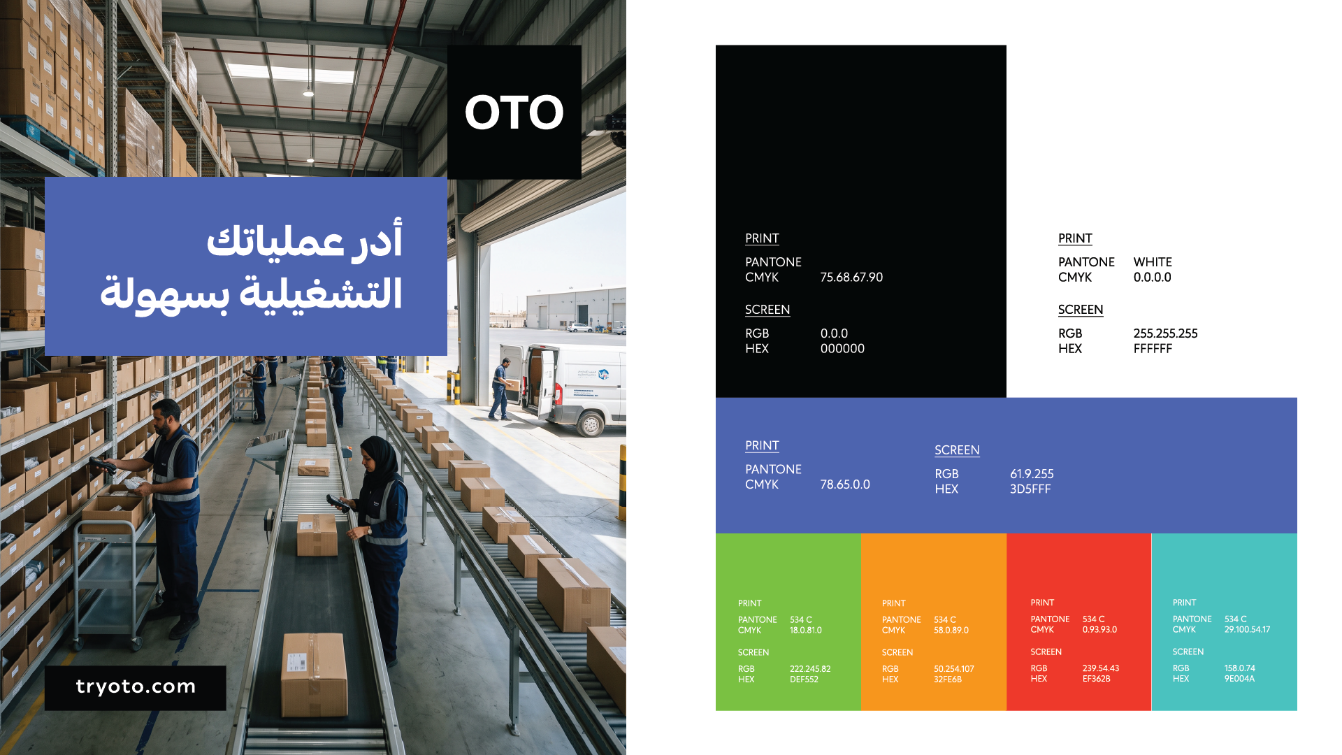
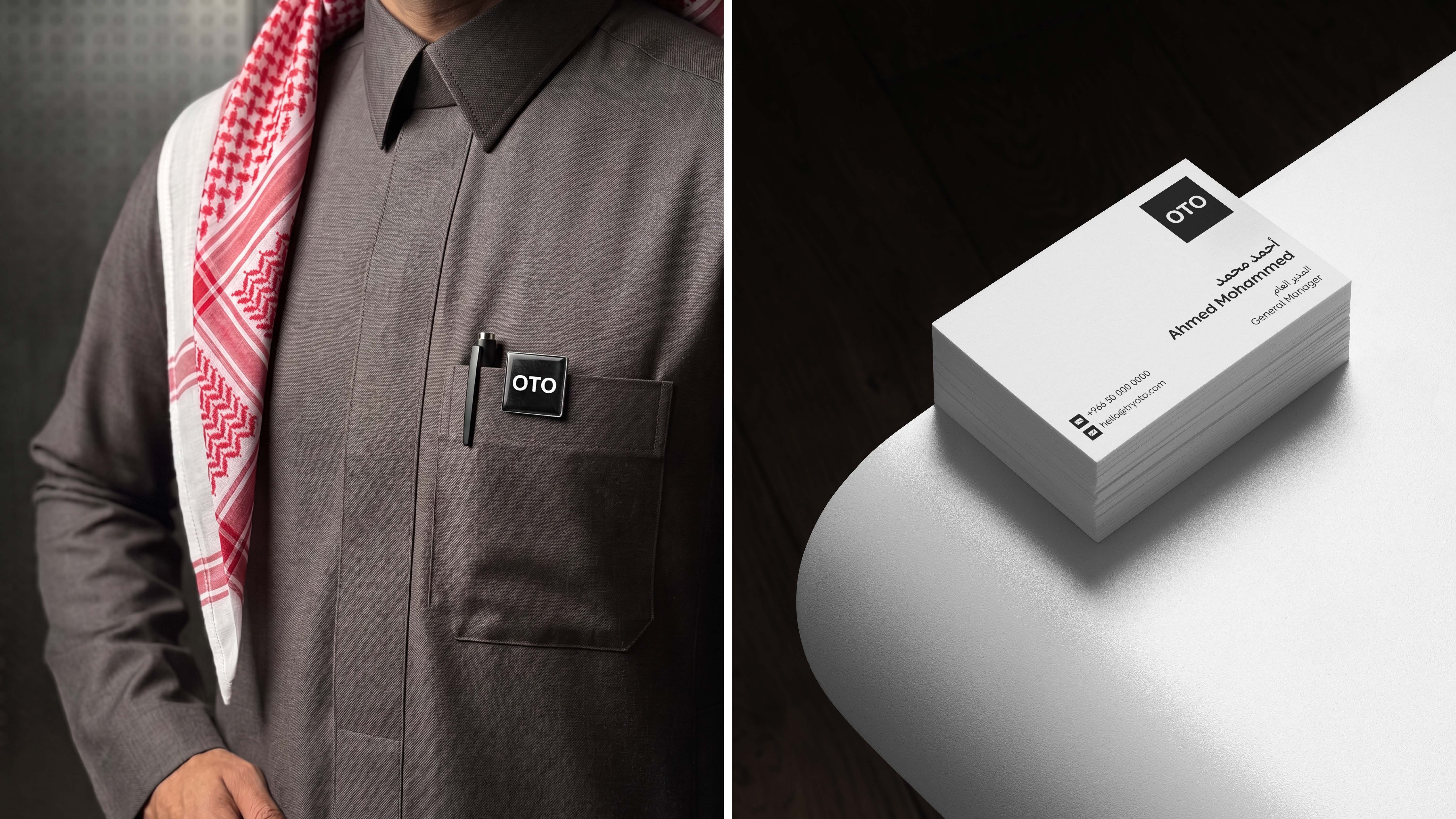
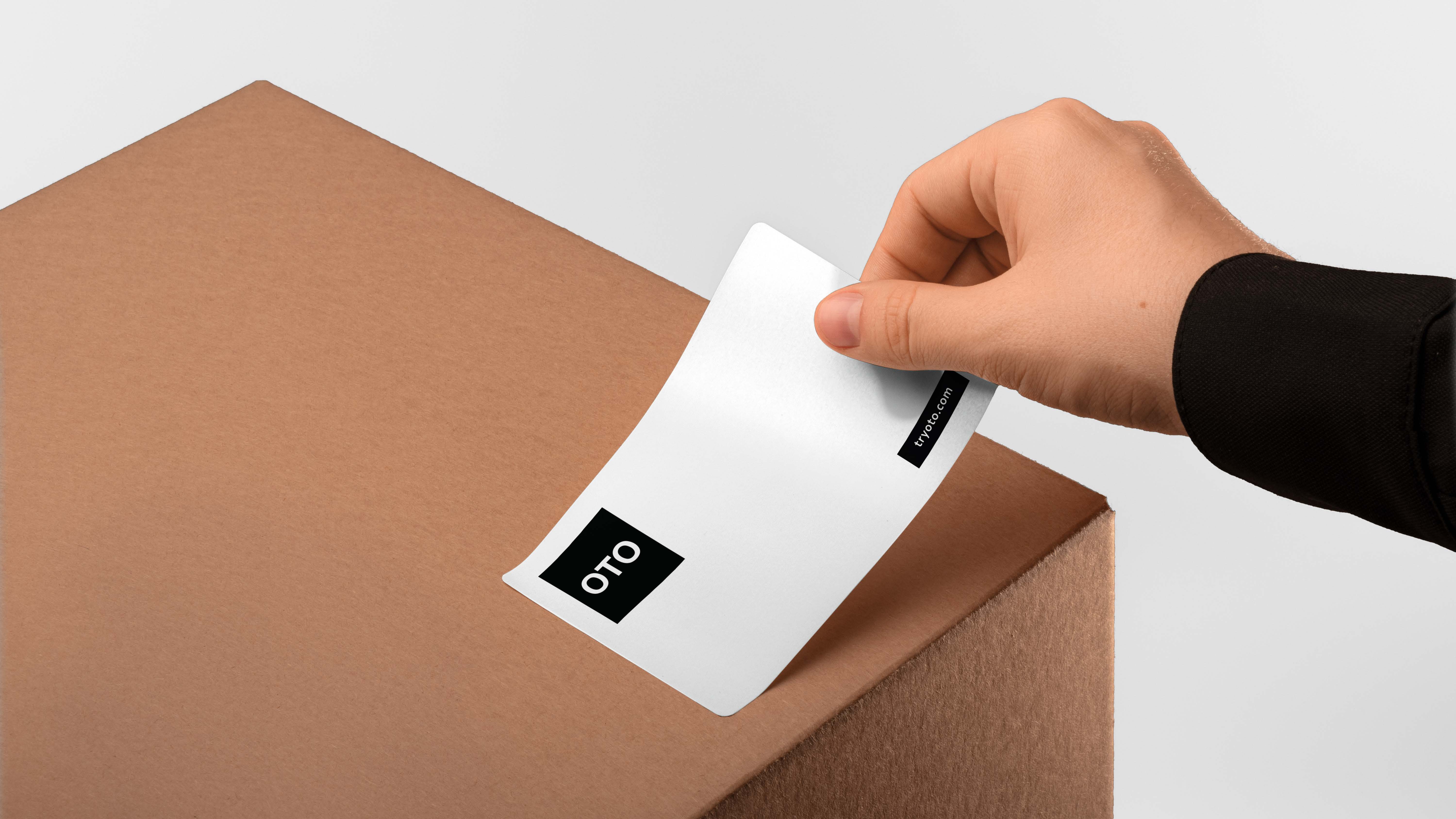
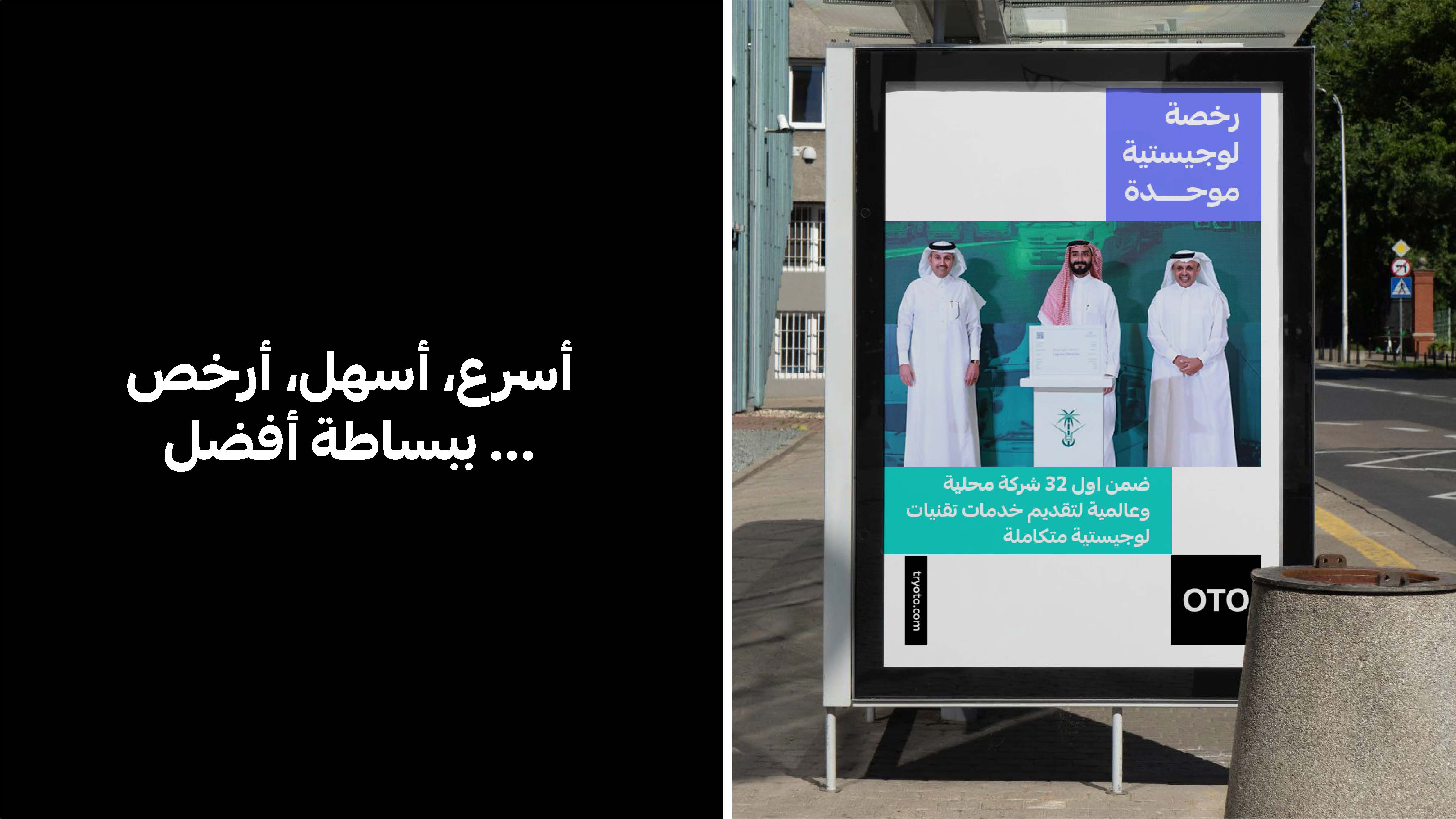
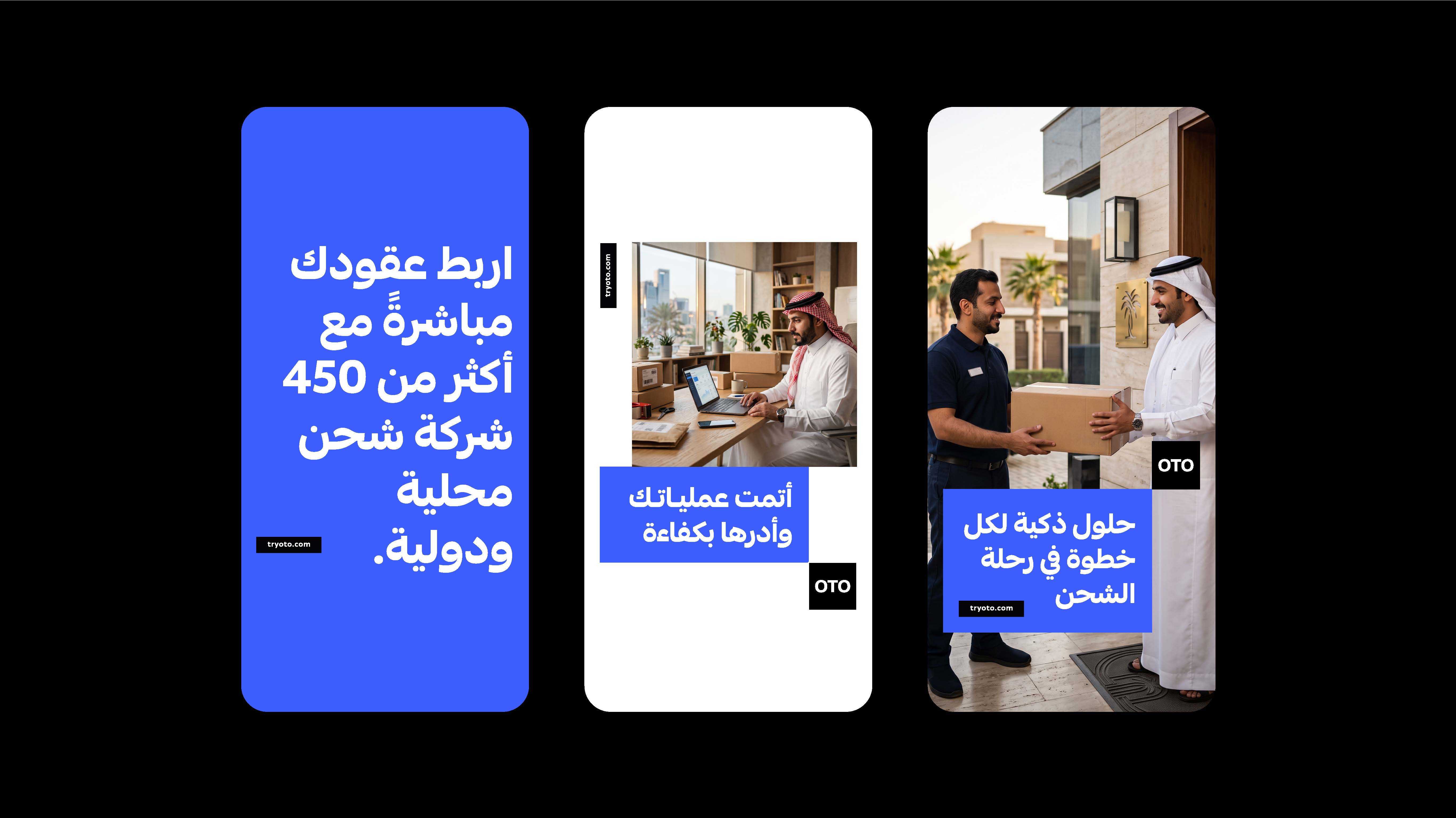
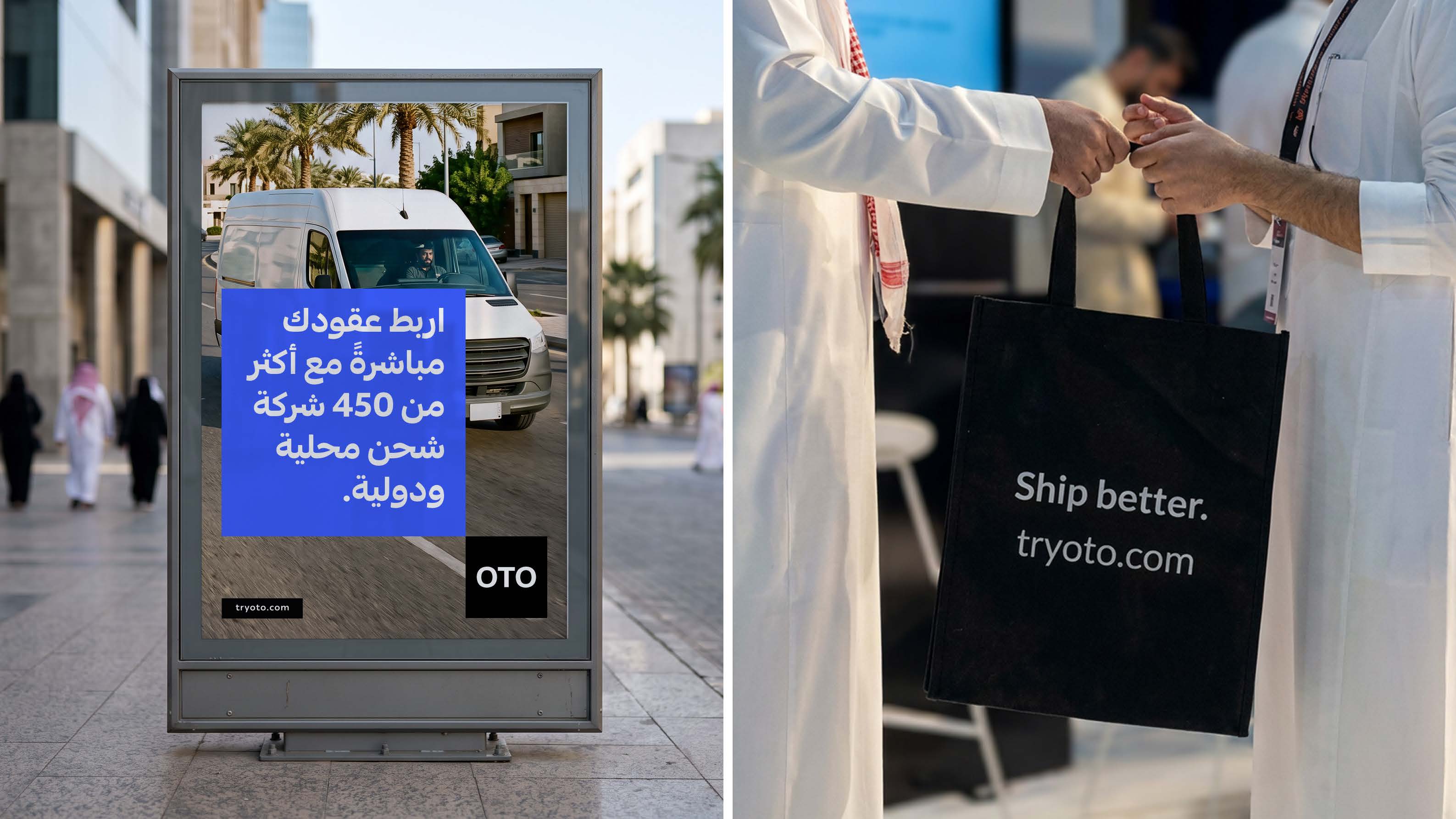
After building the visual system, we applied it across different touchpoints—from the app experience to advertising content—while maintaining a clear presence of the logo, colors, and typography throughout every application.
In the final stage, the visual system evolved into a complete identity, extending from the logo, typography, and colors to digital and advertising applications. The result is a simple, bold, and recognizable presence wherever OTO appears.
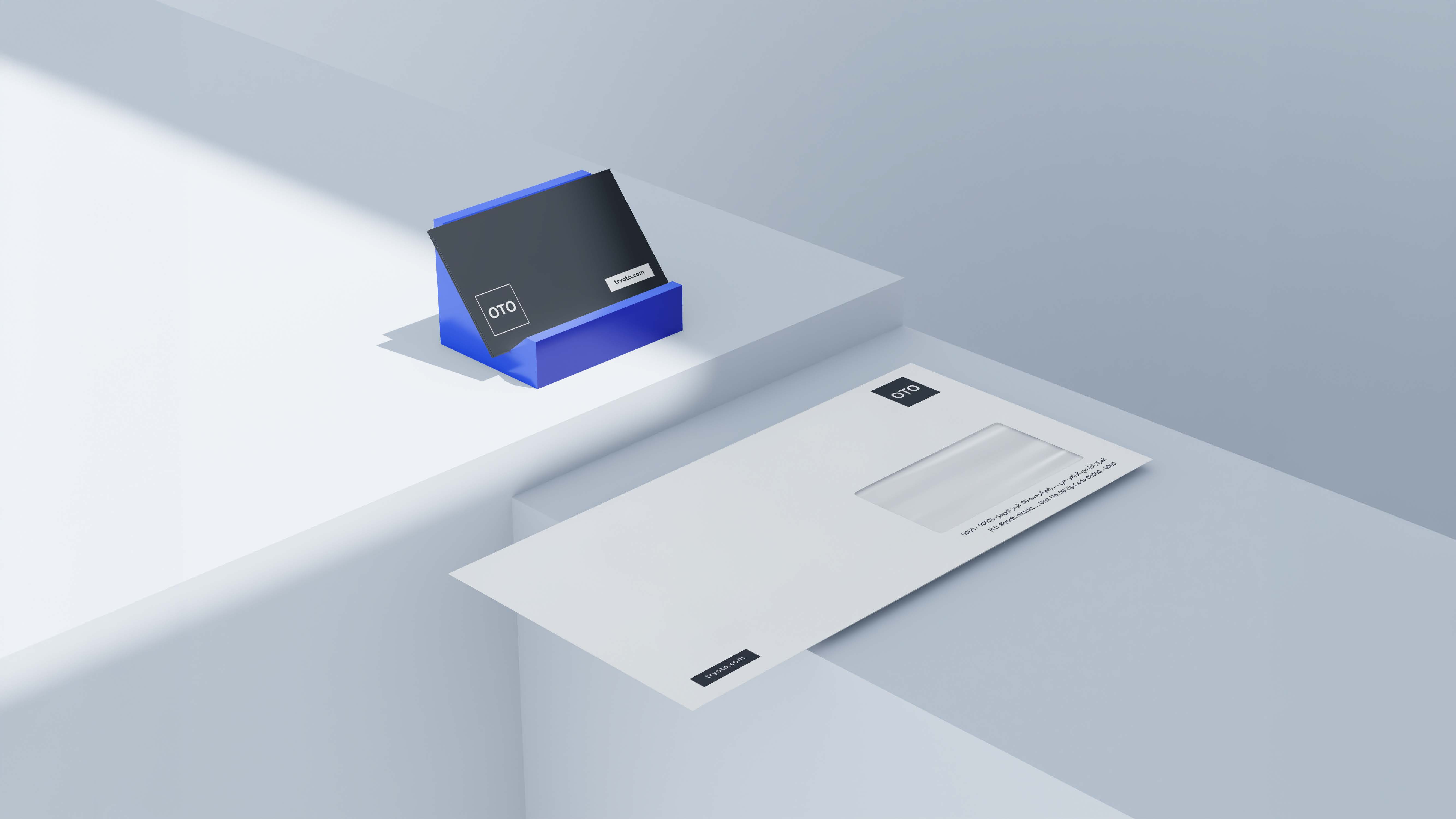


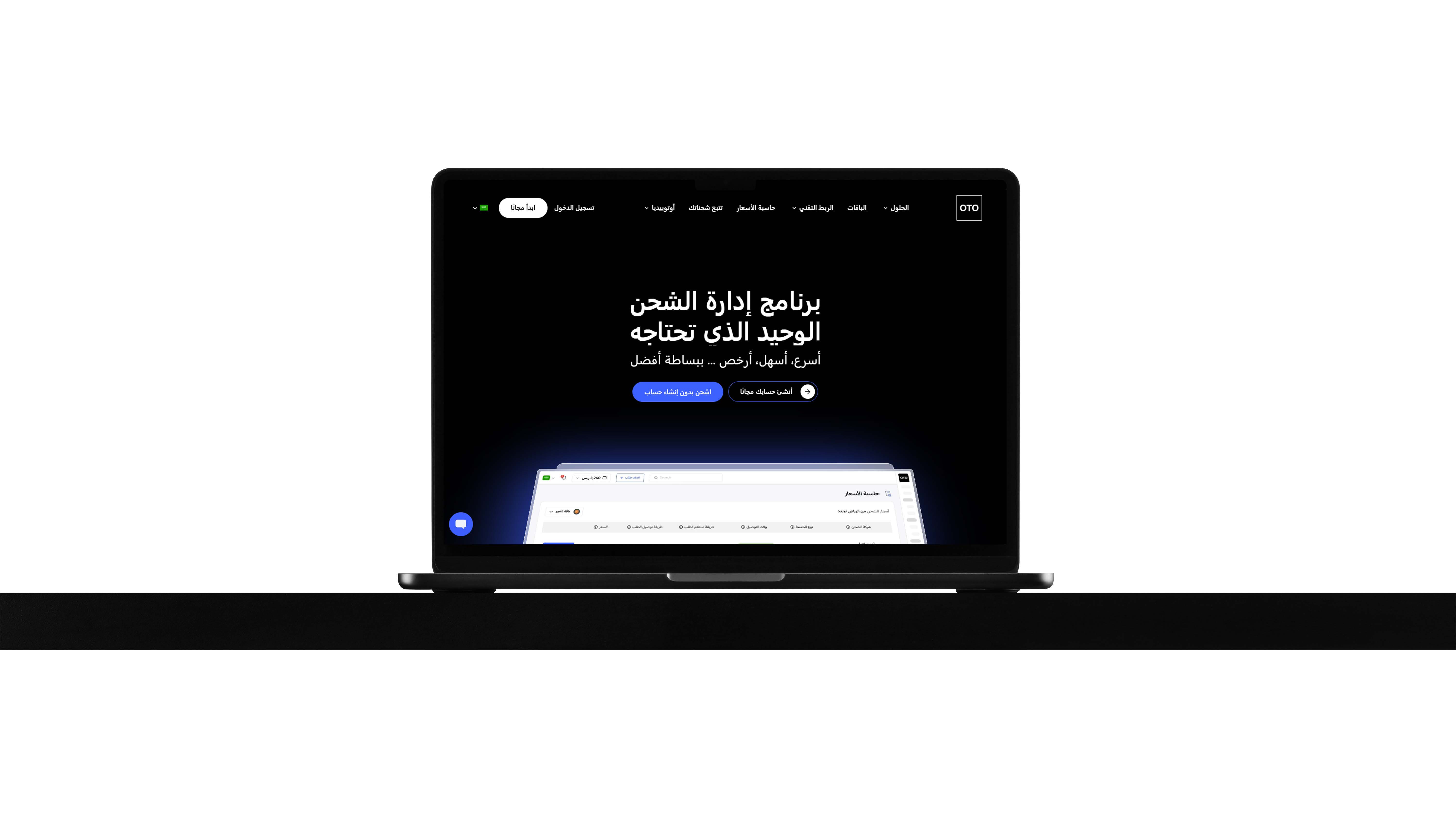
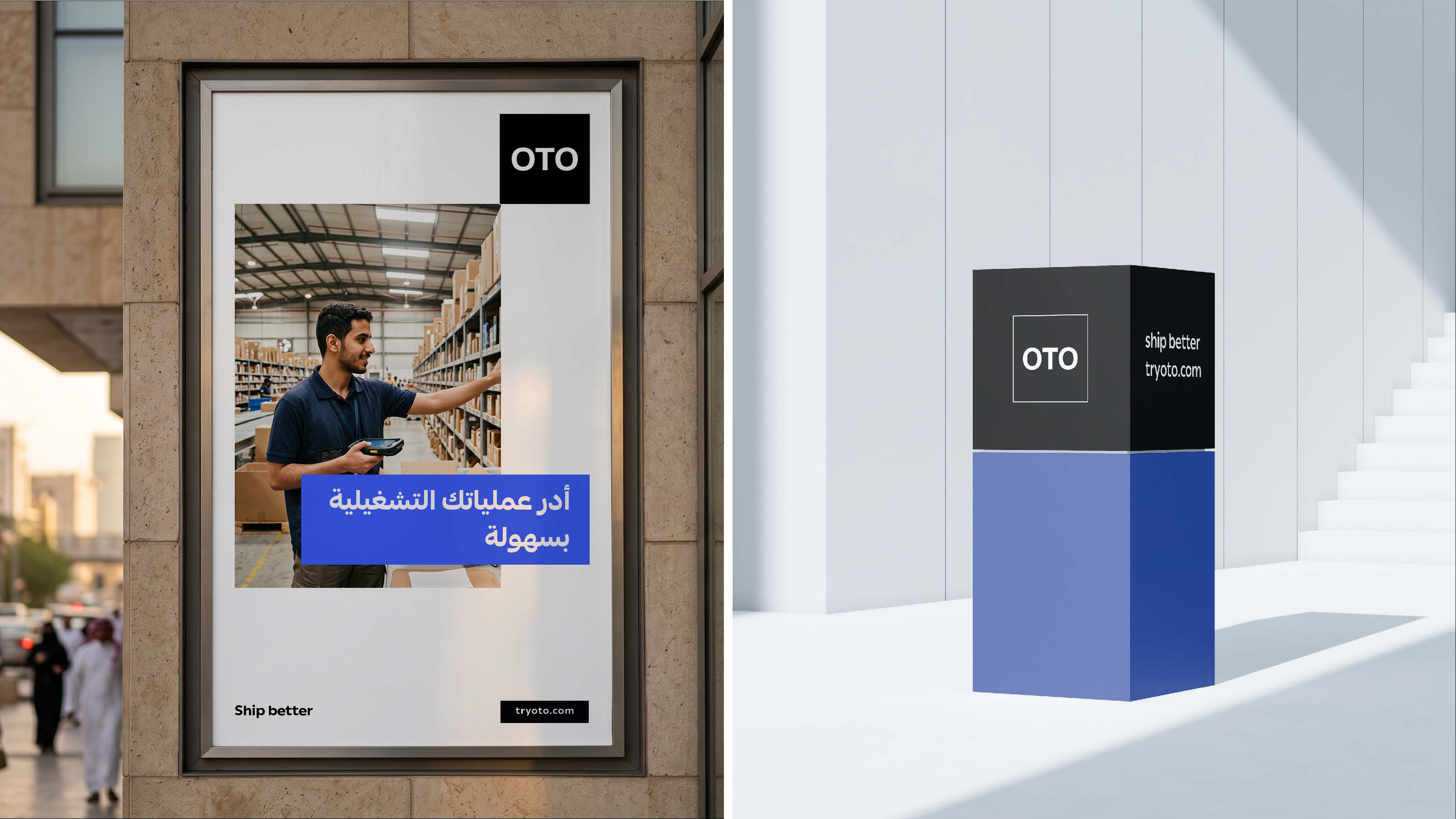
We turned simplicity into an identity—quick to make an impact, clear in its message, and flexible across applications.