
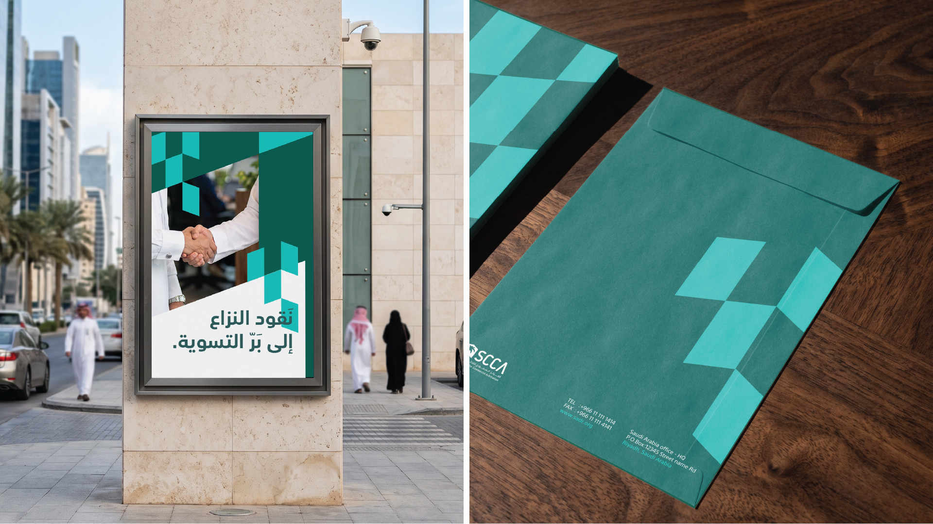
The Saudi Center for Commercial Arbitration is a specialized entity focused on resolving commercial disputes. The project aimed to develop the brand’s presence and enhance its clarity by building a more consistent and professional visual language. In a sector built on trust and precision, the challenge was to create a clear and cohesive brand presence without losing its institutional character.
The challenge was to build a visual presence that reflects the center’s institutional nature, while presenting a clearer and more cohesive image that keeps pace with the evolution of its role and presence.
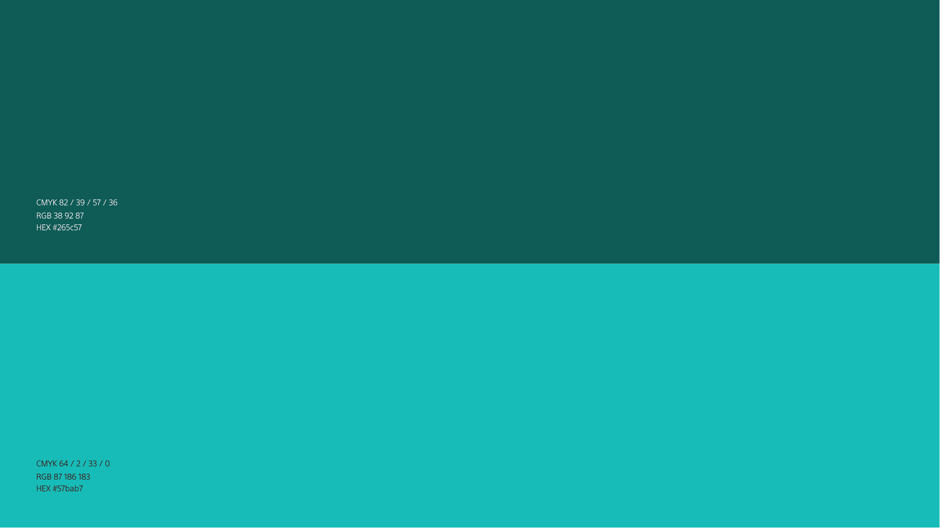
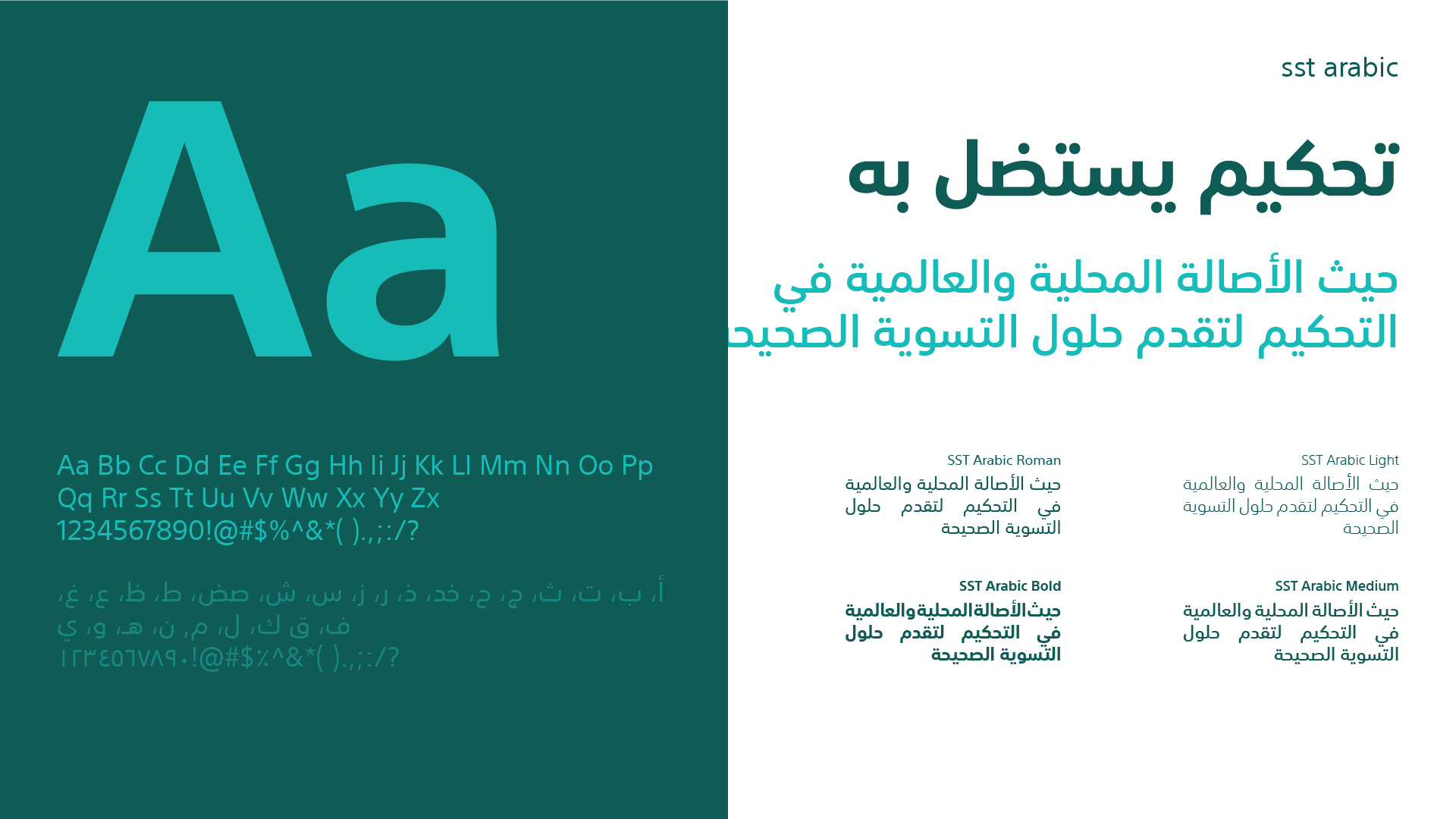
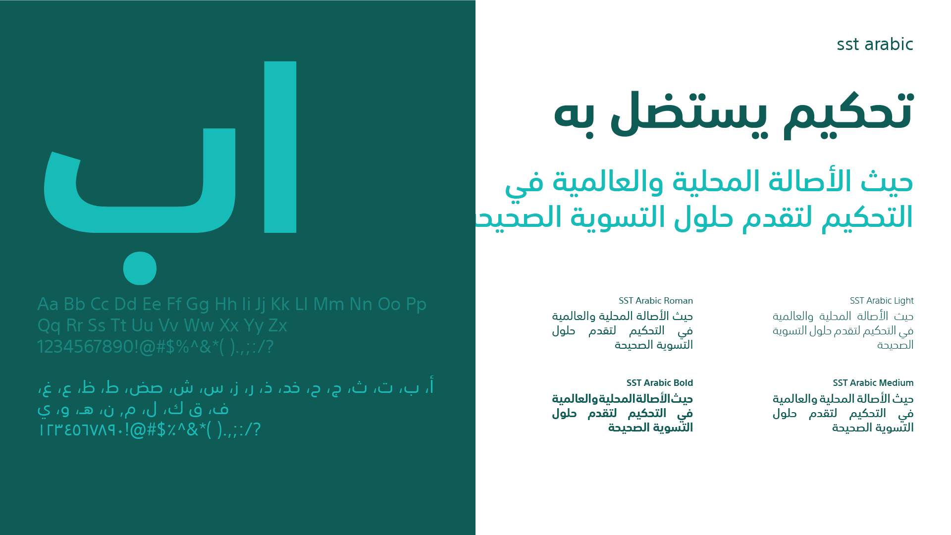
Turning Personality into a System We then translated the personality into a complete visual system through typography and color, giving the brand a clear digital presence that could be applied across different touchpoints.
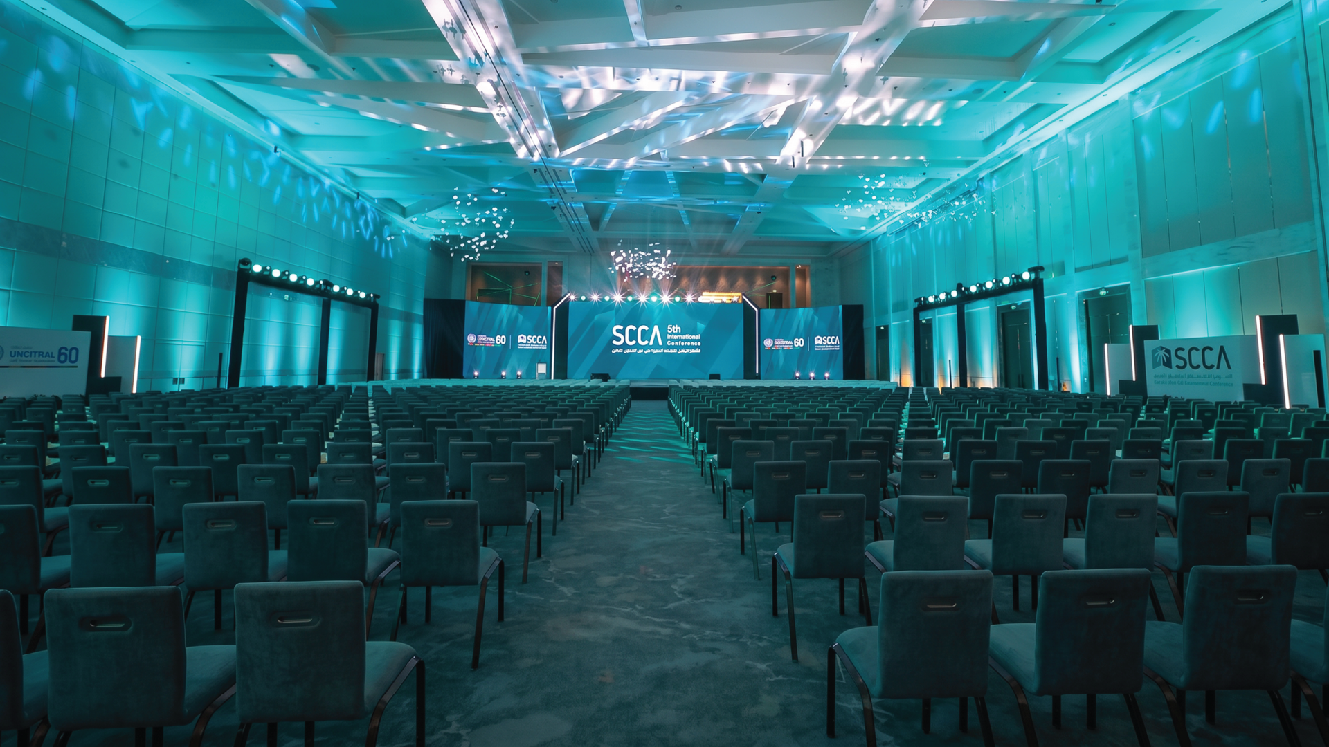
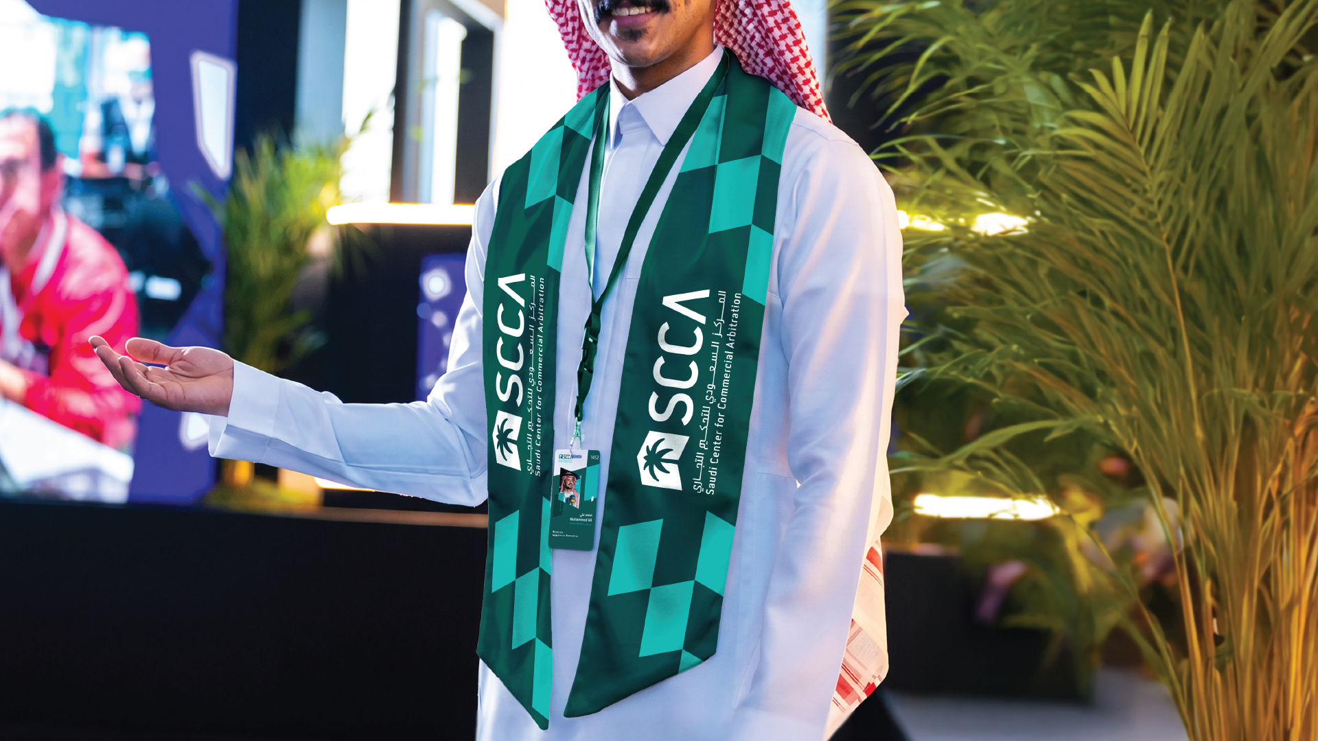
We began by understanding the essence of the center and what the brand represents—from authenticity, strength, and formality to its role in connecting parties and providing solutions. From there, we explored visual elements that express these meanings while maintaining the brand’s connection to its local context.
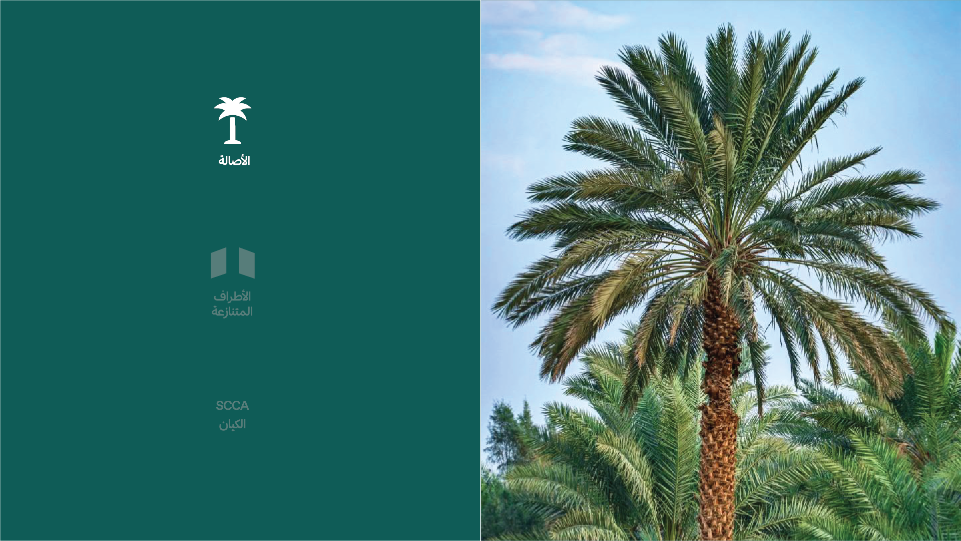
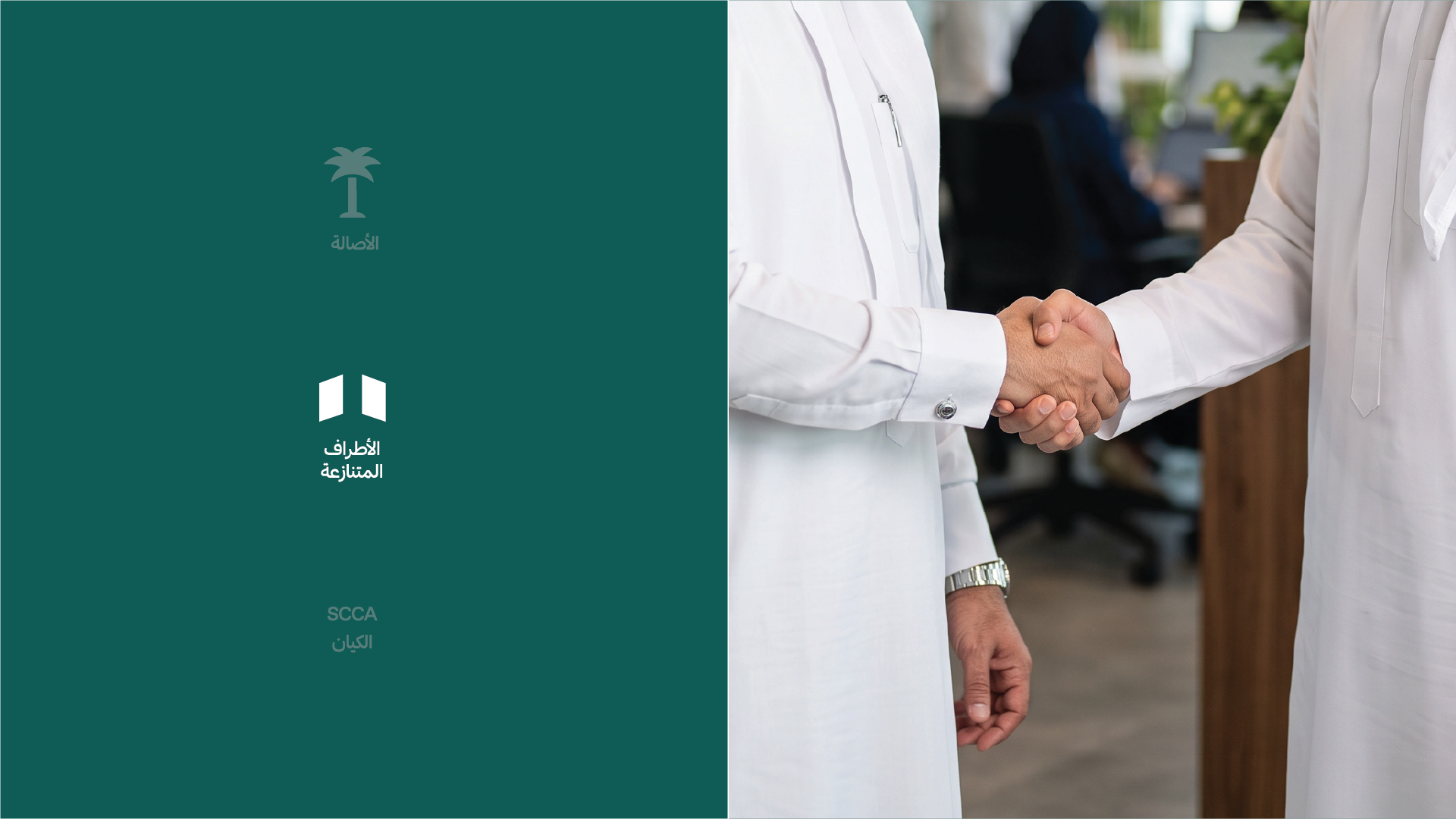
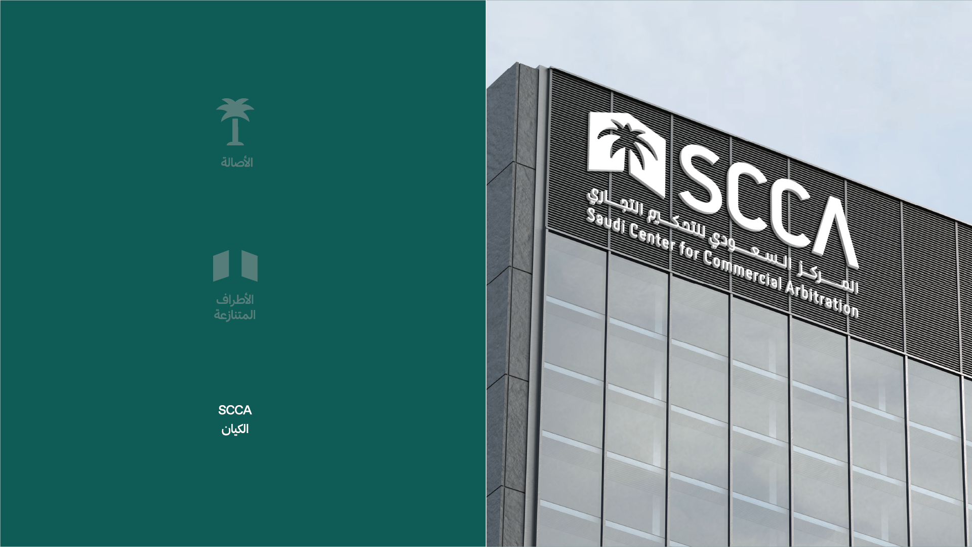
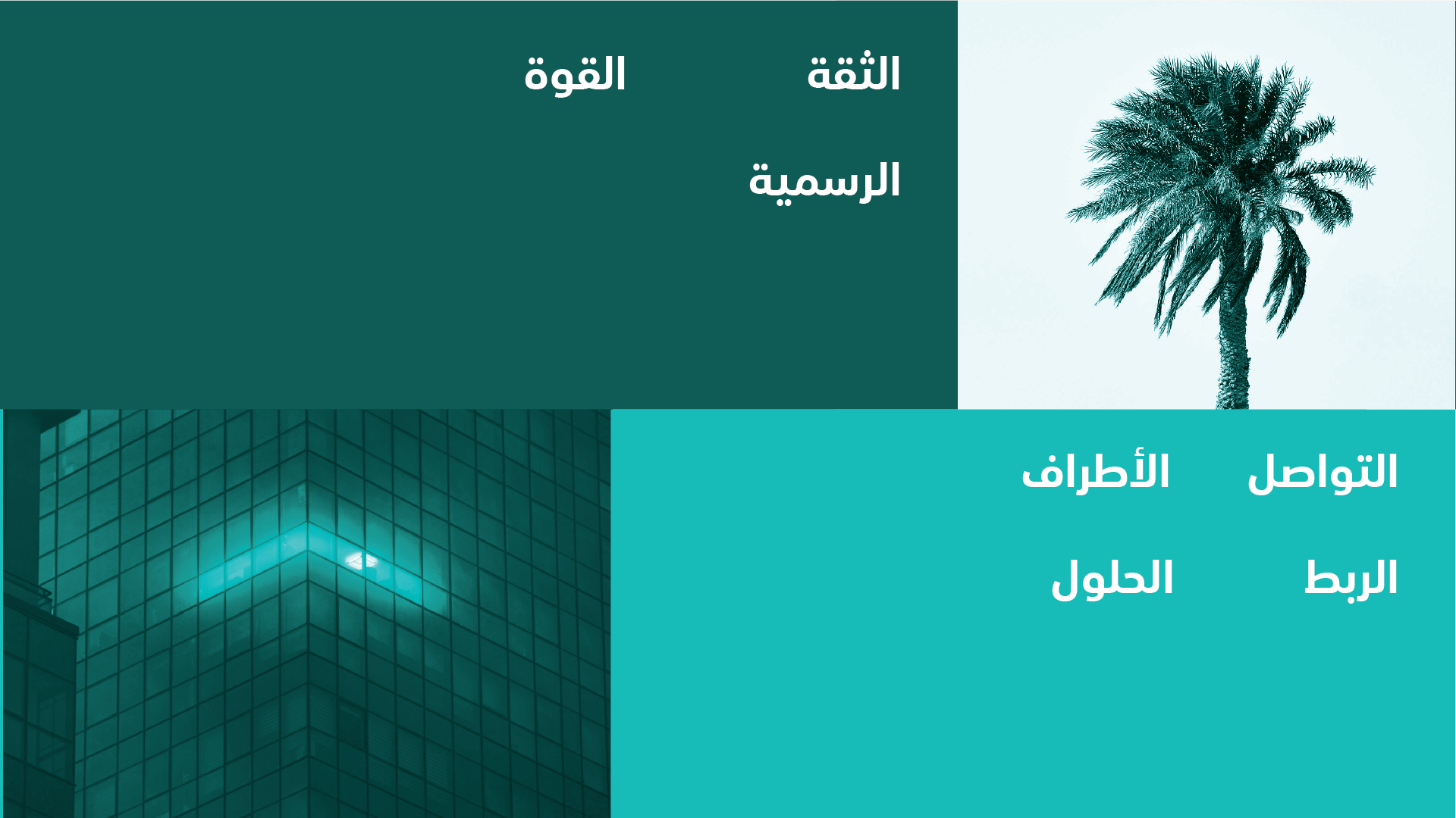
We translated these insights into a clear direction that defines the brand’s personality and what it should communicate visually. We focused on a set of core values: trust, strength, formality, communication, connection, and solutions—as the starting point for building the identity.
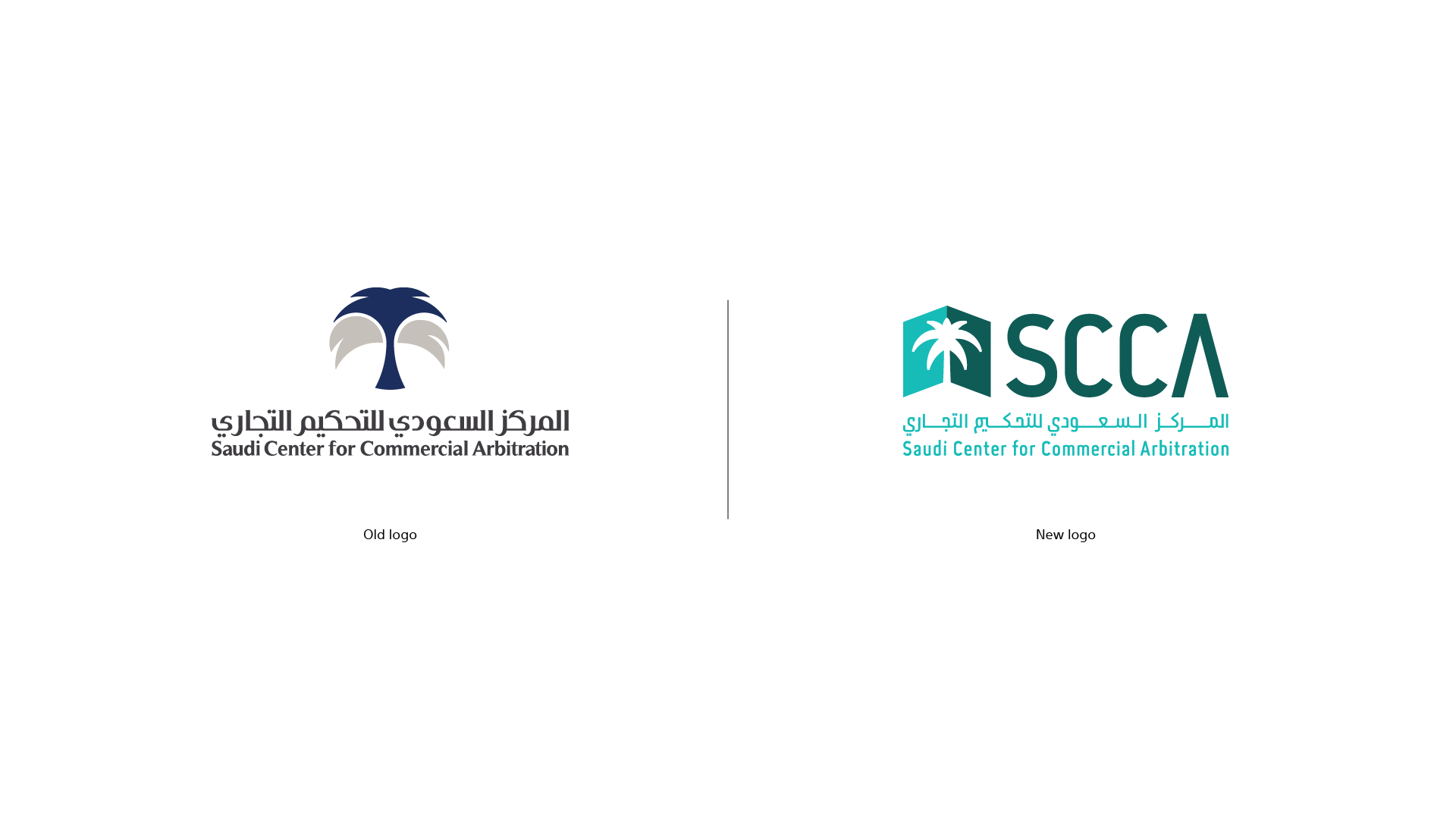
We began by translating the concepts into a clear visual form and developing the relationship between the symbol and the name. We then evolved the previous identity into a clearer composition that preserves the center’s presence while giving it a more distinctive visual personality.
Once the direction was established, we moved into building the visual system around the logo—from color to how the brand appears across different backgrounds. The goal was to create a cohesive language that gives the center a clear and adaptable presence.
In the final stage, we refined the details of the visual and verbal system, from typography and its weights to the way messages are crafted. The result is a cohesive language that brings together formality and clarity, reflecting the center’s personality across different applications.
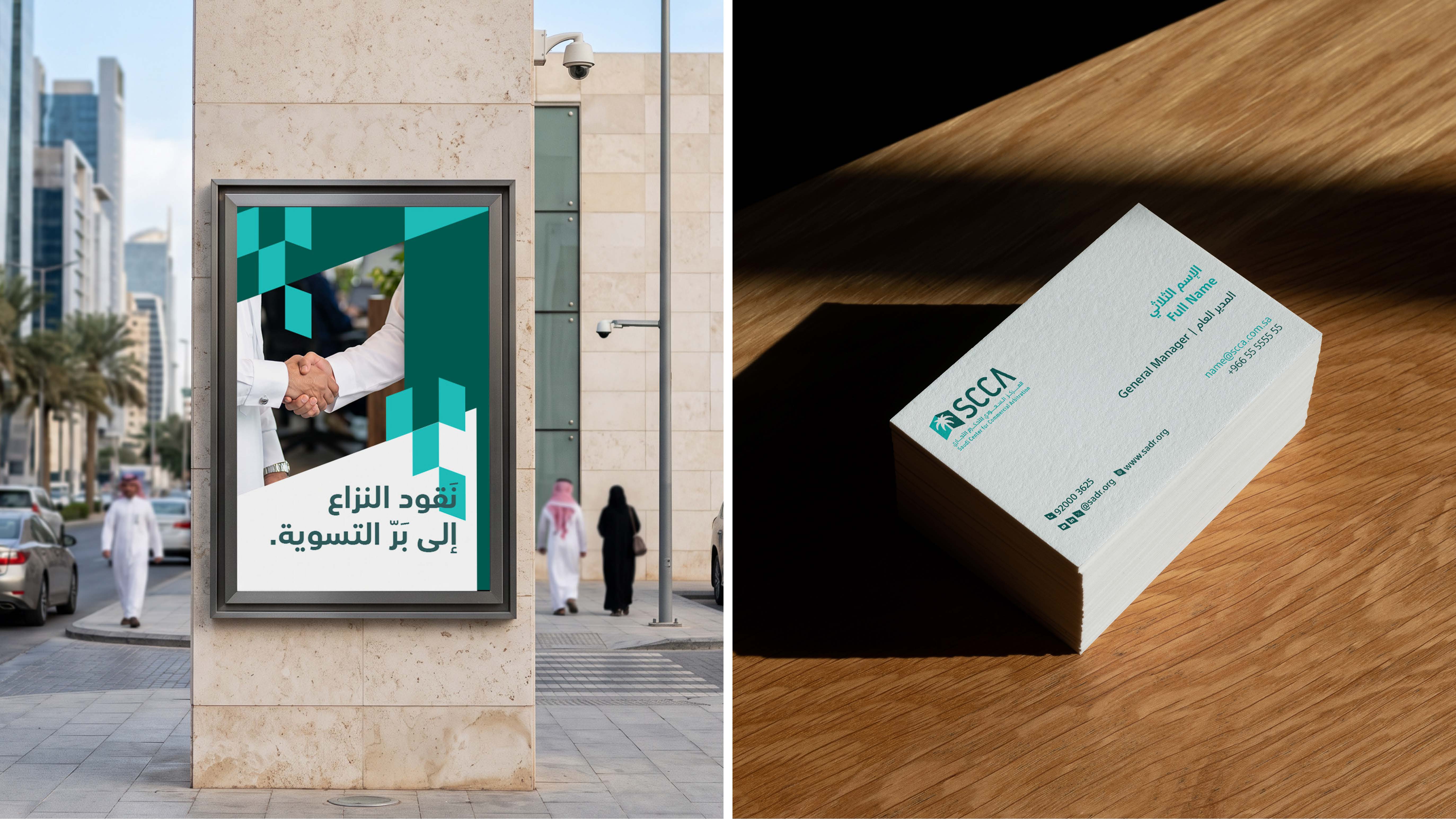
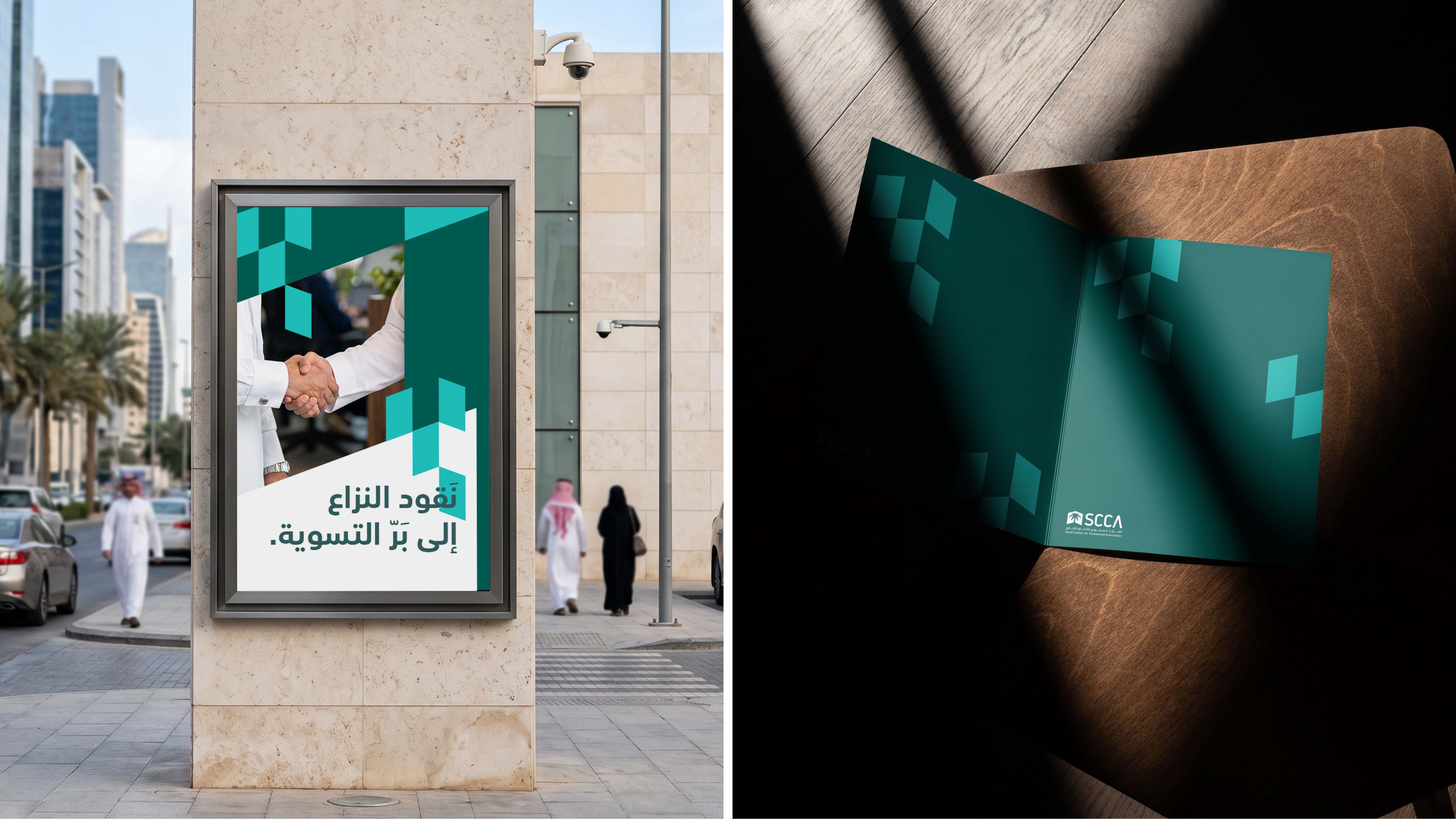
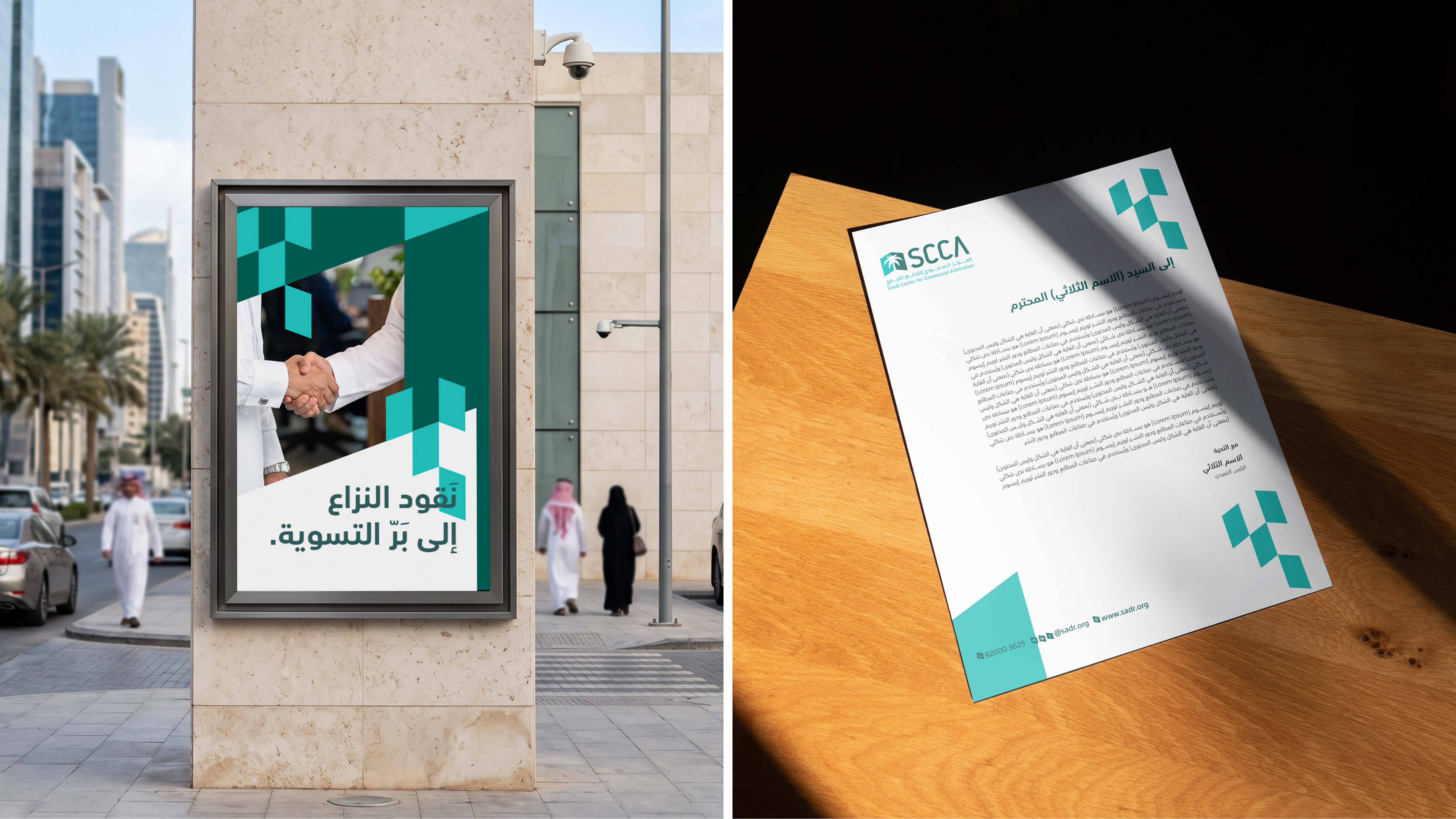
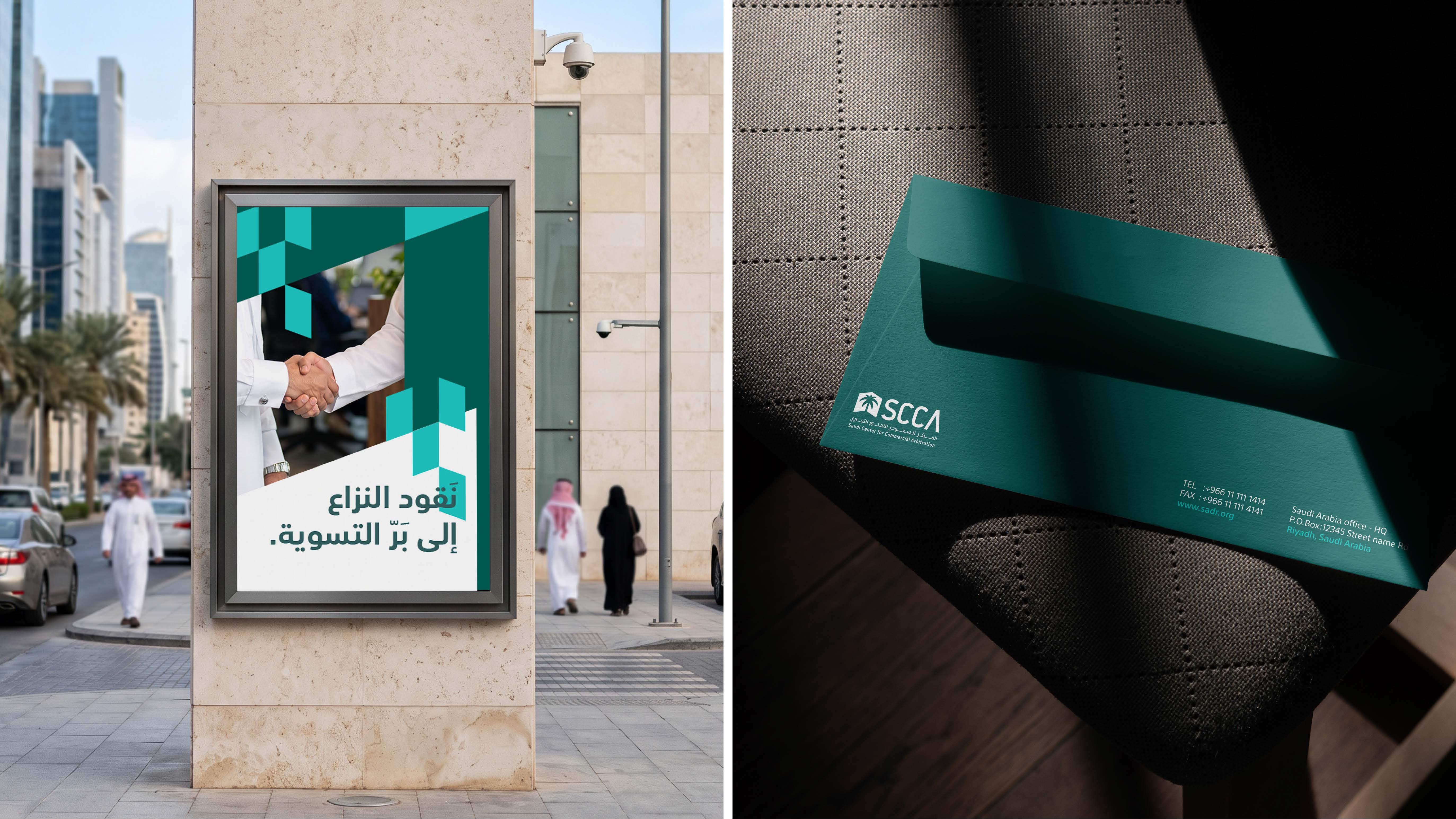
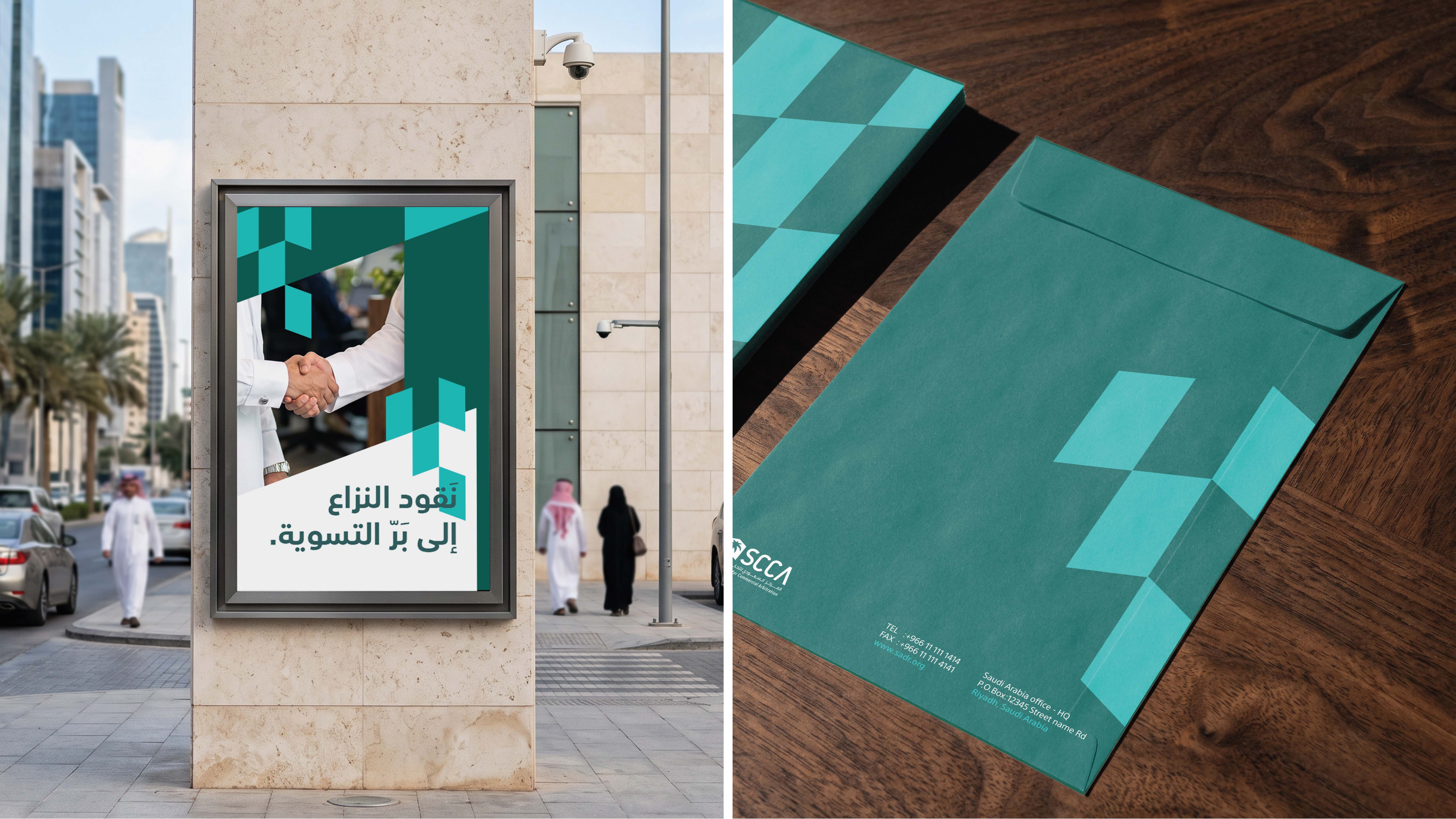

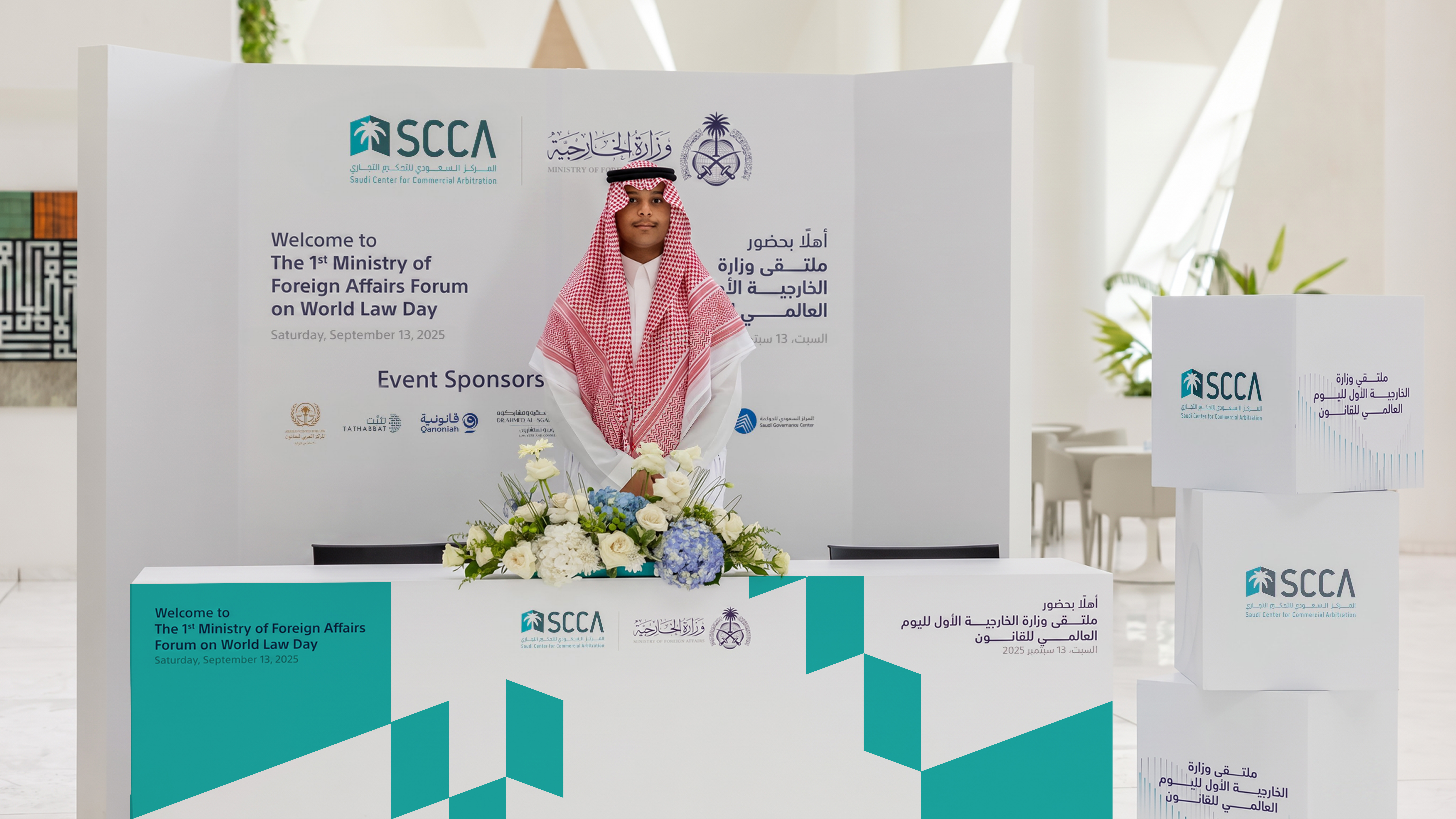
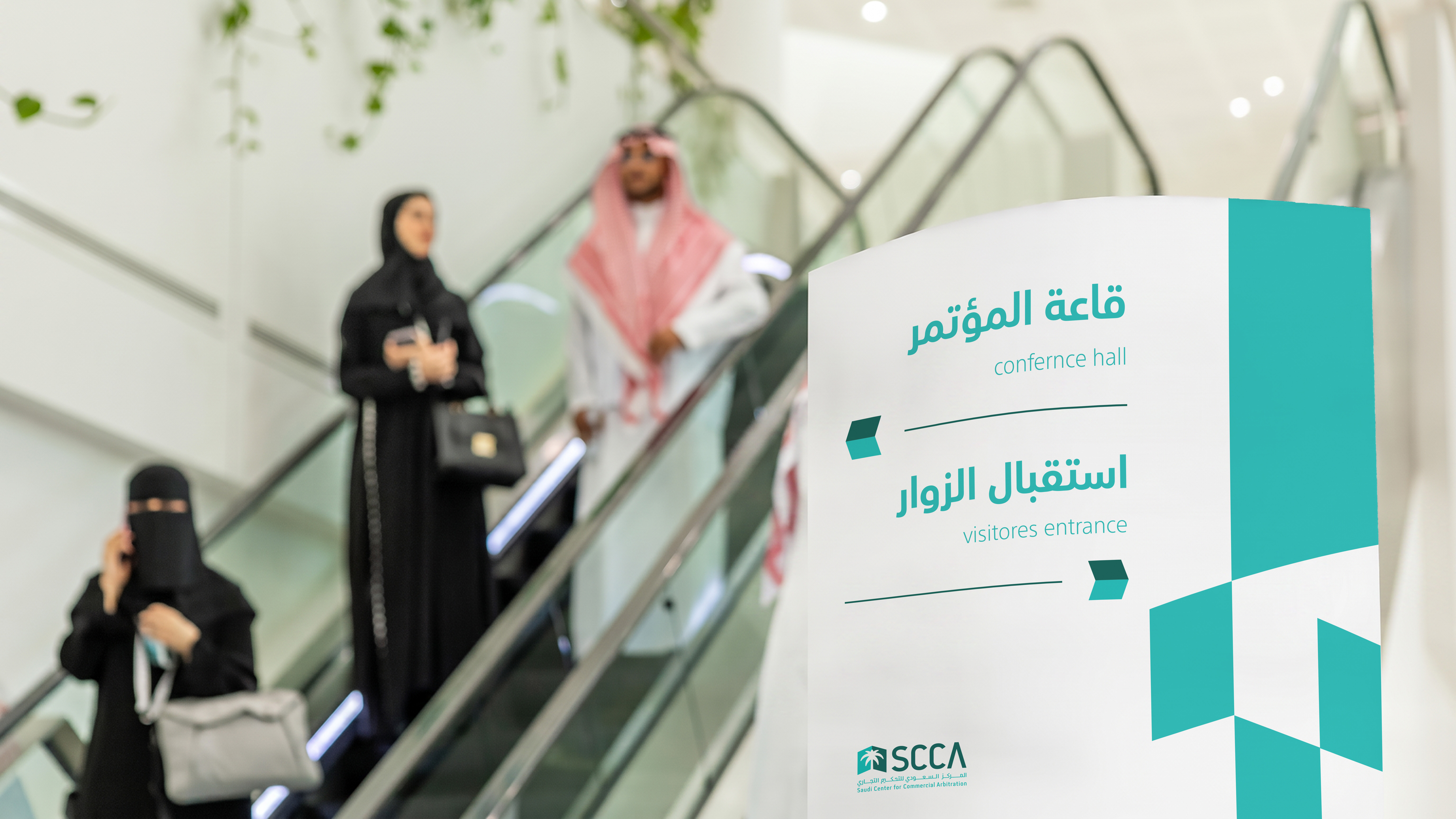
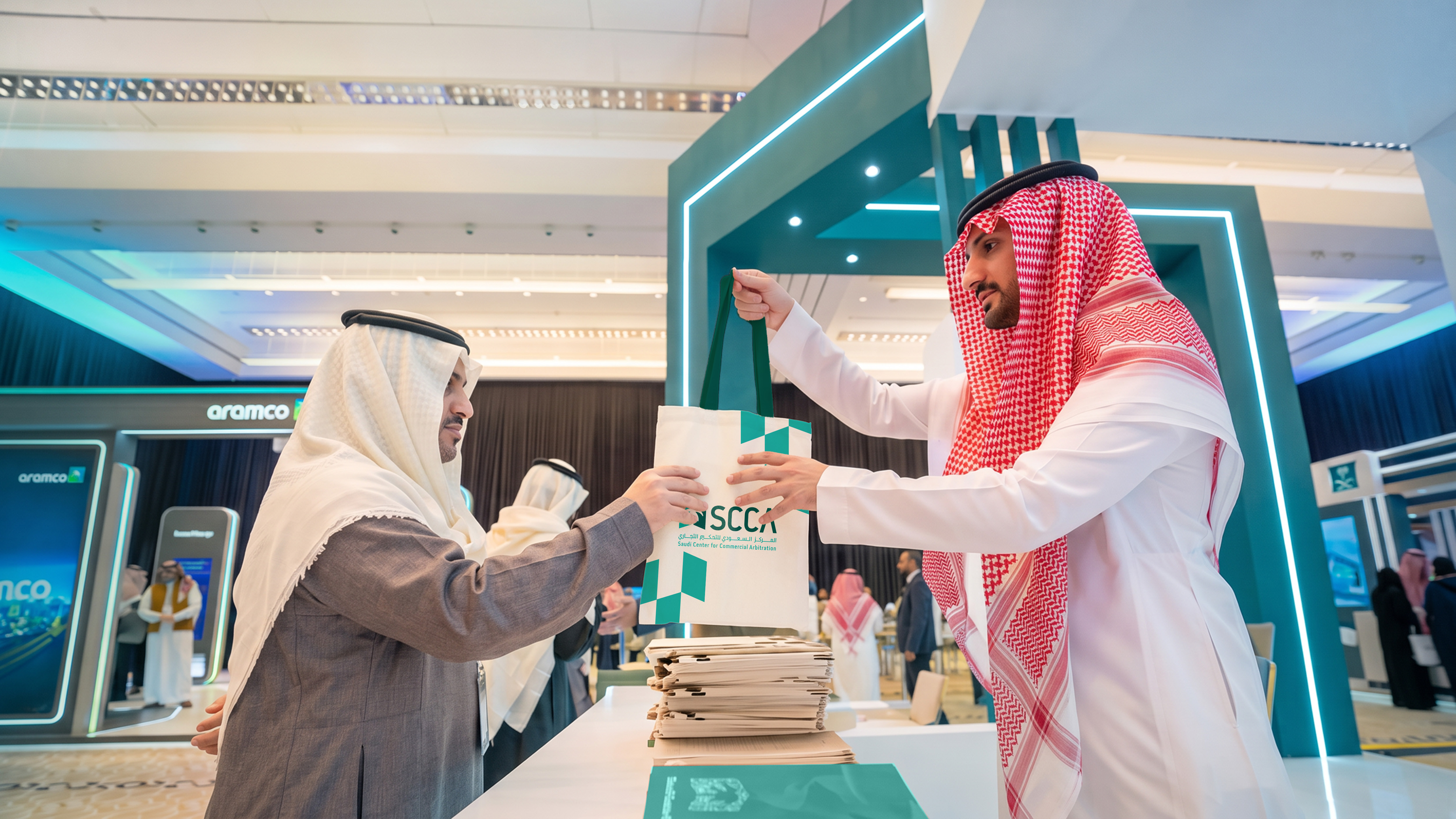
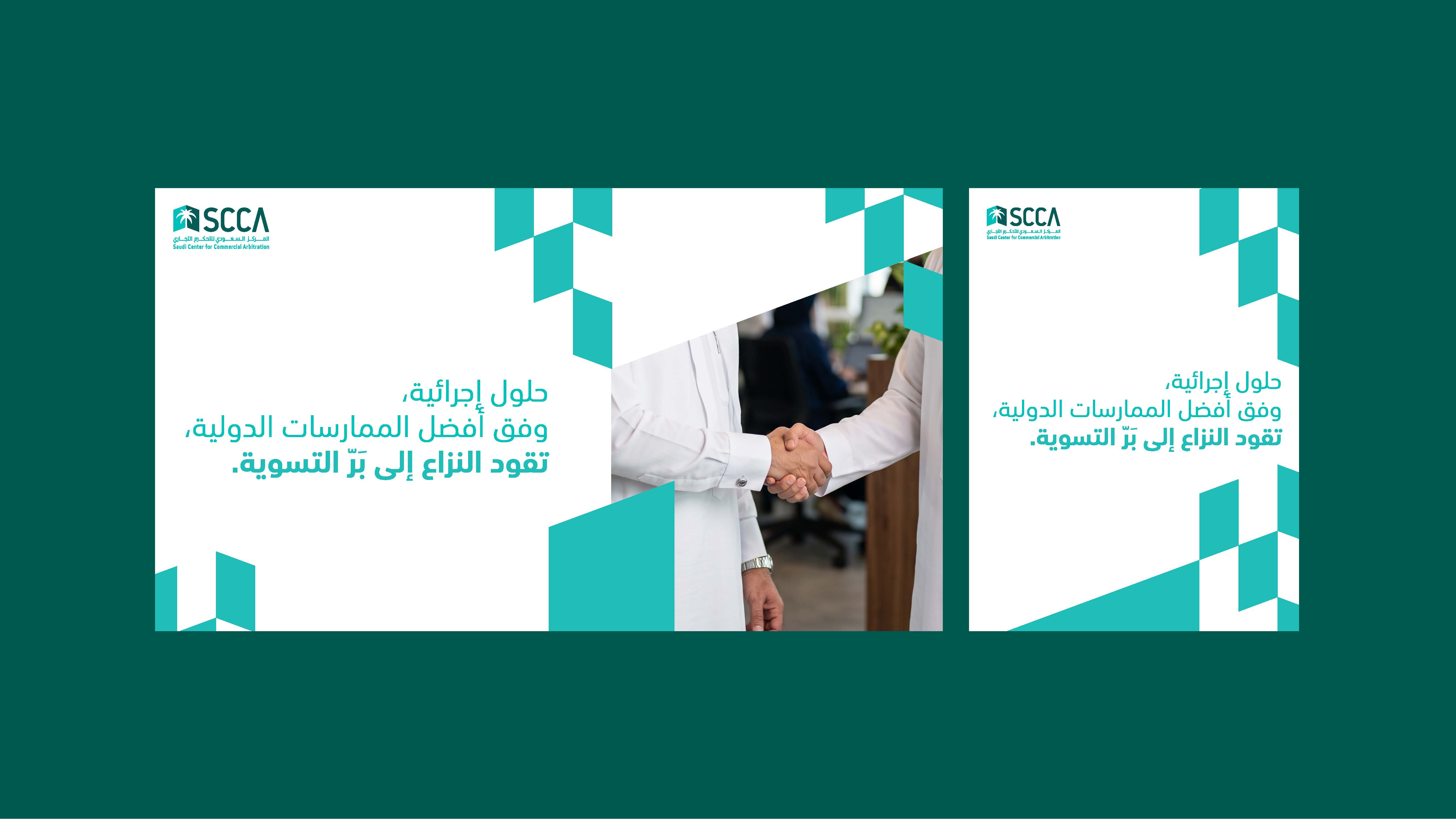
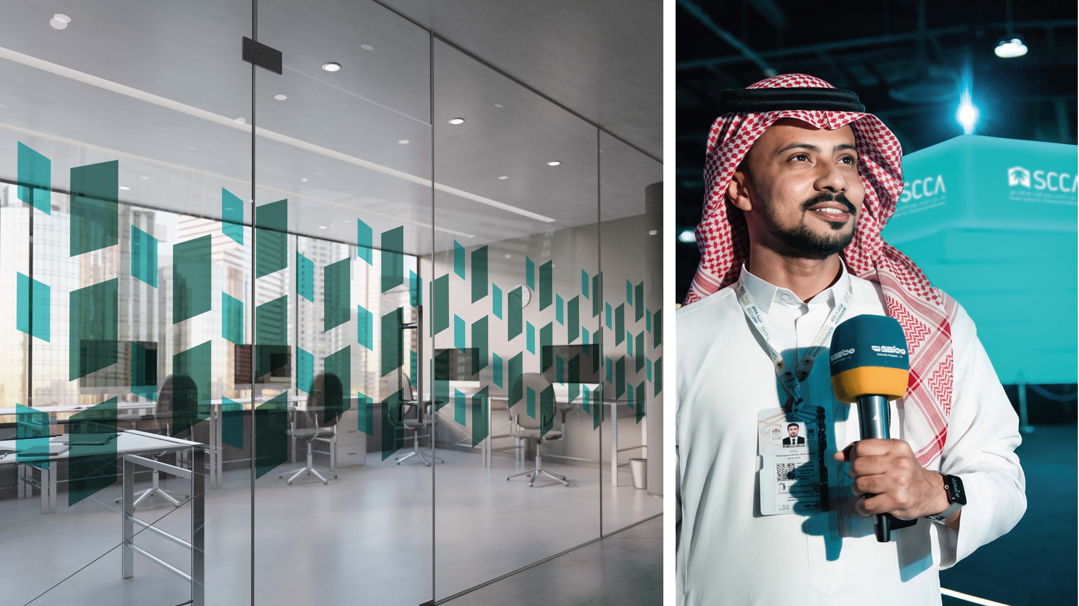
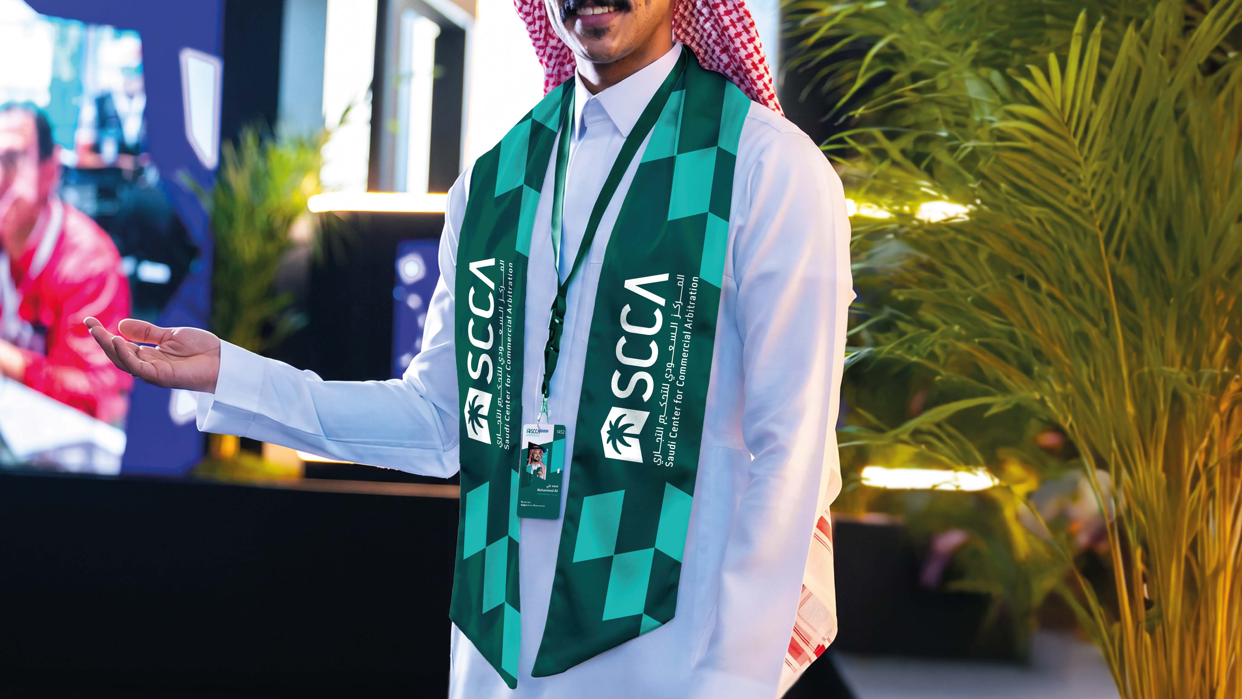
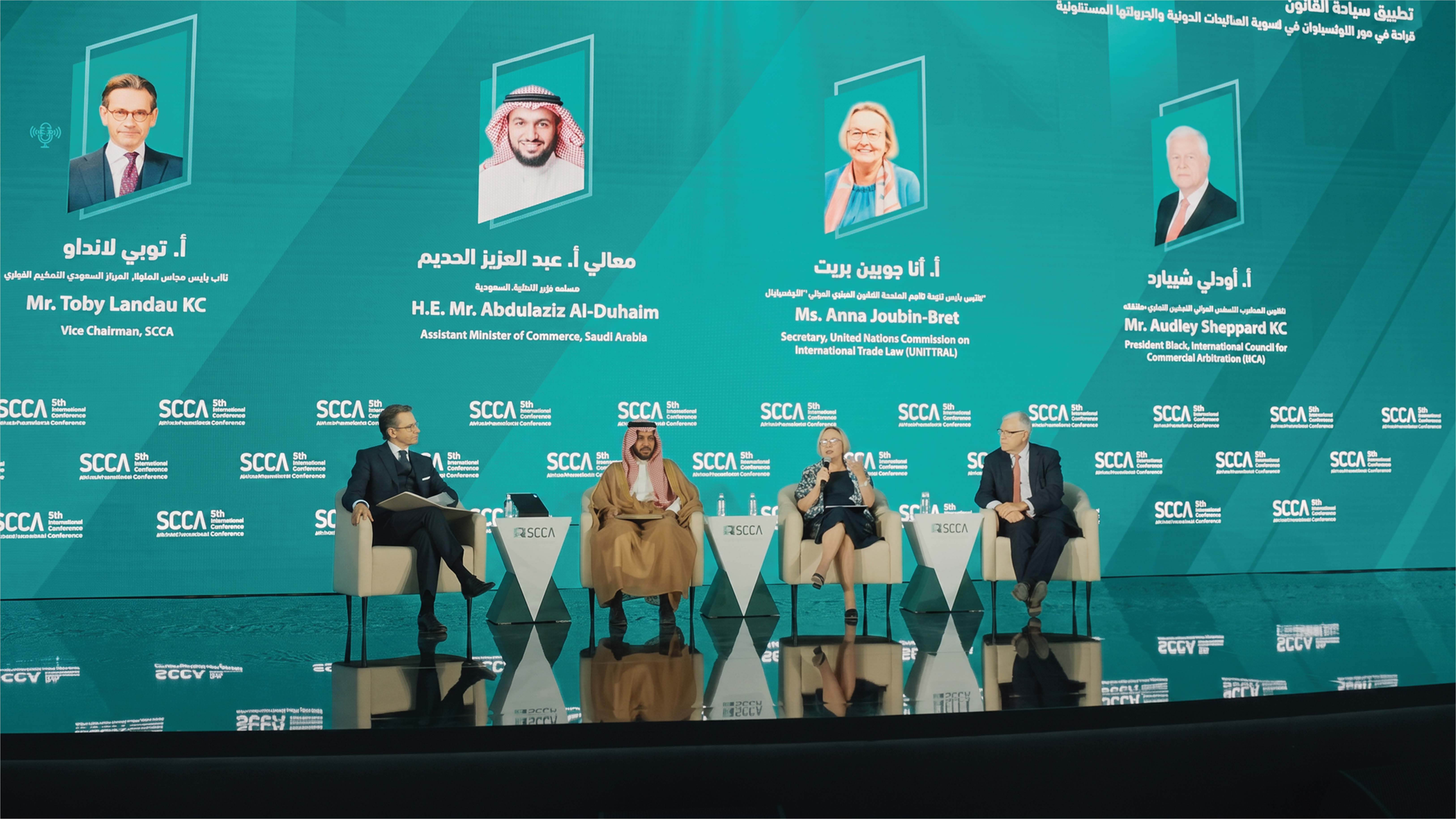
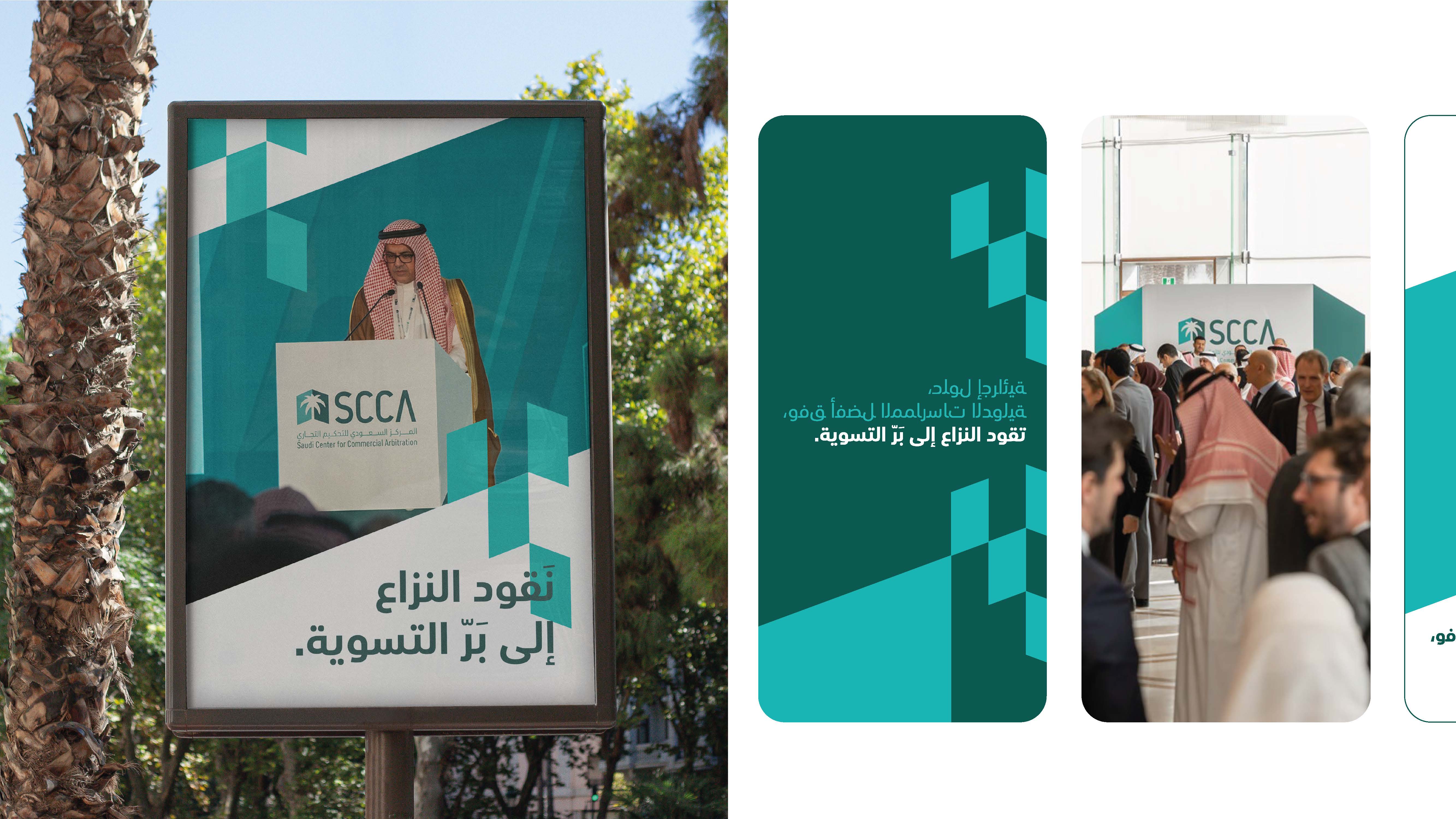
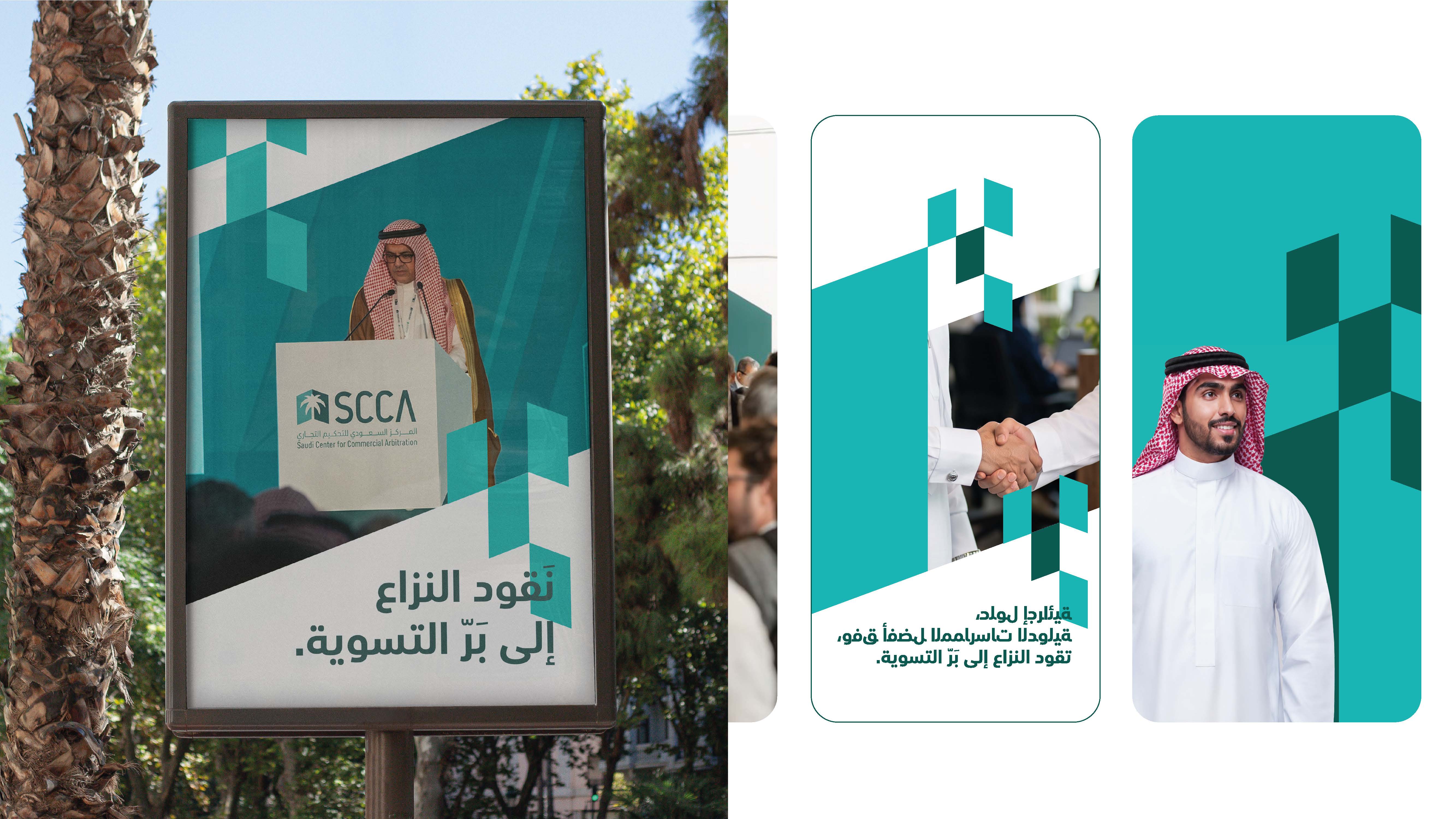
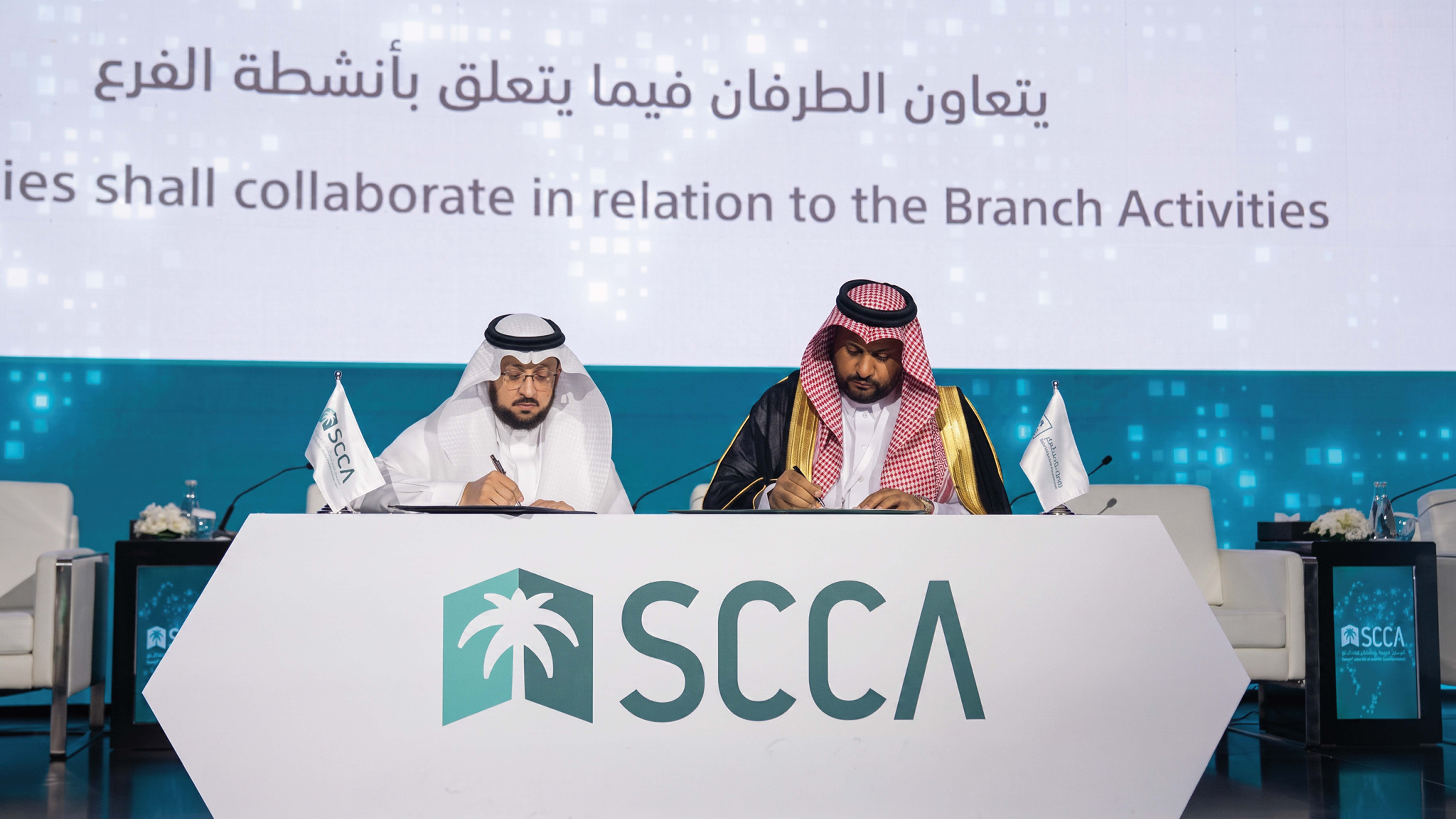
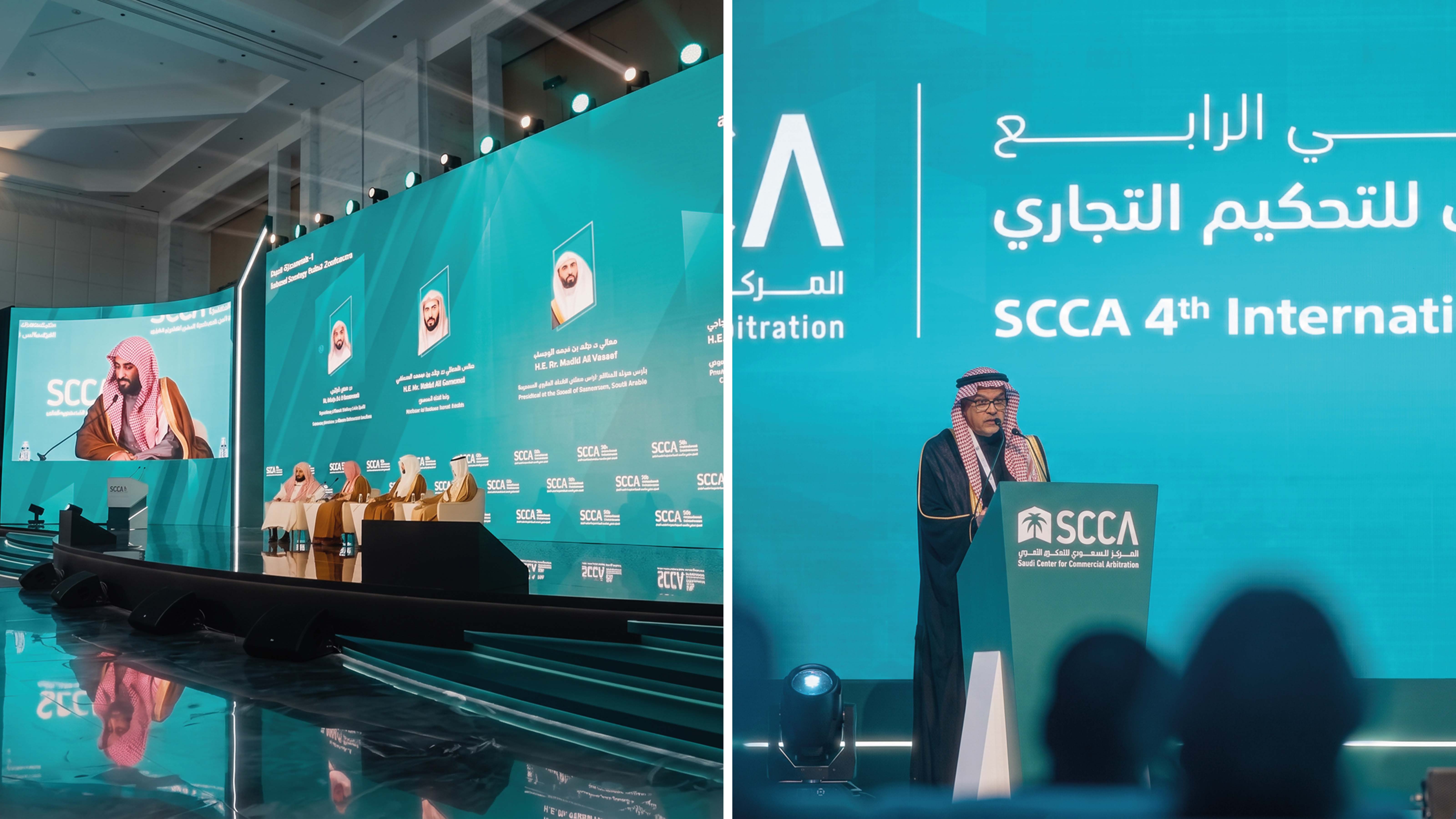
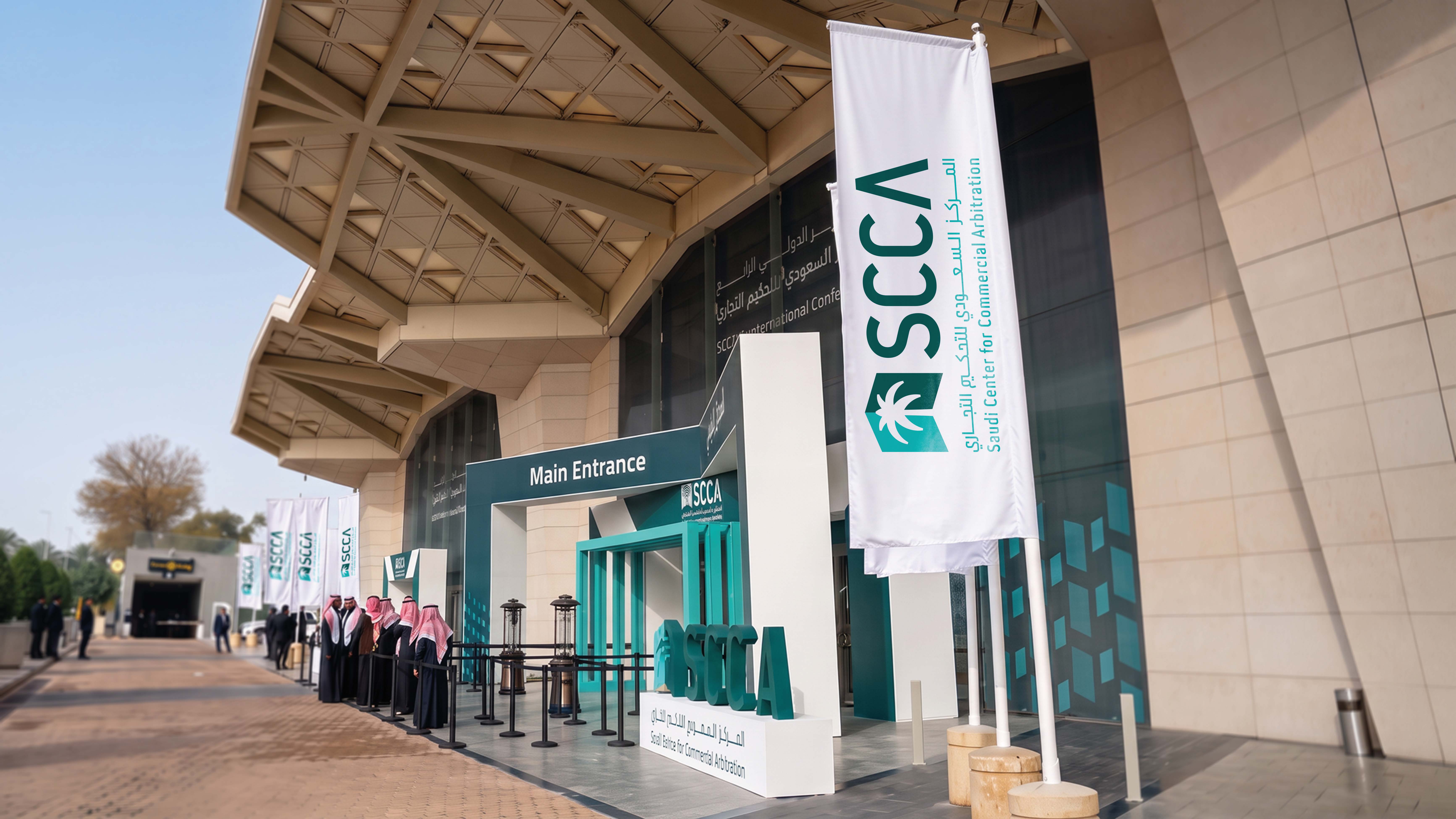
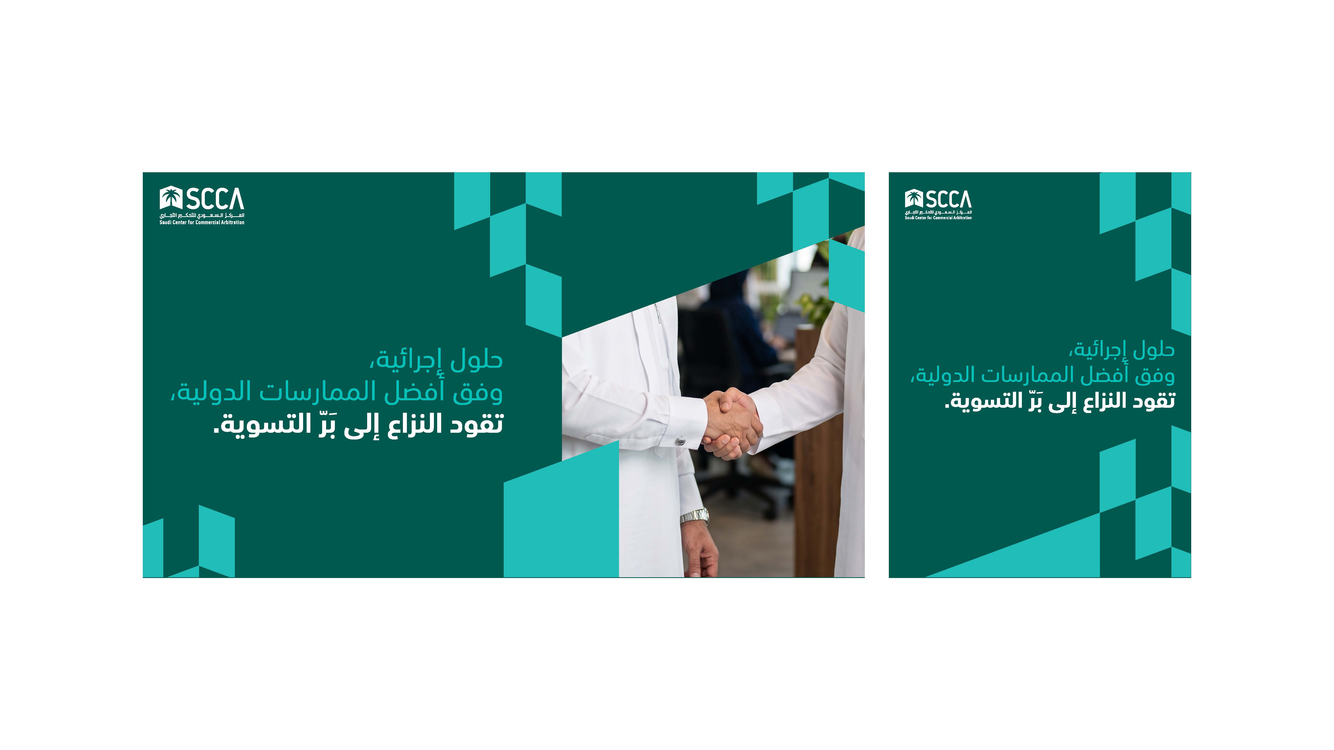
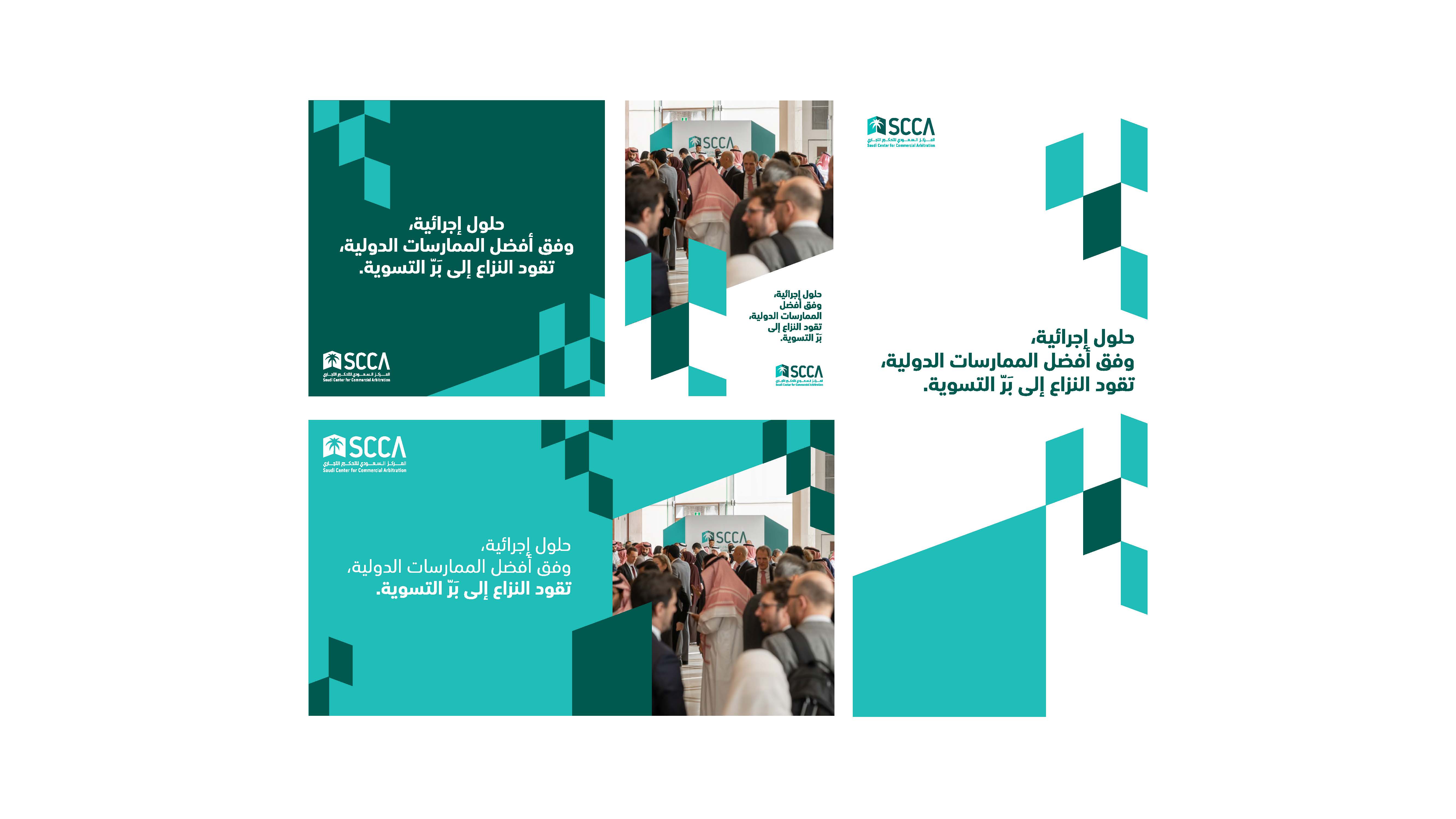
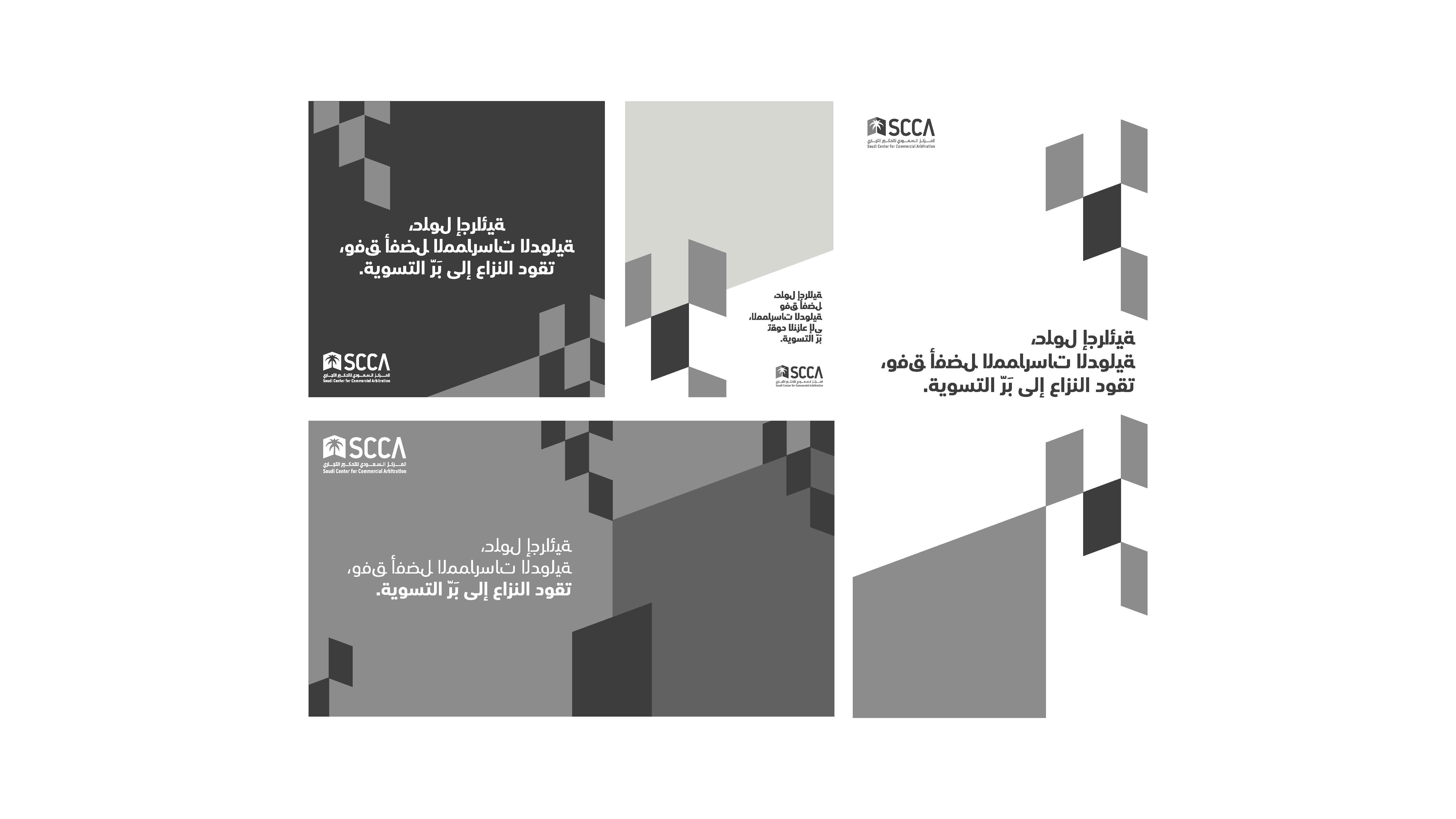
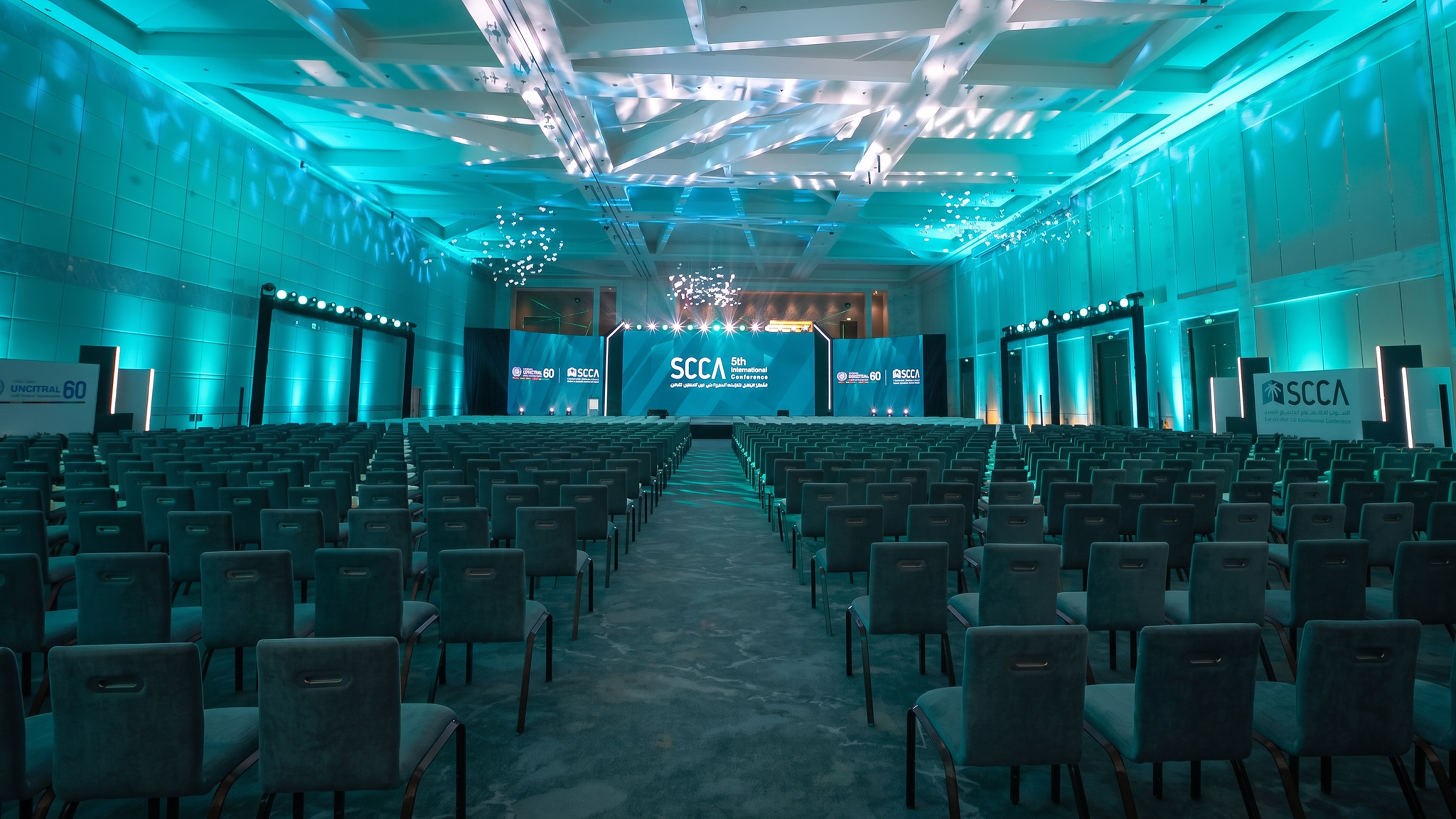
We transformed trust and precision into a clearer and more cohesive visual presence—a contemporary take on an institutional identity that reflects the center’s stature and evolves with its growing presence.