
The General Authority for Awqaf regulates and develops the endowment sector, strengthening its developmental impact through the efficient and sustainable management and investment of endowment assets. The visual identity was designed to reflect this role, connecting the heritage of endowments with the concept of sustainable investment. Giving is not limited to providing benefits; it also means preserving value and ensuring its impact continues over time.
The challenge was to visually express the nature of the endowment sector, which brings together deep-rooted values, management, and long-term investment. The identity needed to reflect trust, governance, and sustainability, while communicating that an endowment is not a momentary act of giving, but an asset capable of creating lasting benefit over time.
The opportunity was to build a visual language that brings together the roots of endowments with a modern investment-oriented approach; a language that evokes the values of giving and heritage while expressing growth, empowerment, and sustainability.
This approach allowed us to present the Authority through a cohesive identity that extends from the logo to its corporate and digital applications.
We began by understanding the nature of the General Authority for Awqaf and its role in regulating and developing the endowment sector, with a focus on the meaning behind the brand: giving that preserves its value and grows its impact over time.
From there, the direction was shaped around an identity that brings together the heritage of endowments, confidence in their management, and the ambition to sustain their impact.
After understanding the nature of the Authority, we defined the values its visual presence should reflect—from heritage and governance to empowerment, leadership, and impact. These values became the foundation for shaping an identity that brings together institutional trust and the spirit of sustainable giving.

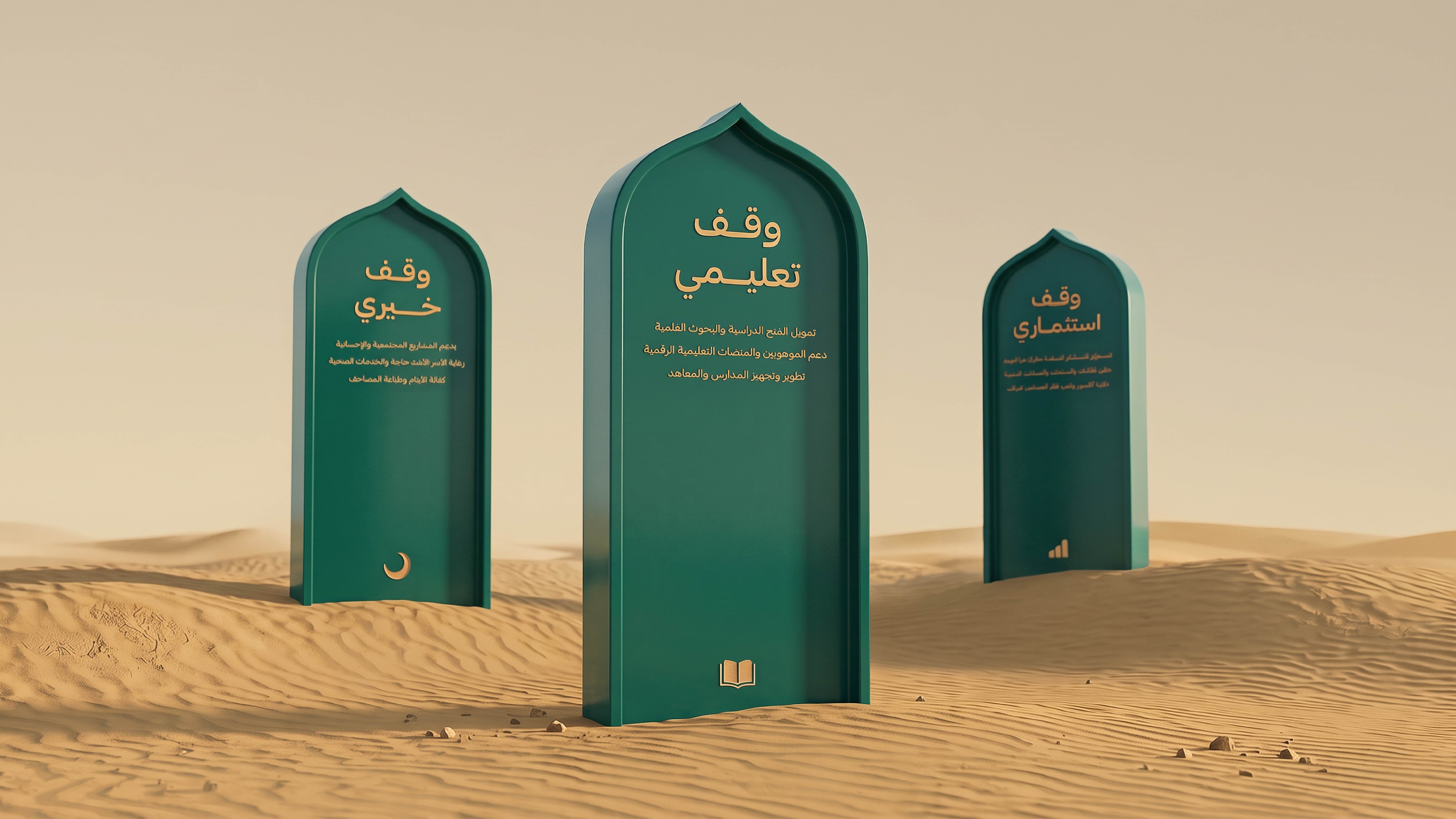
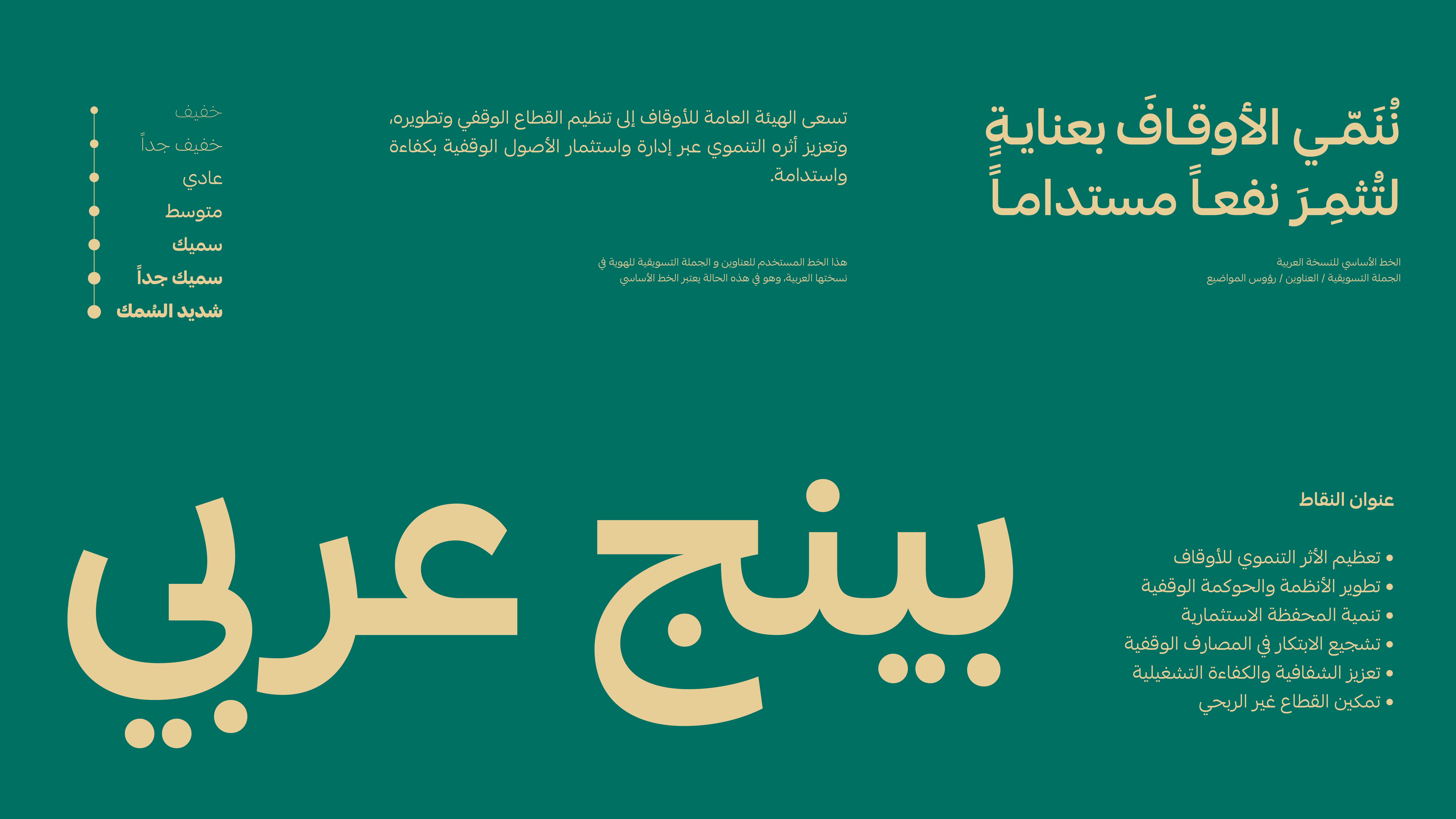
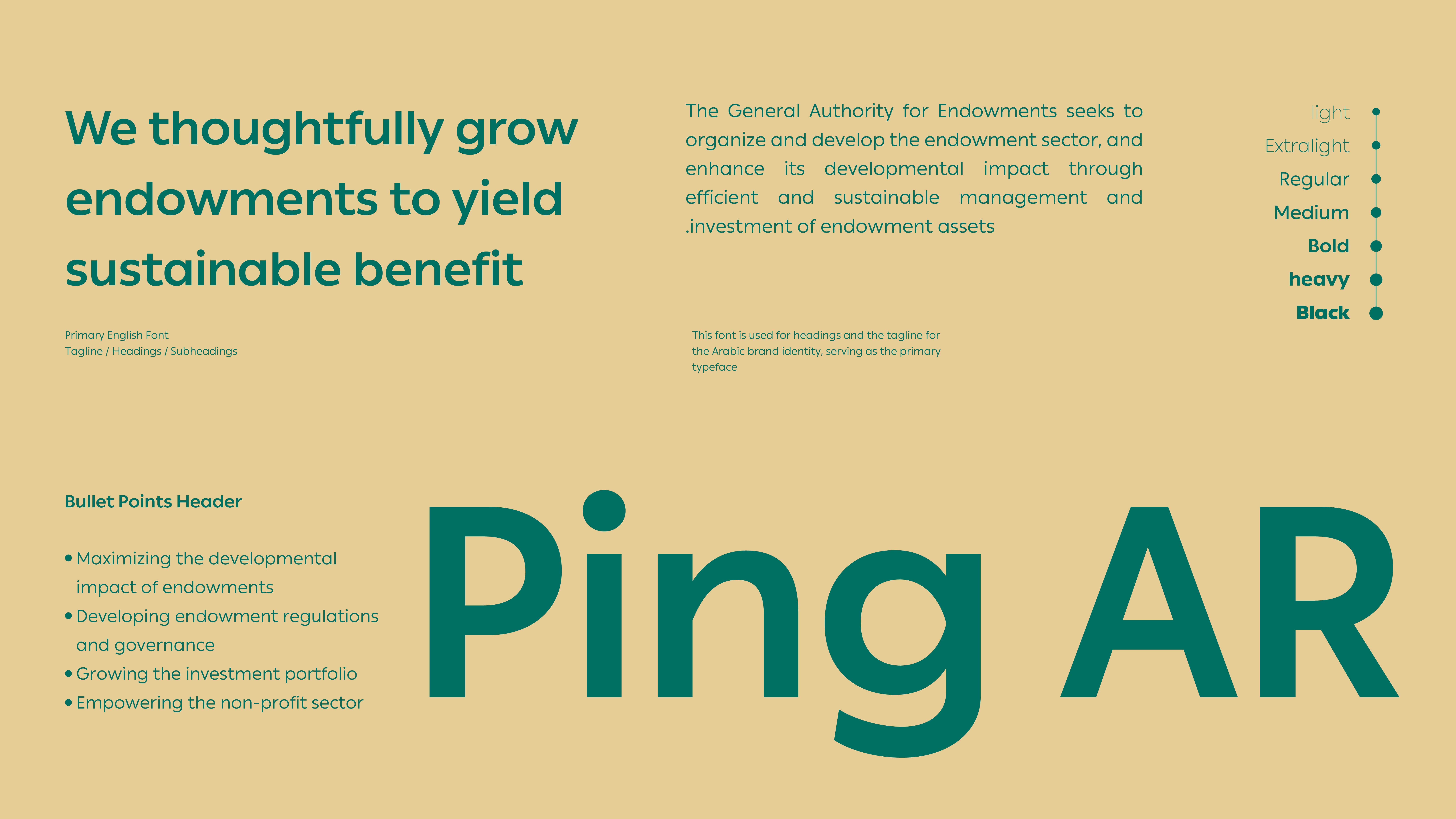
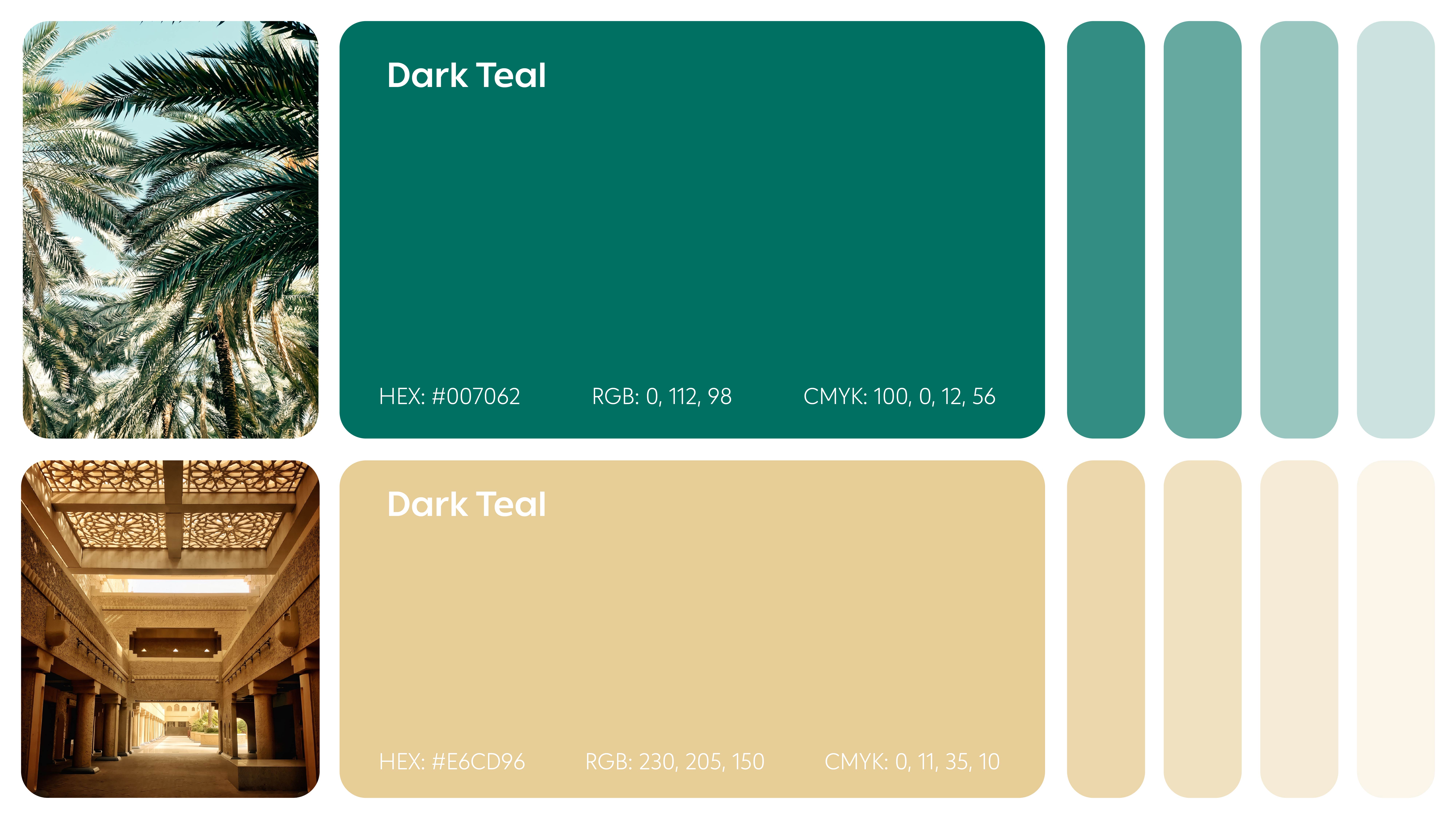
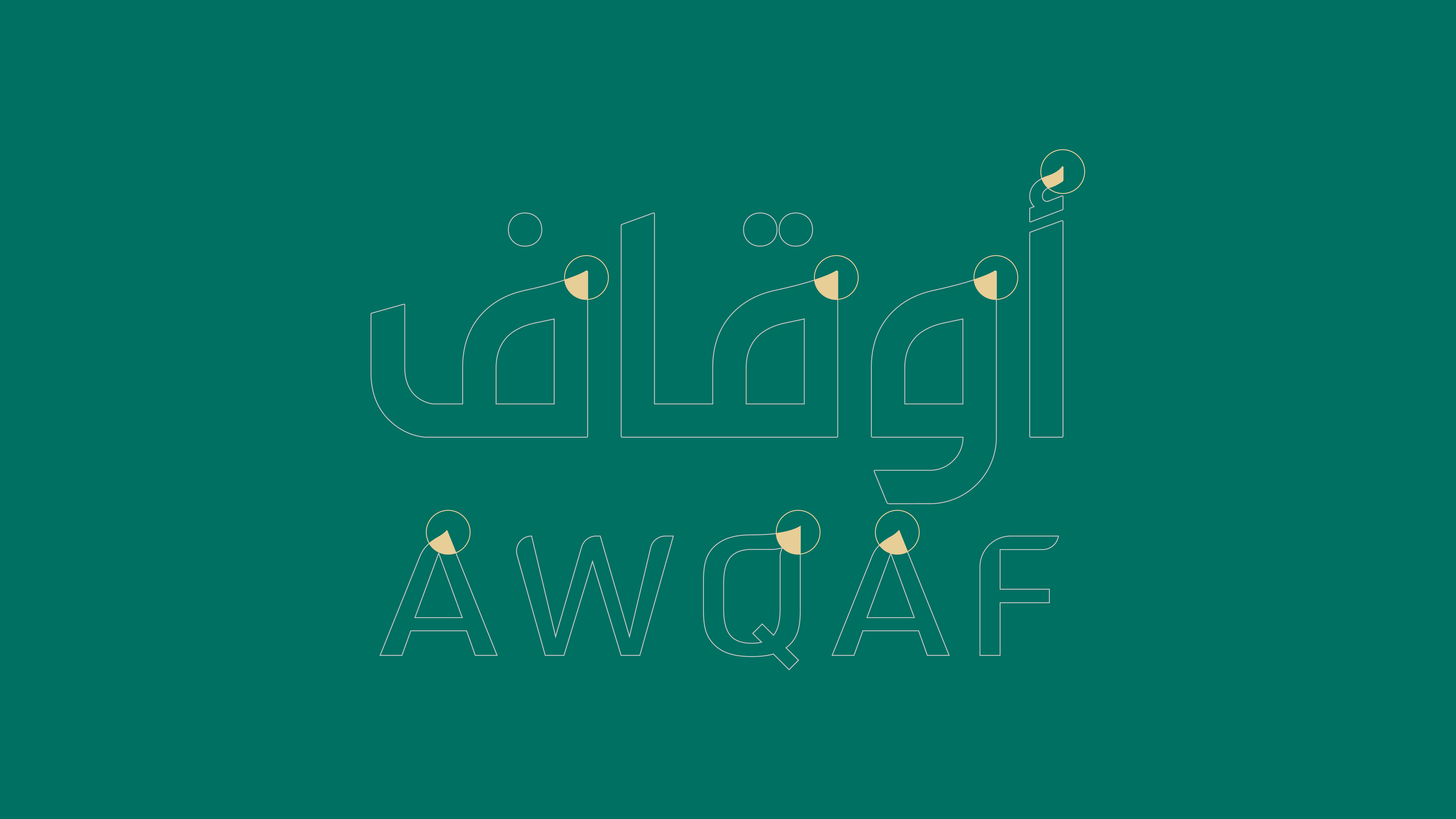
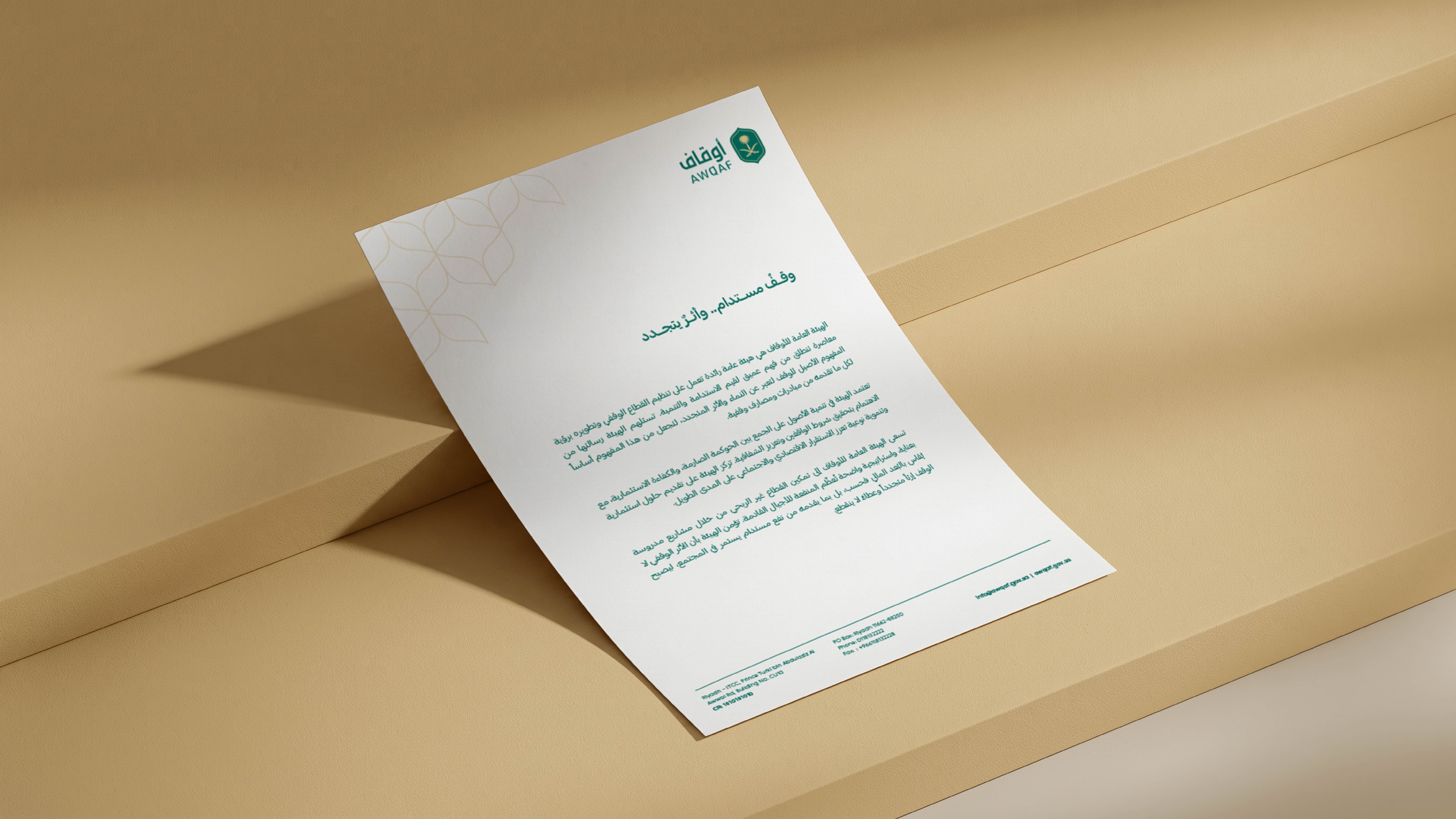
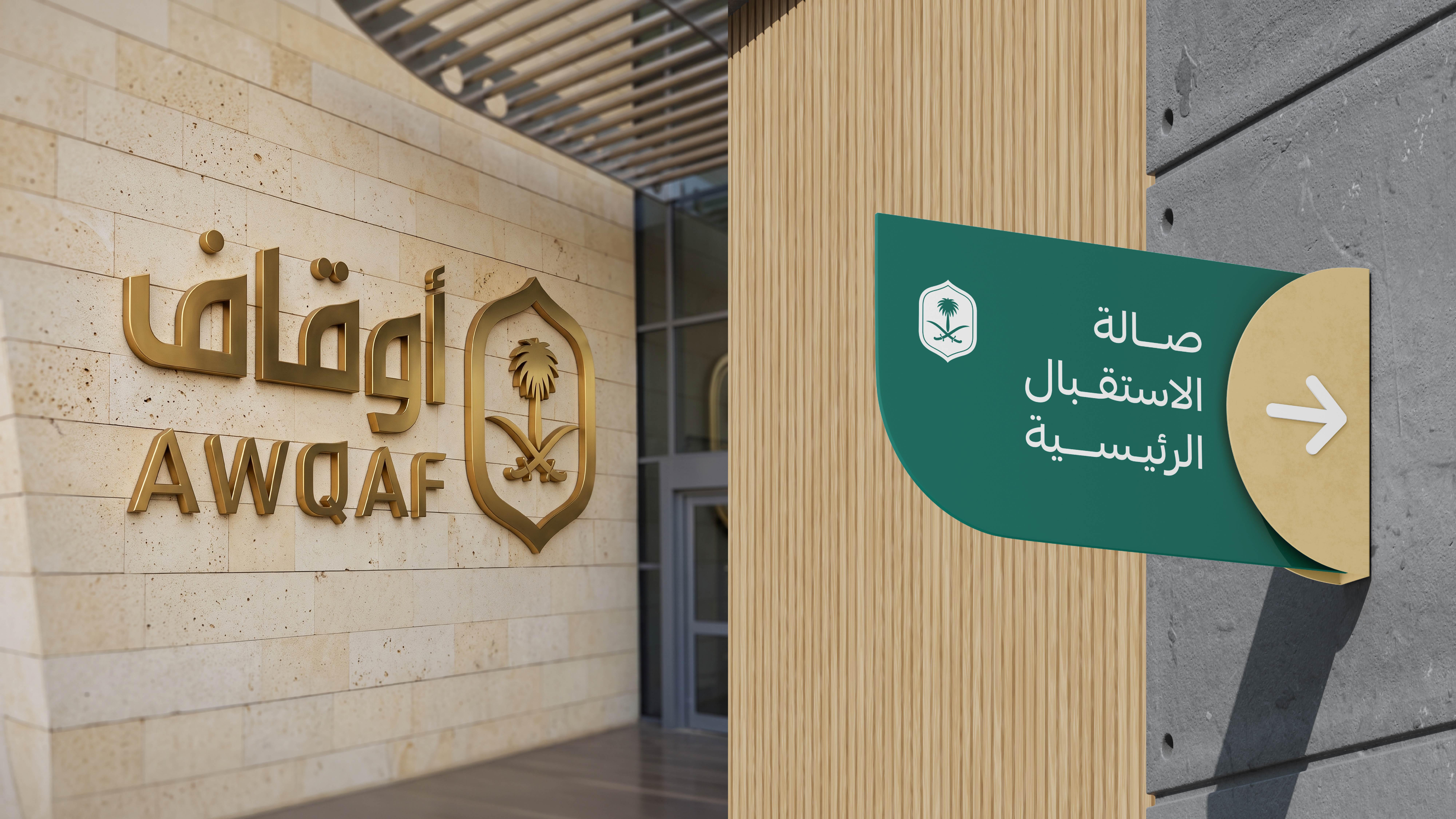
We moved into developing the visual system surrounding the brand, from a color palette combining deep green and gold to the Arabic and English typefaces and supporting tagline. Together, these elements give the identity a balanced character that brings together formality, heritage, and a forward-looking perspective.
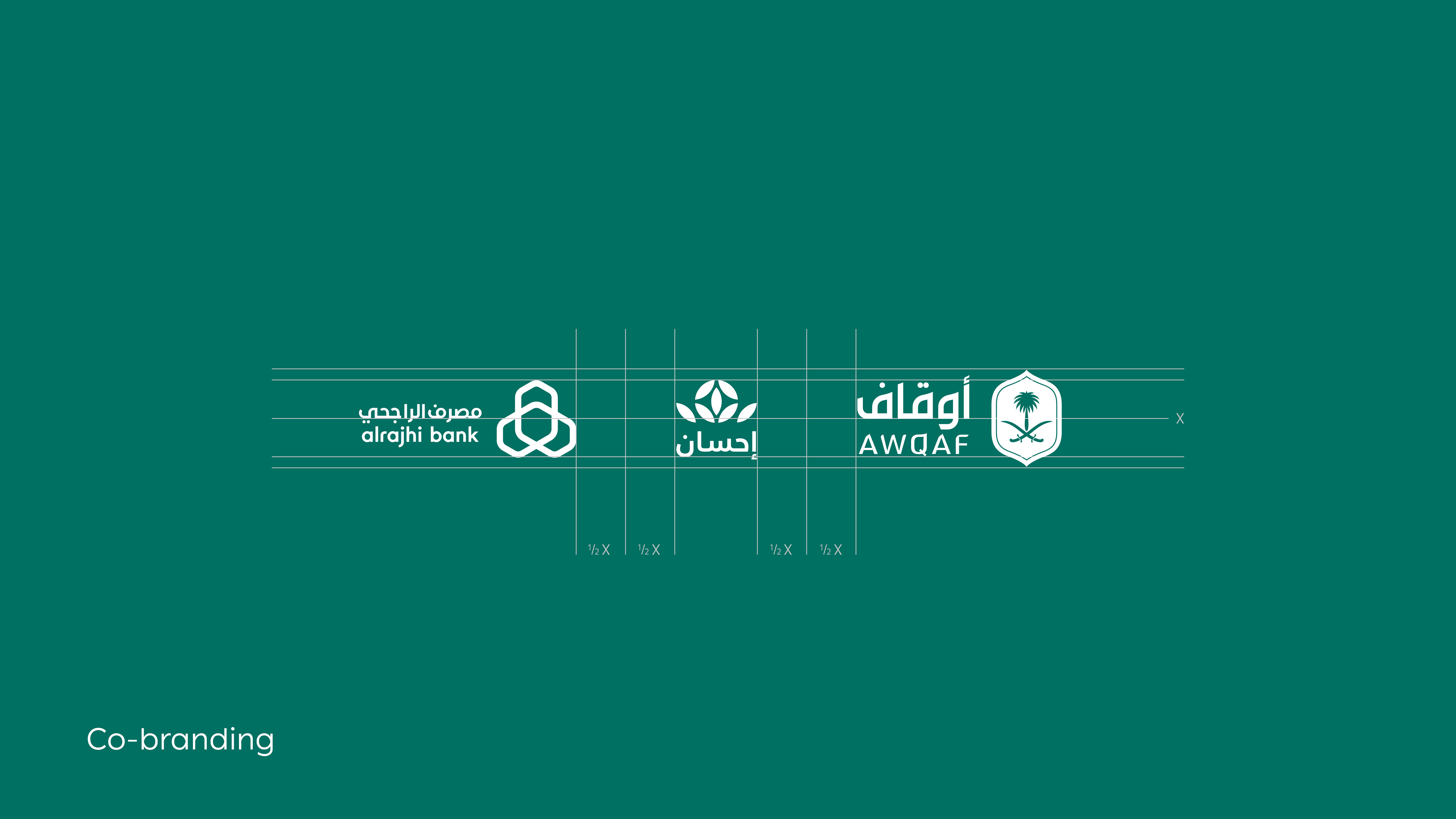
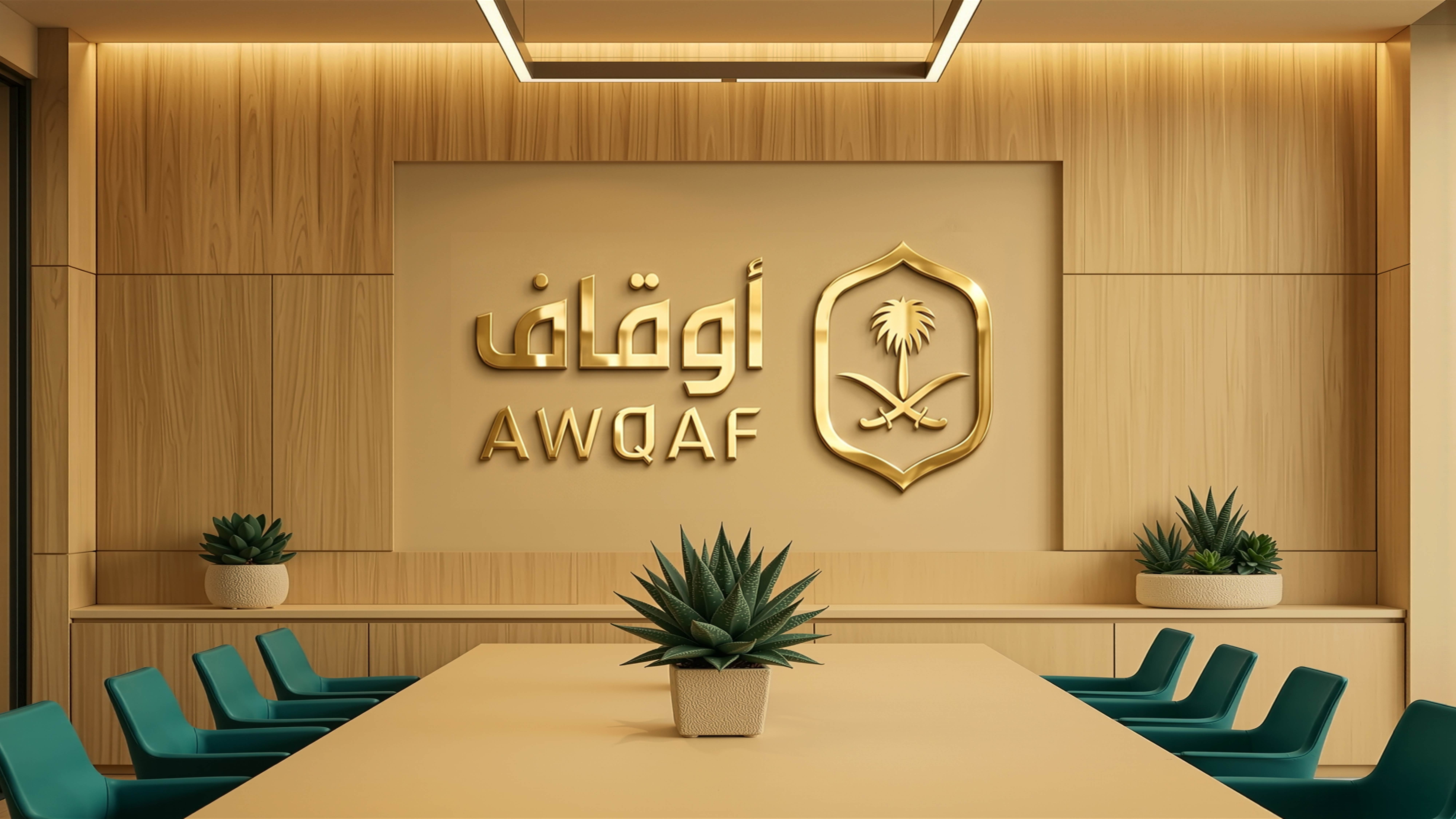
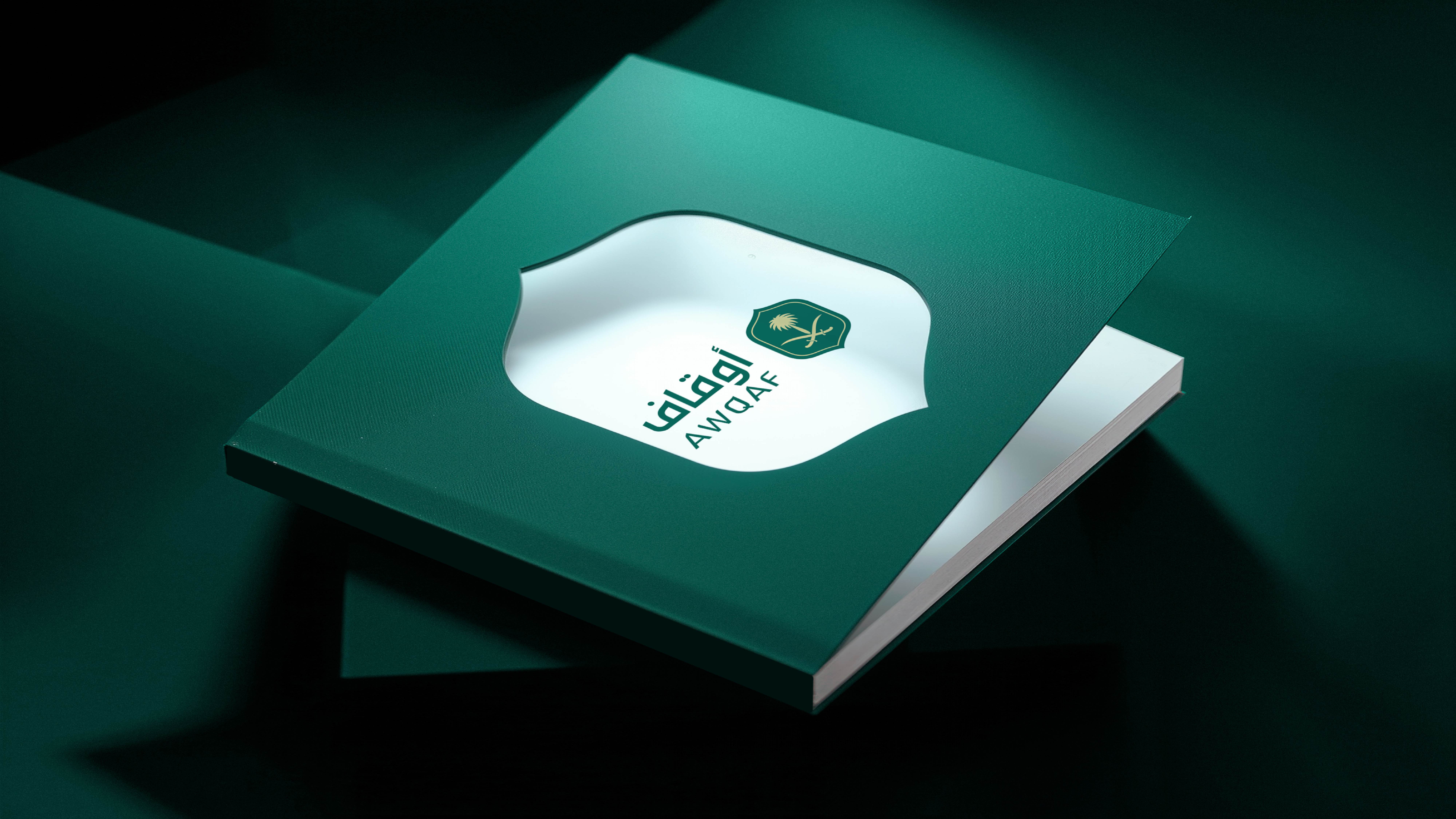
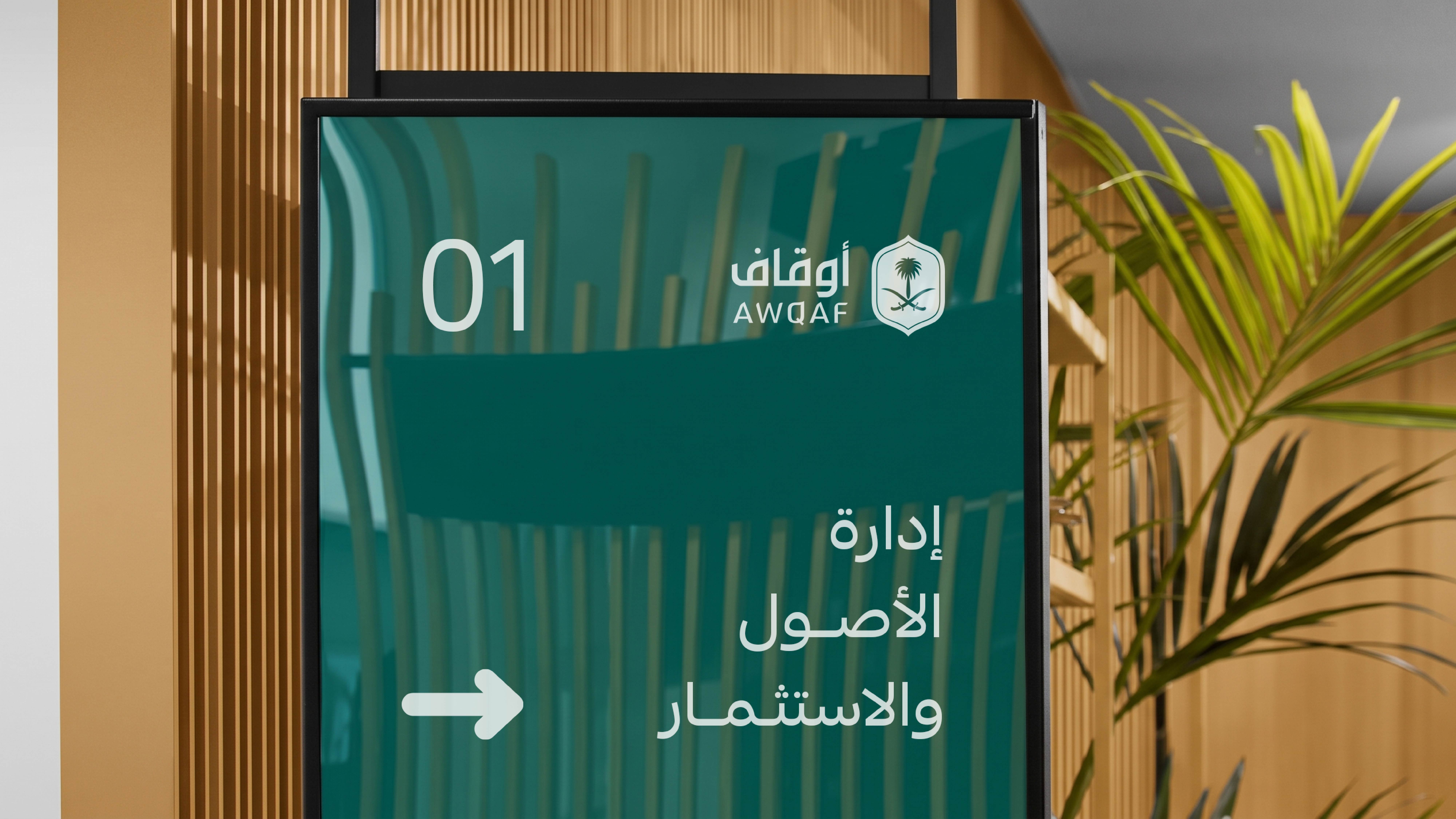
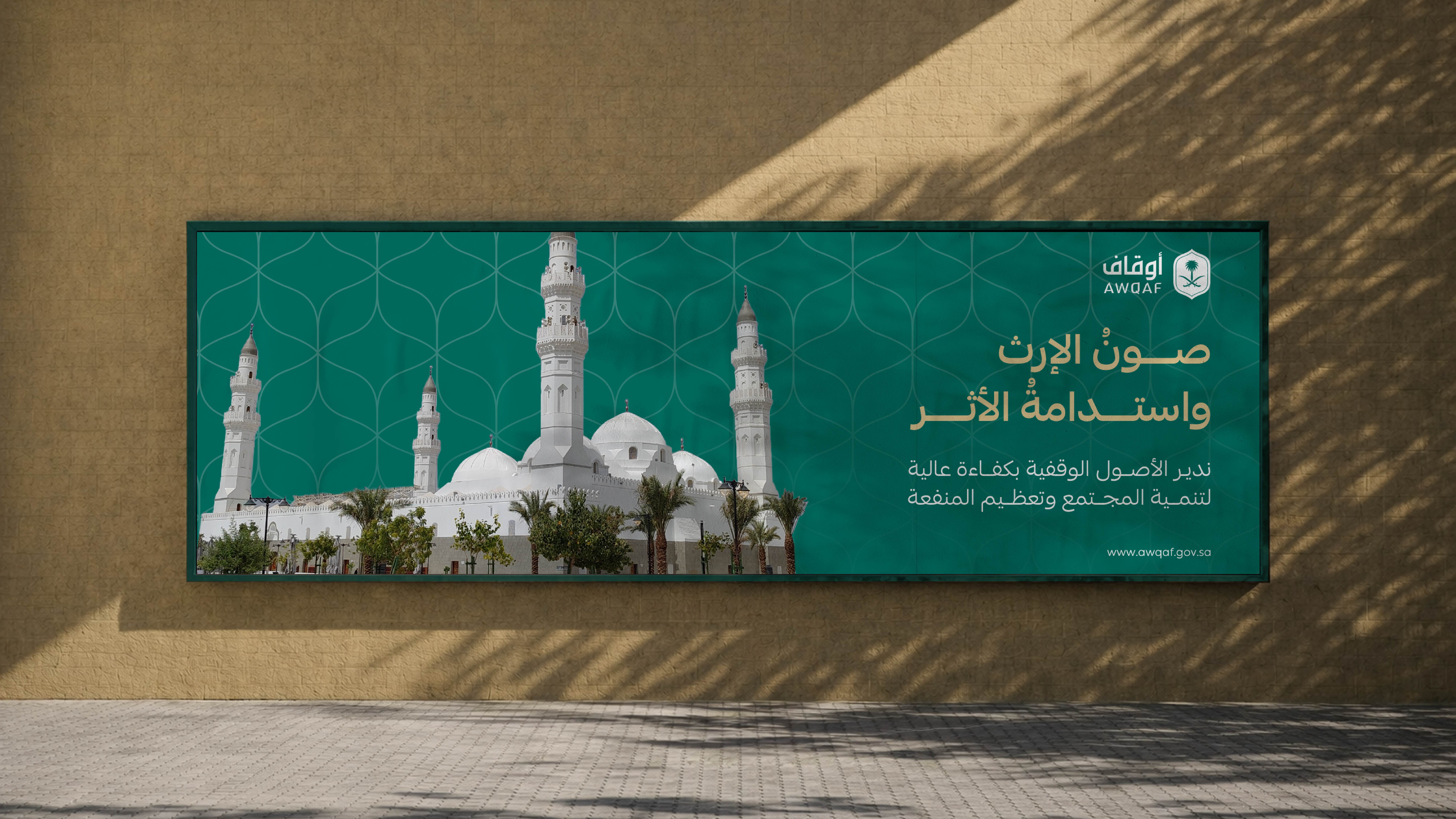
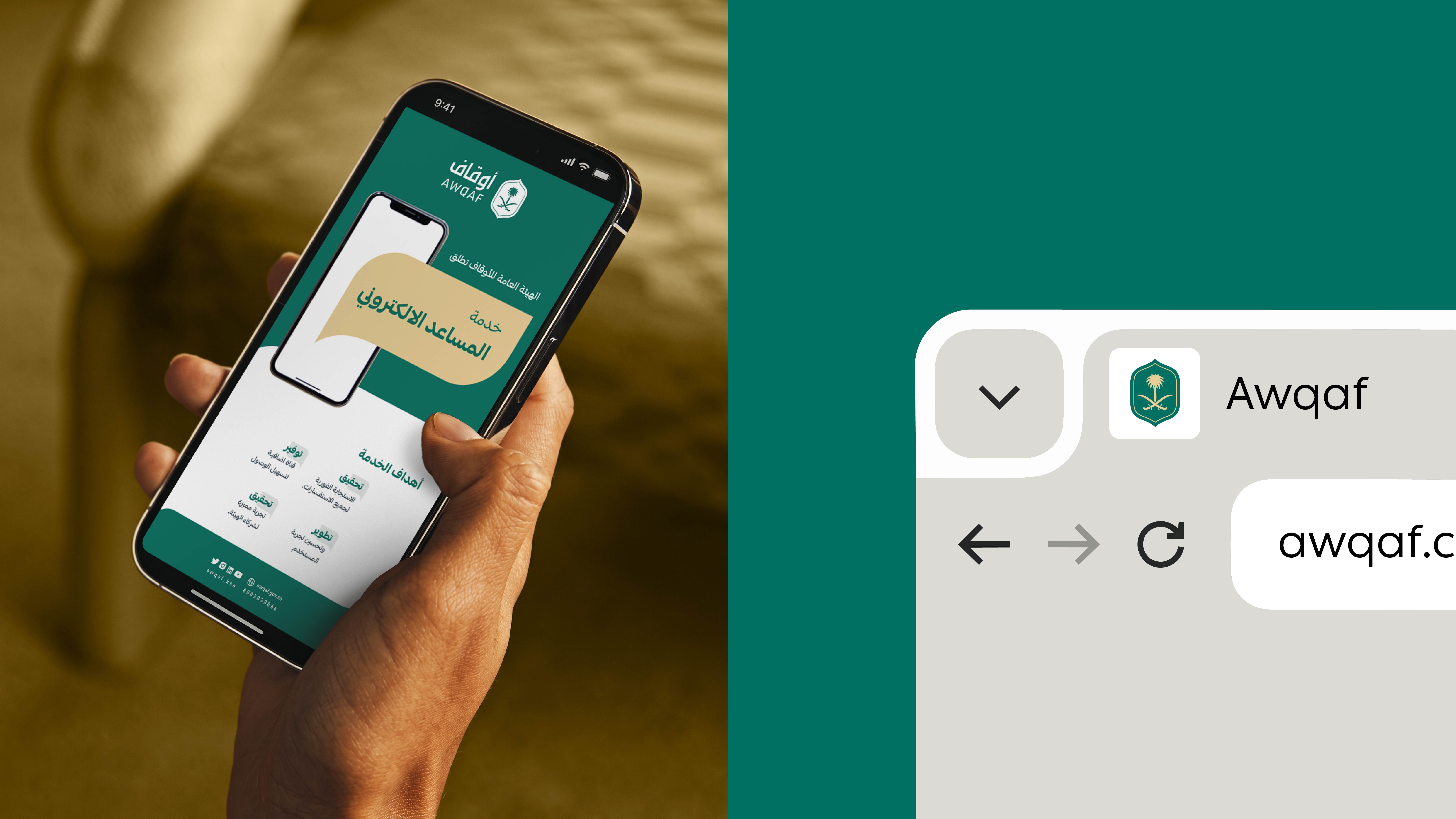
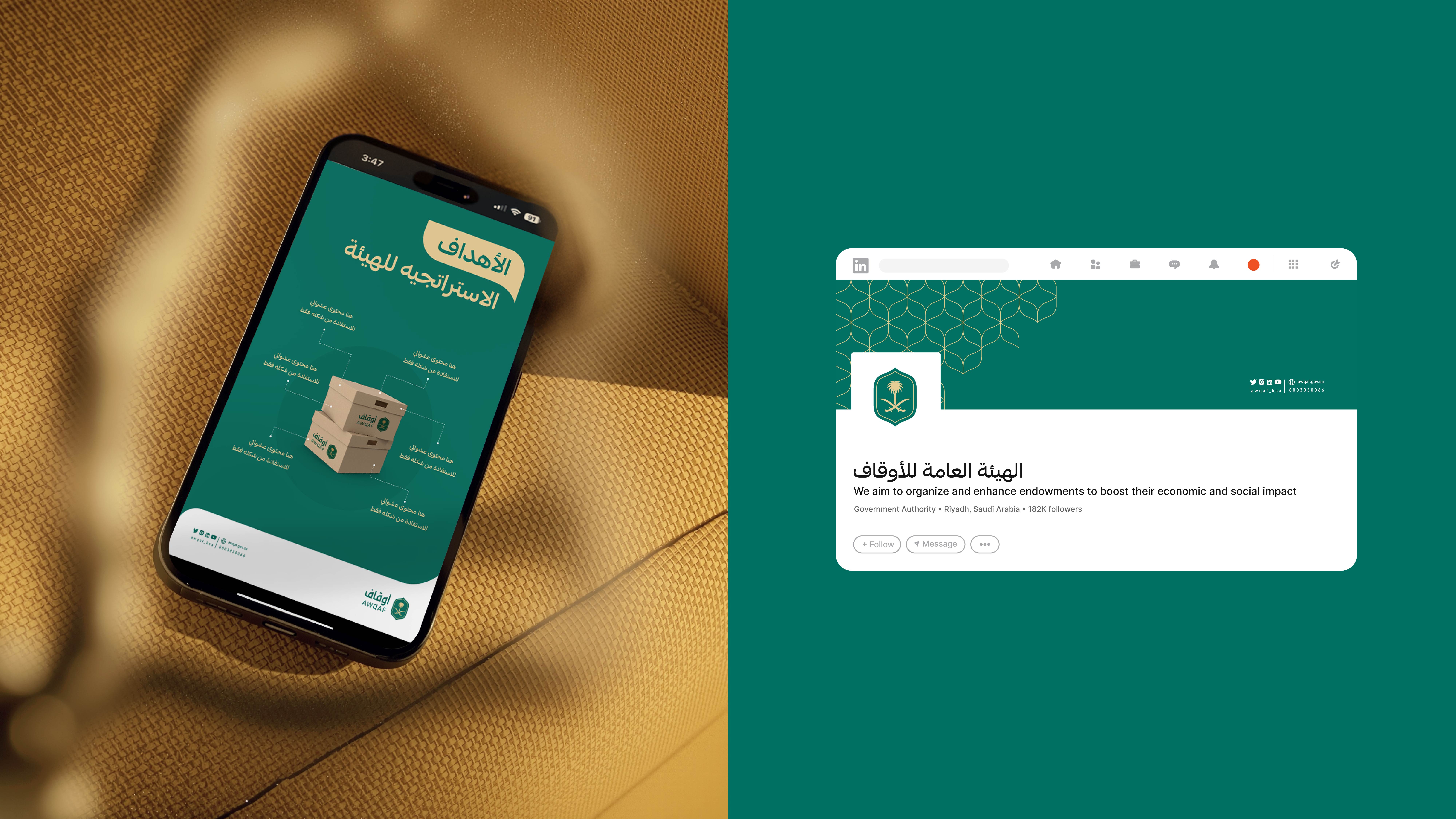
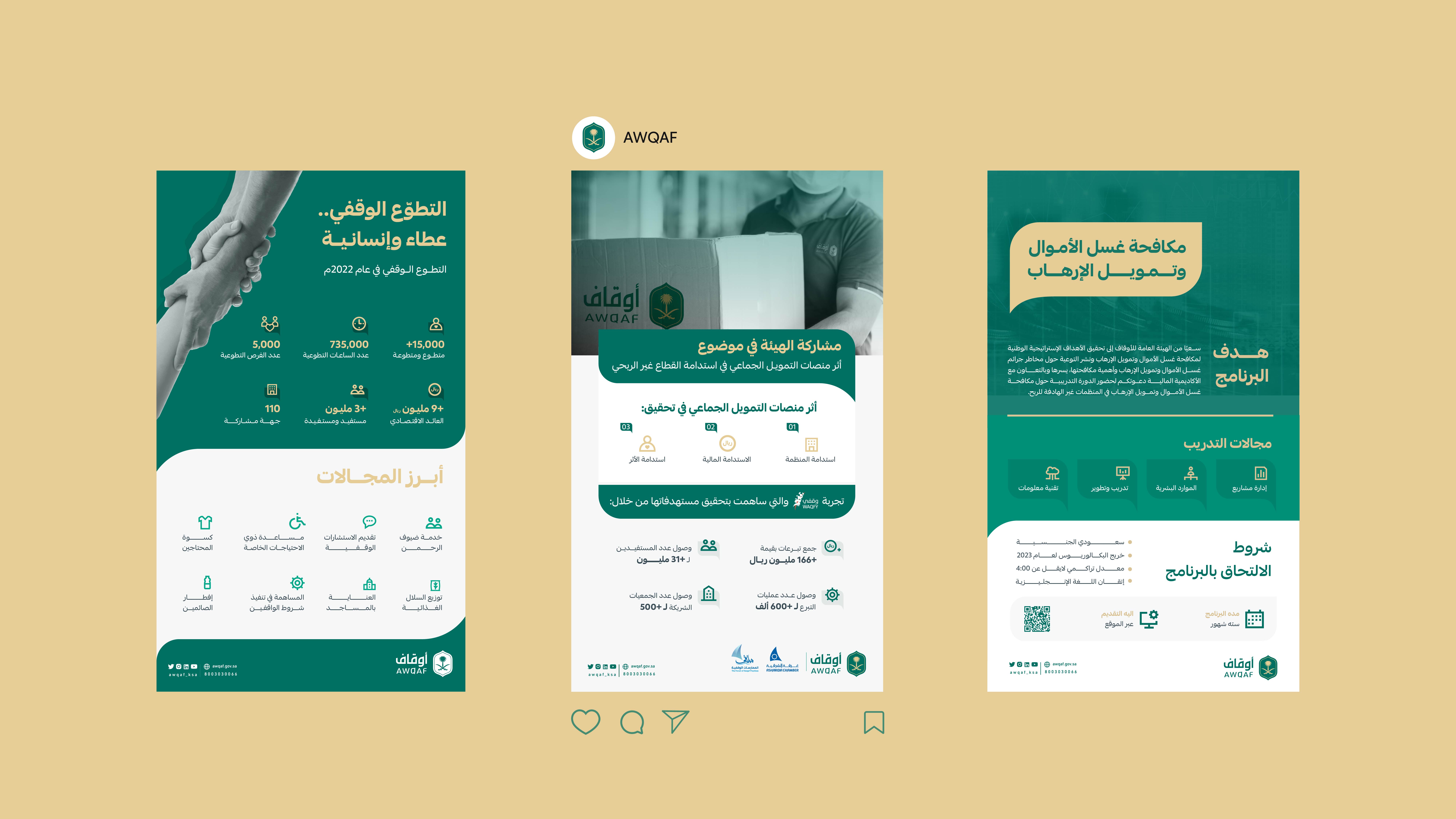
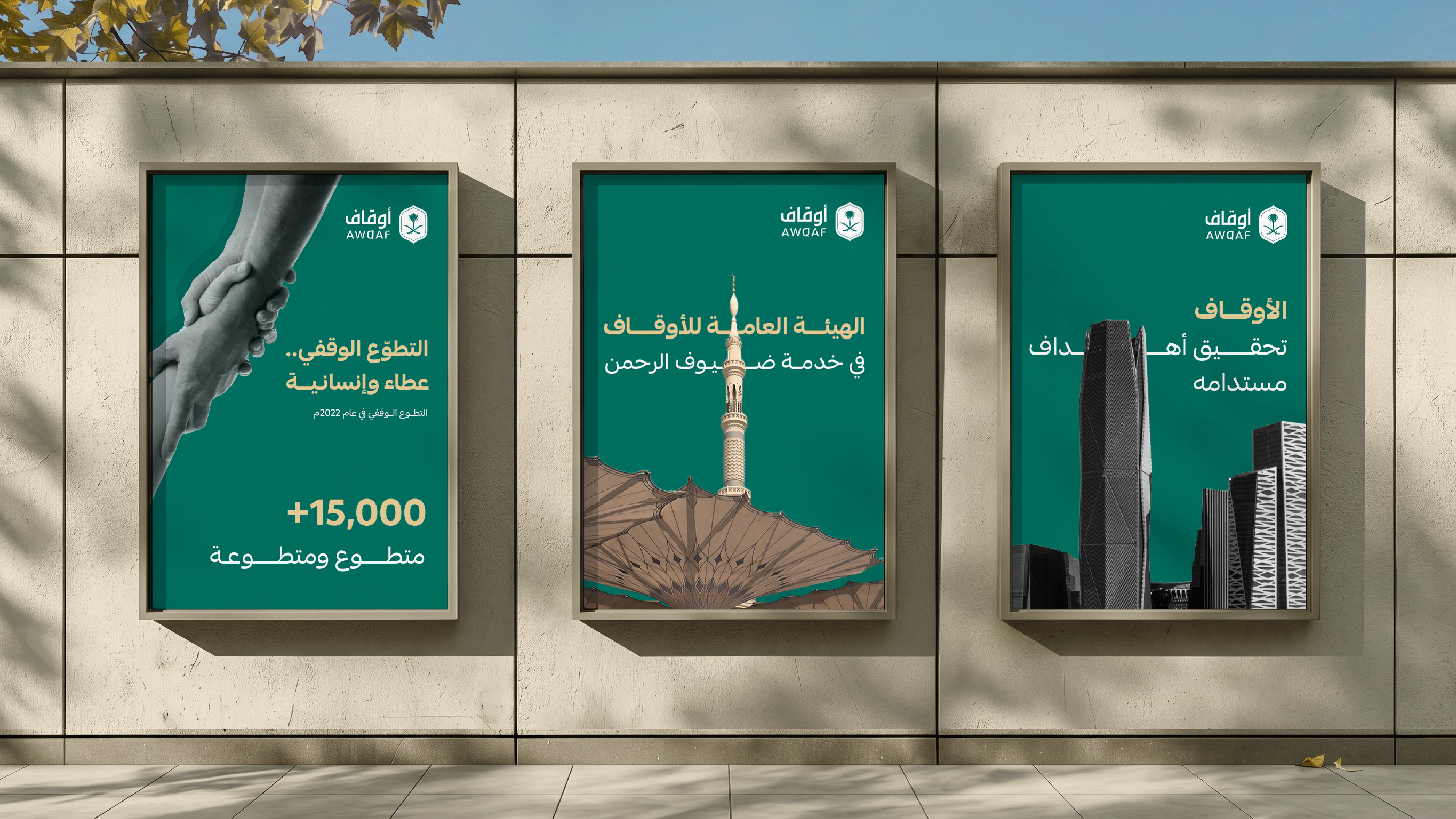
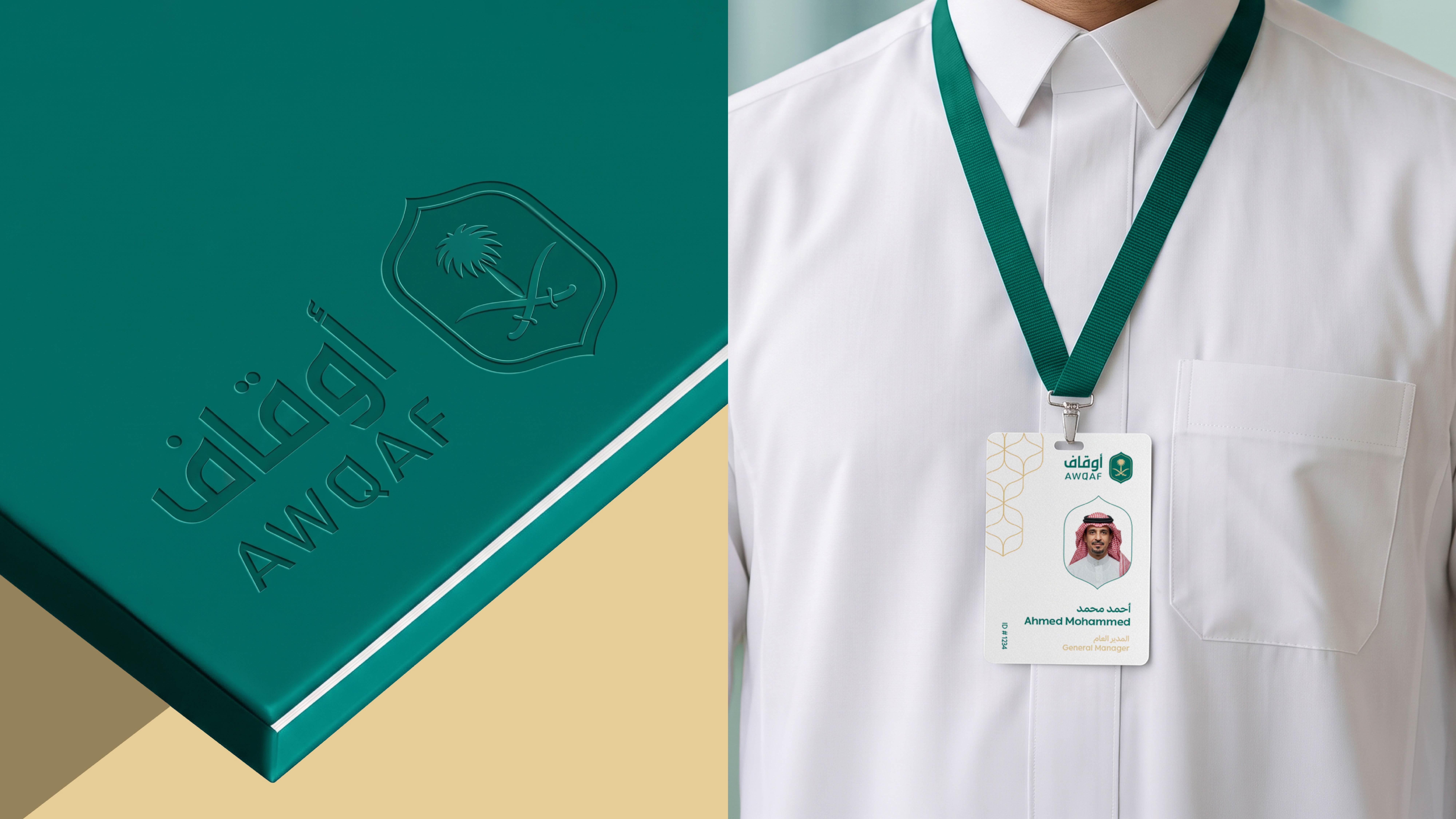
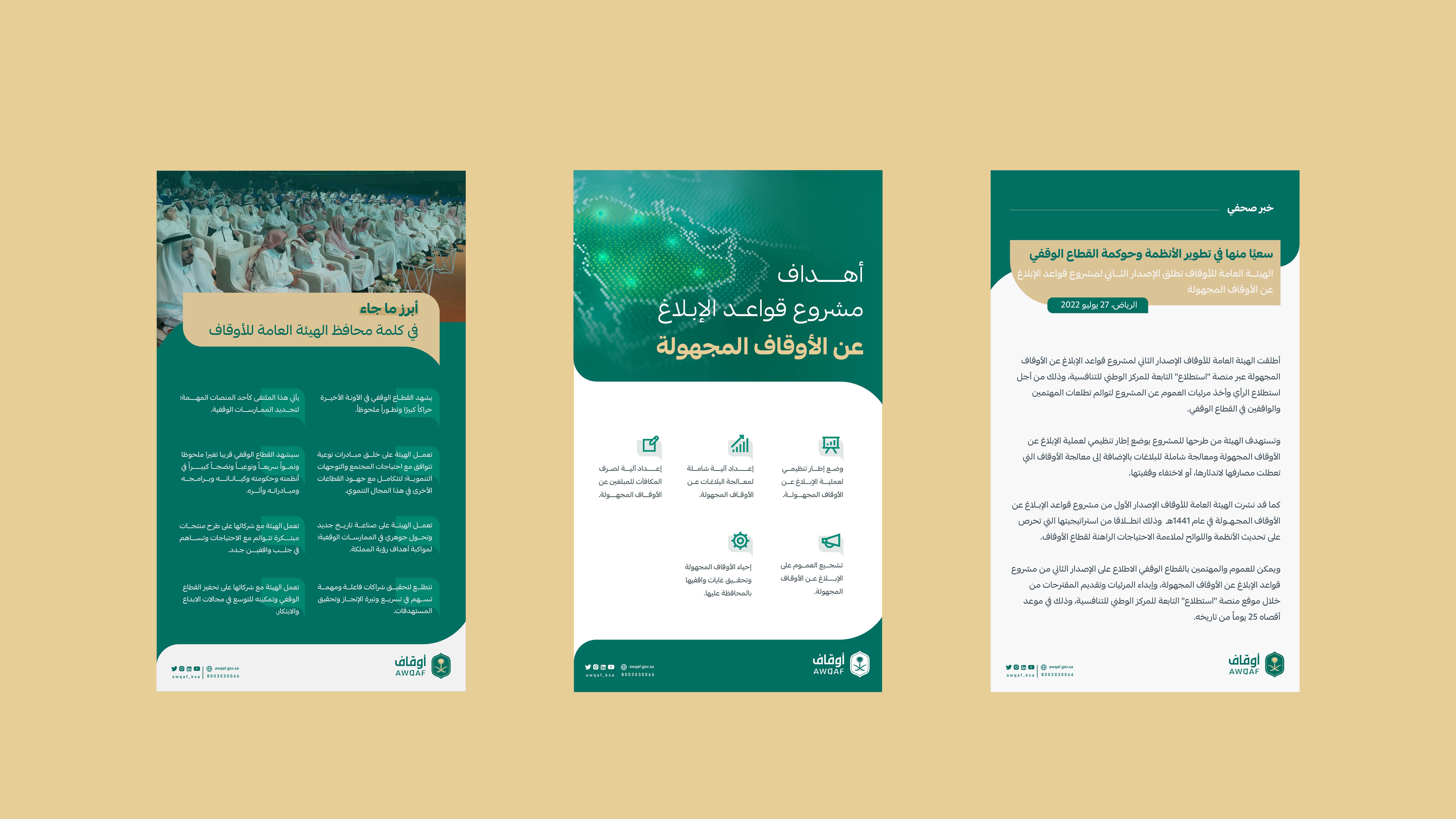
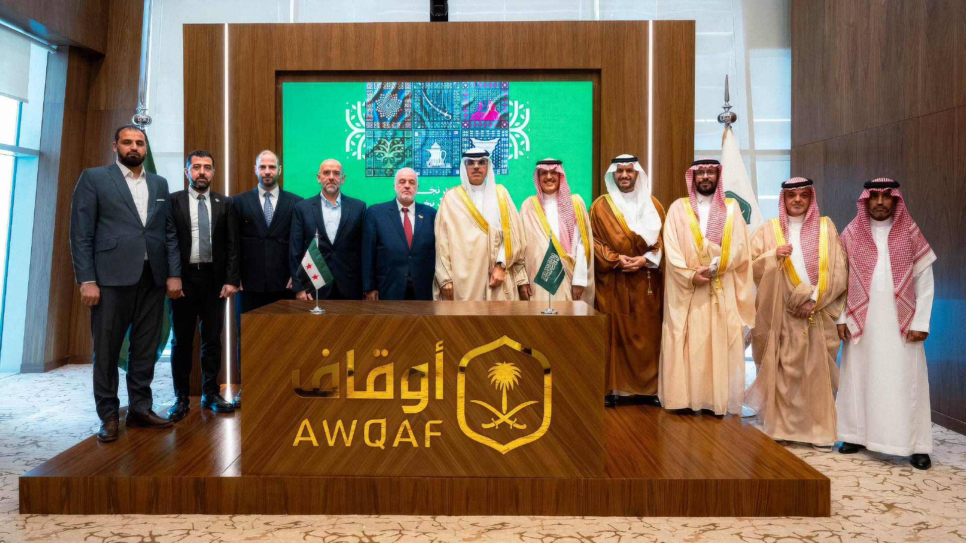
After defining the visual system, the identity extended across a range of applications that reflect the Authority’s presence across different environments. From digital content and corporate materials to signage and institutional spaces, the visual elements remained connected and consistent while adapting to different applications.
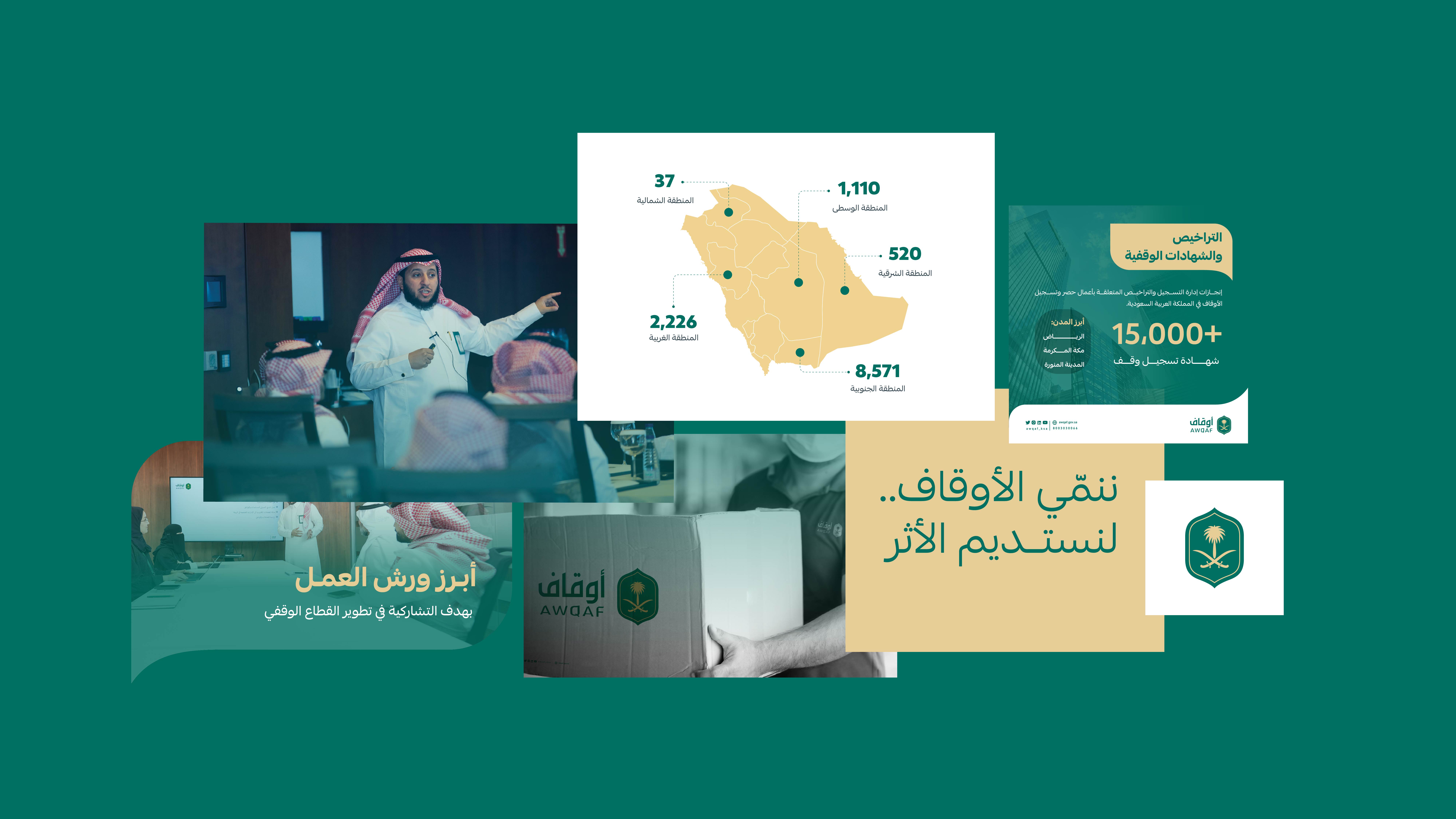
We reviewed the visual system across different applications, from the details of the logo and colors to printed and corporate materials. The focus was on maintaining the identity’s clarity and consistency, ensuring that its defining elements remain clear and adaptable across different contexts.
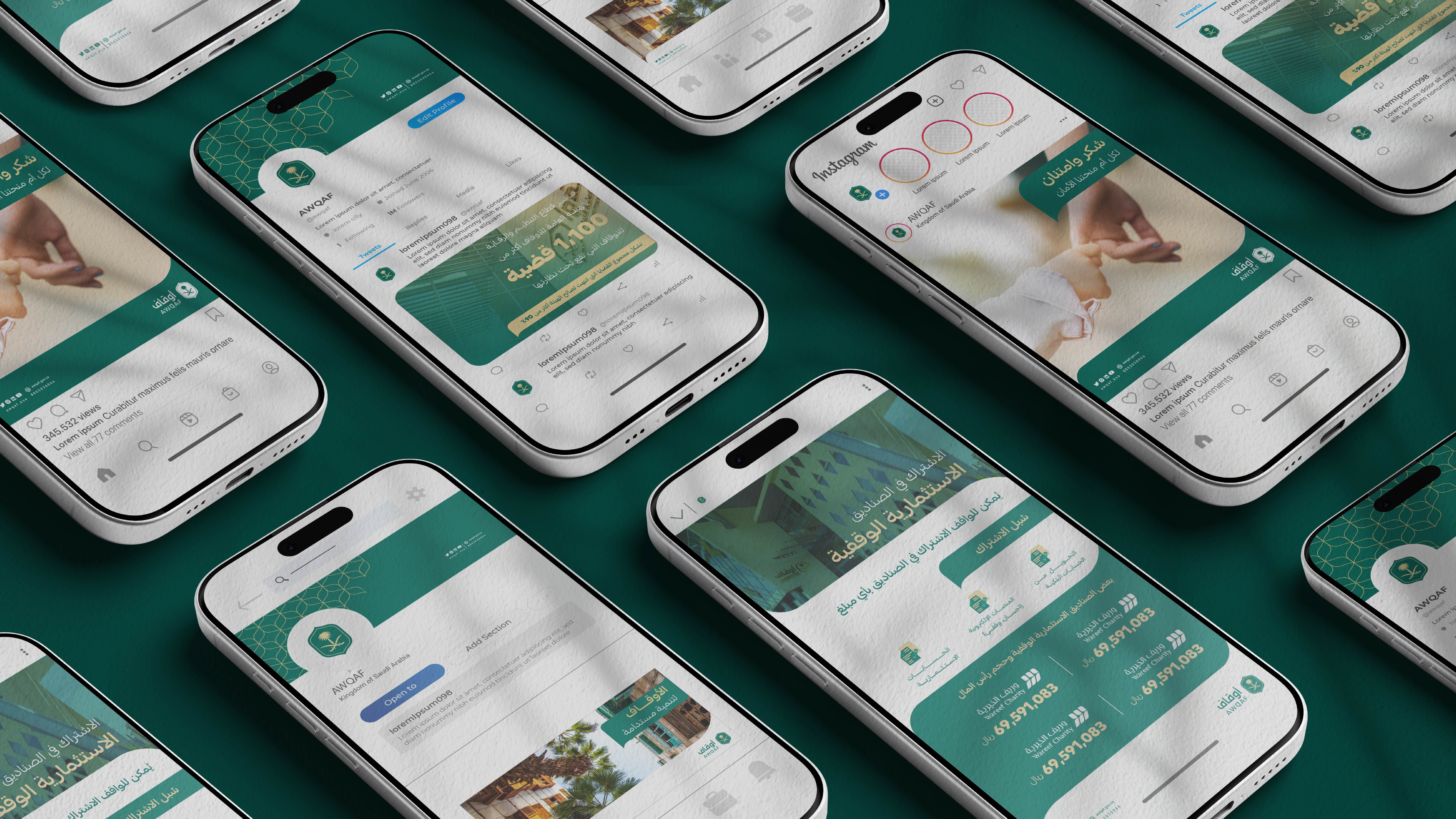
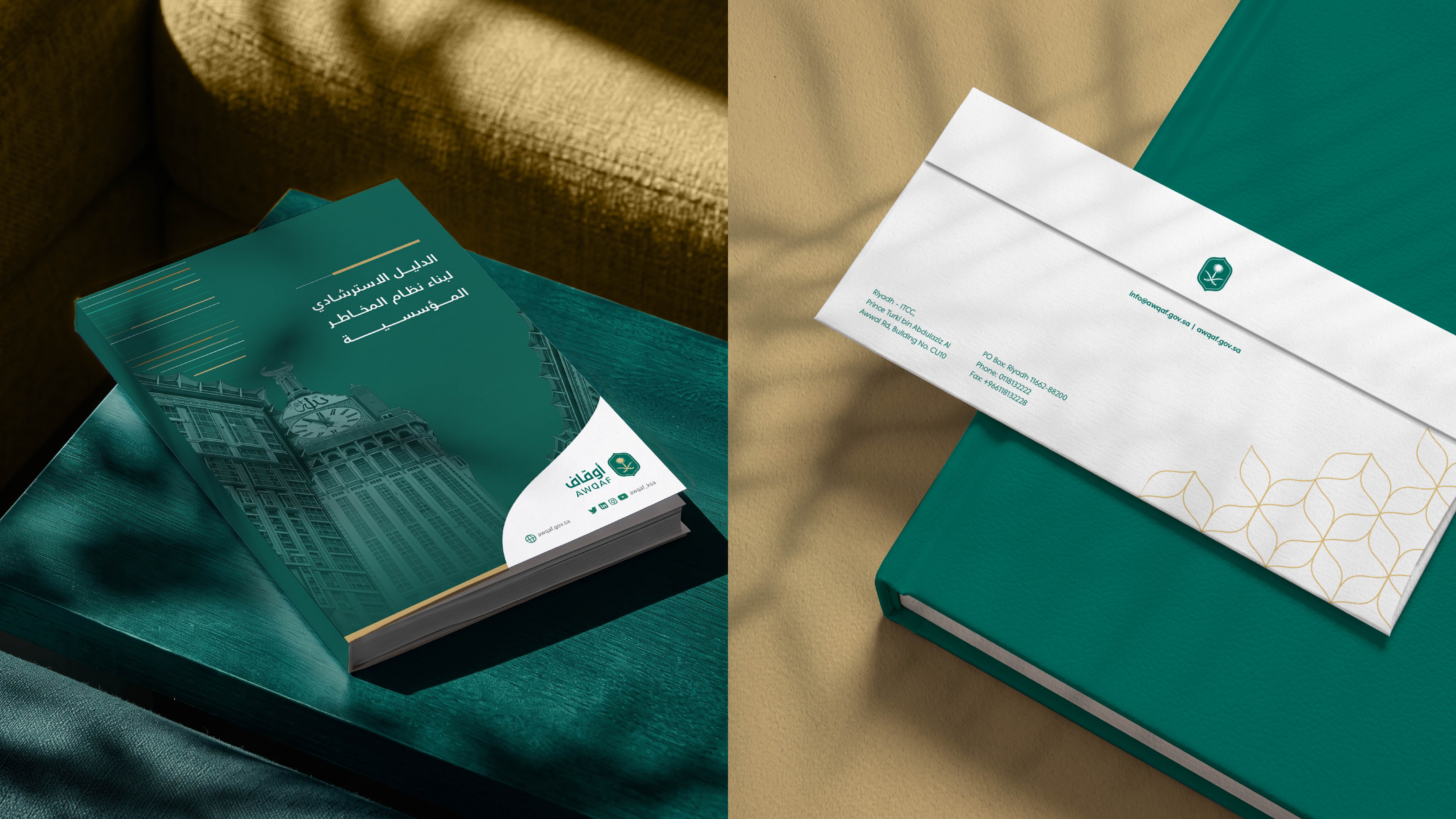



The idea was not simply to create a visual identity for an entity operating in the endowment sector, but to express a deeper meaning of giving: one that becomes a value preserved, an asset that grows, and an impact that endures.
From this perspective, the identity brings together the heritage of endowments and the spirit of sustainability through a visual language that extends across every touchpoint.