
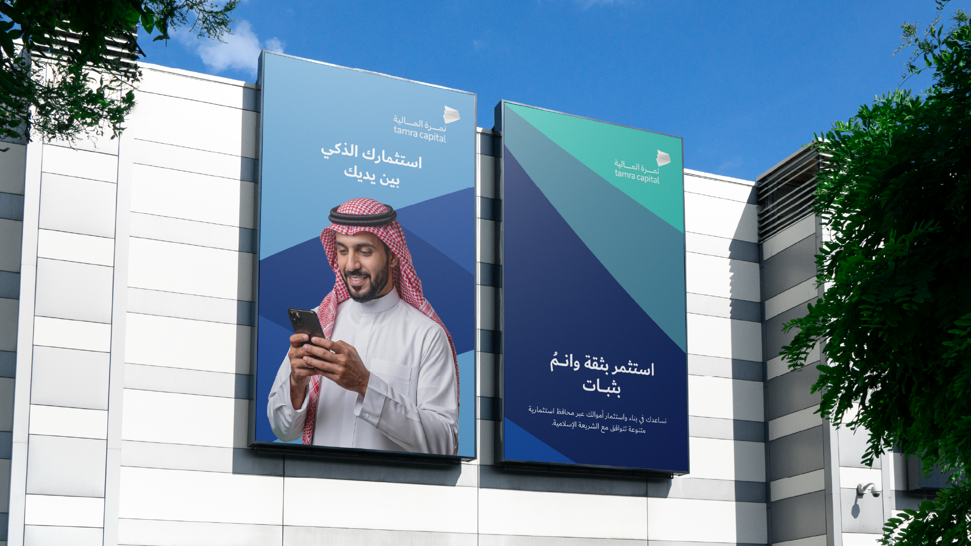
Tamra Capital is a Saudi investment company licensed by the Capital Market Authority, offering automated, Sharia-compliant investment services since 2021. Through its digital platform, it enables individuals to access diversified investment portfolios based on exchange-traded funds (ETFs). The identity was developed to support a simpler and clearer investment experience, speaking to individuals across different levels of experience while moving away from the complexity typically associated with the world of investing.
The challenge was to express investment and wealth in a way that does not feel complex or distant from the everyday user.
Tamra combines financial and technology services, so the identity needed to strike a balance between financial trust, digital simplicity, and a human, approachable feel.
The opportunity was to transform the idea of investing from a specialized concept into a clearer and more accessible experience.
Instead of speaking in complex financial language, the brand could make simplicity part of its personality, communicating the idea that Sharia-compliant investing can be accessible to everyone, regardless of their level of experience.


We began by understanding Tamra as a digital investment platform with a clear purpose: removing traditional barriers to investing and making wealth building simpler.
From there, the direction centered around one core idea:
Investing does not have to be complex to be trusted.
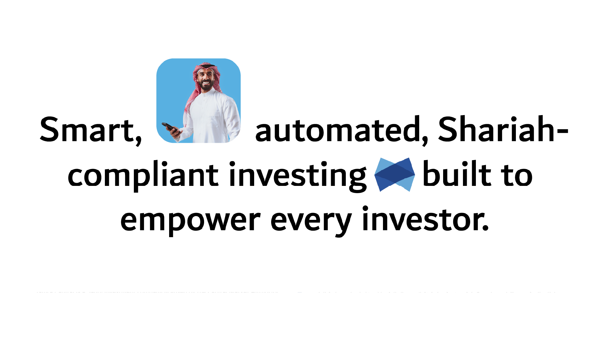
We translated the idea into a clear direction: a brand that is simple, modern, trustworthy, and approachable.
The goal was for Tamra to speak in a language that new investors can understand, without losing the credibility required in the financial sector.
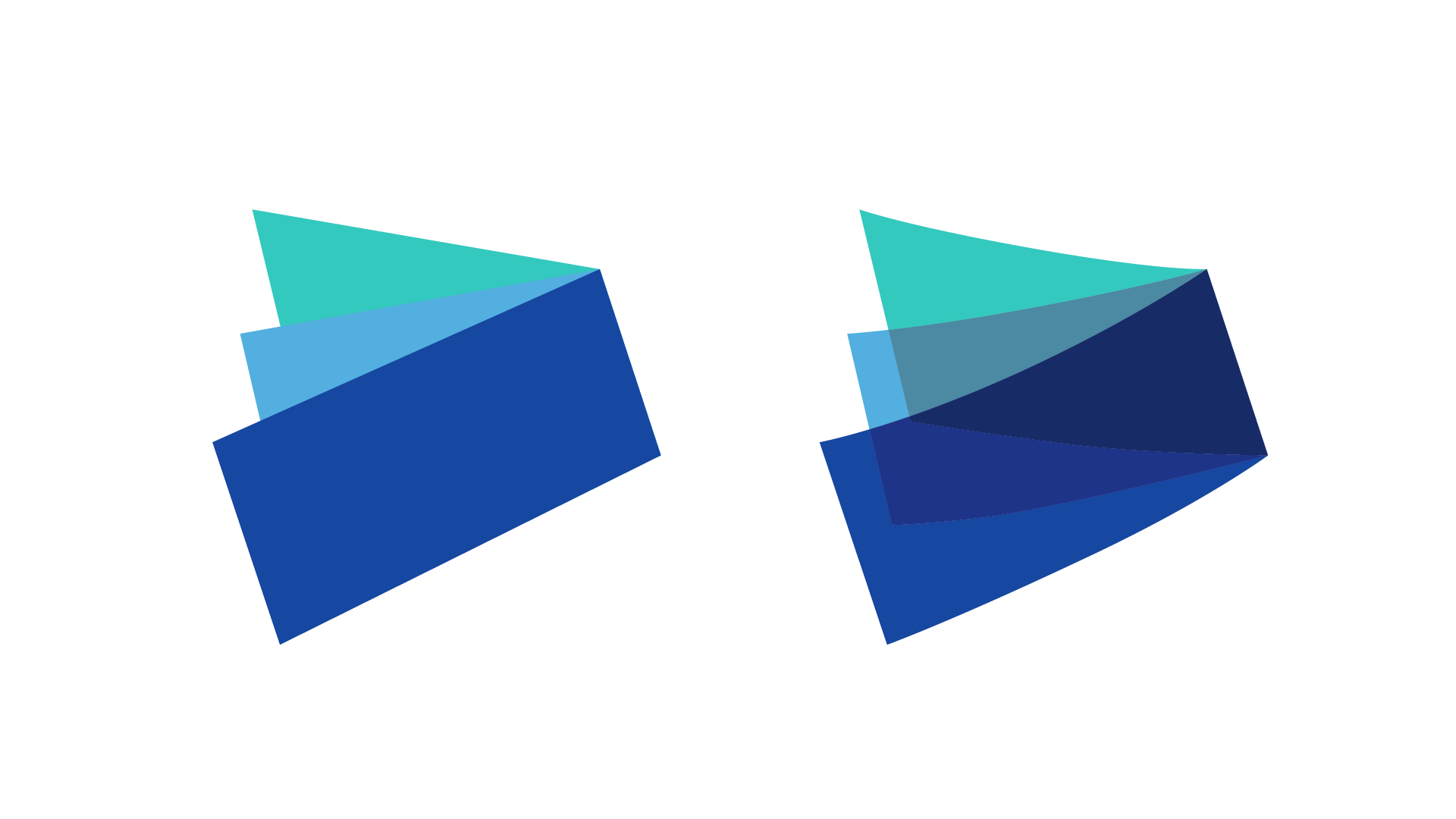
We drew inspiration for the symbol from elements directly associated with investment and growth, bringing them together in a single composition that reflects the diversity of opportunities and the building of wealth.

We developed the visual language around the principles of clarity and simplicity, with typography serving as a key element in shaping the brand’s personality.
This is reflected in the use of Dubai Medium as the primary typeface, giving the identity a clear and balanced presence across both Arabic and Latin scripts.

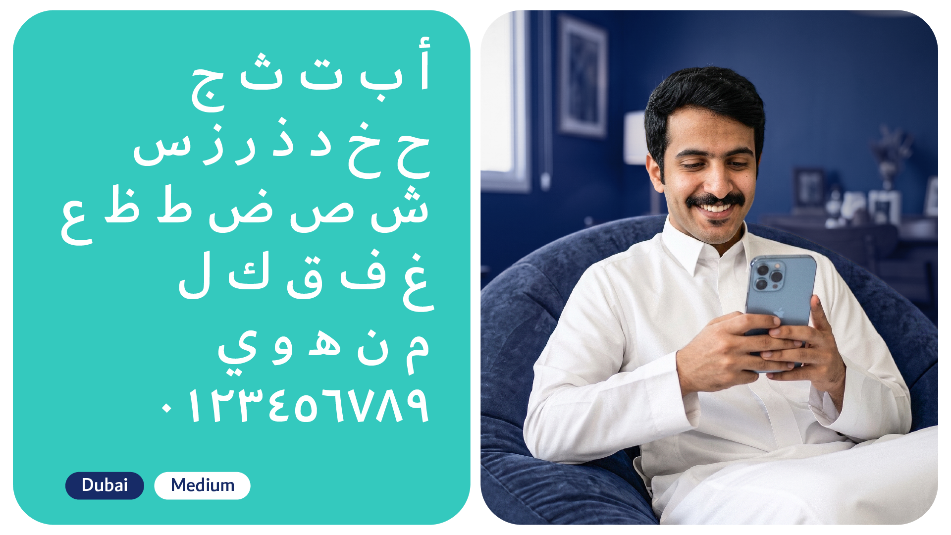
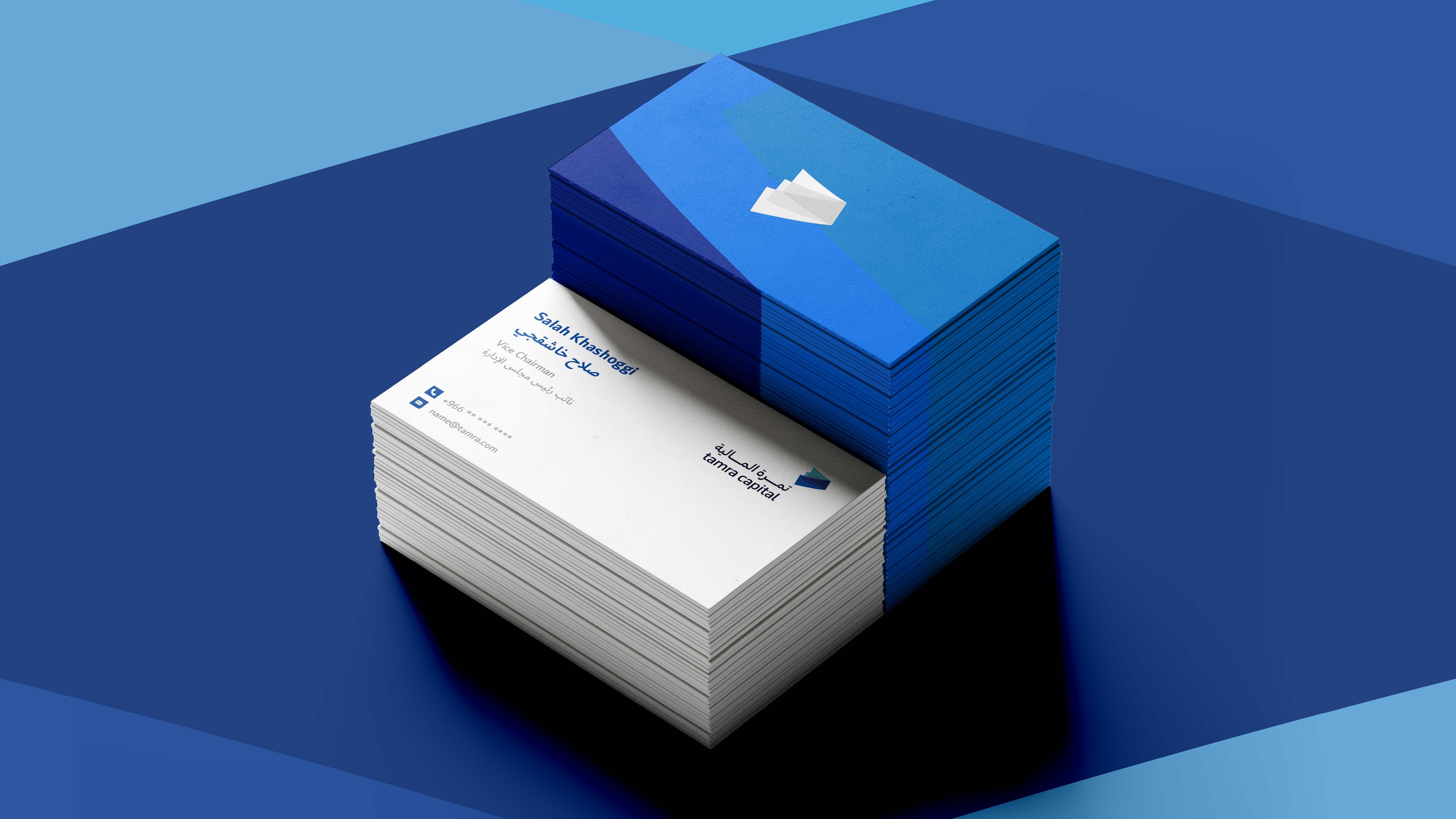
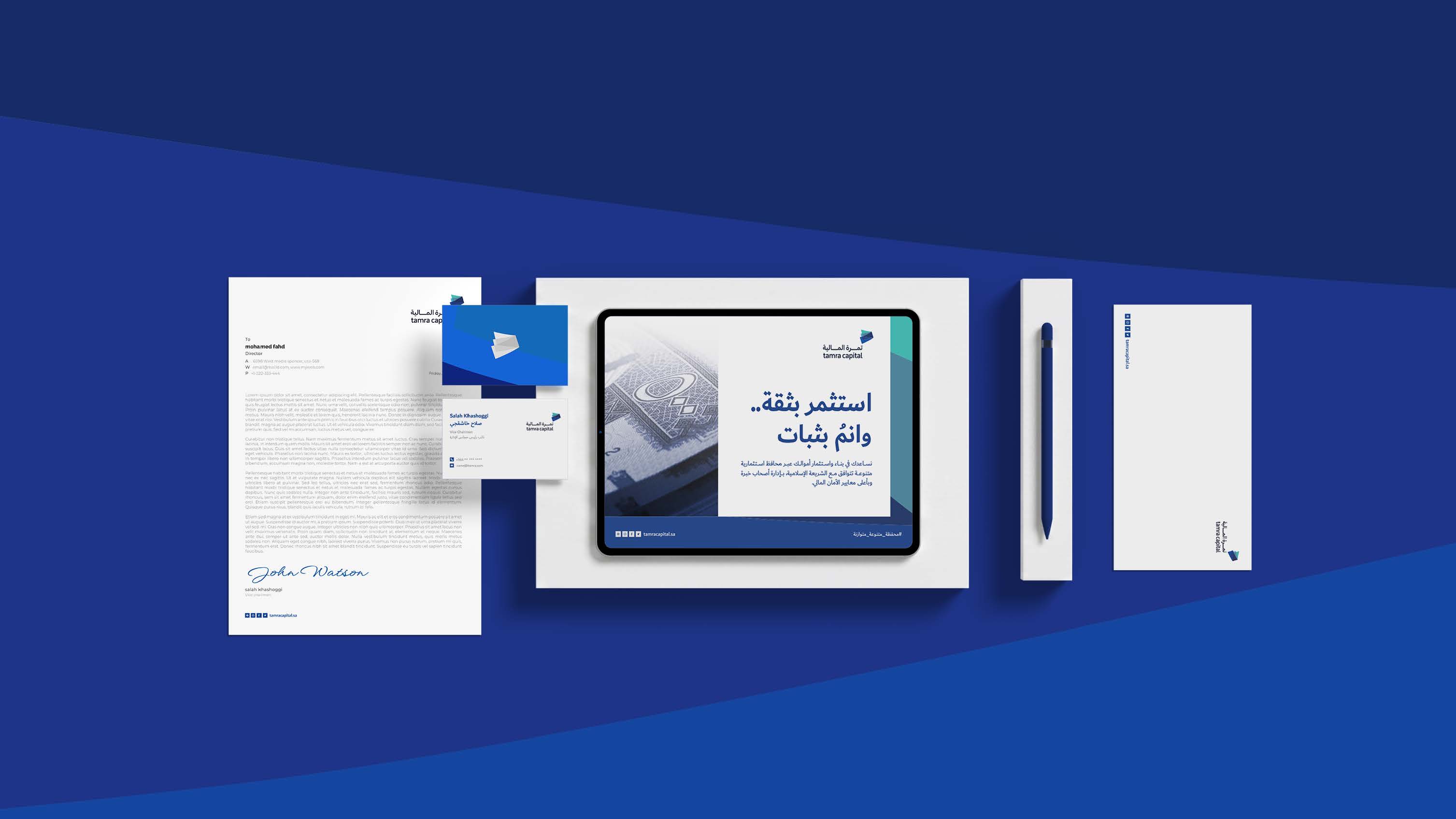
Once the language was established, we moved into building a complete visual system through typography and color, giving the brand a clear digital presence that could be applied across different touchpoints.
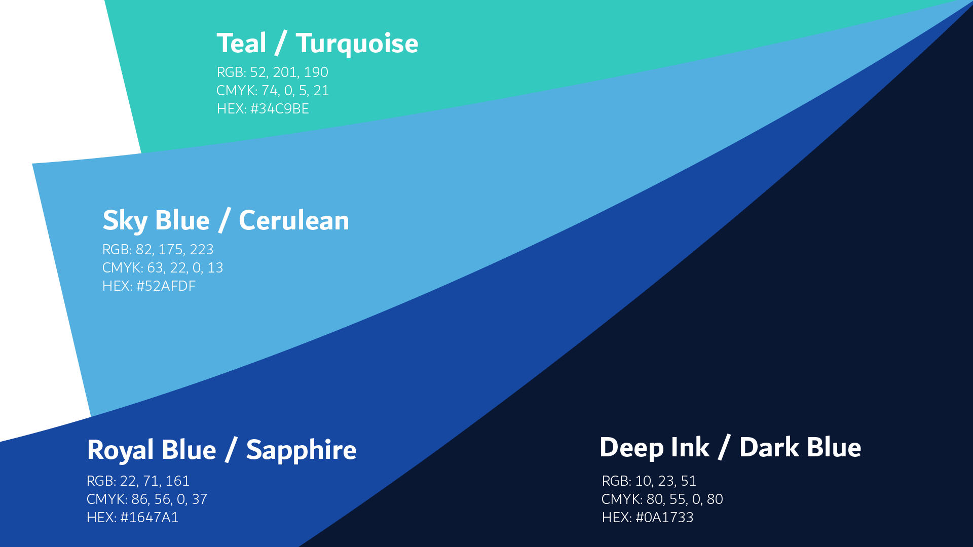
In the final stage, we refined the relationship between typography, colors, and visual elements to ensure a clear and consistent brand presence across different applications.
The result is an identity that brings together financial trust and digital simplicity, supporting Tamra’s promise to make investing more accessible to everyone.
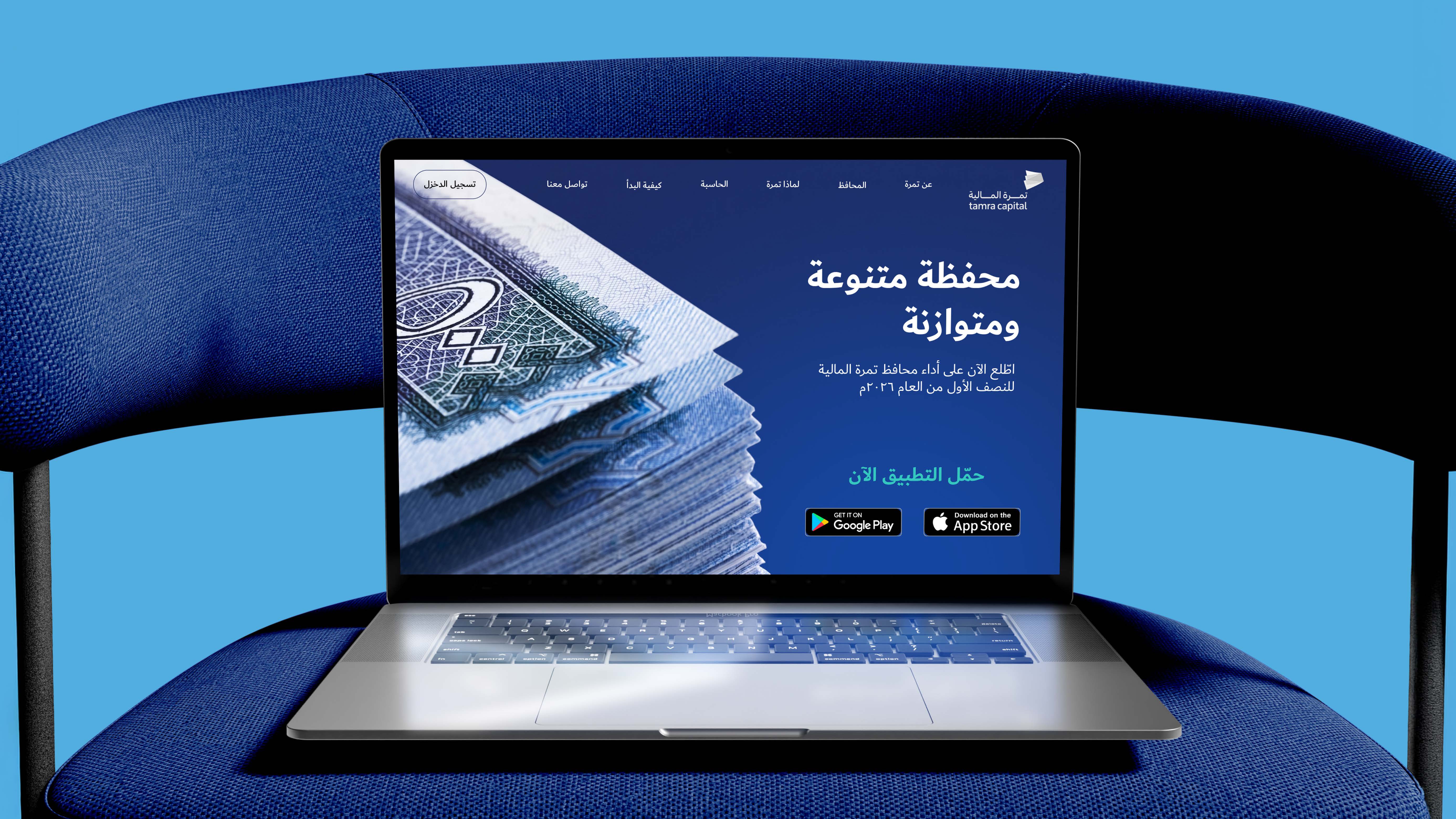
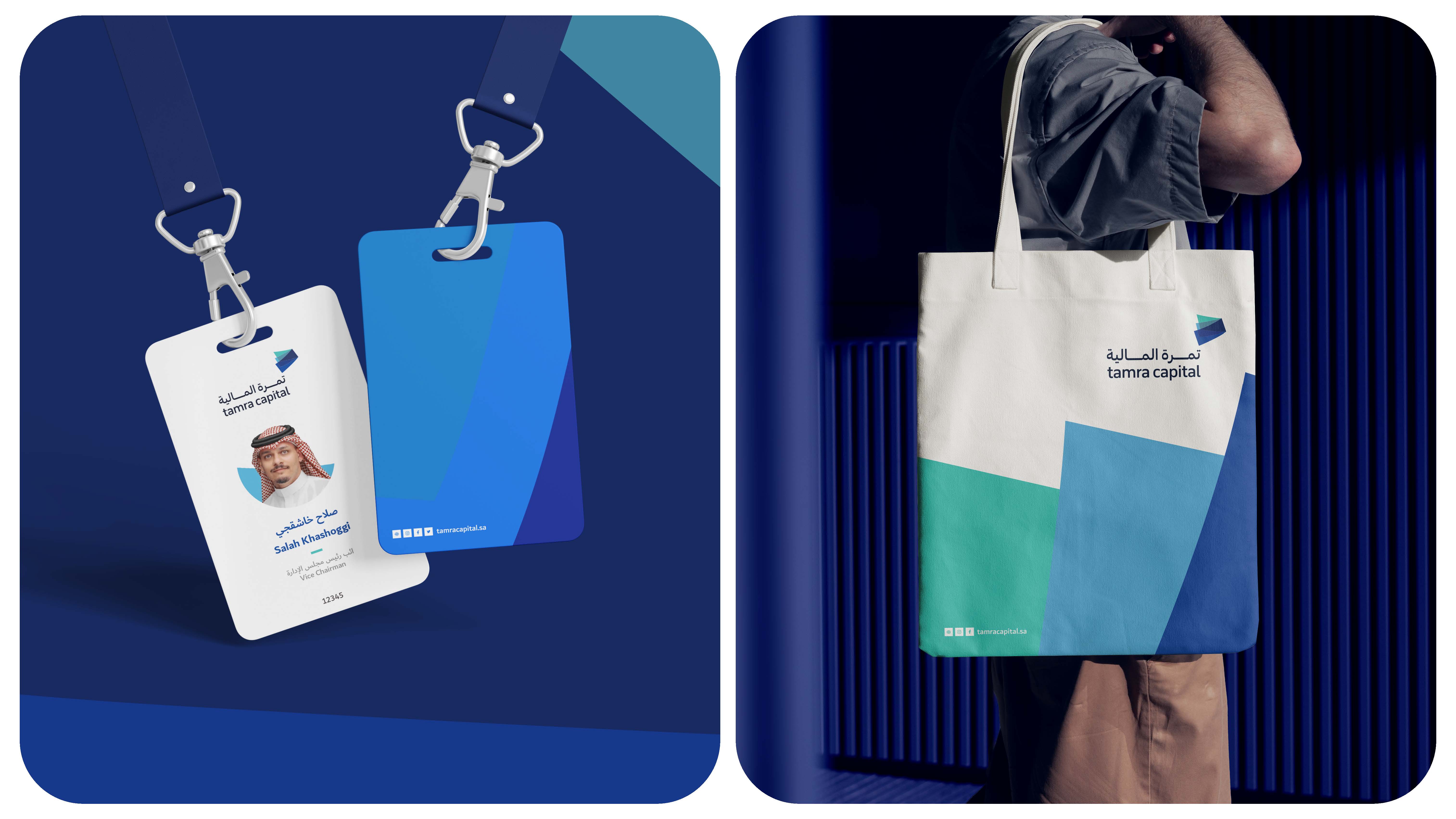
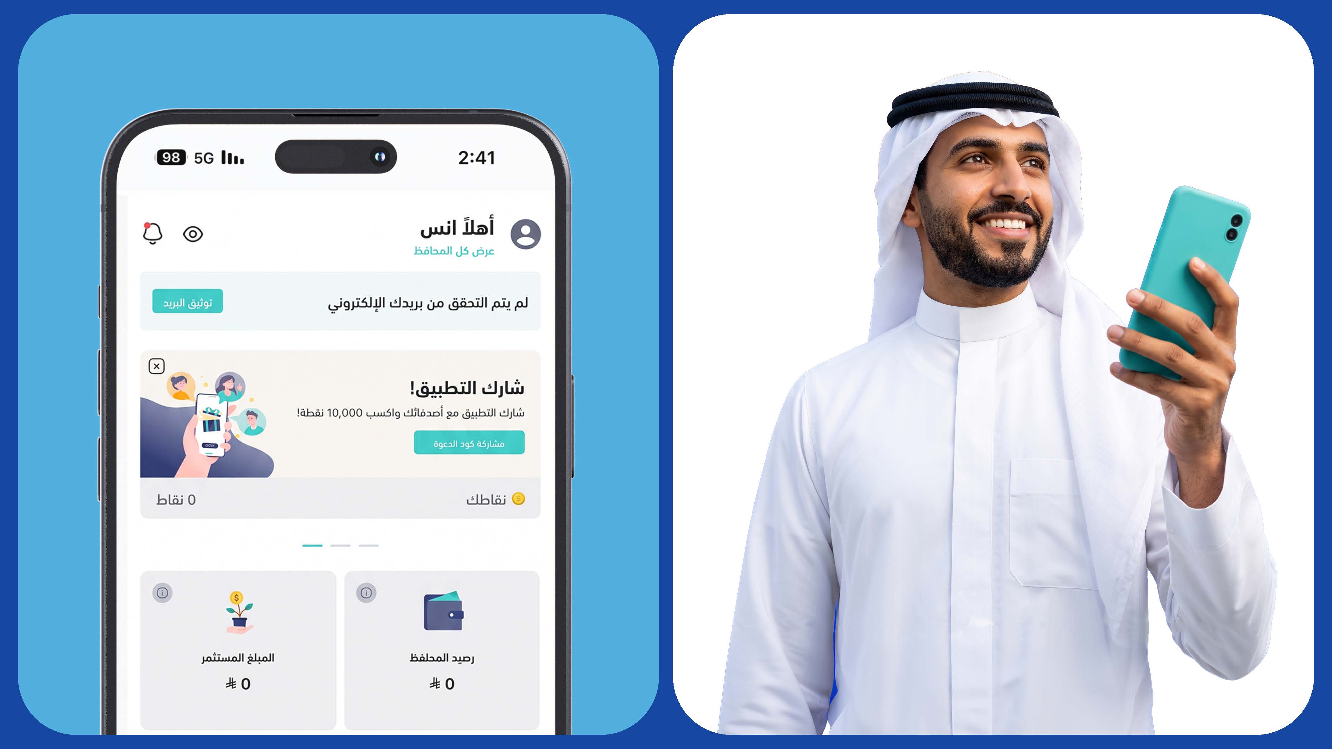
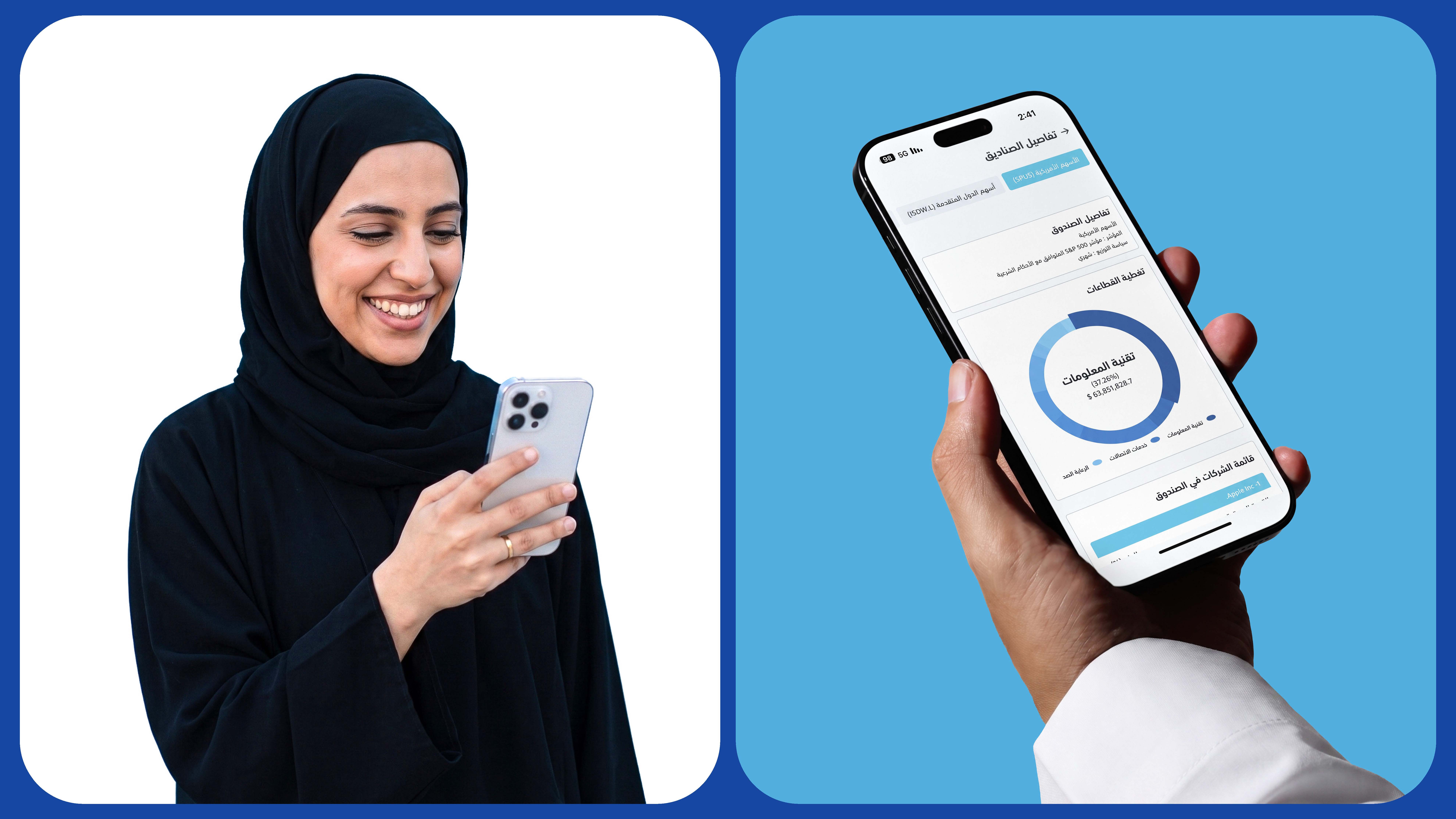
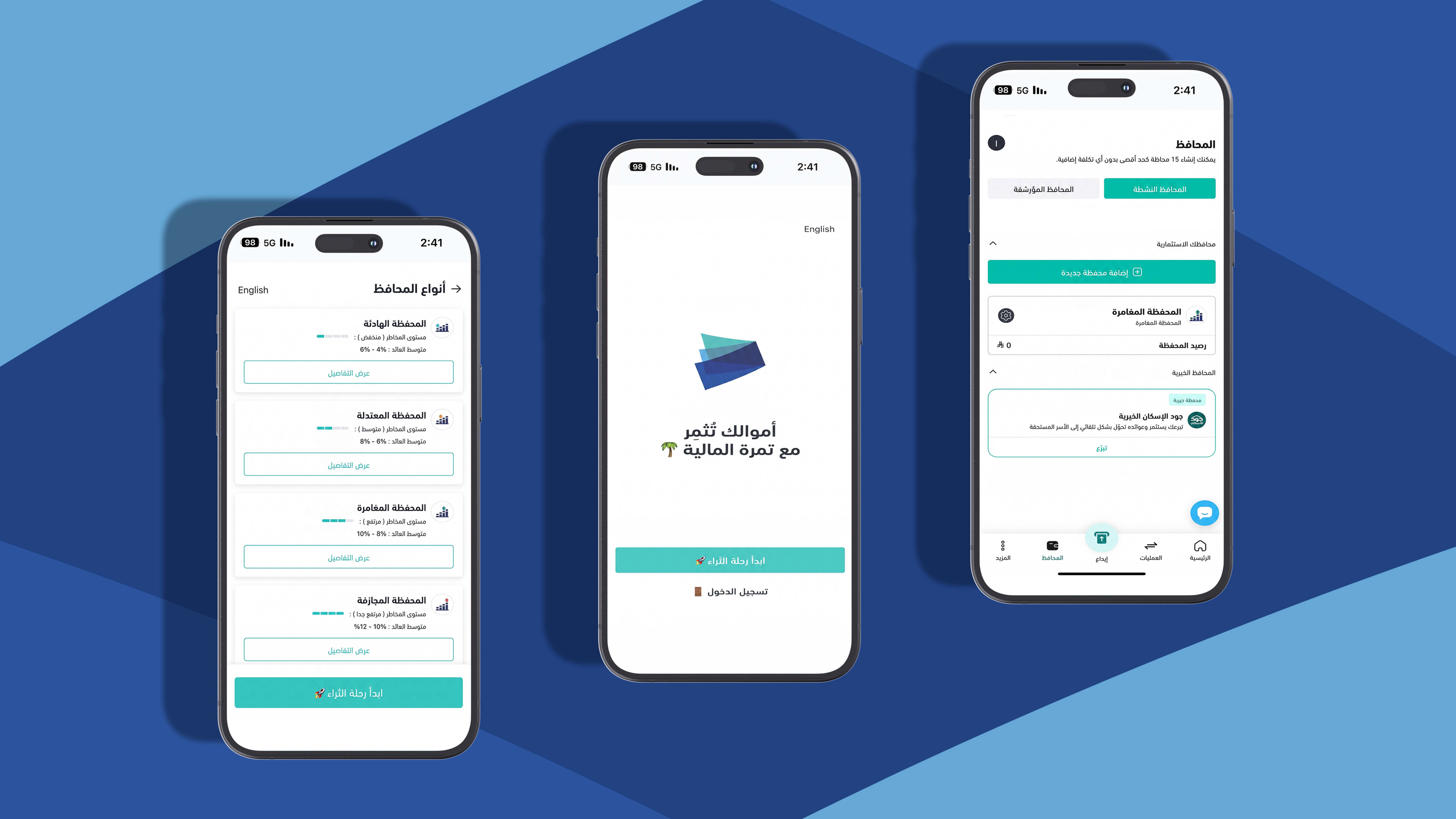
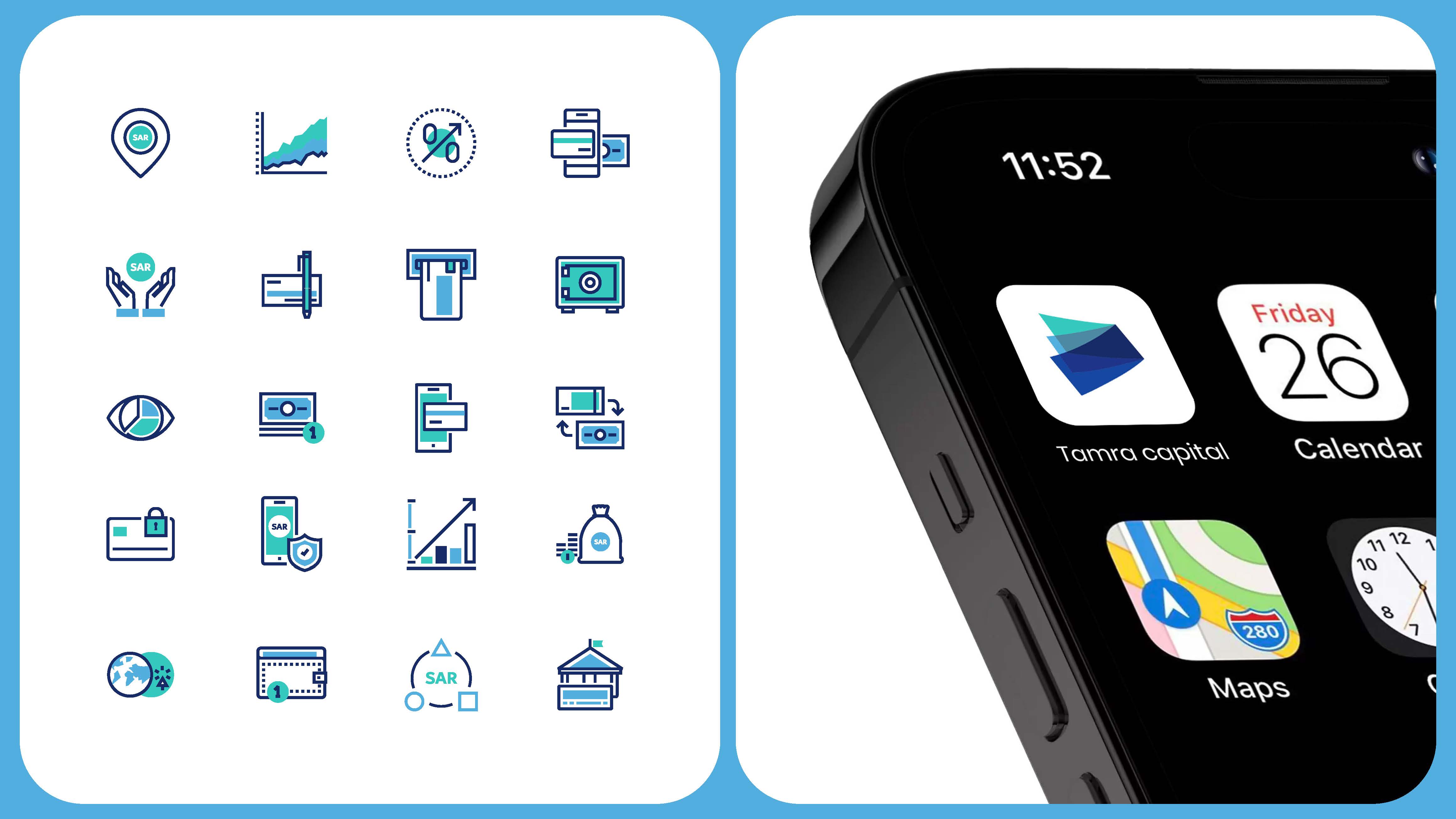
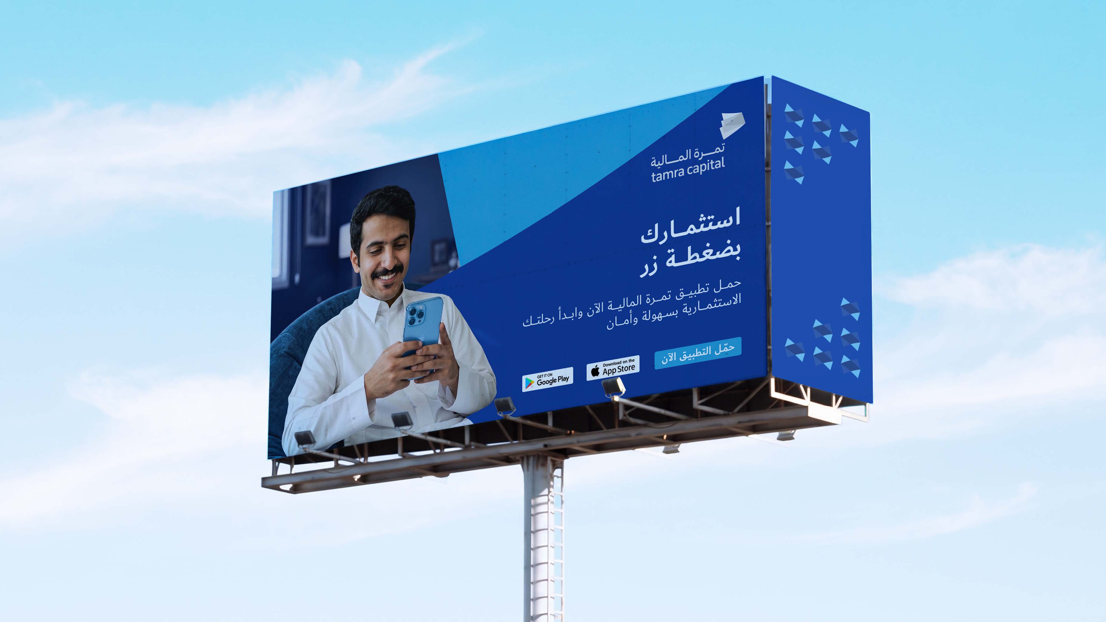
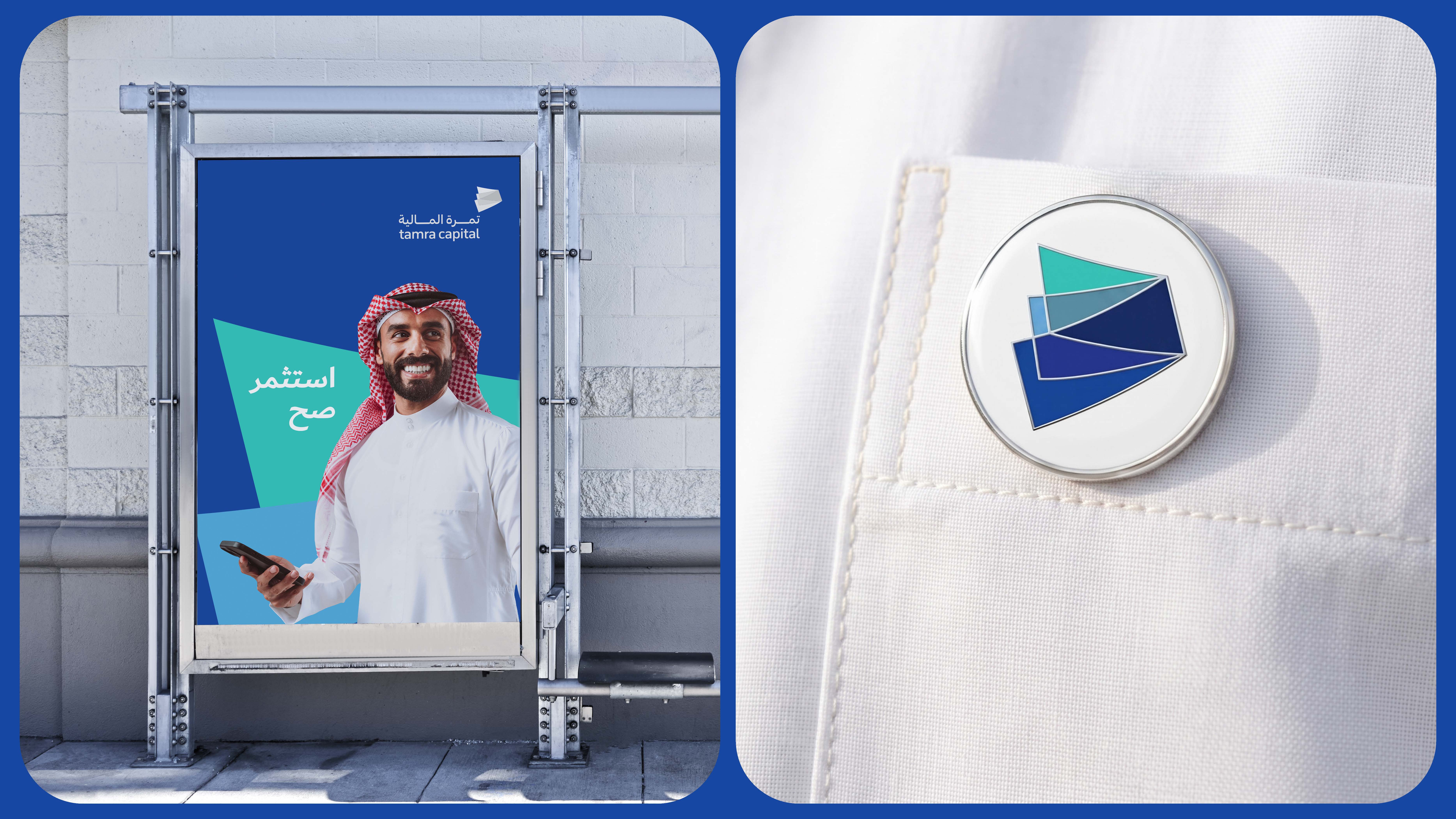
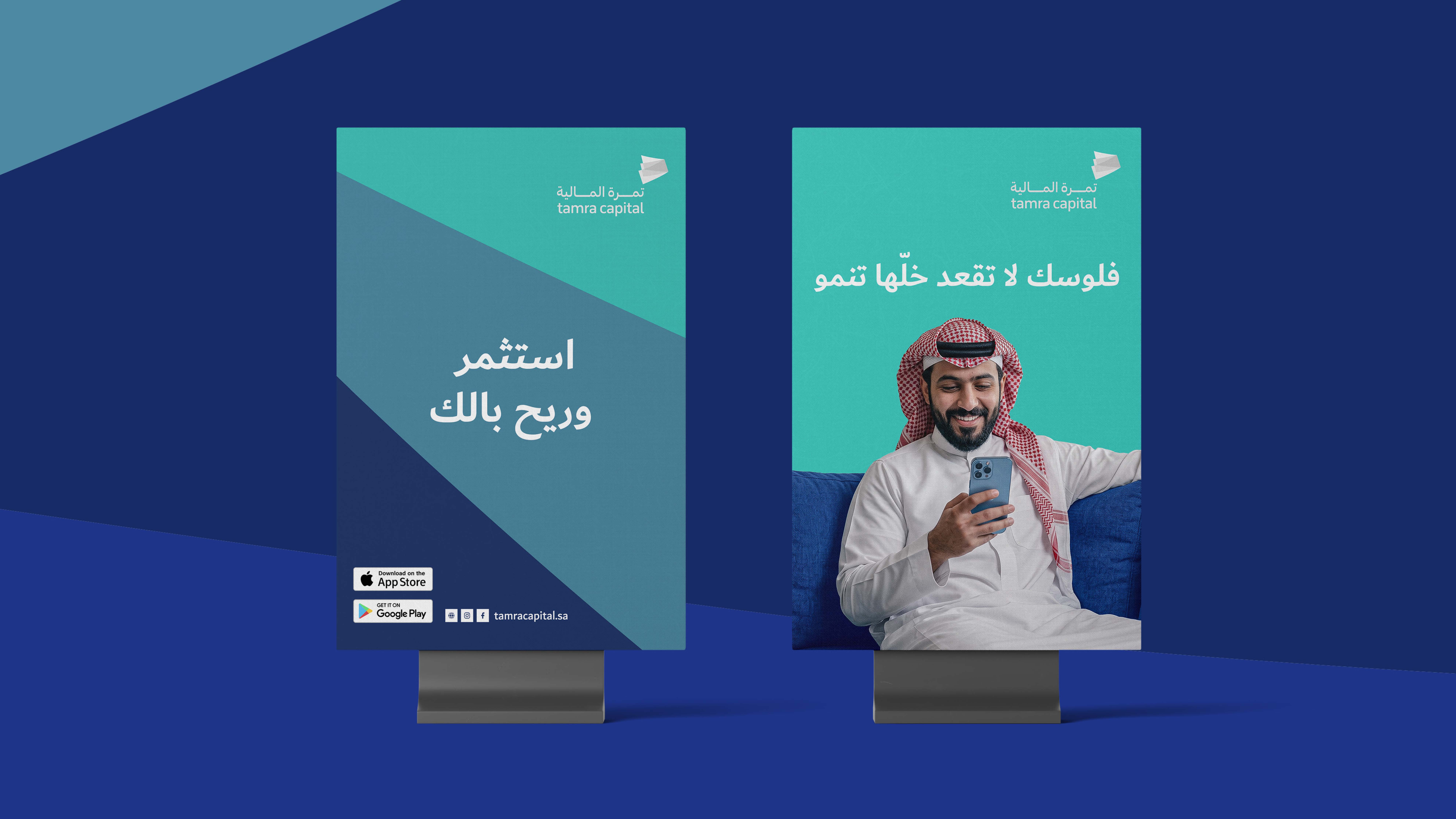
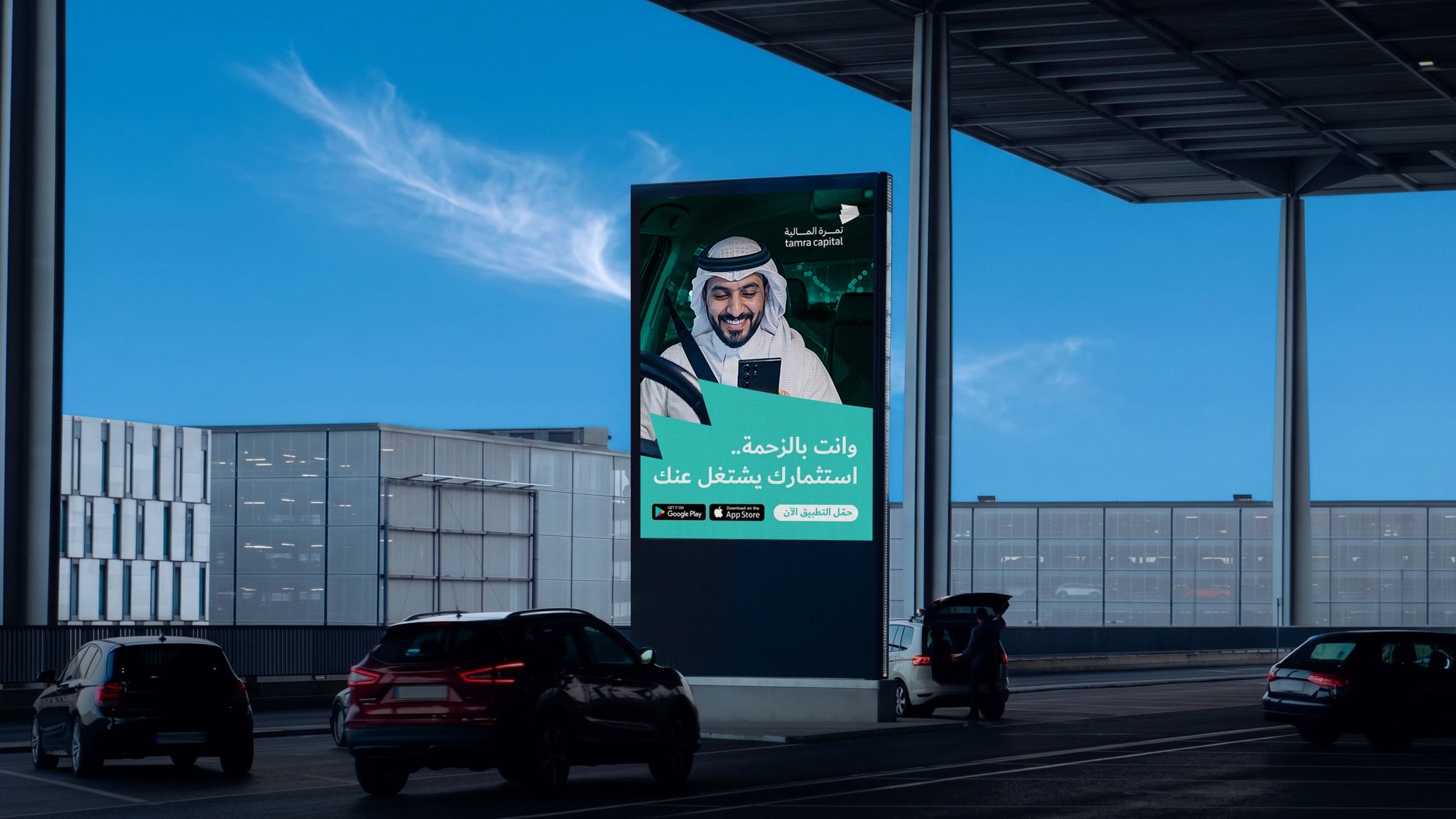
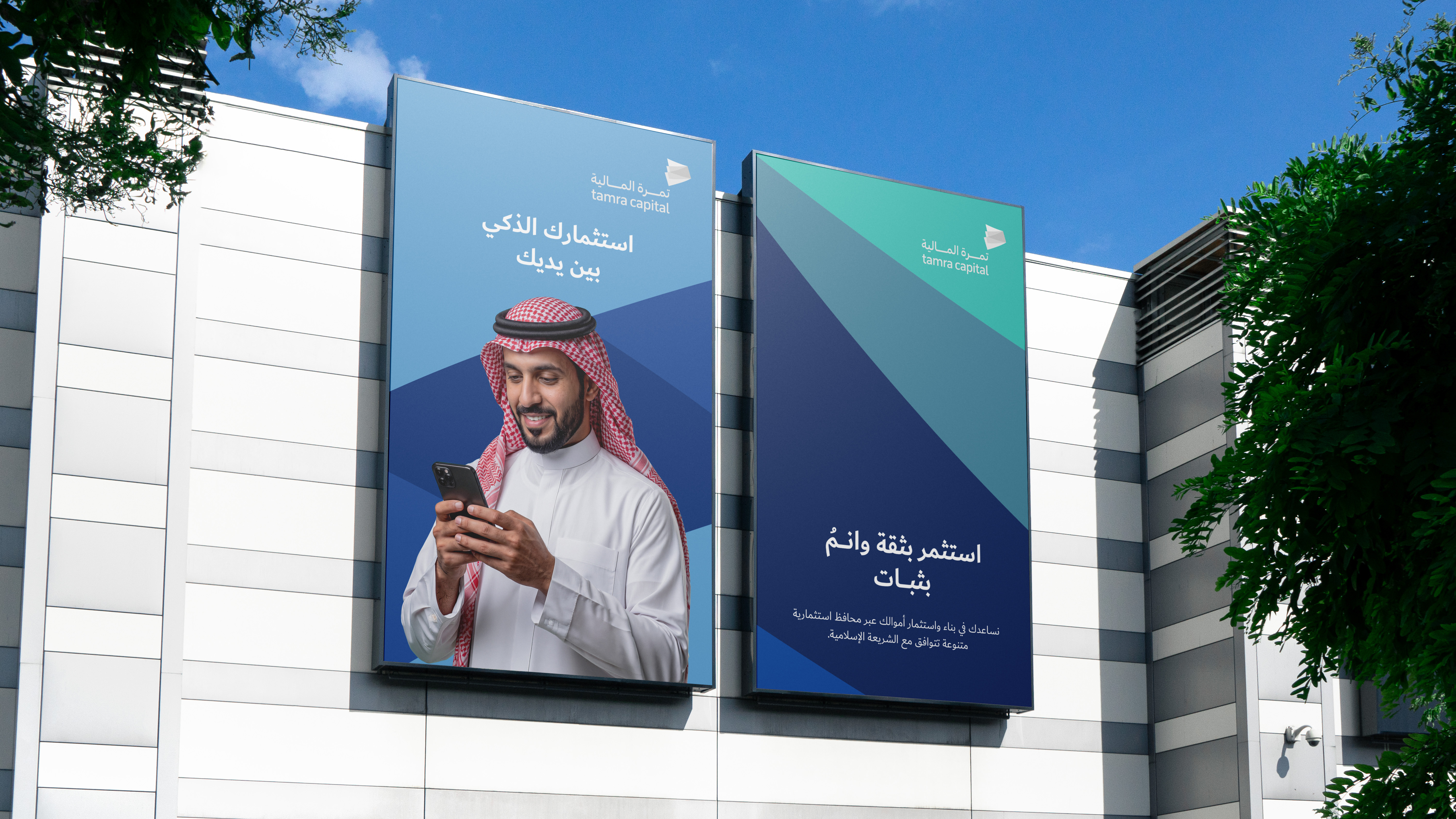
We transformed simplicity from a visual style into an integral part of the Tamra experience, making the identity more approachable, clearer, and more trustworthy.