
The General Authority for Survey and Geospatial Information is a government entity operating in the geospatial information and surveying sector. The project began as the Authority worked to strengthen its visual presence and establish a consistent way of presenting the brand across different touchpoints. Unit worked with the Authority to develop its visual identity and applications, building a clearer and more cohesive brand. The Authority’s work focuses on providing and regulating geospatial information and data, supporting a range of entities and sectors that rely on geographic and spatial data in their operations and decision-making.
The need was to create a visual presence that reflects the Authority’s nature and its role in surveying and geospatial information. The challenge was not limited to the logo itself, but to finding a visual language that connects data, location, and precision while clearly expressing the Authority’s personality without relying on traditional geographic symbols.
This required defining a concept capable of building a cohesive identity before moving into the design.
This stage presented an opportunity for the brand to redefine itself around the relationship between place and information. We could build a visual system that makes the Authority’s nature and role clearer, while giving the identity greater flexibility to extend across different platforms and applications.
We began by understanding GEOSA’s position and institutional presence, while identifying what needed to remain consistent and what could be developed. The project therefore started from a clear principle: evolving the identity without changing its essence.
The first phase of the project focused on understanding GEOSA’s existing brand and its role, along with reviewing how it was represented visually. It was important to me that the development felt like a natural extension of the existing identity, rather than a complete rebuild. I therefore focused initially on the brand’s core elements, preserving the official logo, primary colors, and institutional typefaces, while developing how these elements work together.
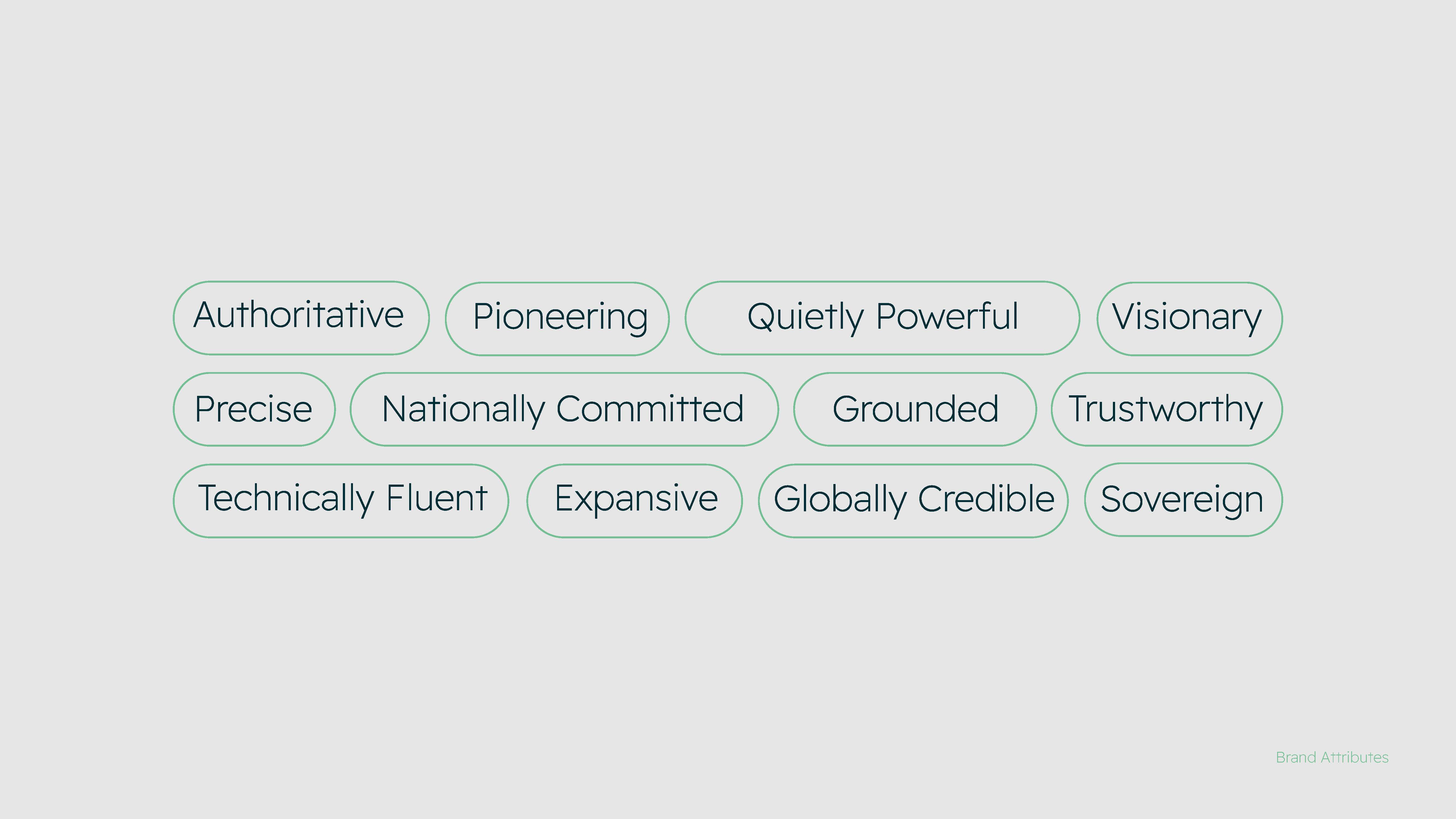
After understanding GEOSA’s identity, we defined the qualities we wanted its new presence to reflect: precision and reliability, quiet strength, leadership, and a forward-looking perspective.
After defining the brand personality, we turned to visual sources that reflect the nature of GEOSA—from layers of the earth and terrain to elements of Saudi identity.
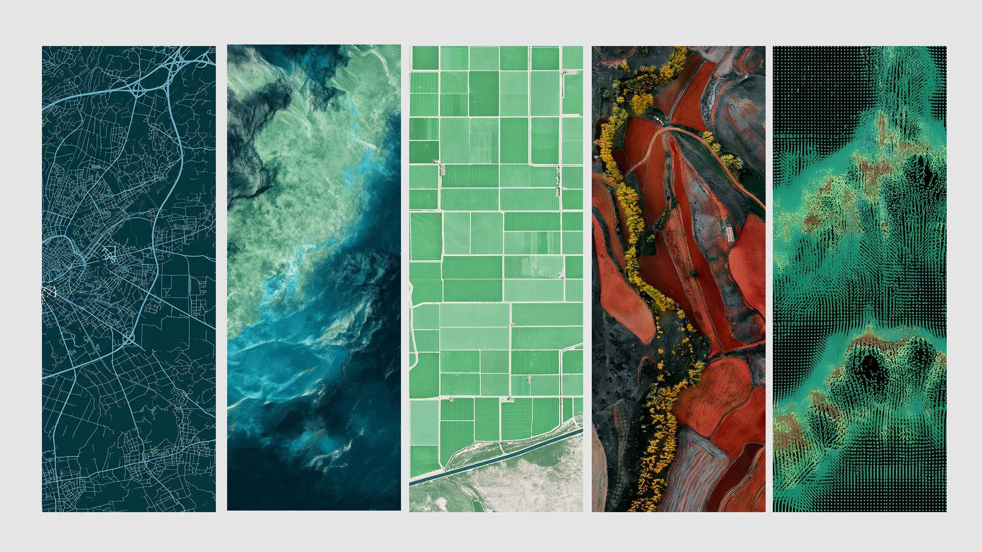
Layers of the earth, the crossed swords and the palm tree became sources of inspiration for understanding the symbol, while maps and geographic data provided a starting point for building a visual language more closely connected to the brand’s field.
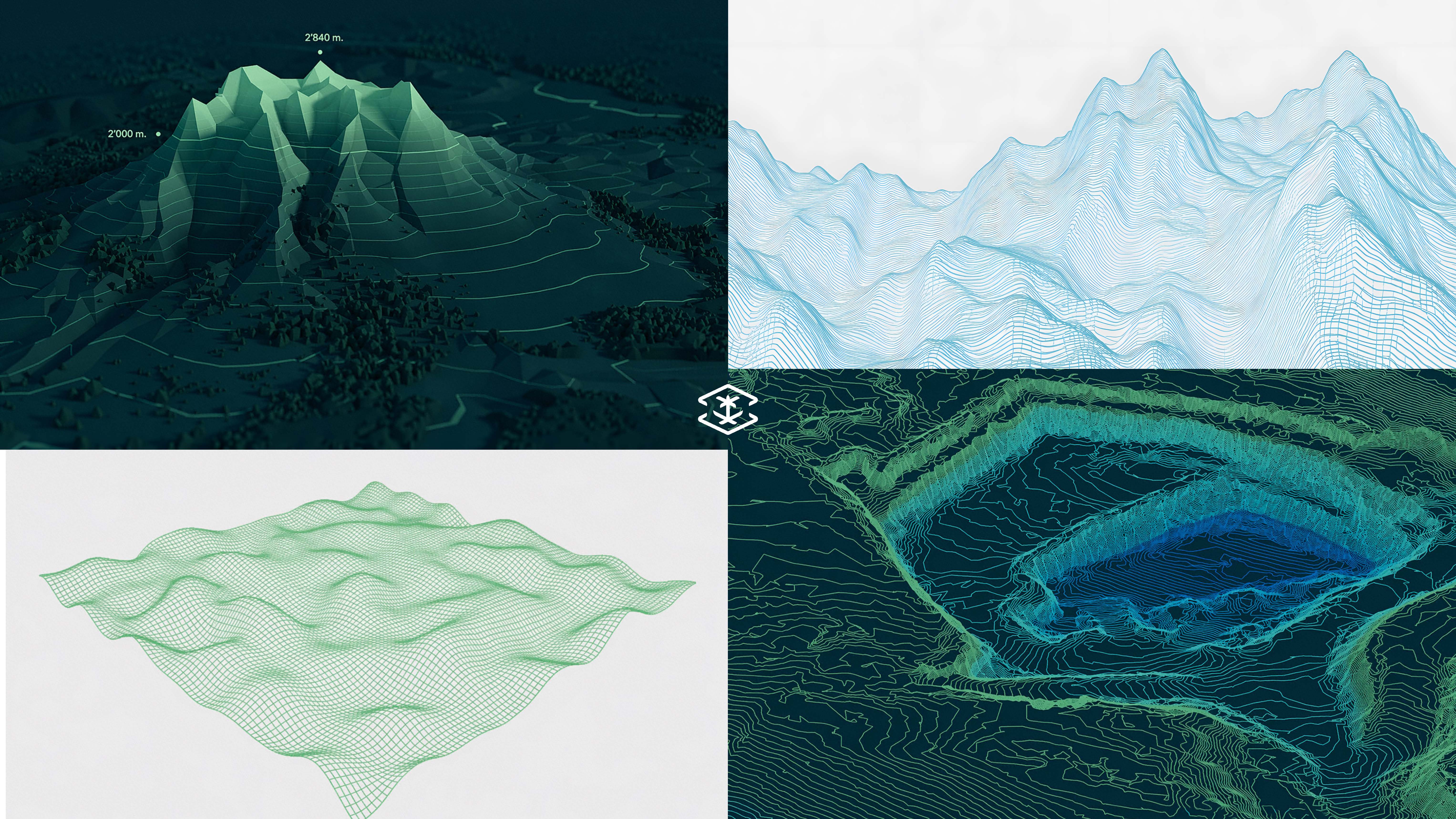
We translated the idea of earth layers and geospatial data into a flexible visual language, exploring different ways of building elements and compositions until we arrived at a system that reflects GEOSA’s precision and technical character while preserving its core identity.
We started with the brand’s core elements, transforming the earth layers, crossed swords, and palm tree into a more flexible visual language. We then developed the concept through lines and compositions inspired by maps and terrain, arriving at a visual system that reflects the technical and geographic nature of GEOSA.
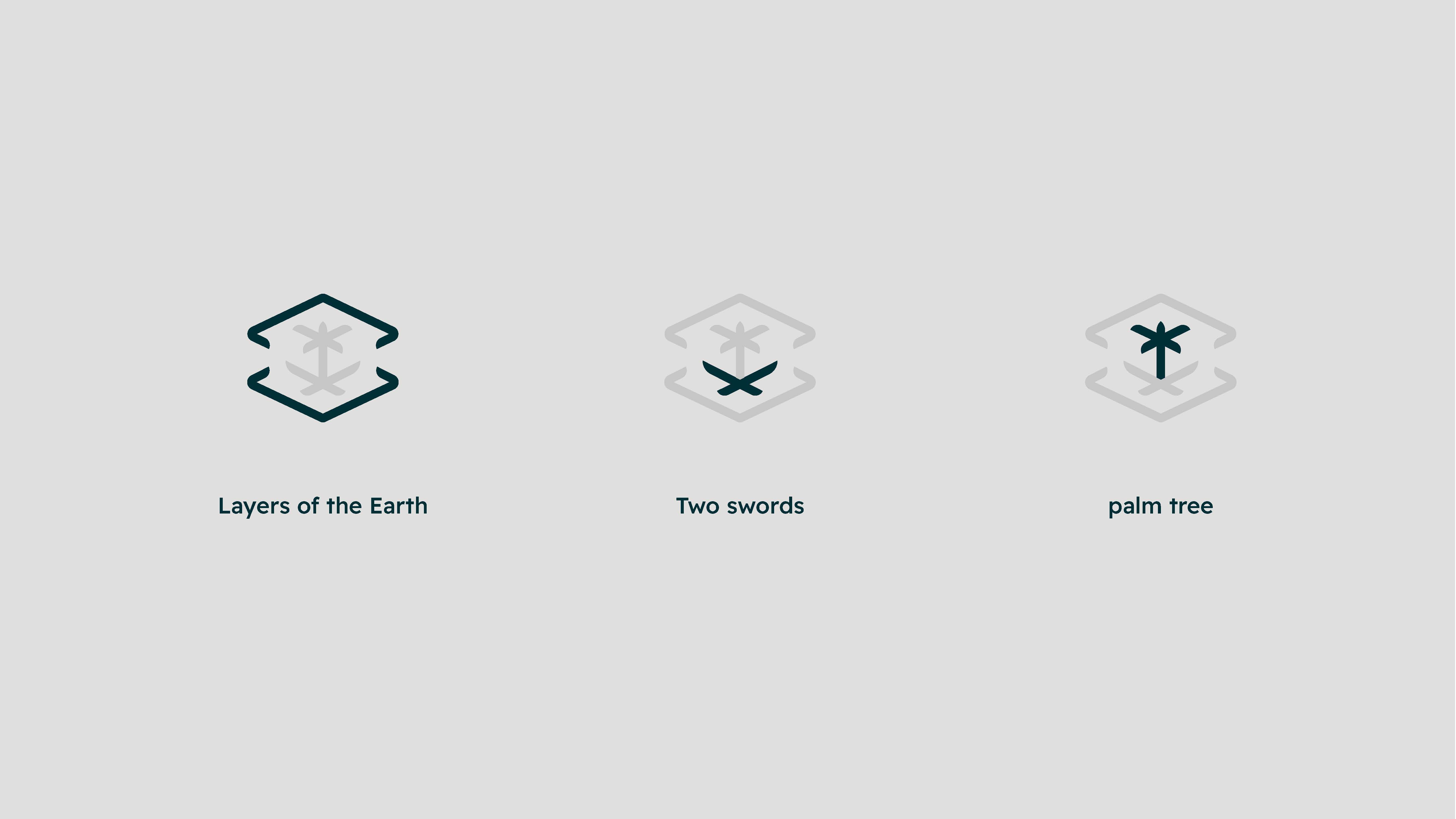
We moved from the concept into developing the visual system, where the symbol appears within a precise geometric grid, and this language extends into lines, paths, and compositions inspired by maps and terrain.
The symbol thus became part of a larger system, capable of expressing geospatial data in multiple ways without losing the brand’s character.

We reviewed the visual system and ensured consistency and cohesion across its elements, from the symbol and typography to the colors and compositions. We then refined the final details to achieve a clear and flexible identity that preserves the essence of GEOSA while supporting its digital presence.
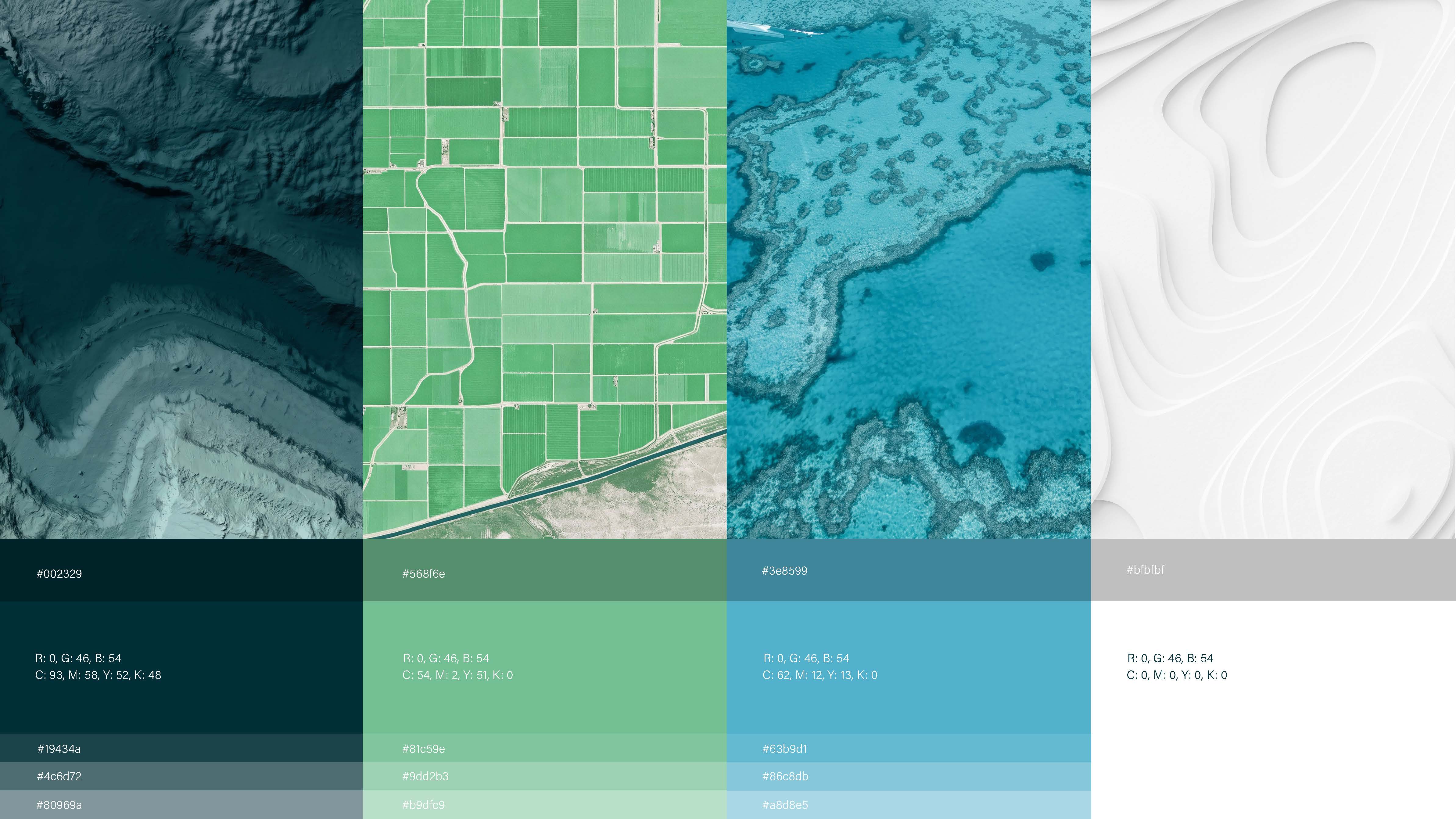
In the final stage, the visual system evolved into a complete framework that extends from small institutional details to larger-scale applications.
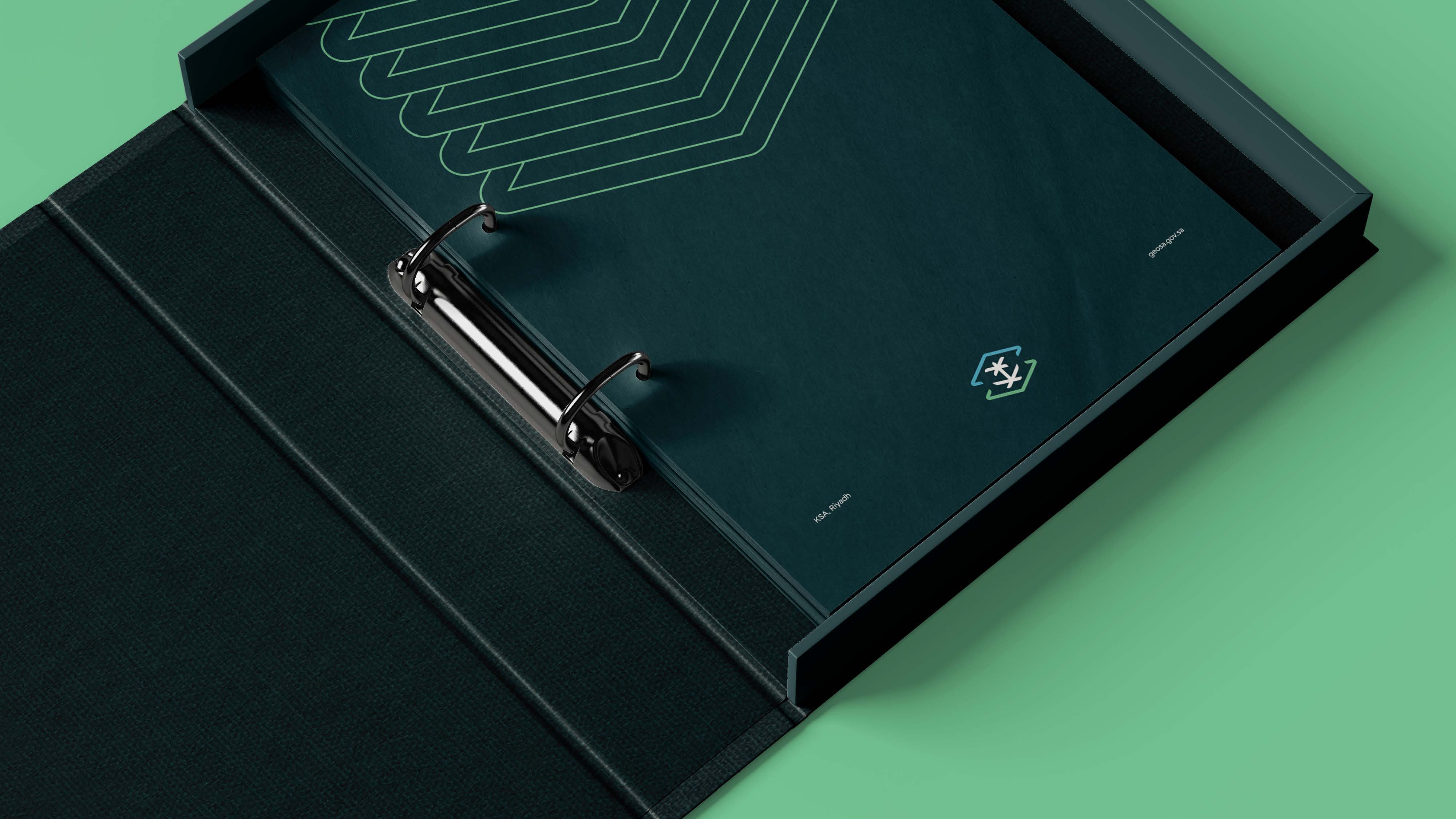
From business cards and stationery to corporate folders and gifts, and then across digital presence and vehicles, the visual elements remained interconnected, maintaining a consistent brand personality throughout.
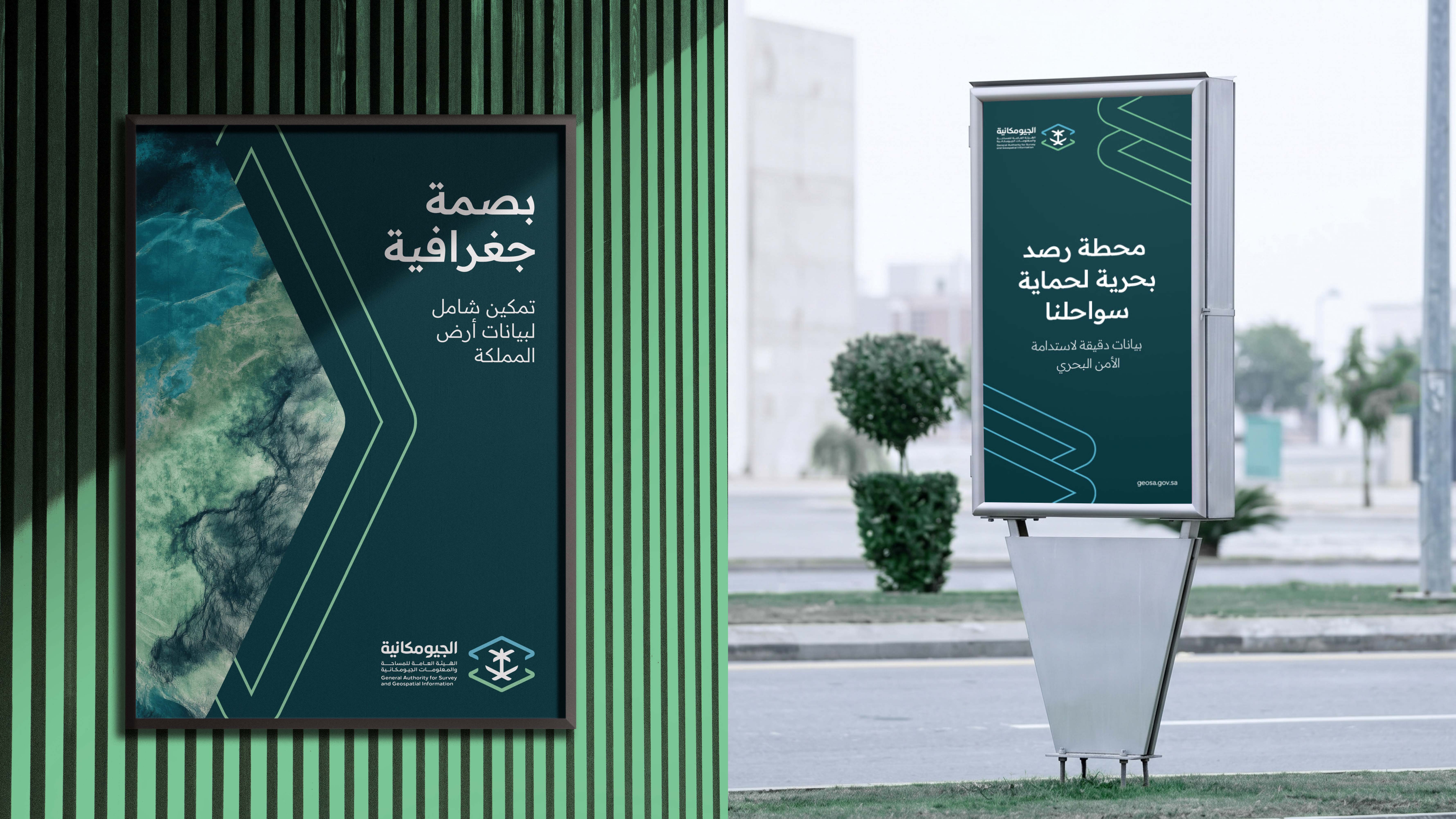

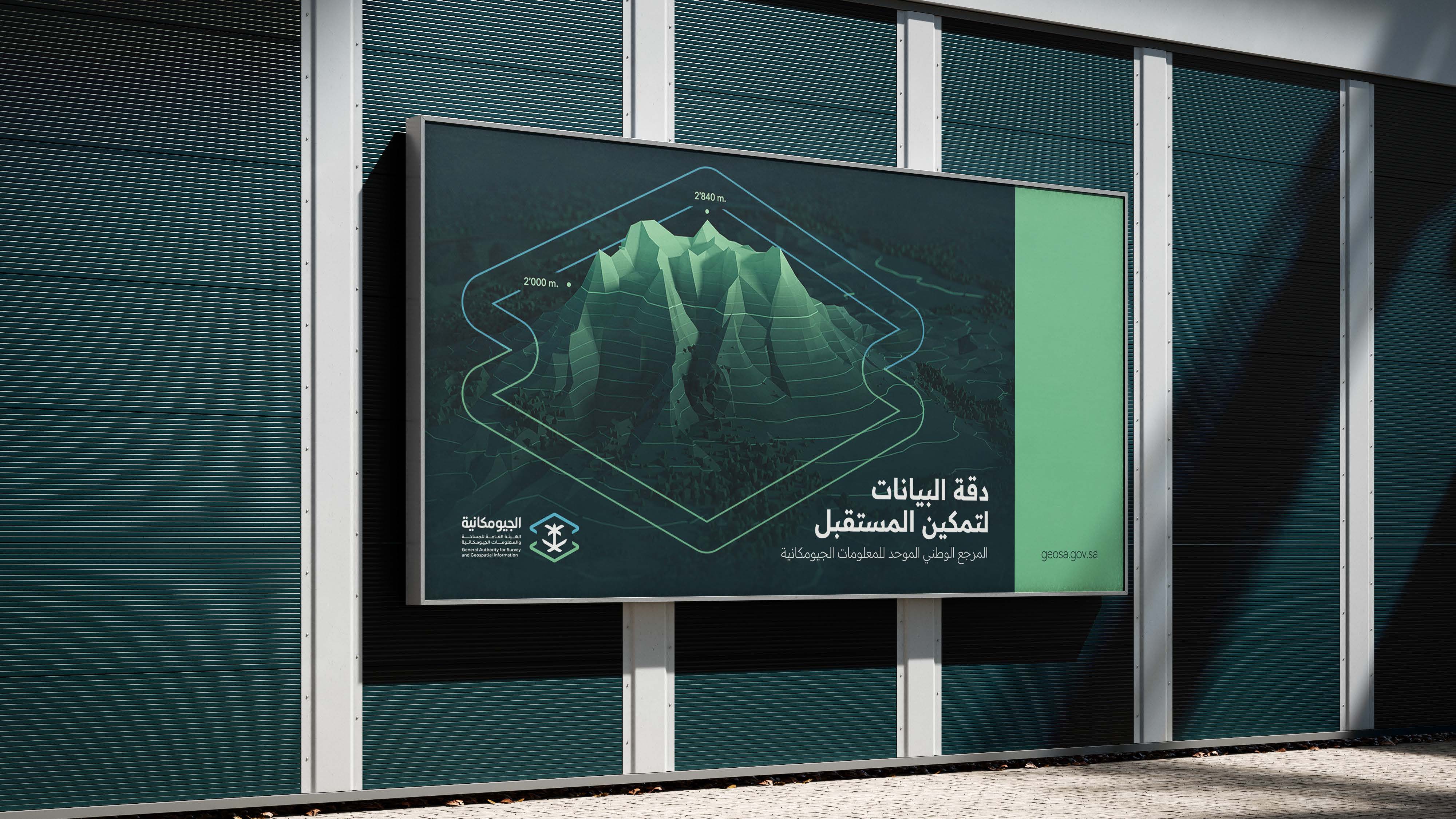
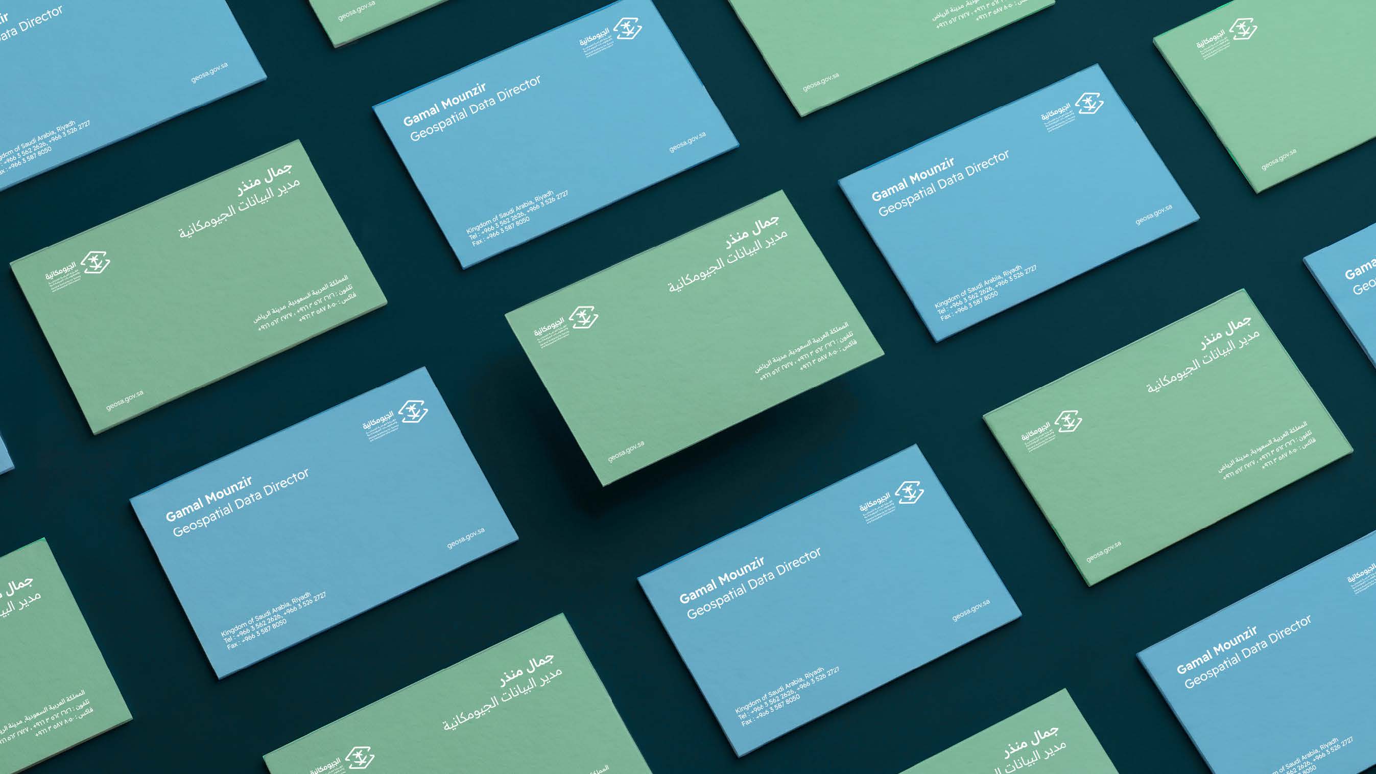
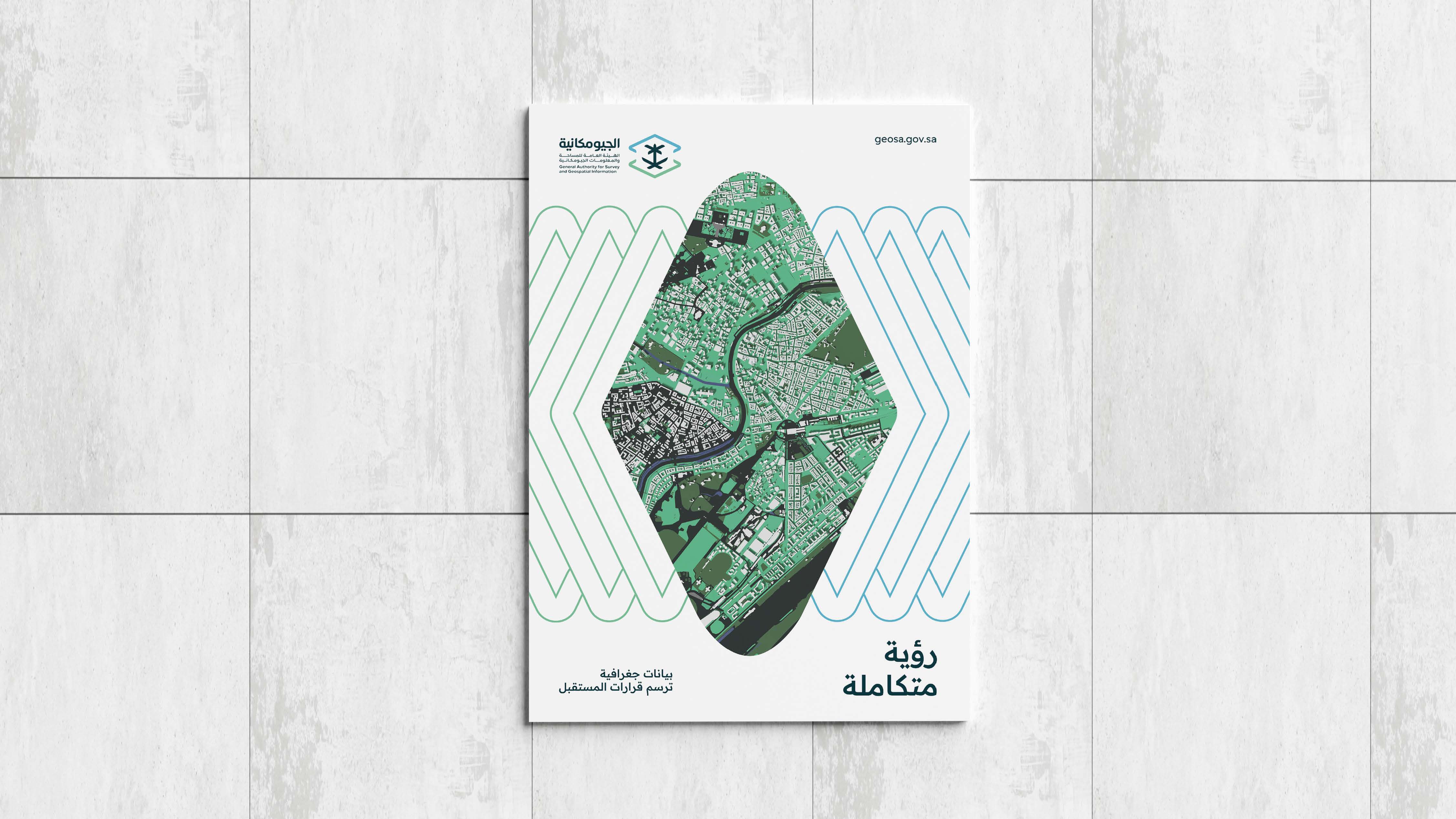
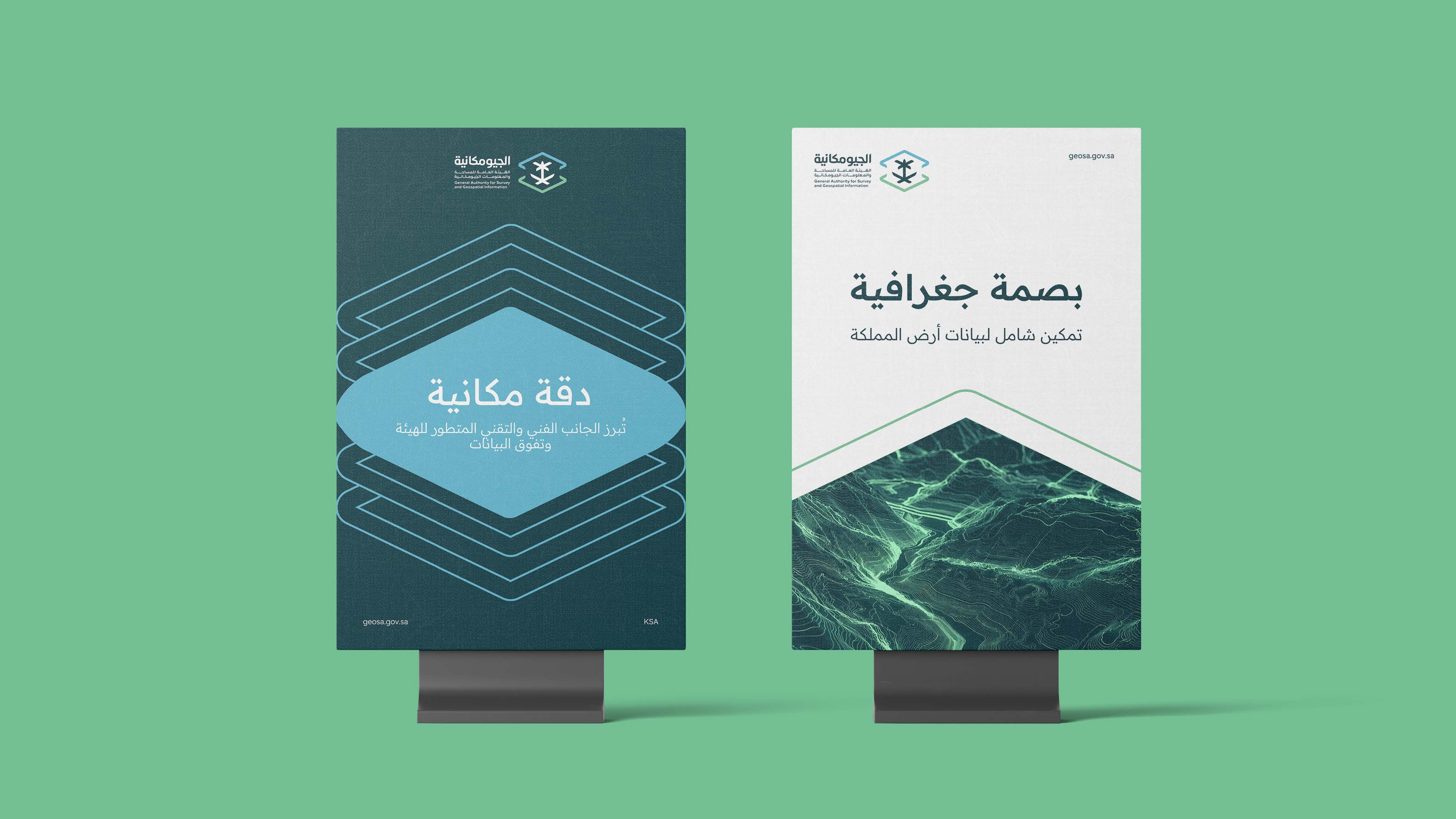
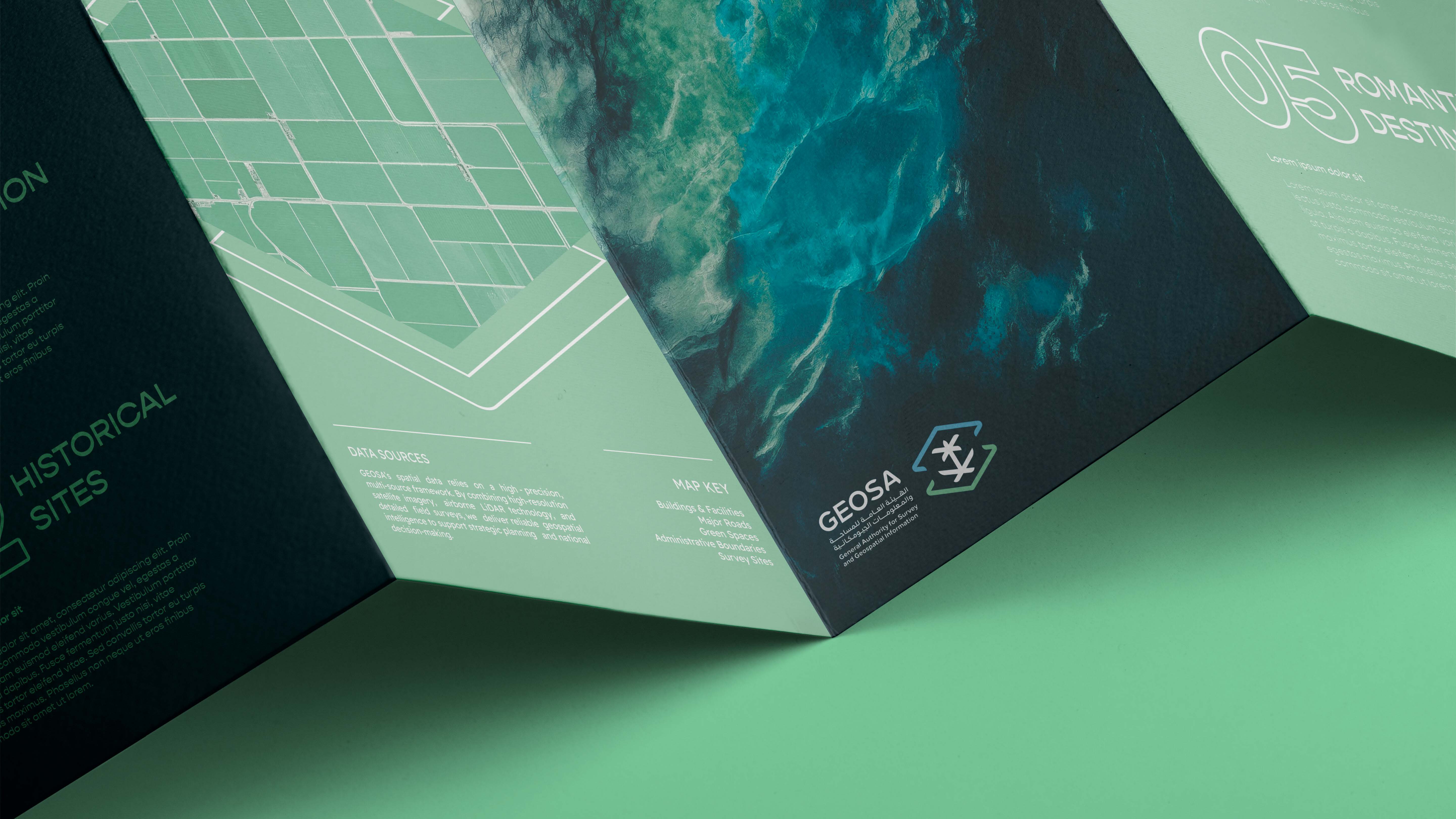
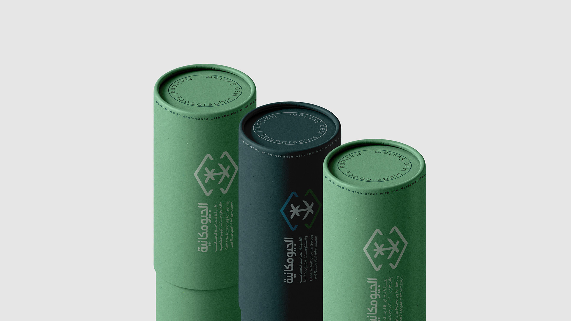
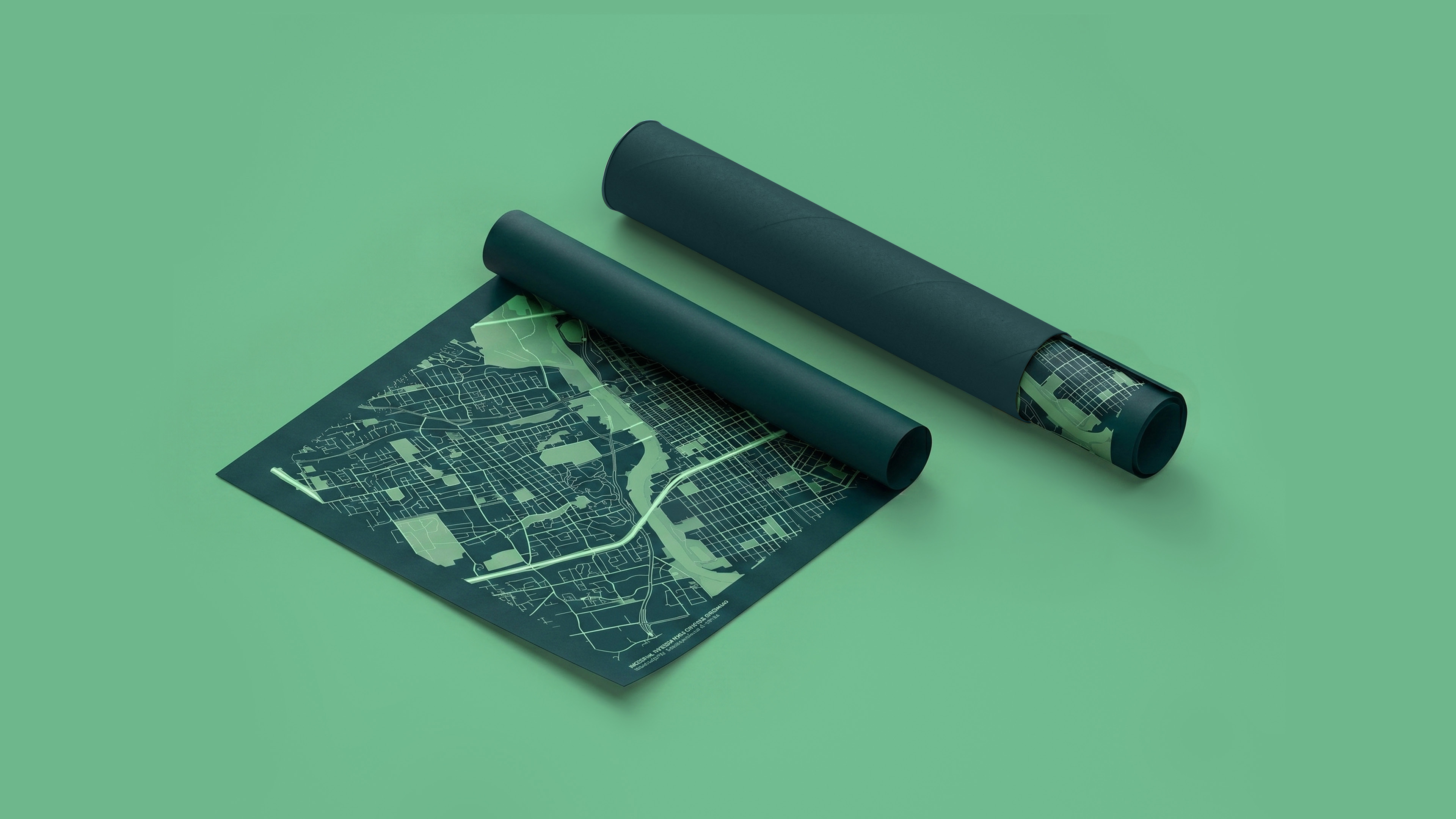
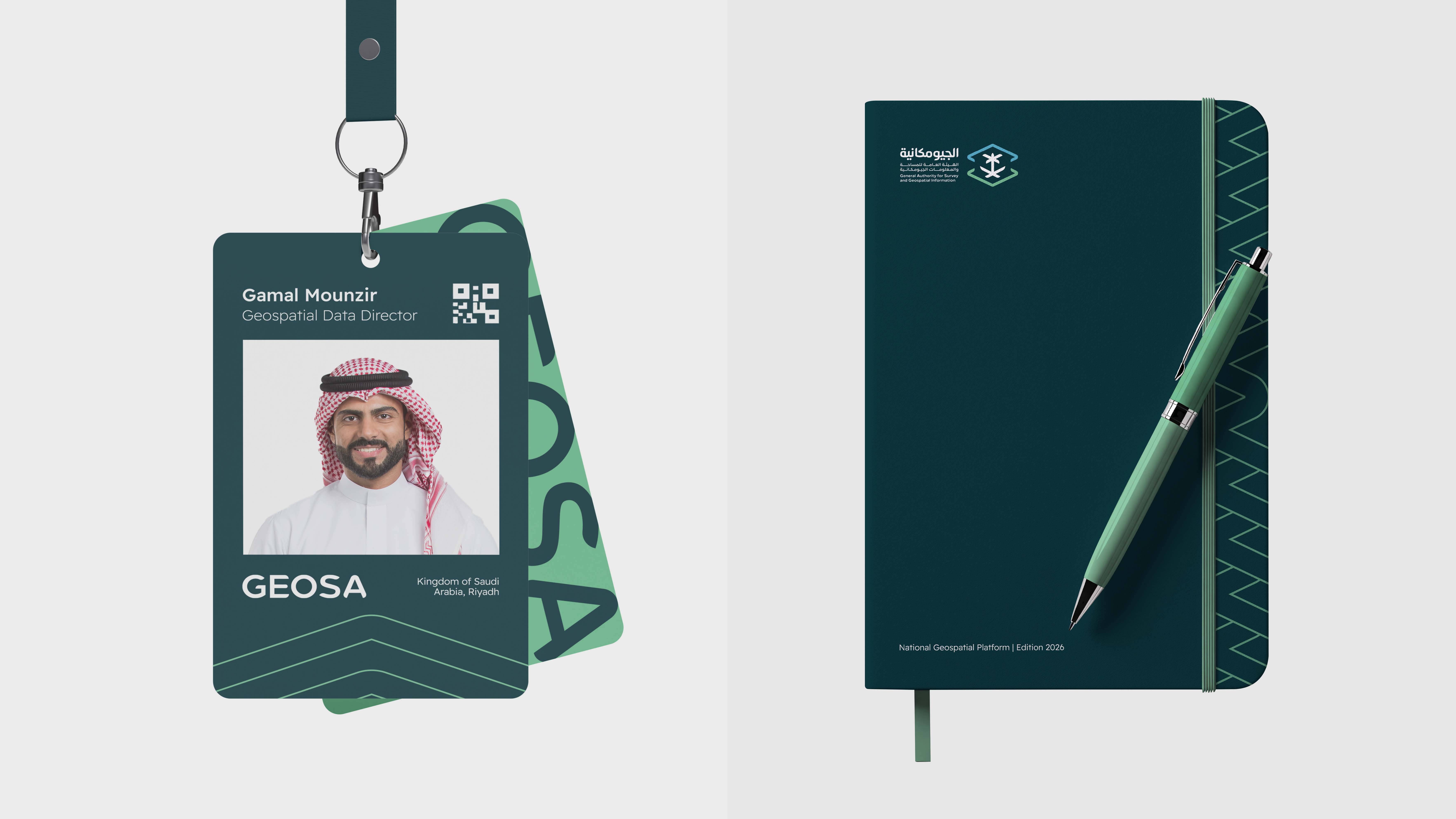
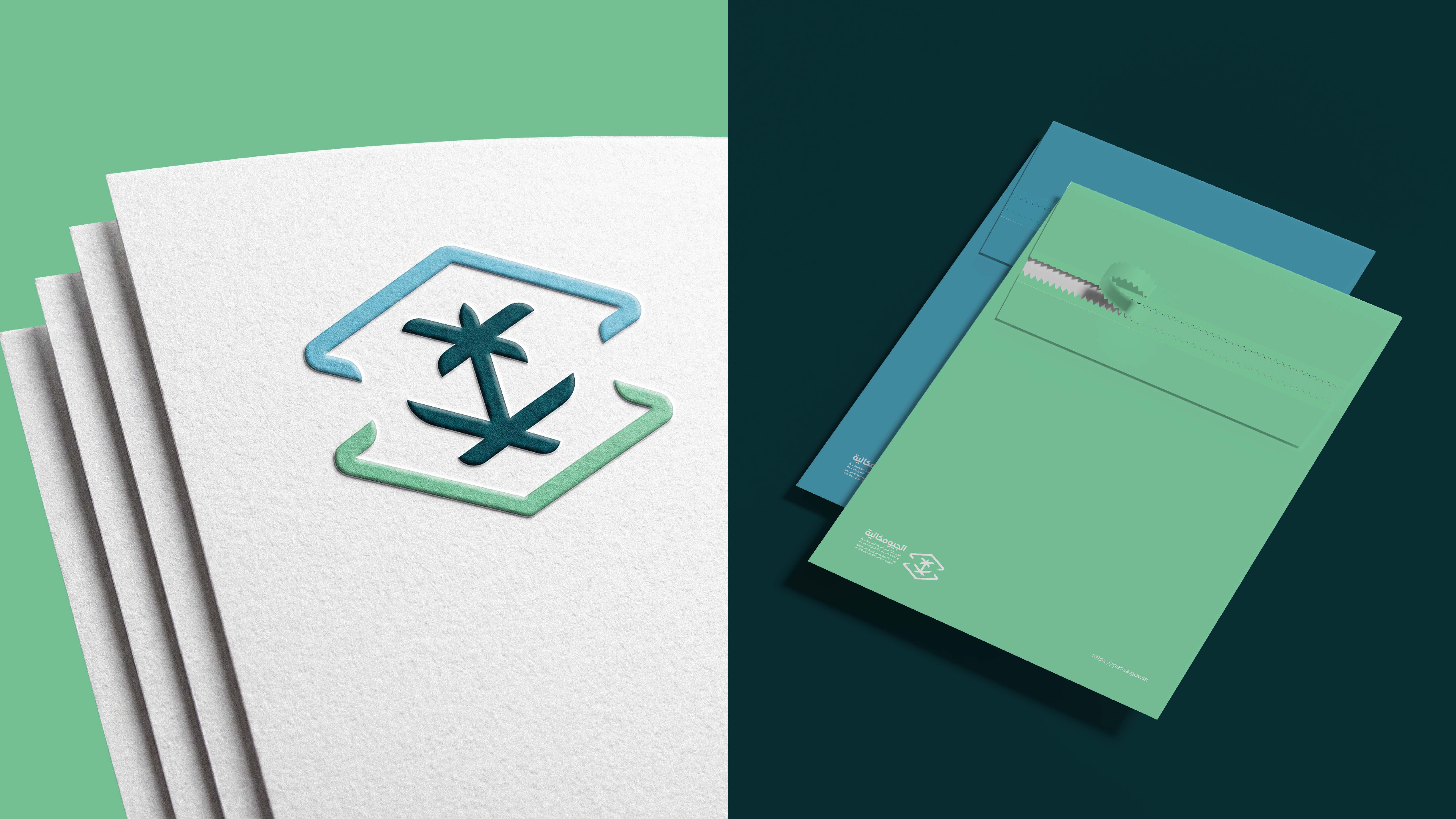
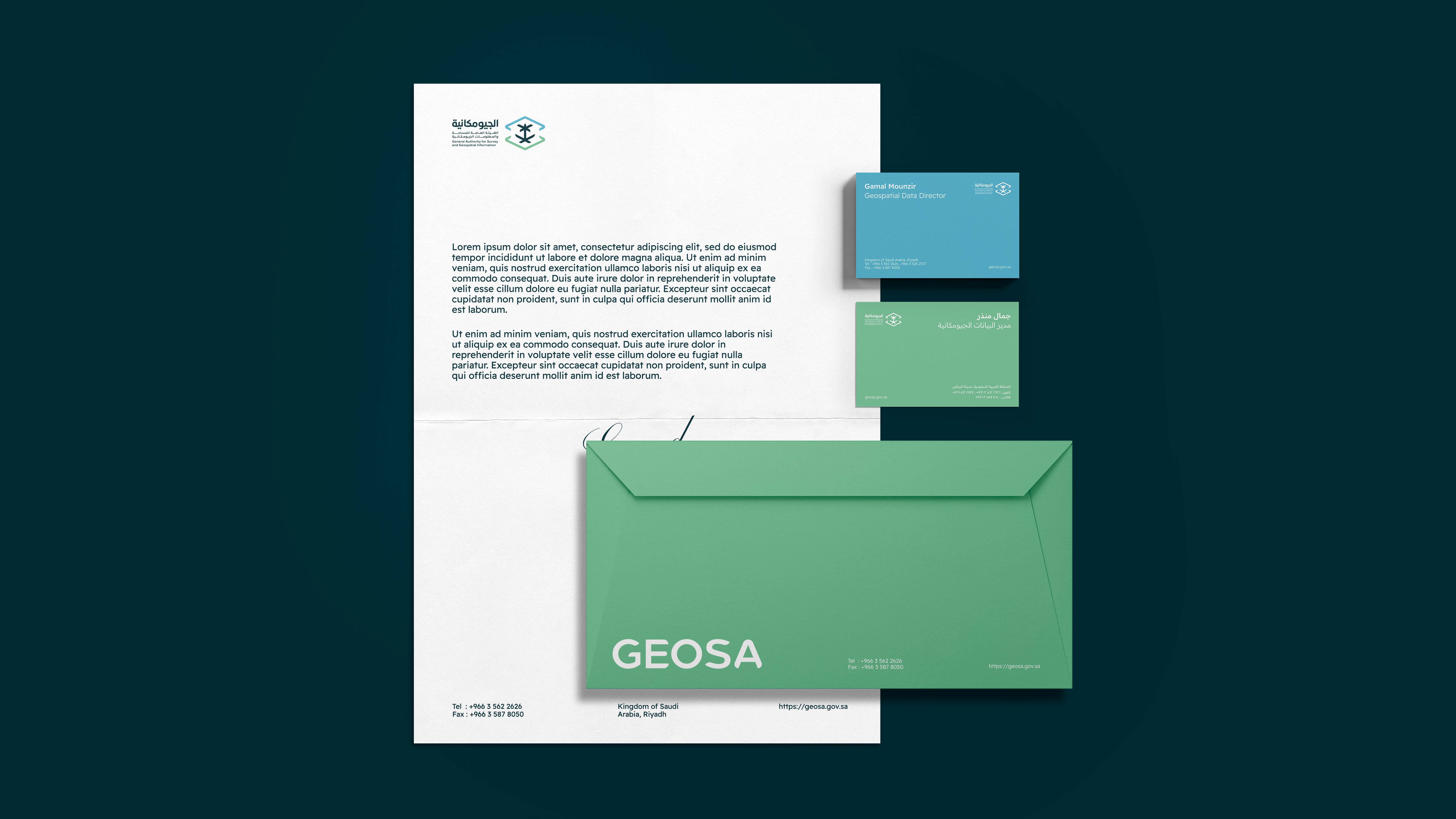
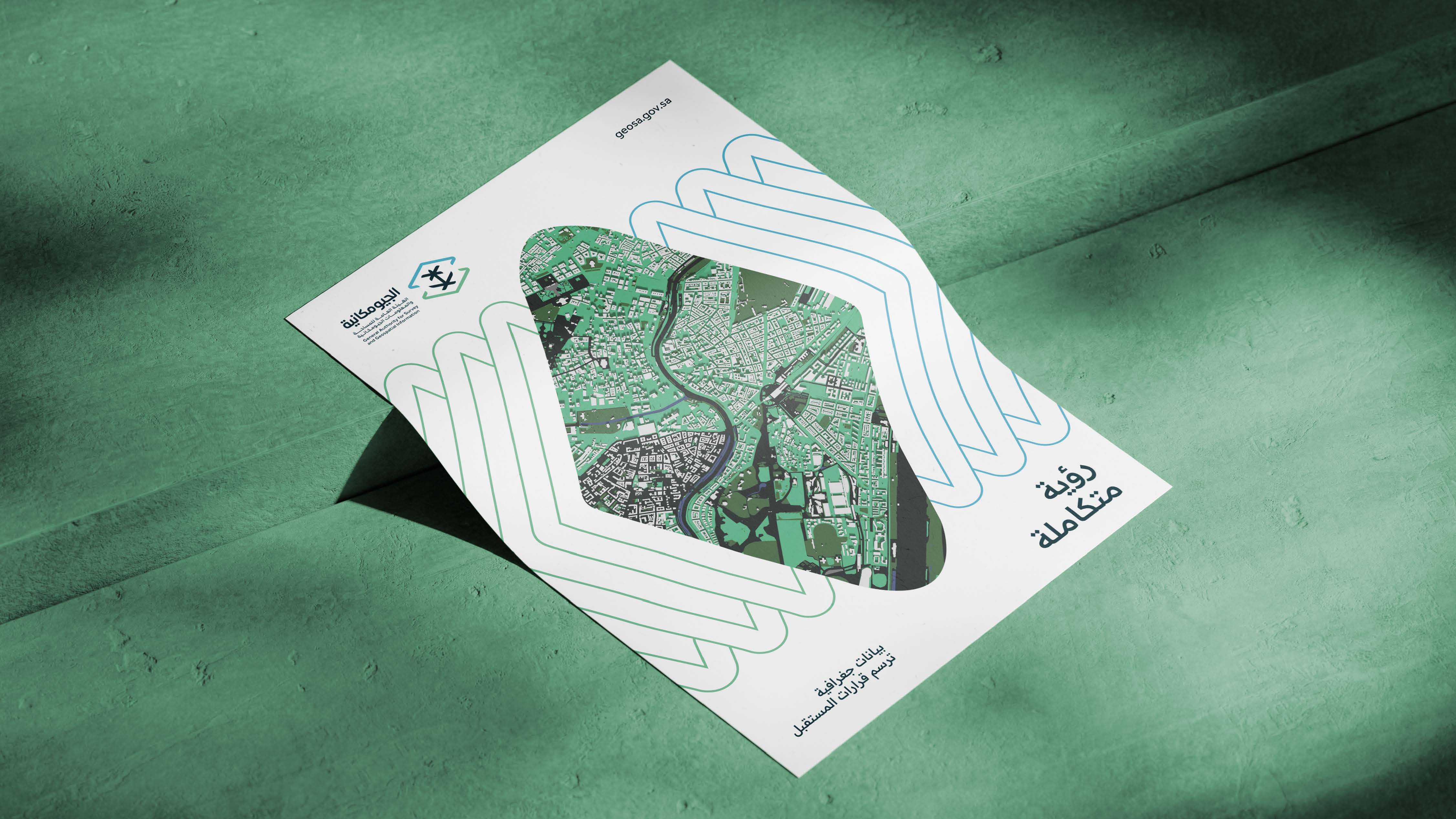
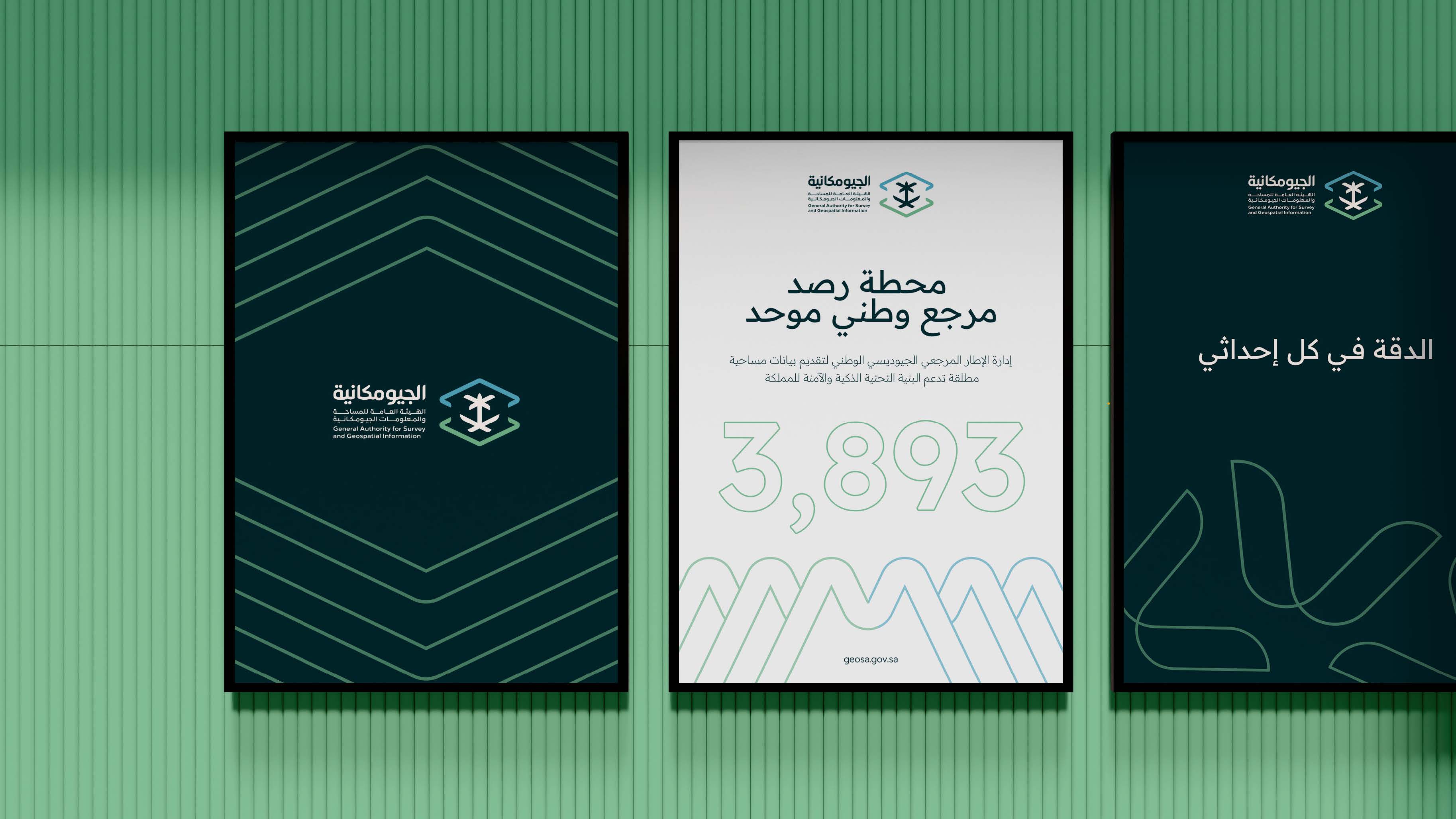

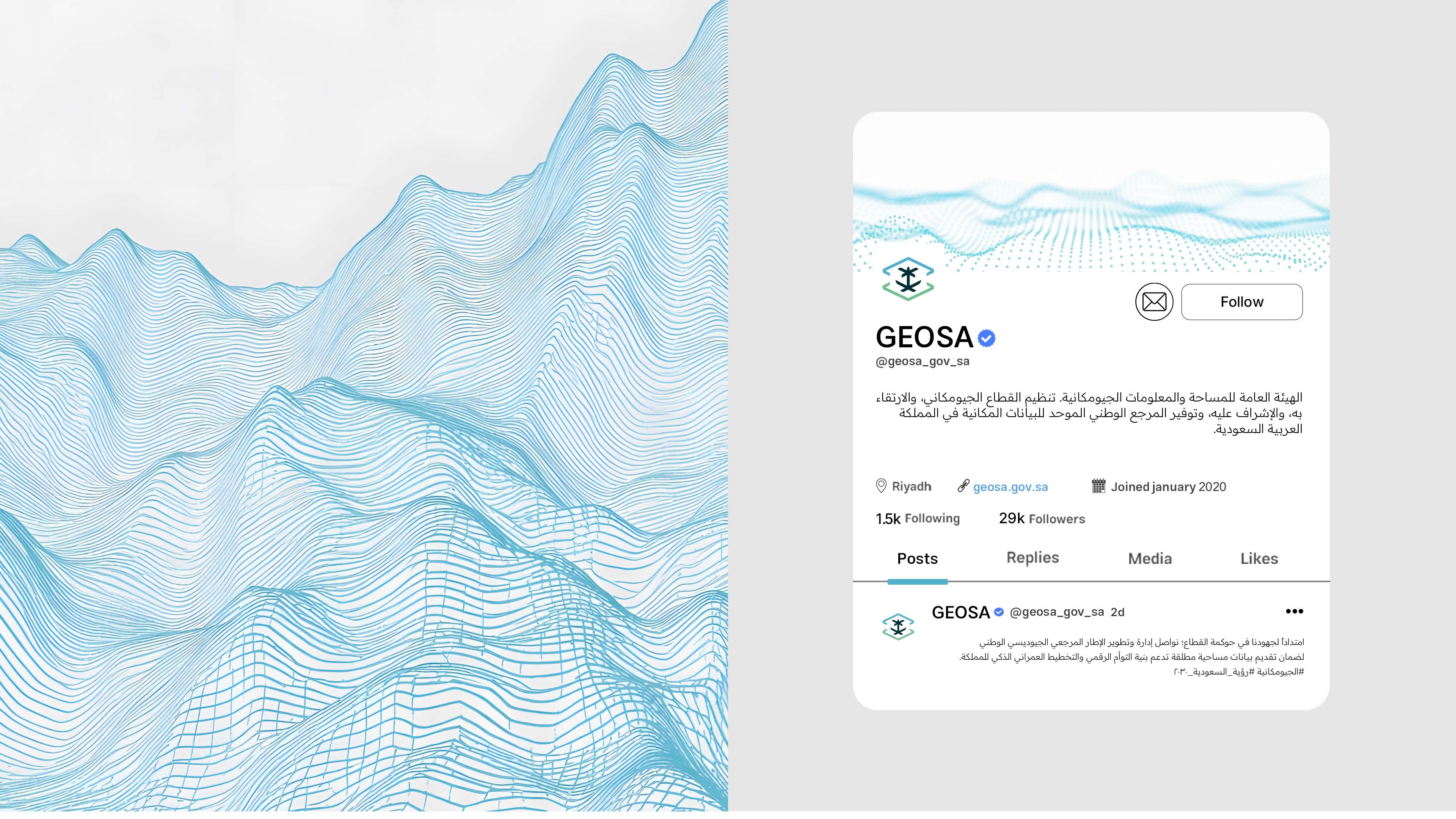

We developed GEOSA’s identity to make it clearer and more flexible, transforming the concept of geospatial information into a visual language that extends from maps and terrain to every touchpoint.