
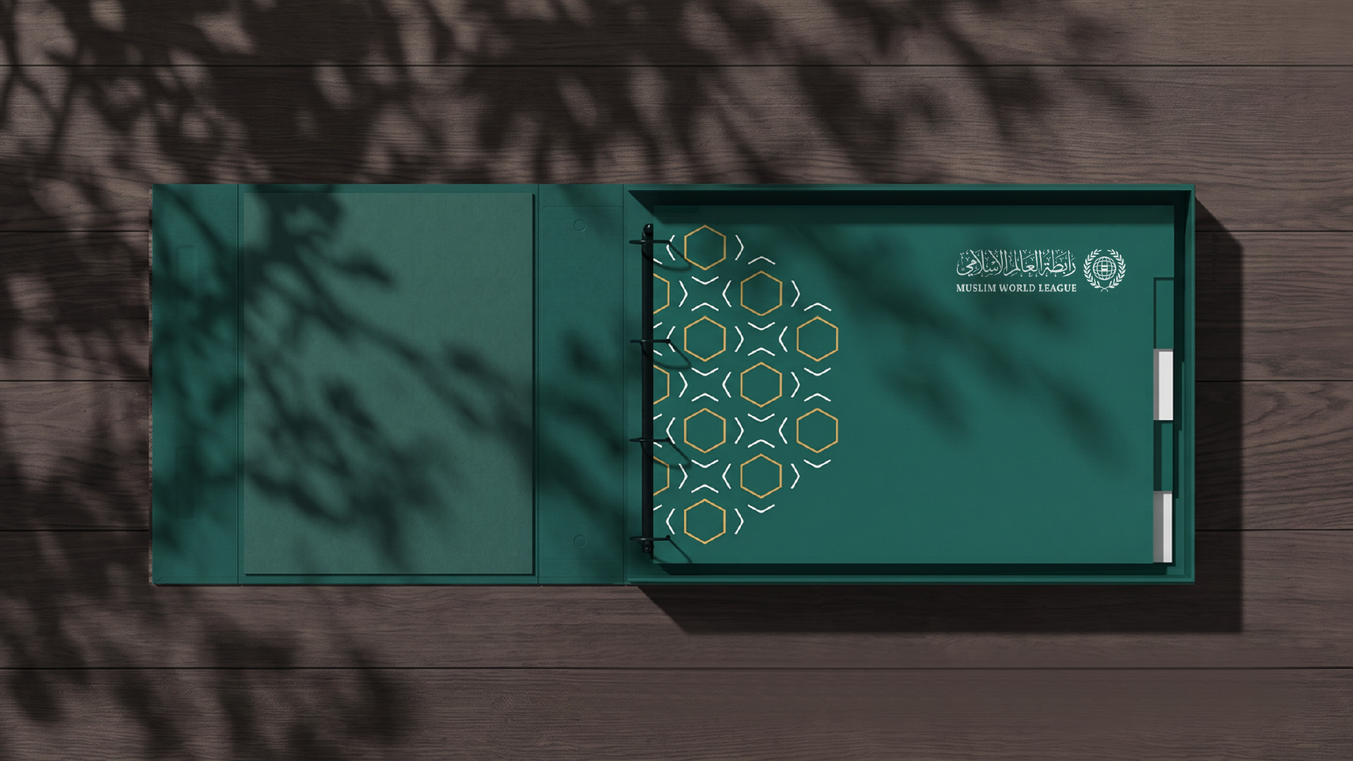
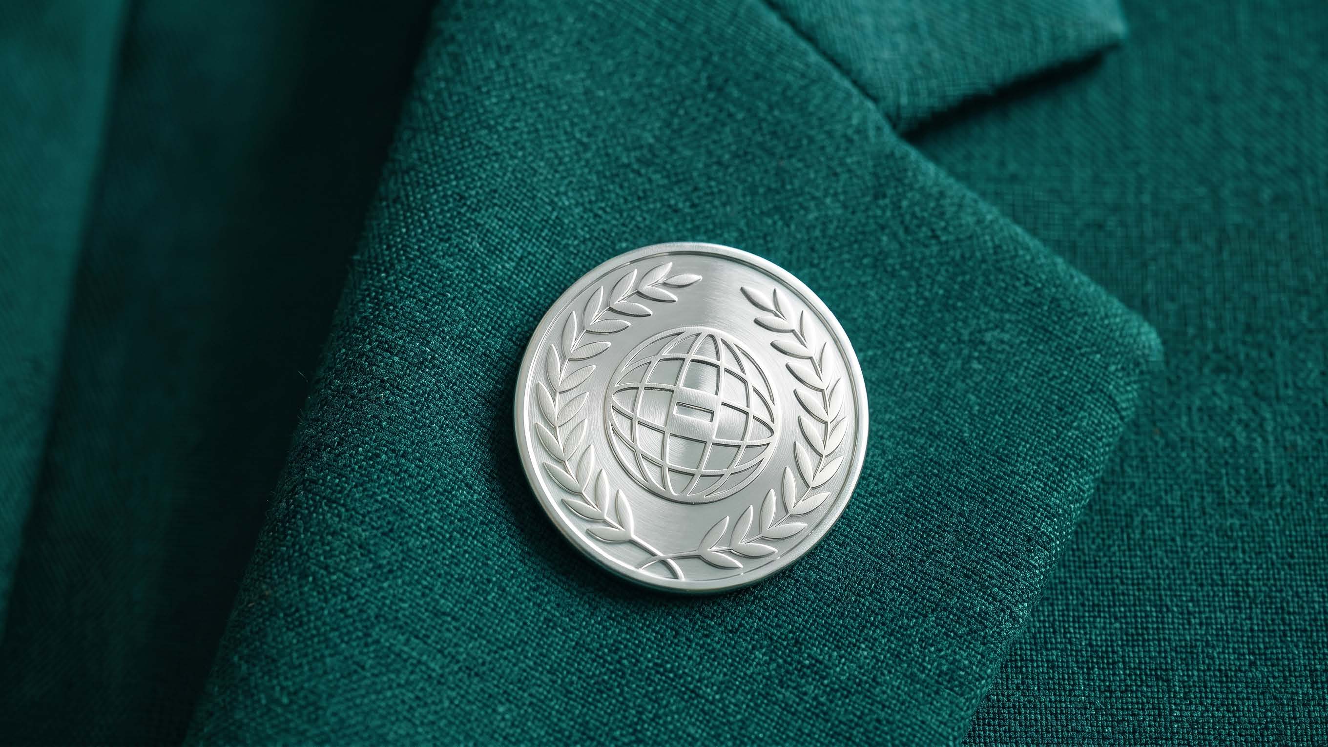
The Muslim World League is an independent international non-governmental organization headquartered in the Kingdom of Saudi Arabia, founded in Makkah in 1962. It works to introduce Islam and its values of tolerance, promote moderation and balance, and foster communication and dialogue among peoples. The identity development aimed to translate the breadth of the League’s mission into a unified visual language—one that originates from Makkah and carries the values of compassion, peace, and connection to the world. The concept was built around symbols with clear meanings, most notably the unifying direction of the Qibla, the olive branch, and Arabic calligraphy.
The challenge was to balance the depth of the League’s Islamic heritage with the breadth of its presence around the world.
The identity needed to maintain its connection to Makkah and Islamic identity, while also expressing a message that transcends borders and cultures and speaks to diverse peoples and communities.
The challenge was not to create a new symbol, but to translate the League’s profound meaning into a visual language that the world could understand.
The opportunity was to start from the most unifying point for Muslims: Makkah and the Qibla.
From there, we could build an identity that carries a meaning beyond place—an identity that brings together Islam, compassion, peace, and dialogue, transforming these values into a visual system capable of existing across diverse contexts around the world.
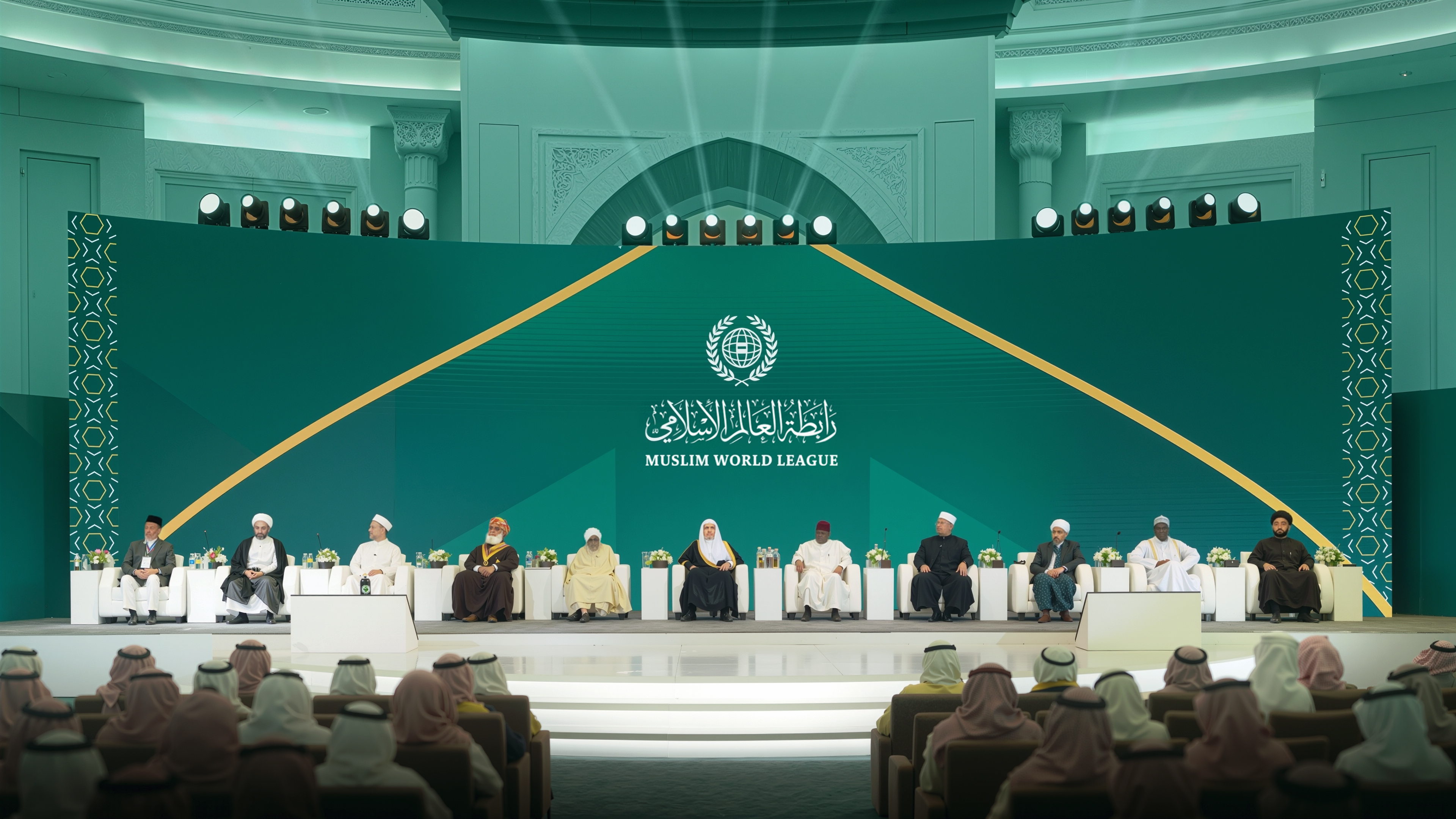
We began by understanding the significance of the Muslim World League and its mission, which extends from Makkah to the world. The focus was on building an identity that carries this global reach while maintaining its roots and cultural identity.
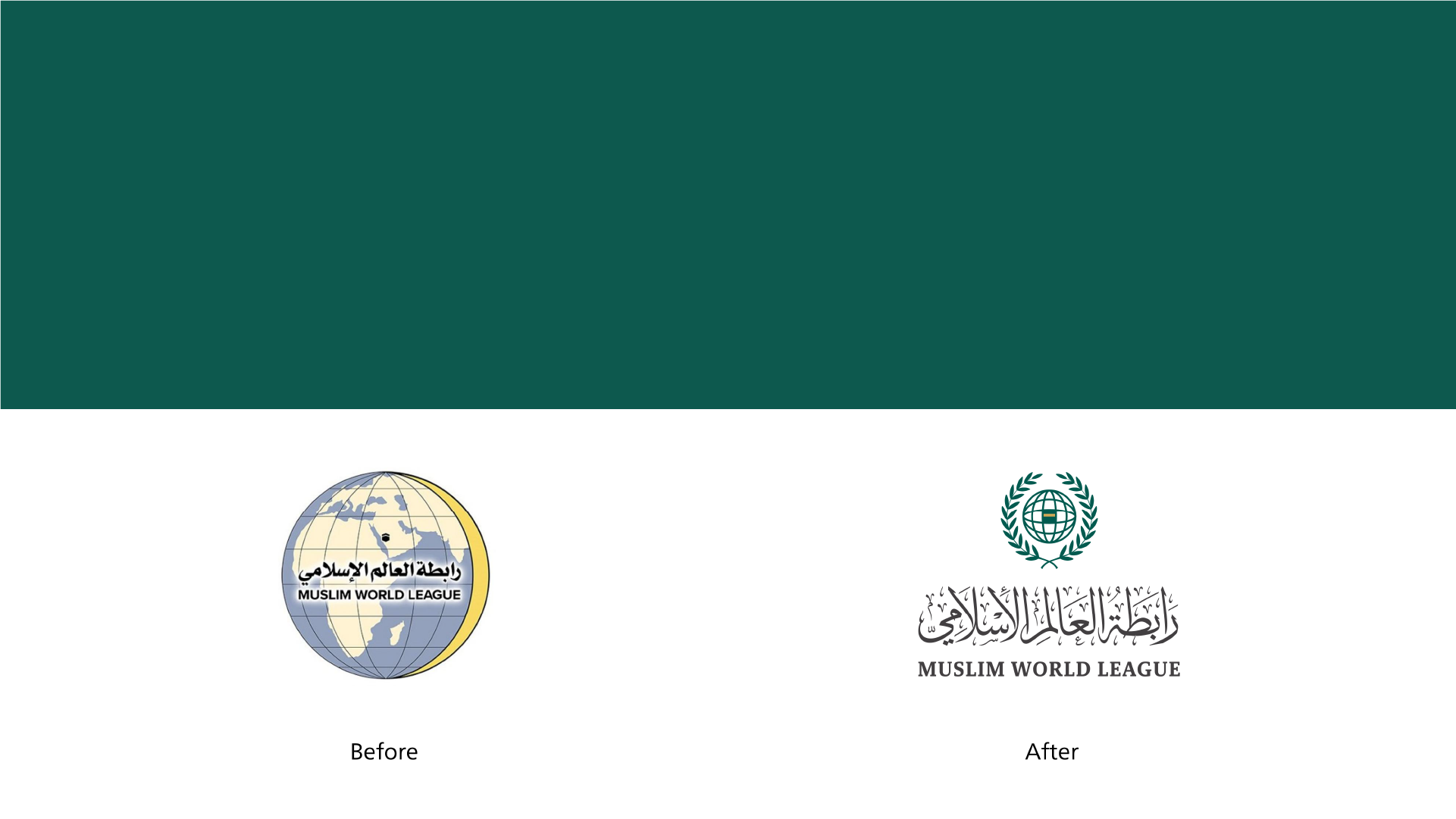
We began by bringing the elements together into a single symbol, refining their relationships and proportions to achieve a balanced composition. We then developed the wordmark using an approach rooted in the authenticity of Arabic calligraphy, preserving the brand’s Islamic and cultural identity.
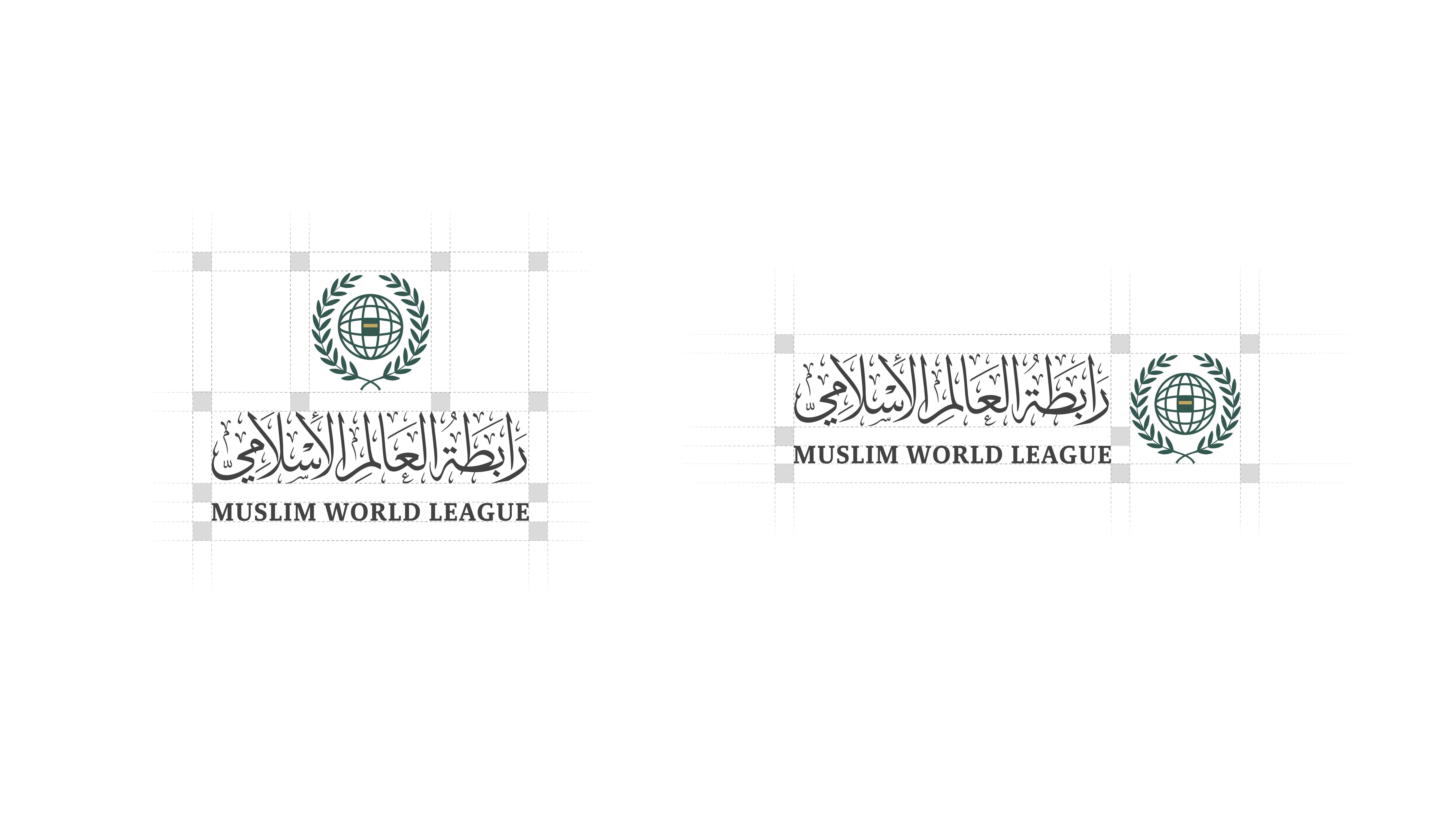
Once the symbol was established, we moved into building the visual system around it—from colors and typography to how they work together, creating a cohesive and adaptable visual language.
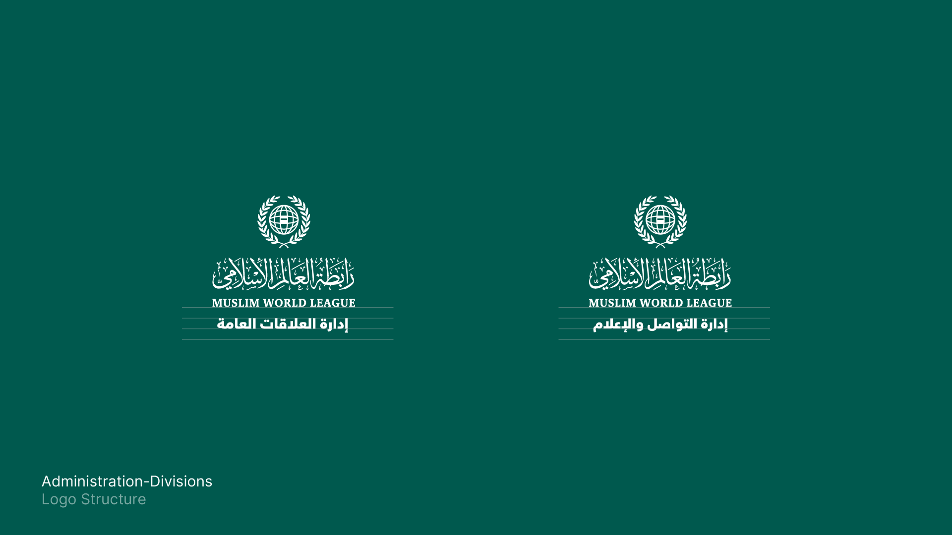
We refined the details of the identity and ensured consistency across its elements, from the structure of the symbol to the colors and typography, resulting in a complete visual system that maintains the brand’s clarity and reflects its global mission.

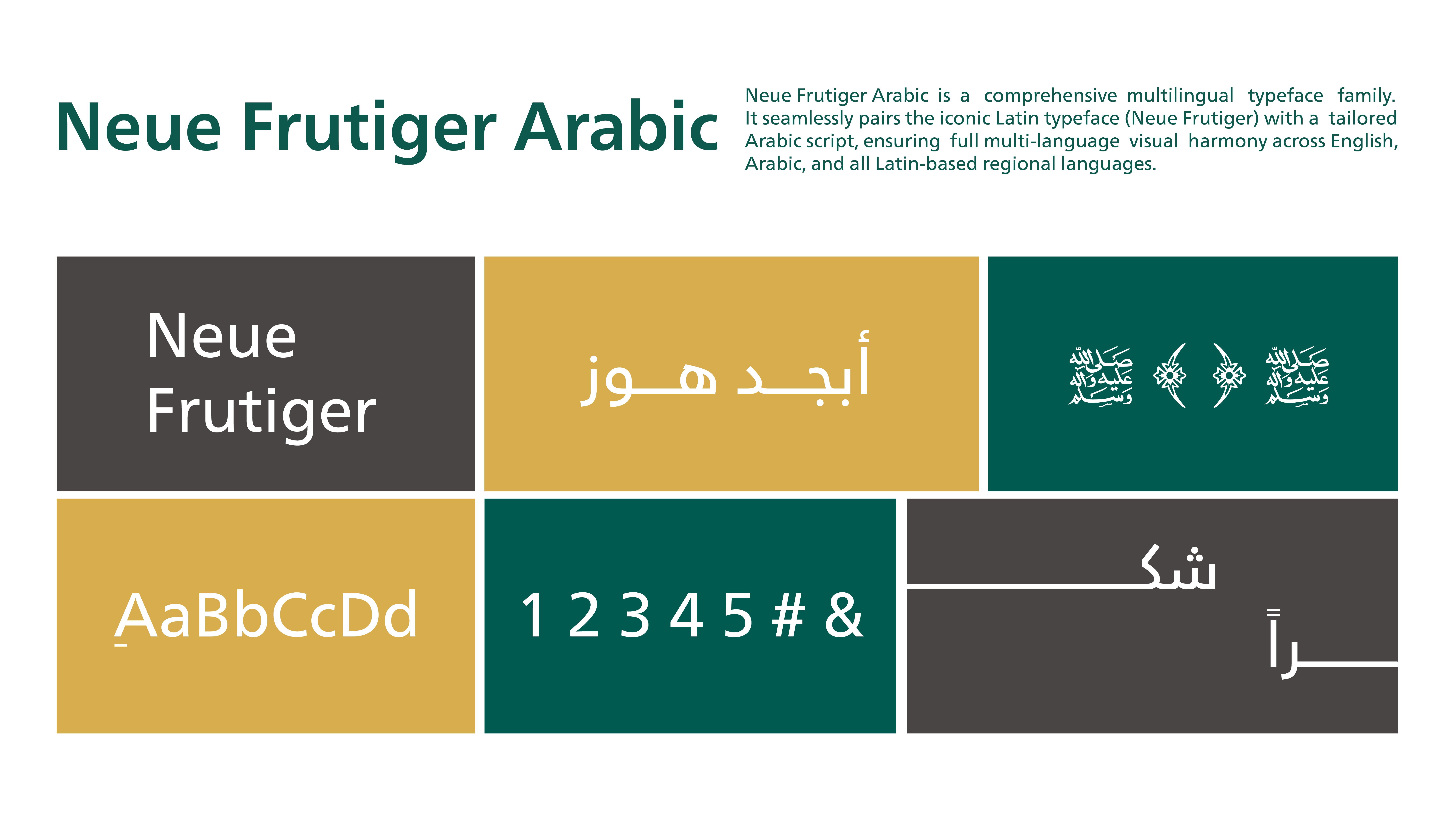
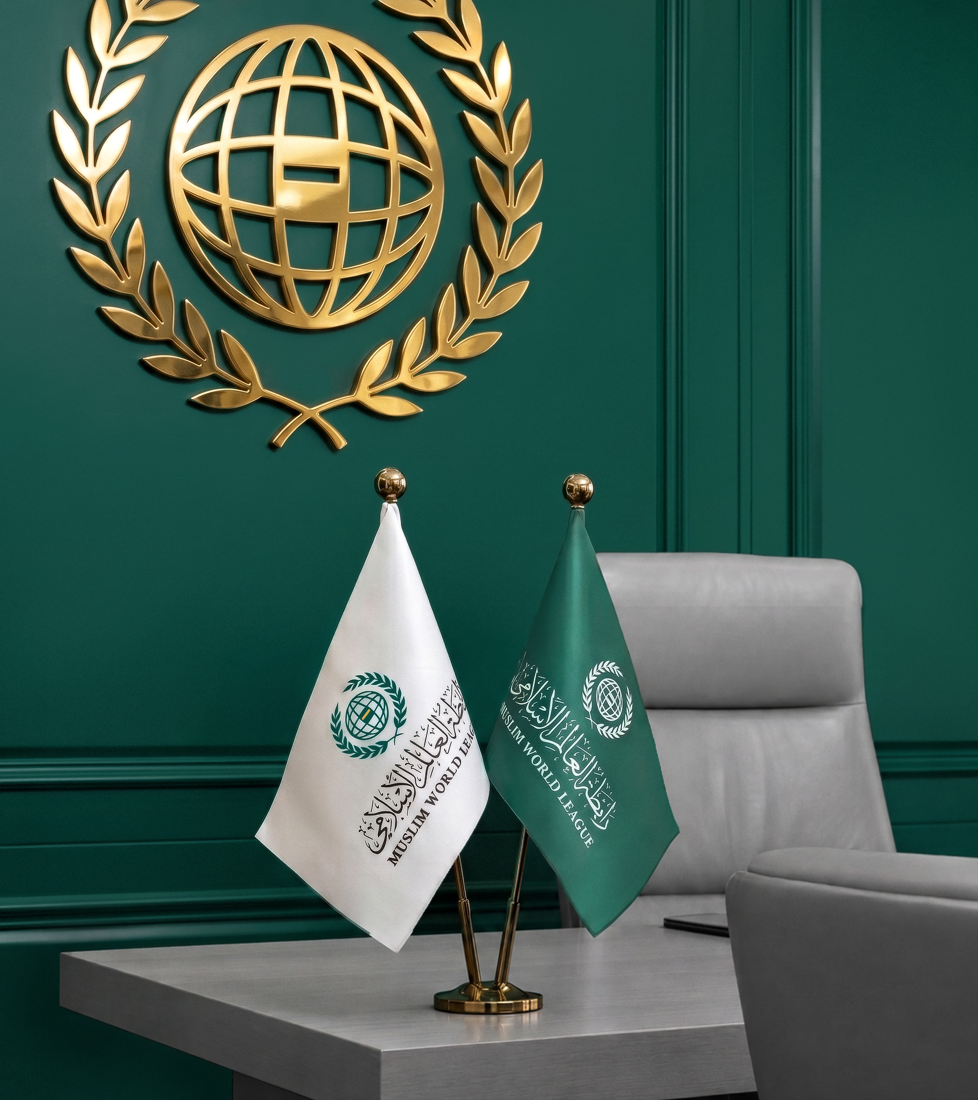
In the final stage, we tested the identity across various applications to ensure a clear and cohesive presence that preserves the spirit of the League while giving it a more contemporary and open visual language.
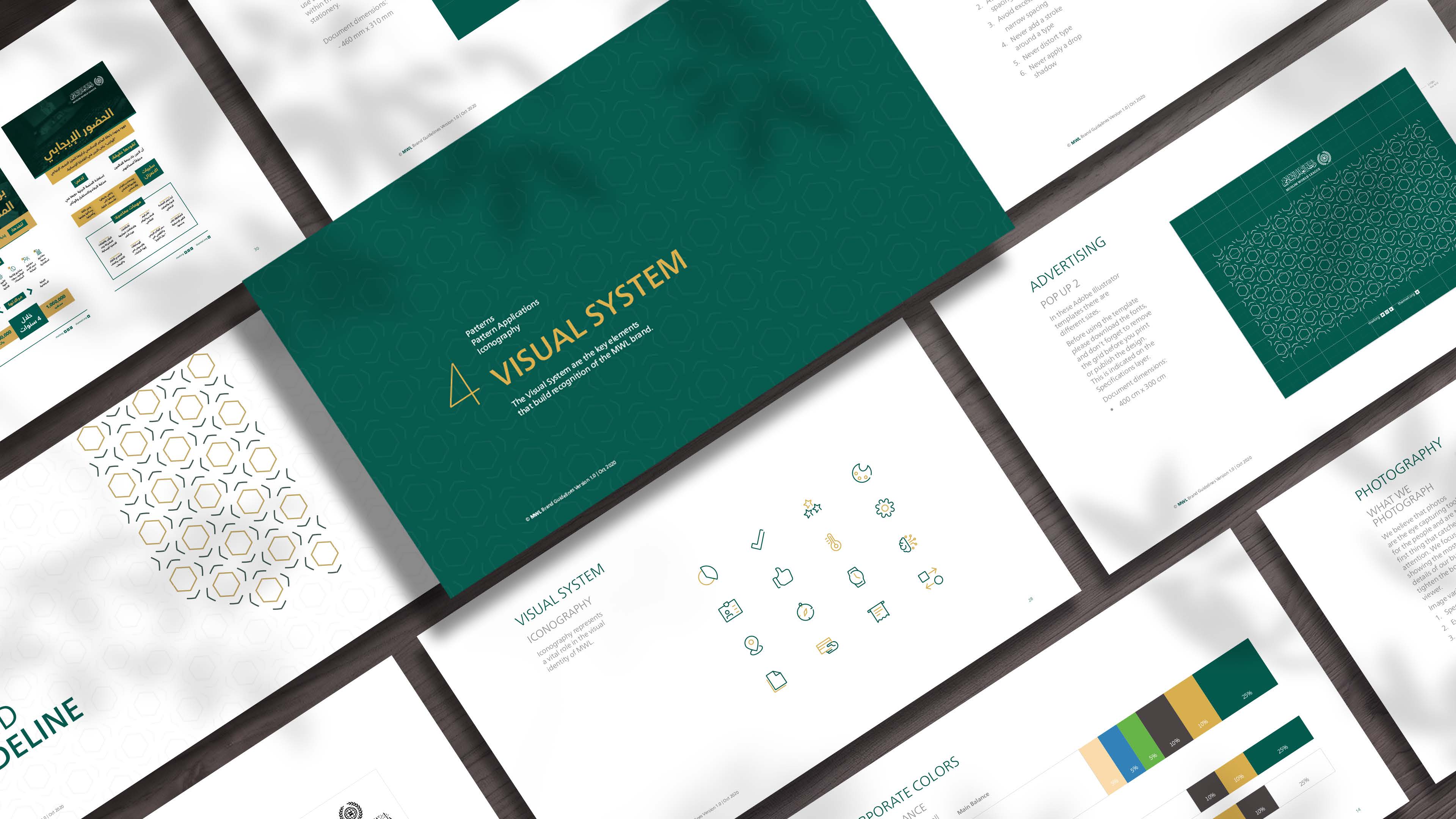
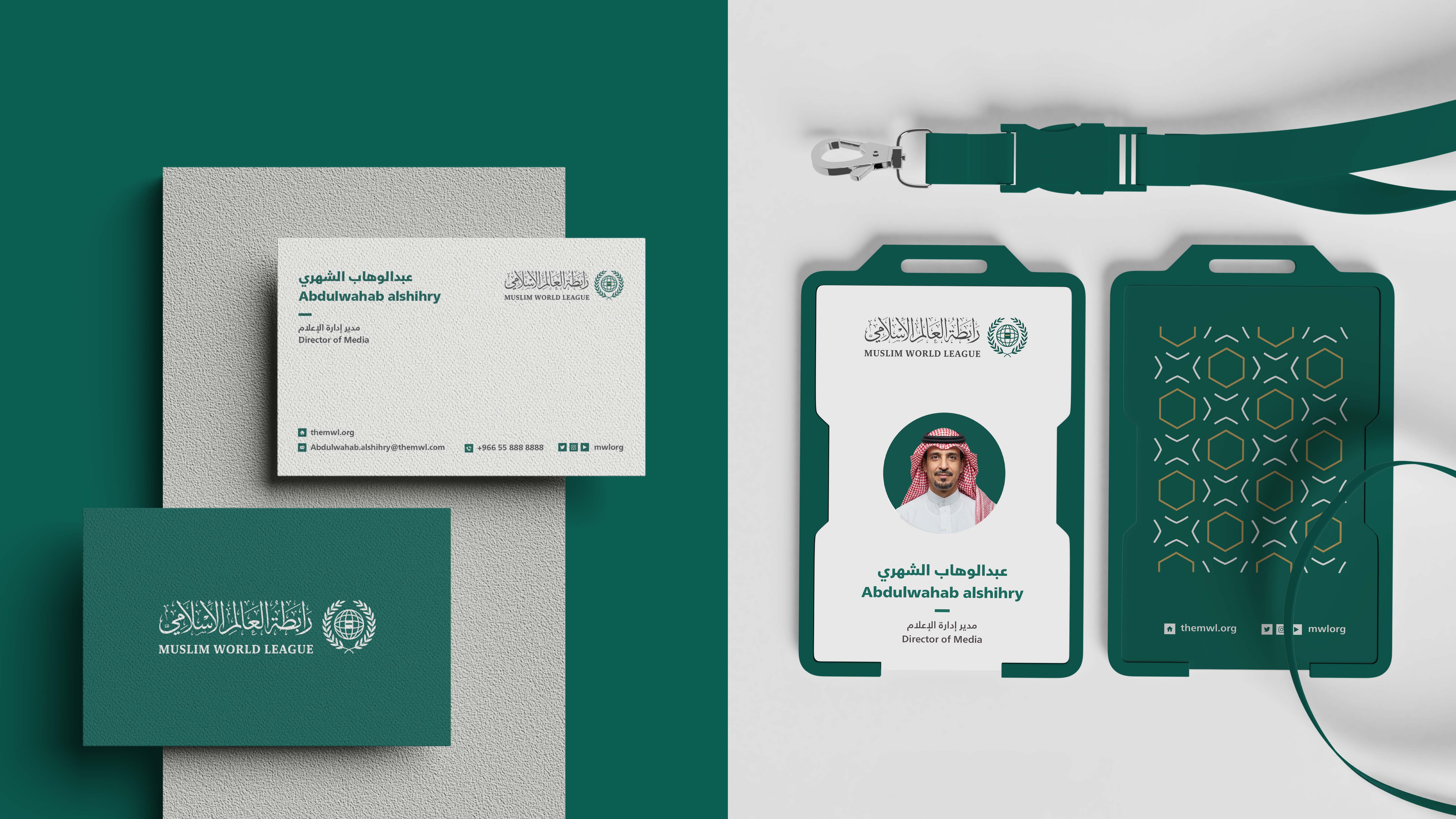
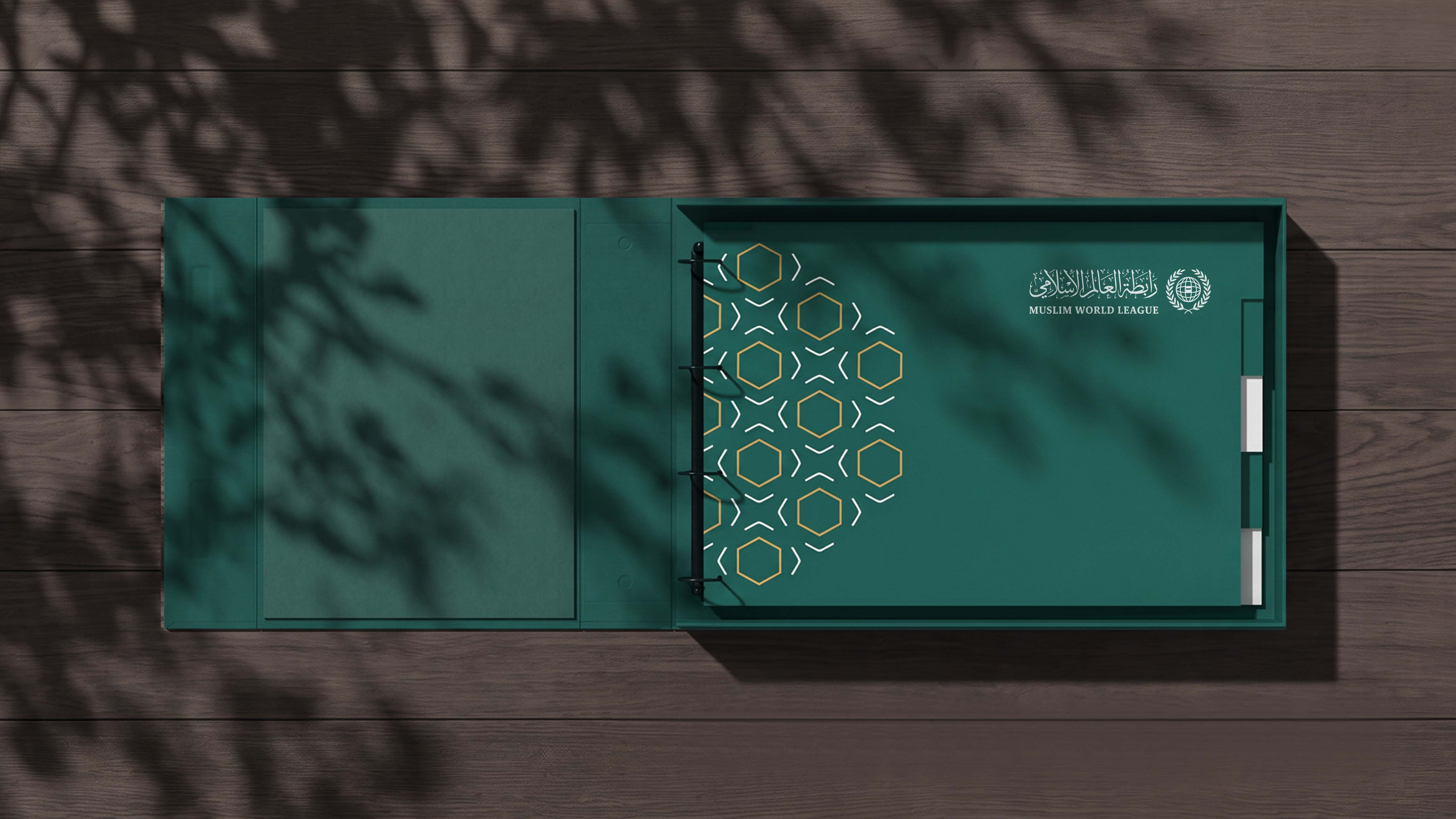
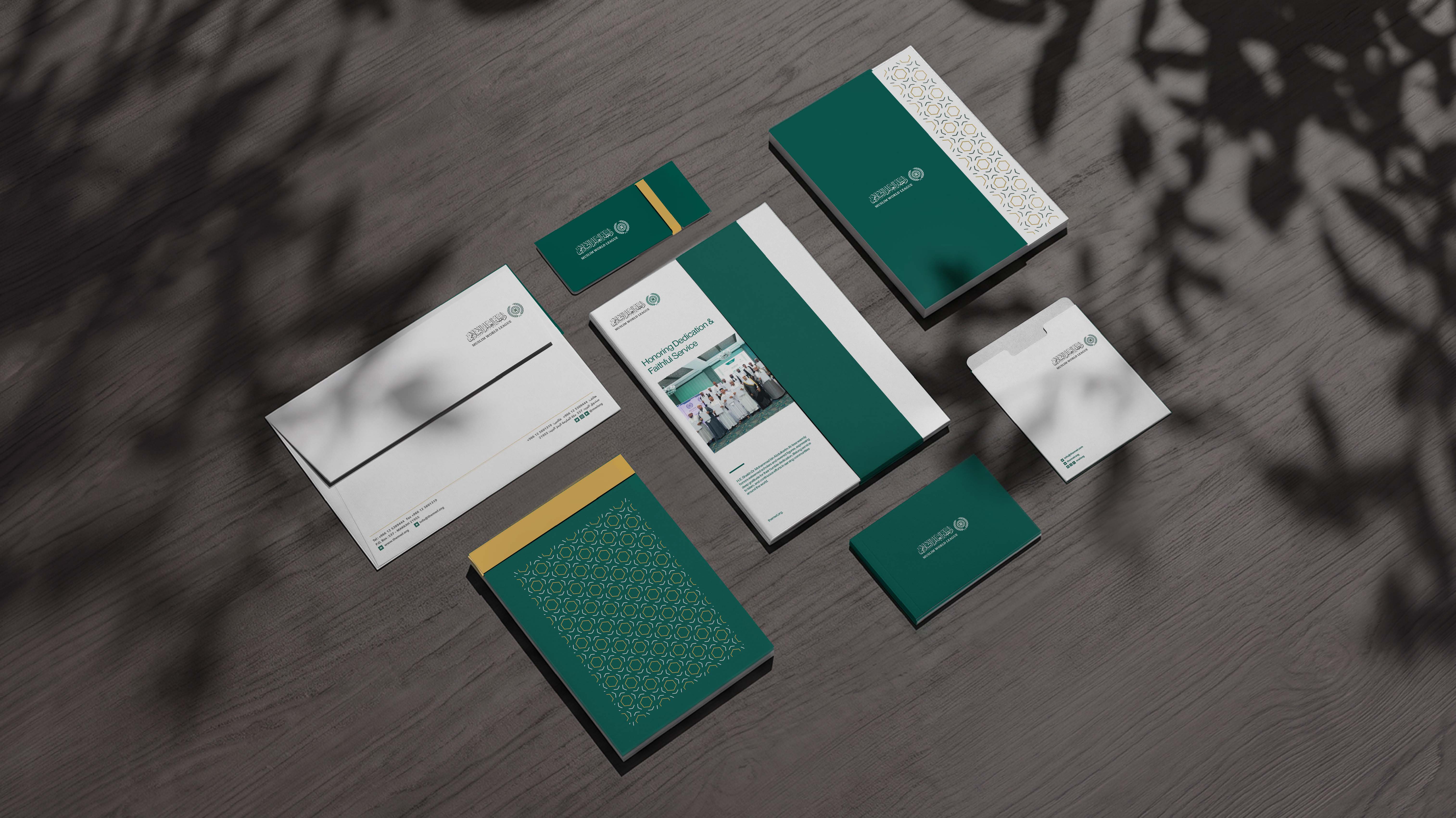
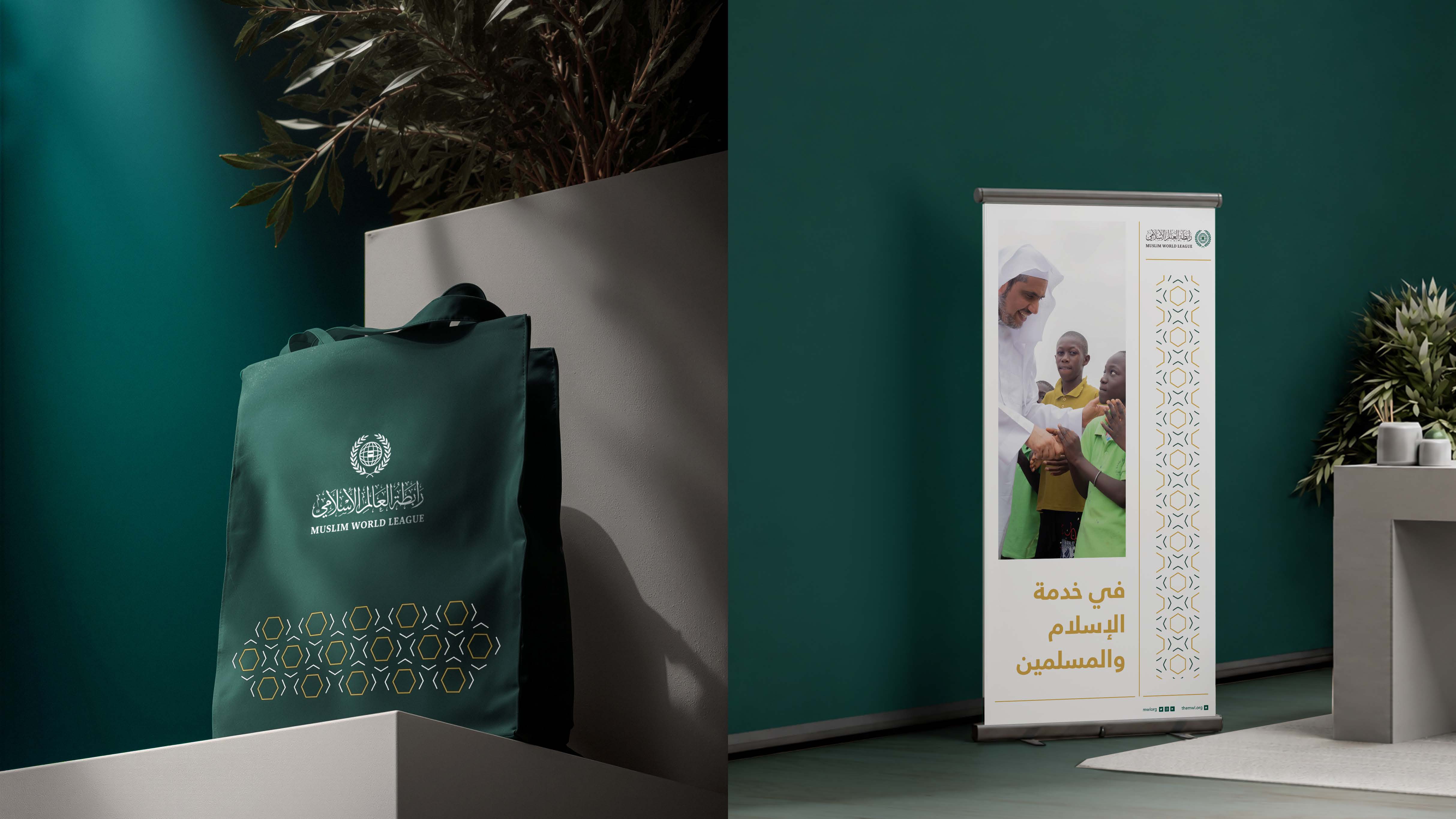
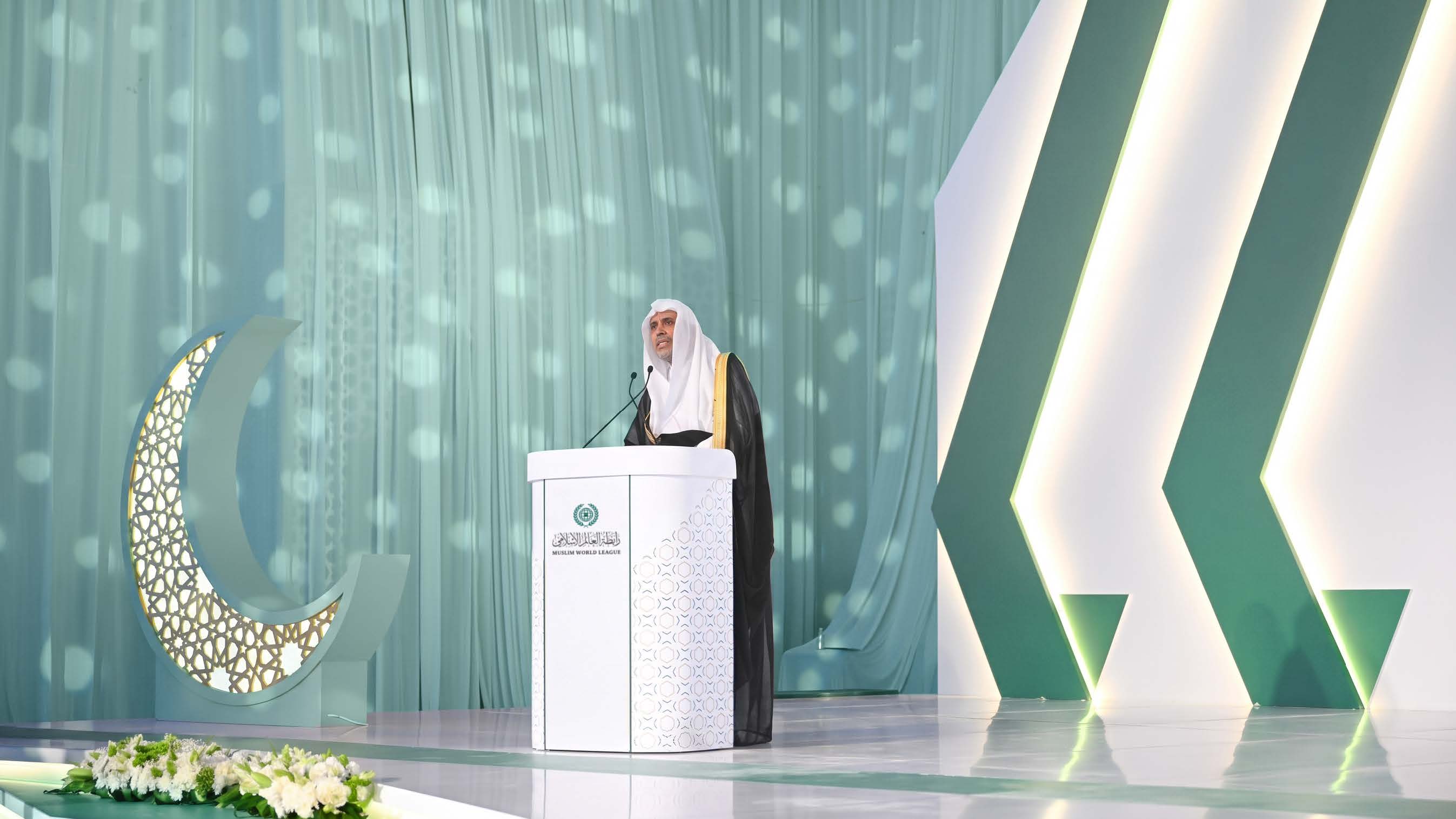

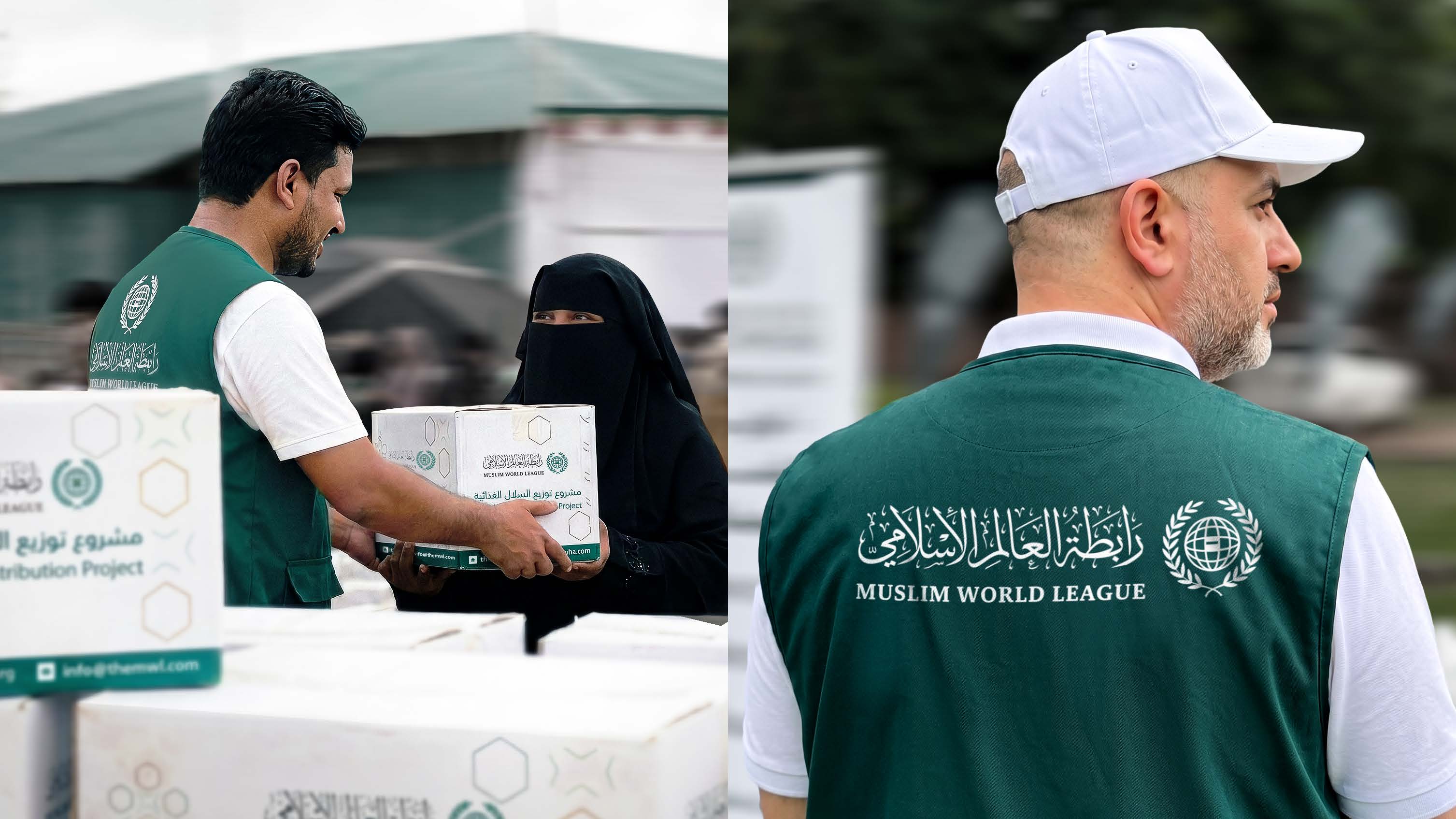
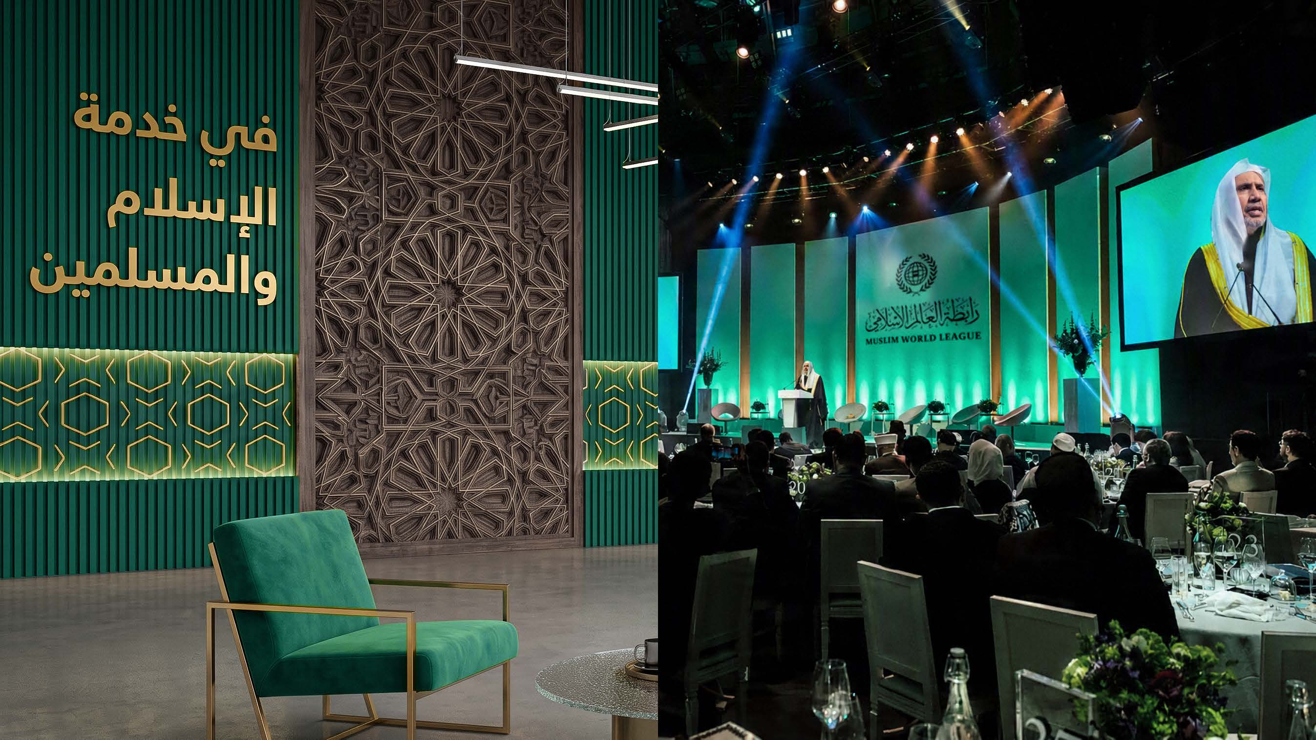
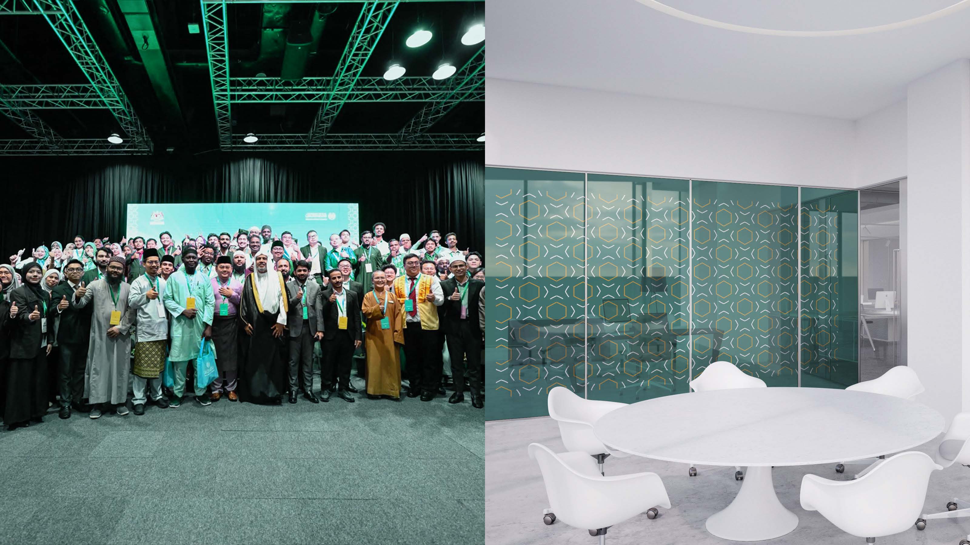
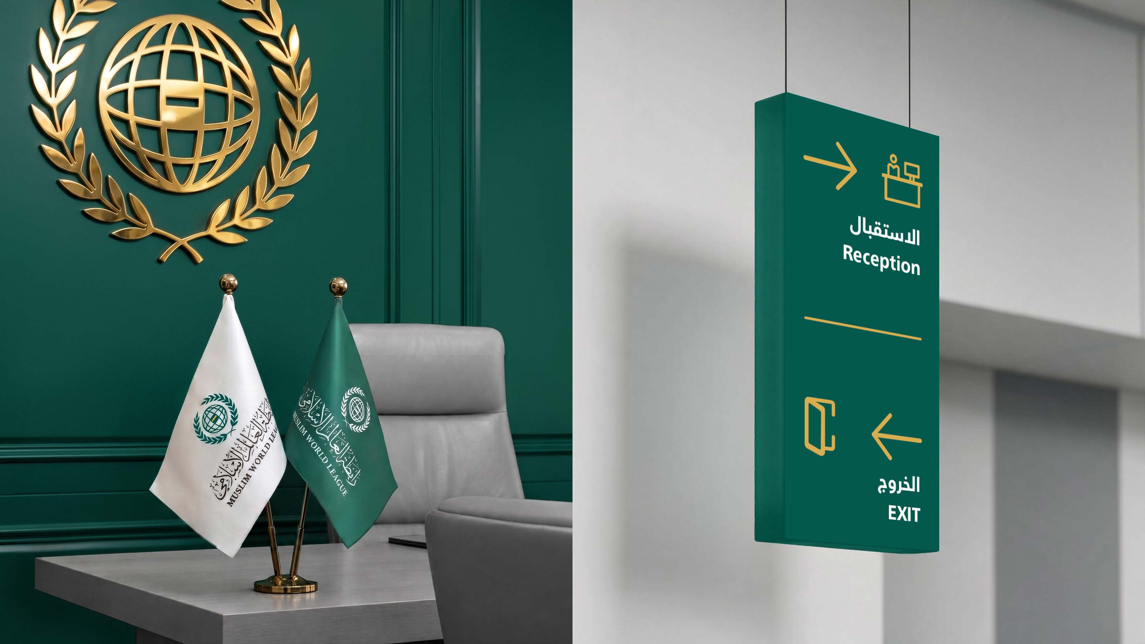
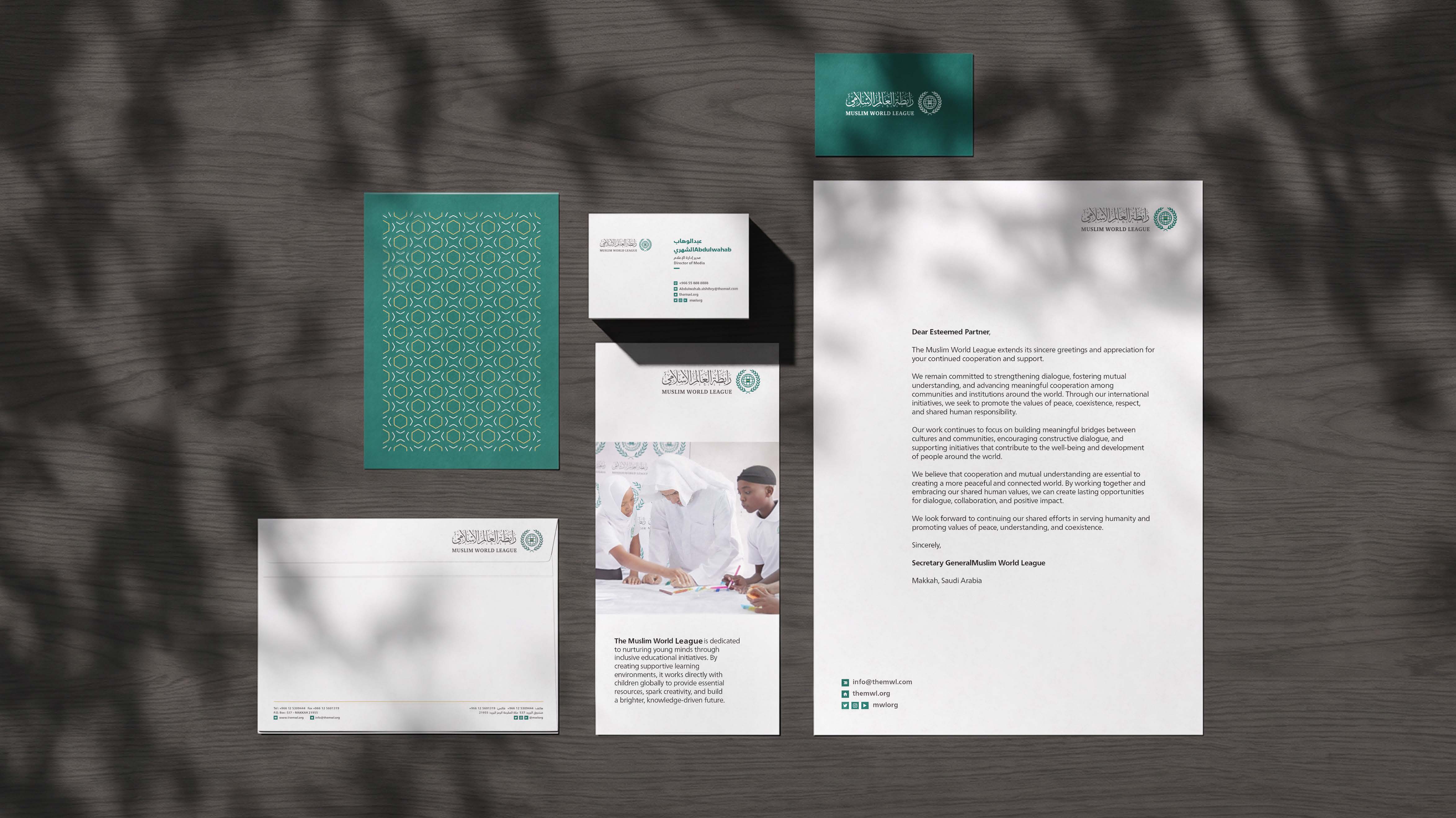
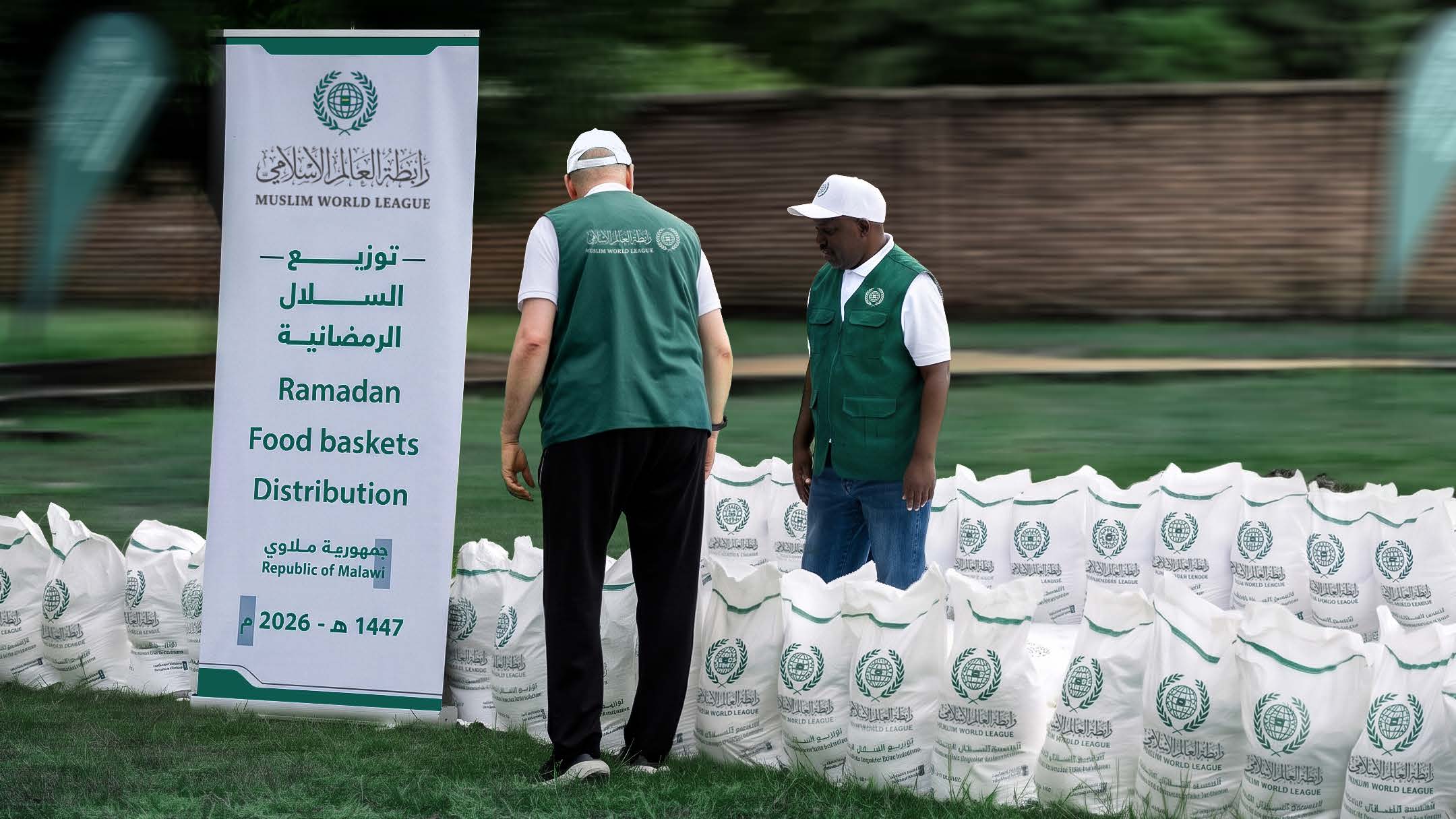
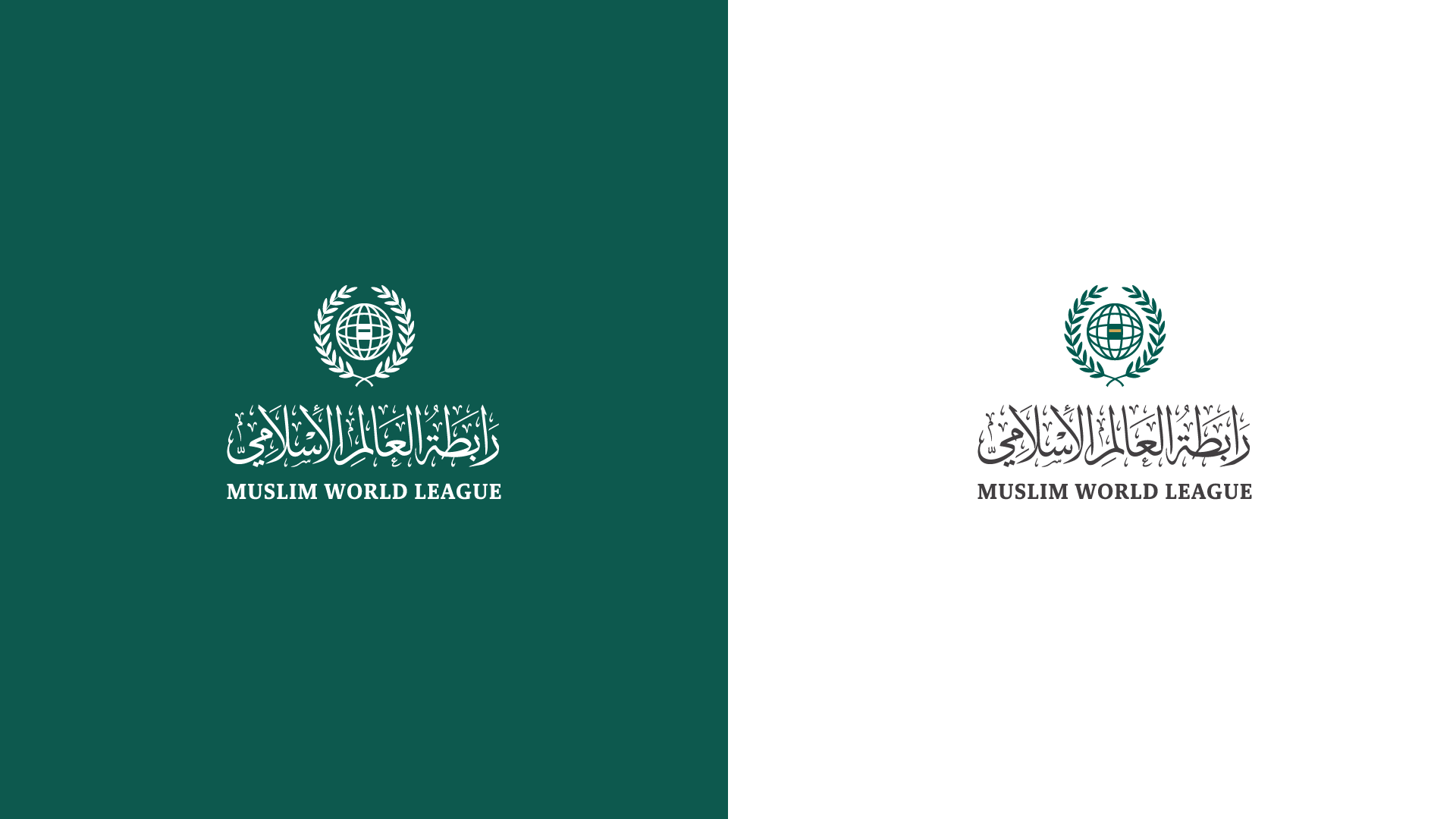
From Makkah to the world, we transformed the League’s mission into a visual identity that brings together its roots and global reach—an identity that preserves its authenticity while expressing its presence through a clearer, more contemporary language.
An identity that starts in Makkah and carries its message to the world.